2018 Winner
Typeface Design
IBM Plex


IBM Plex
Category—Typeface Design
2018 Winner
Typeface Design
IBM Plex
Studio
IBM Brand Experience & Design and Bold Monday
Designer(s)
Mike Abbink, Paul van der Laan, and Pieter van Rosmalen
Client
IBM
Additional Credits
CREATIVE DIRECTION - Mike Abbink
TYPE DIRECTION - Paul van der Laan and Pieter van Rosmalen
WEBSITE: ibm.com/plex
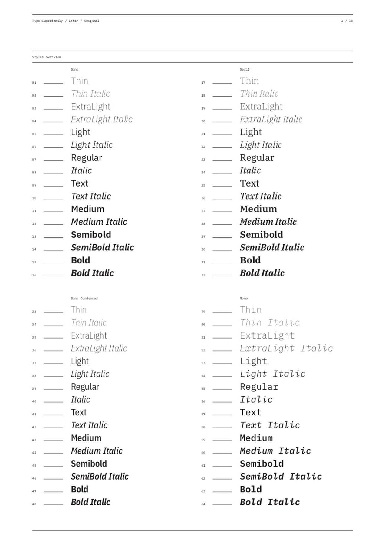
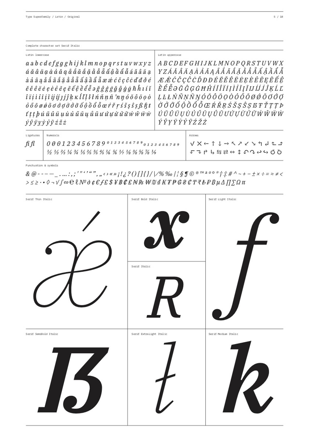
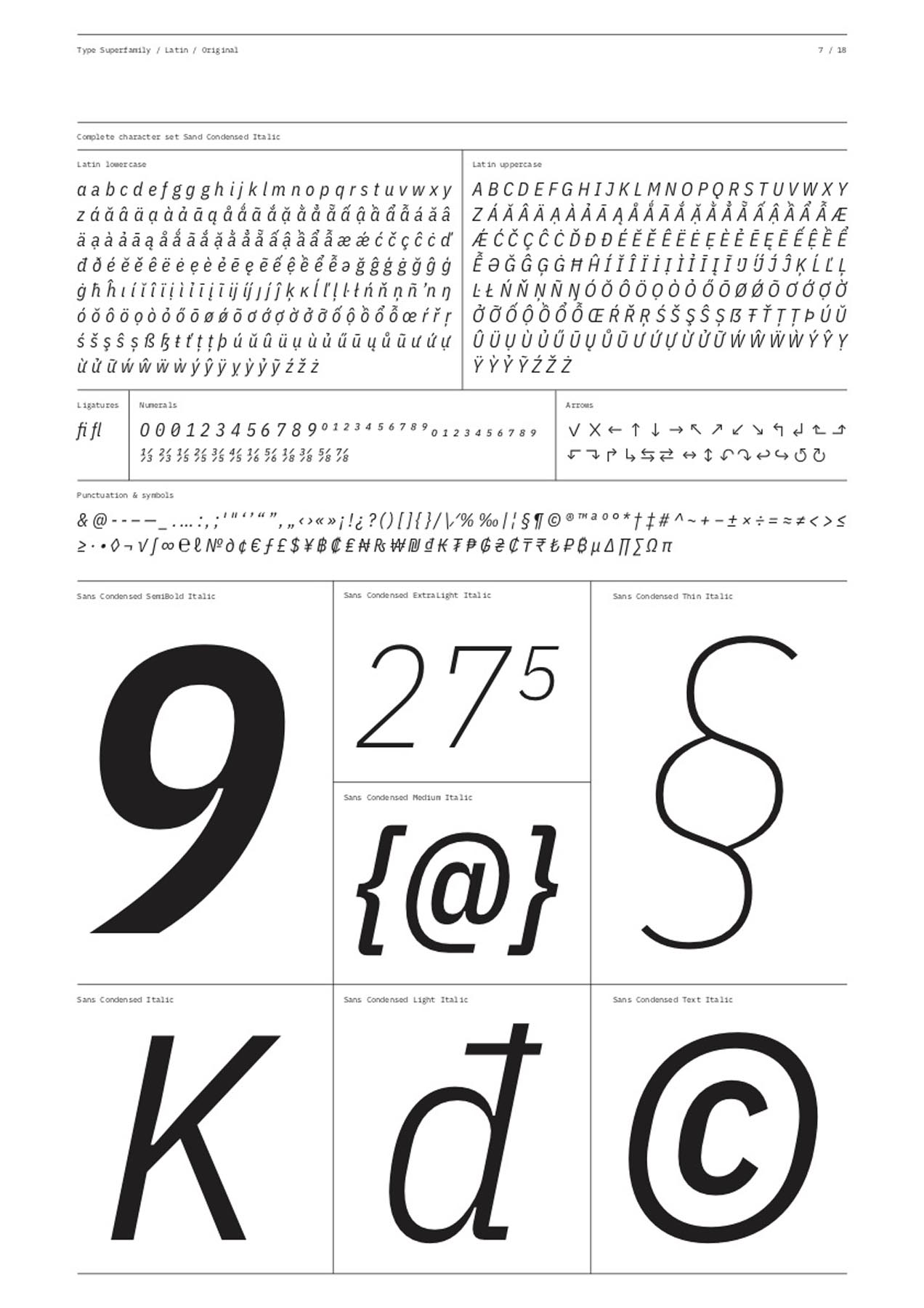
MEMBERS OF THE TYPE FAMILY: IBM PlexTM Sans, Mono, Condensed, and Serif
CONCEPT:
IBM PlexTM is the new corporate typeface for IBM worldwide and an open-source project developed by the IBM Brand Experience & Design (BX&D) team. Plex is an international typeface family designed to capture IBM’s brand spirit and history, and to illustrate the unique relationship between mankind and machine—a principal theme for IBM since the turn of the century. The result is a neutral yet friendly grotesque-style typeface that balances design with the engineered details that make Plex distinctly IBM.
The family includes a Sans, Sans Condensed, Mono, and Serif and has excellent legibility in print, web, and mobile interfaces. Plex’s three designs work well independently, and even better together. Use the Sans as a contemporary compadre, the Serif for editorial storytelling, or the Mono to show code snippets. The unexpectedly expressive nature of the italics gives you even more options for your designs.