To celebrate our talented and diverse membership, the TDC is profiling one member each month who is selected at random. We’re asking members the same five questions that will hopefully let us – and you – get to know them better. Kicking us off is Bruno Maag…
Tell us a little bit about yourself – what you do and where you work
I am the Chairman of Dalton Maag, the company I founded in 1991. These days my role is primarily to set strategic direction and represent the company in public engagements and with clients, all over the world. I always have my ears and eyes open, so that I can spot new design and technology trends, and bring them back to the business to ensure that everything we offer is in response to our clients needs. This closeness with the world allows me to bring innovation back to my talented team.
What is your favorite typeface? And why?
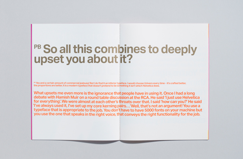
I often get asked this question, and I find it difficult to answer. The favourite typeface depends on the mood of the day, and of course where it’s going to be used. I know that this is the easy option out, so I say this: irrespective of how the typeface is going to be used, simply judged on its letterforms, and how they play together? Then it has to be Univers by Adrian Frutiger. Each shape is about as close to perfect as it can get. No fuss, no schmuss.
Where do you take your typographic/design inspiration from?
Inspiration is having your eyes and ears wide open. It comes from everywhere. It can be a conversation you have in the pub with a complete stranger, it can be a shape you see as you walk along the road. I often doodle whilst on the telephone, or whilst I draw up my shopping list. I like letting my mind wander and doodling allows me to let the pencil find its own way on the paper.
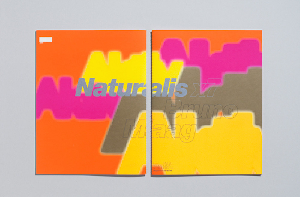
 Brochure design by Sea Design for GF Smith Papers, featuring Aktiv Grotesk
What is your all time favorite piece of design?
This has to be the Rex Swiss potato peeler. So simple and so effective; and so cheap. This is a piece of design that does not pretend to be doing anything more than it was designed to do. The shaping is ergonomic, it is light, and its blade peels potatoes in a jiff.
Where do you see the future in typographic design and typeface design?
Over the last five or so years, I have seen rapid changes brought on by the incredibly fast moving mobile technology. We’re currently finding that no-one really understands how to design for the myriad devices that are existing, and no-one really has a grip as to where this is going. Typographic design will definitely have a role to play in providing good reading experiences. However, it is important to understand that these reading experience are probably going to be quite different from what we already know. Typeface design will be part of this evolution, not only for the Latin script, but on a global basis. At Dalton Maag we’re laying the foundations to be able to react quickly to the changes coming, known or unknown.
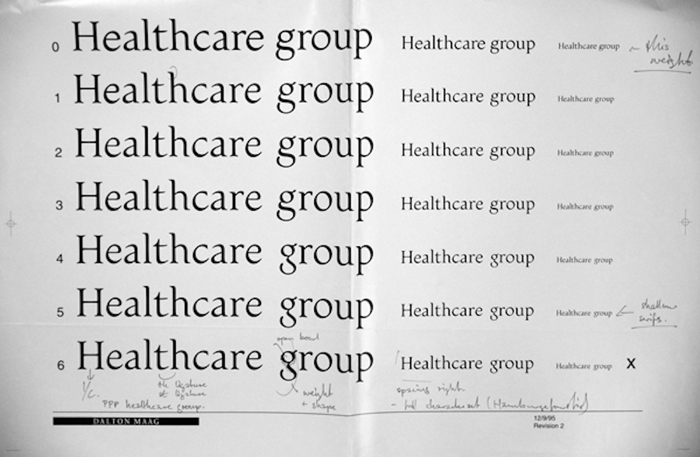
 Process image of one of Bruno’s very first custom font projects for PPP Healthcare
What is your favorite aspect of being a TDC member? / What drew you to become a member of the TDC?
The TDC has been around for quite some time. I remember it as far back as the start of my career, so quite some time then! What I like is that the TDC does not get distracted by off-the-moment design movements and trends. It focuses on the theme of typography and type. It has a clear mission, and works within these parameters to promote typography and type.
I decided to become a member to have more exposure to the TDC’s activities and to potentially have more contact with its members as they clearly have similar design interests to me. As I am also increasingly on business travels within the US, it gives me a chance to hook up personally with members and get to know people more, rather than just via our virtual space that we live in.
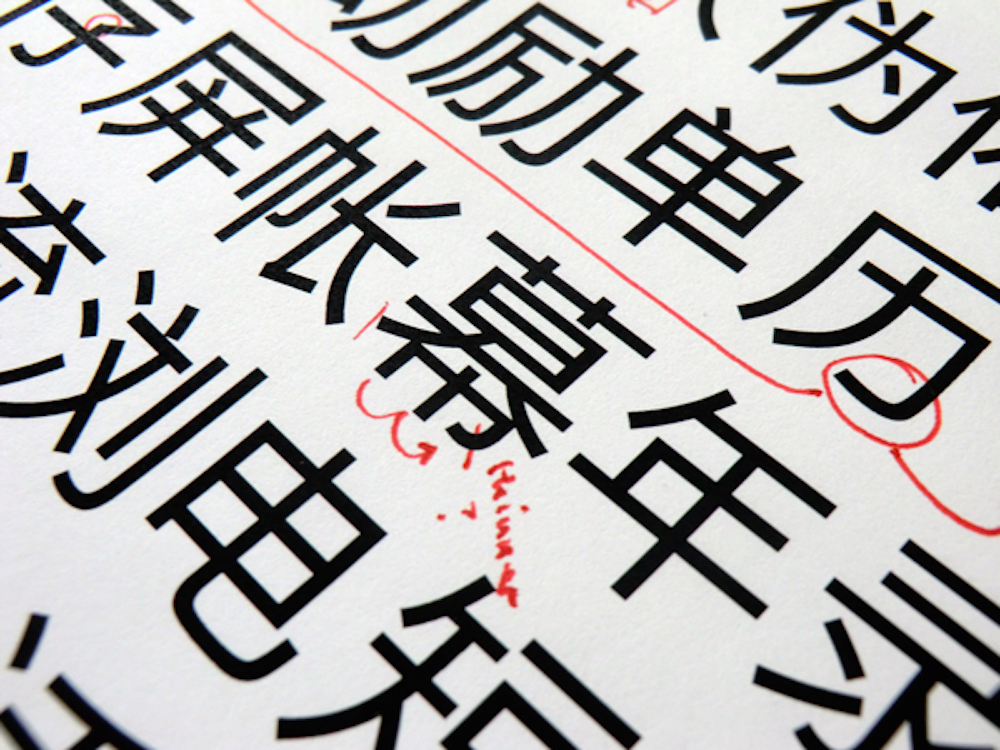
 Process image of multi-script font Nokia Pure, created by the super talented team at Dalton Maag
Links:
Website: daltonmaag.com
Blog: blog.daltonmaag.com
Twitter: @bruno_maag
Pinterest: Dalton Maag
