To celebrate our talented and diverse membership, the TDC is profiling one member each month. We’re asking members the same five questions that will hopefully let us – and you – get to know them better. For our last Member of the Month feature of 2015, we turn to Brazilian typographic artist and graphic designer: Yomar Augusto.
Tell us a little bit about yourself – what you do and where you work
I am a typographic artist and graphic designer. Raised in Rio de Janeiro, I initially trained as a graphic designer before going on to study photography at the School of Visual Arts. I established my own studio in Rio before completing a Masters in Type Design at the Royal Academy of Art in The Hague, The Netherlands where I lived and worked for almost 9 years.
I also taught Typography for Advertising at the Willem de Kooning Academy in Rotterdam between 2011 and 2012, at the Bauhaus University in Germany, and at the Fashion Institute of Technology in NYC. I had also held a number of experimental calligraphy and book art workshops in many countries. Currently I am based in NYC but next year I will be calling South California my new home.
I am a mix media designer / artist, I love typography but I am also interested in so many other graphic languages, such photography, filming, calligraphy, abstract drawing, map making, bookbinding, etc. I really like to push my work into other fields that I don’t have that much experience of.
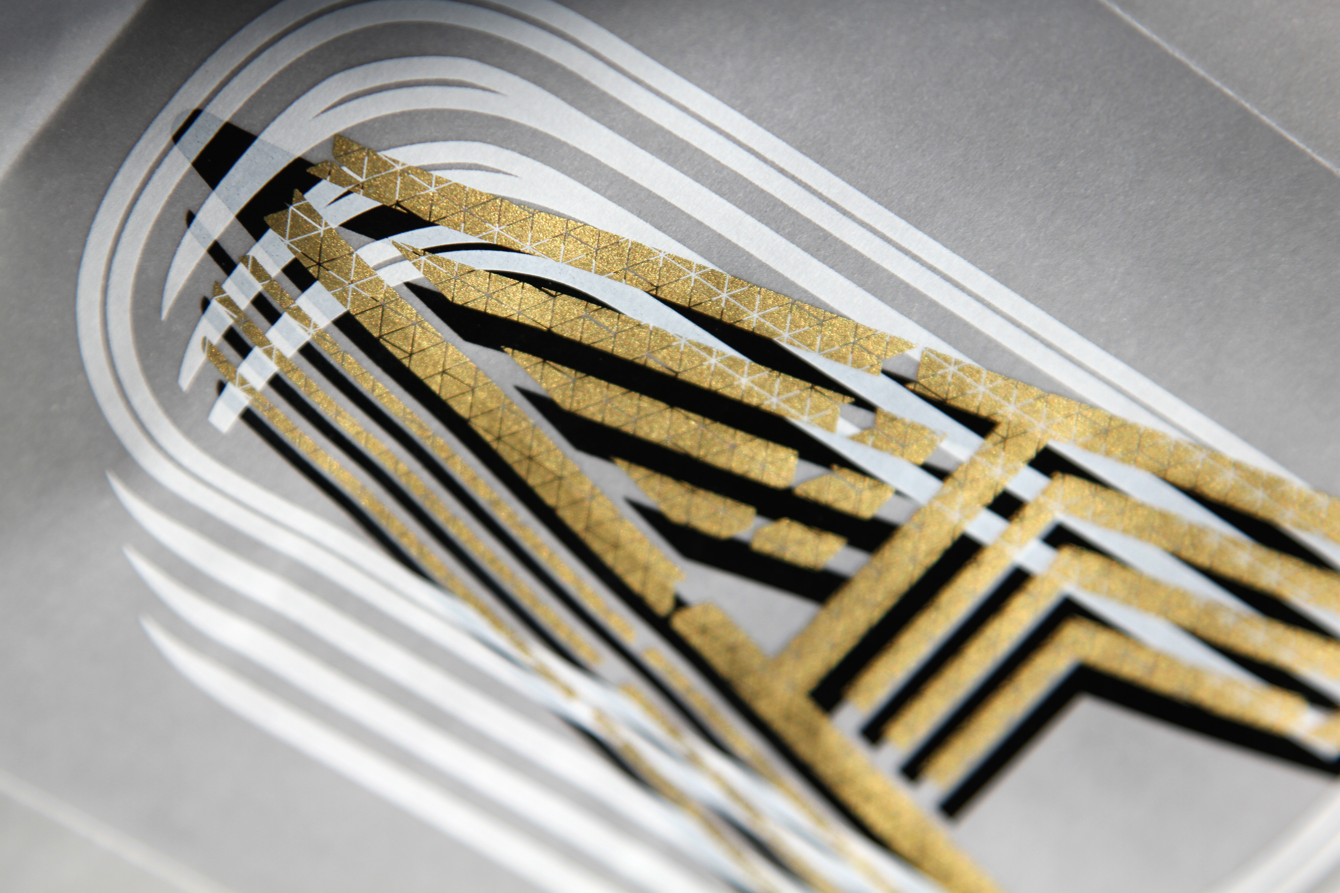
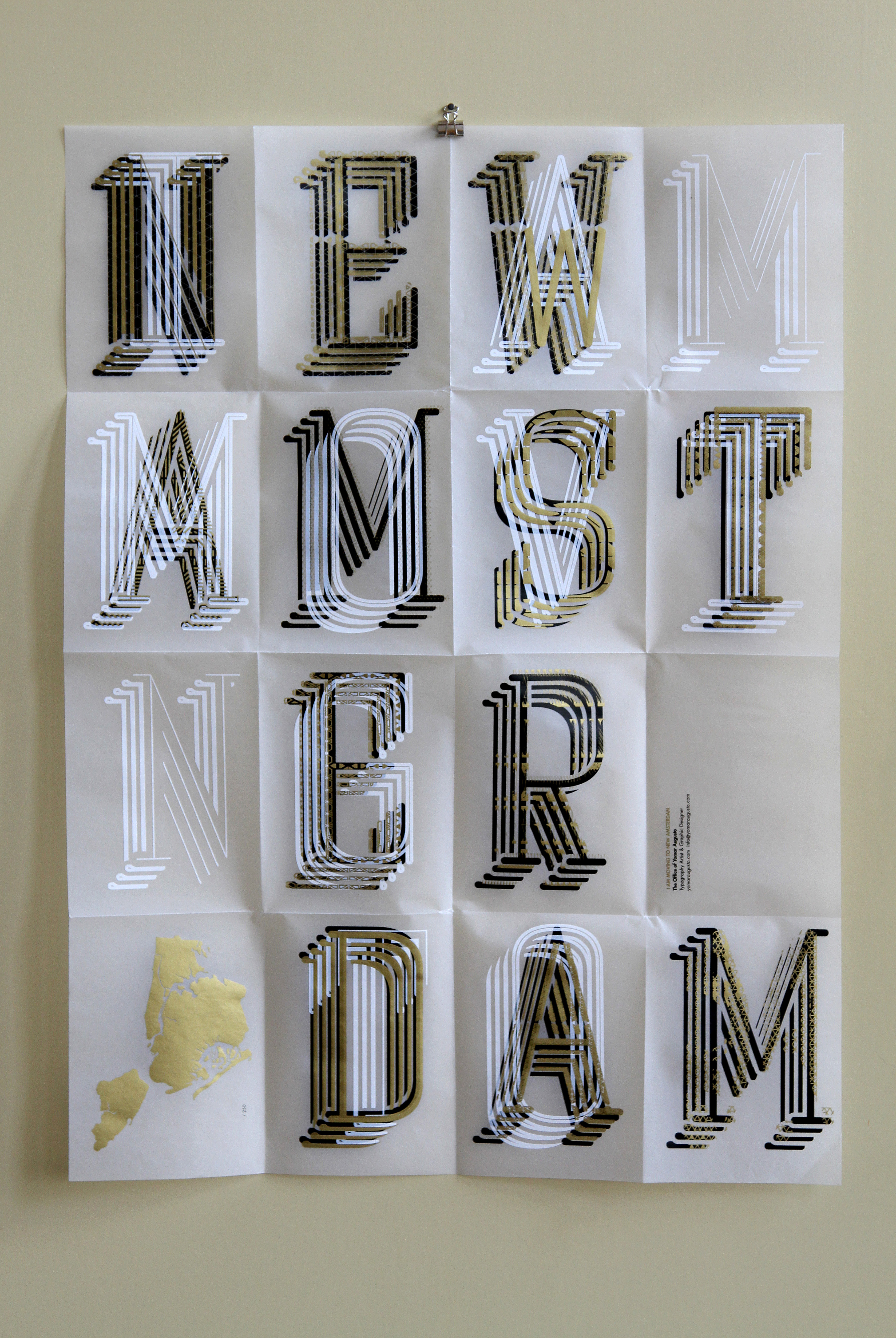
Yomar’s ‘I am moving to new Amsterdam’ silkprint poster.
What is your favorite typeface? And why?
My favourite typefaces are Akzidenz-Grotesk on the sans serif side and Times New Roman for the serifs. I think those faces paved the way for many concepts and ideas for thousands of new projects. I just love them.
Where do you take your typographic/design inspiration from?
My typography inspiration comes from custom projects that can be used as “systems”, a truly combination between the digital and anagogic worlds.
I am a ‘hands on” person and I love combining handmade work with digital stuff, and keeping exploring this intricate relationship.
A designer that I admire deeply is the Dutch designer Rene Knip his work has this amazing and strong physicality that can be translated in so many variations and forms. I kinda follow this route.
I am also a book collector, books helped me to connect with the past and have been truly an inspiration.
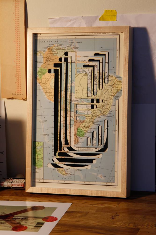
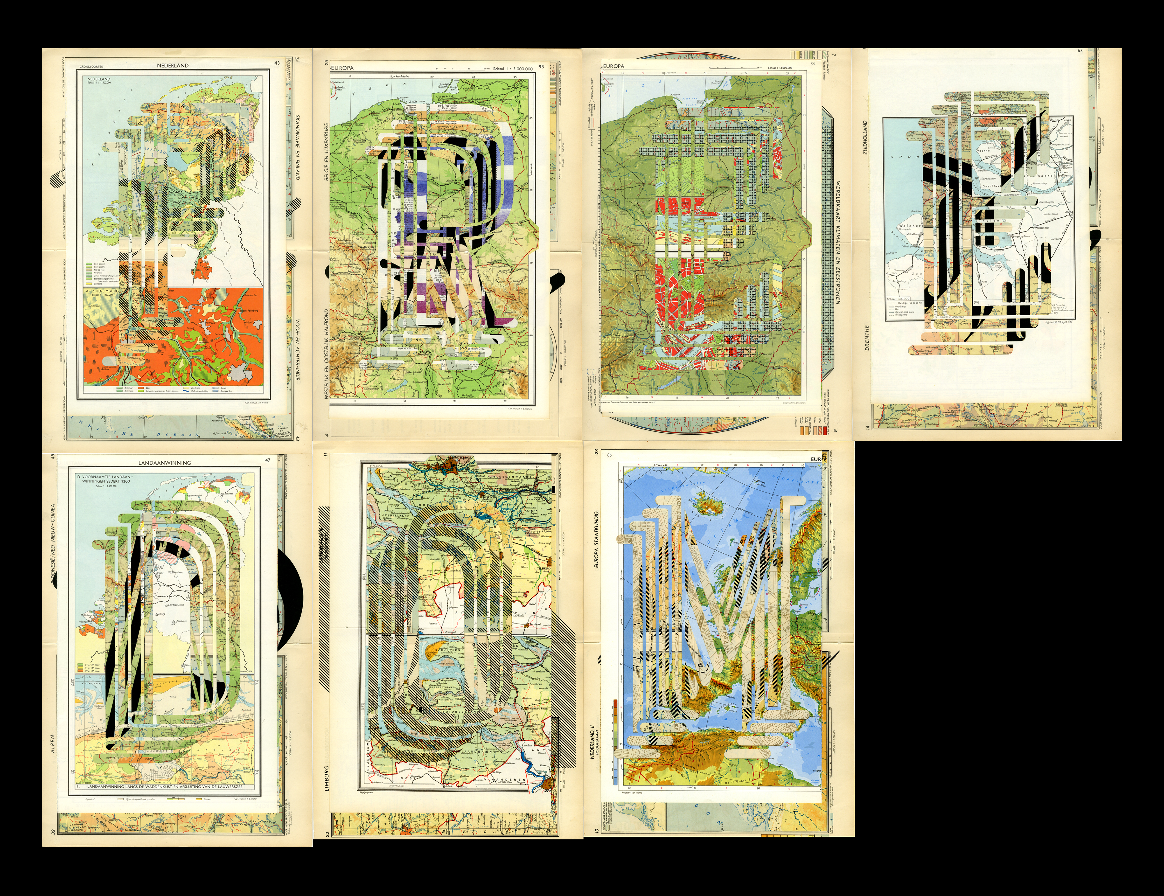
Part of Yomar’s layered mixed media and laser cut ‘All About My Maps’ project.
What is your all time favorite piece of design?
A mountain, a shear massive rock monolith, rising from the ground.
Where do you see the future in typographic design and typeface design?
The future is now, it’s already happening with amazing designers mixing old and contemporary techniques such python language and hardware to make their ideas come reality. I think our period is the most interesting typography wise, but probably a designer in 2345 would say the same thing of their period in time.
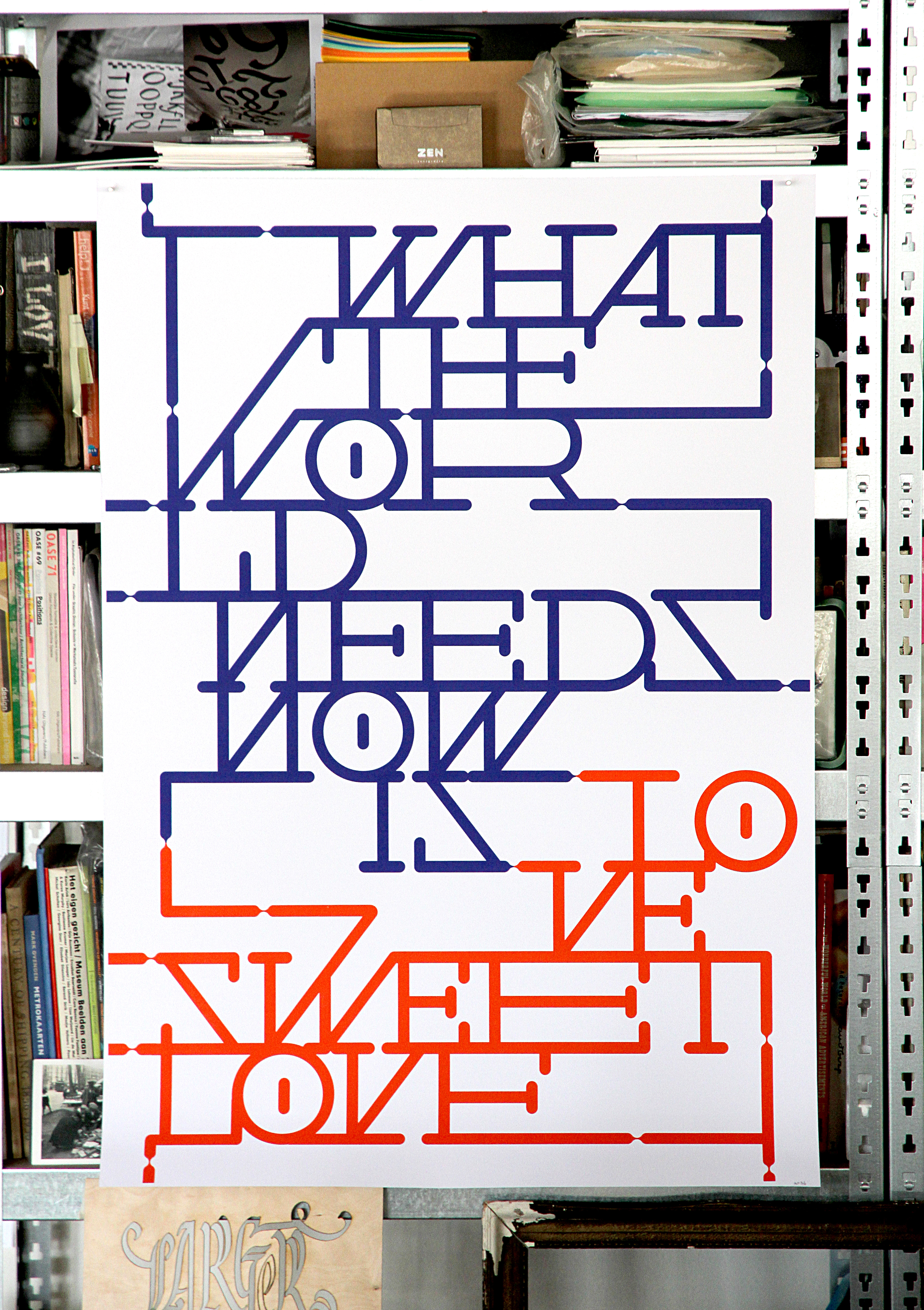
Yomar was one of 20 international artists to have been invited to produce posters to celebrate the 200 years of Warner Chappell, commissioned by Nick Bell design.
What is your favorite aspect of being a TDC member? / What drew you to become a member of the TDC?
TDC inspired me so much: I can meet so many amazing members and share experiences, work and ideas. The simply possibility to be around a such organization in NYC makes you wonder about what might be the limits of typography and design.
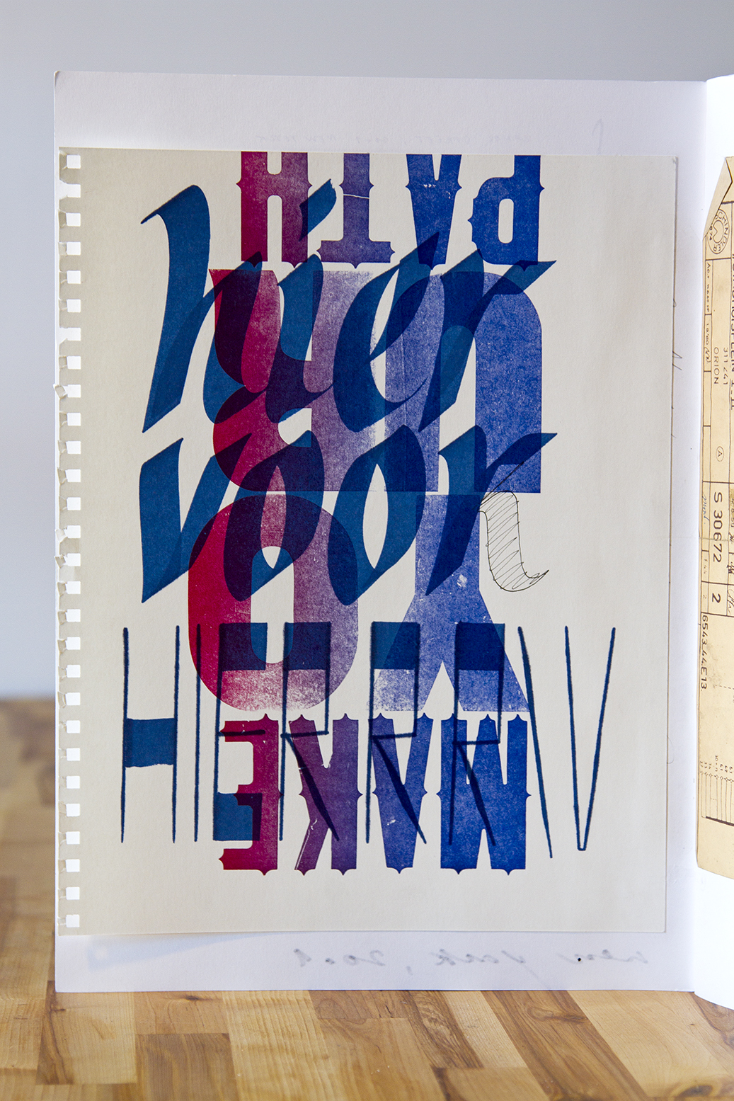
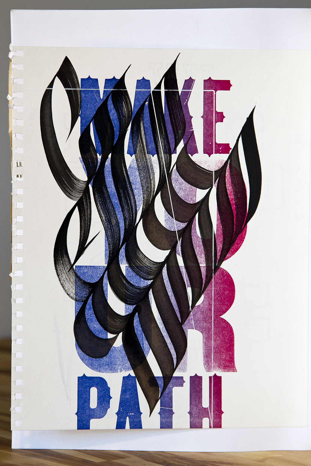
Calligraphy and letterpress experiments from Yomar’s sketchbook
Links:
Website: yomaraugusto.com
All about my projects: allaboutmyprojects.com
Facebook: TheOfficeOfYomarAugusto
Instagram: @yomaraugusto
Twitter: @yomaraugusto
‘Yo+Yo’ personal project/tribute to Yomar’s father: yoplusyo.com
