To celebrate our talented and diverse membership, the TDC is profiling one member each month. We’re asking members the same five questions that will hopefully let us – and you – get to know them better. Graphic and type designer, Wael Morcos, has been selected for May:
Tell us a little bit about yourself – what you do and where you work
I’m a graphic designer, originally from Beirut, Lebanon. I’m also a type designer with a focus on Arabic Typography. After working for studios like SAATCHI, Commercial Type, MTWTF, C&G partners and Base Design I recently started working on my own taking on branding and design projects while working on typeface design.

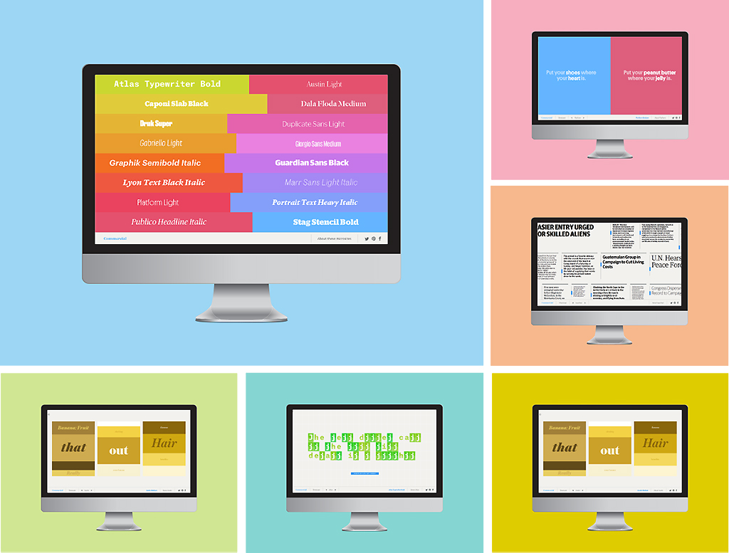
Commercial Type Showcase is a set of sixteen microsites for Commercial Type webfonts library.
What is your favorite typeface? And why?
It changes depending on the context. Currently I’m a big fan of Canela Display originally designed for Document Journal by Miguel Reyes from Commercial Type. I’m excited to seeing the rest of the family released.
Where do you take your typographic/design inspiration from?
Historical archives, urban vernacular signs and the internet, of course. Sometimes online streams become too self-referential so I go back and look at the big art directors of the 1920s and after. Designers like Alexey Brodovitch, Mehemed Fehmy Agha, and later on Willi Fleckhaus and of course Herb Lubalin.

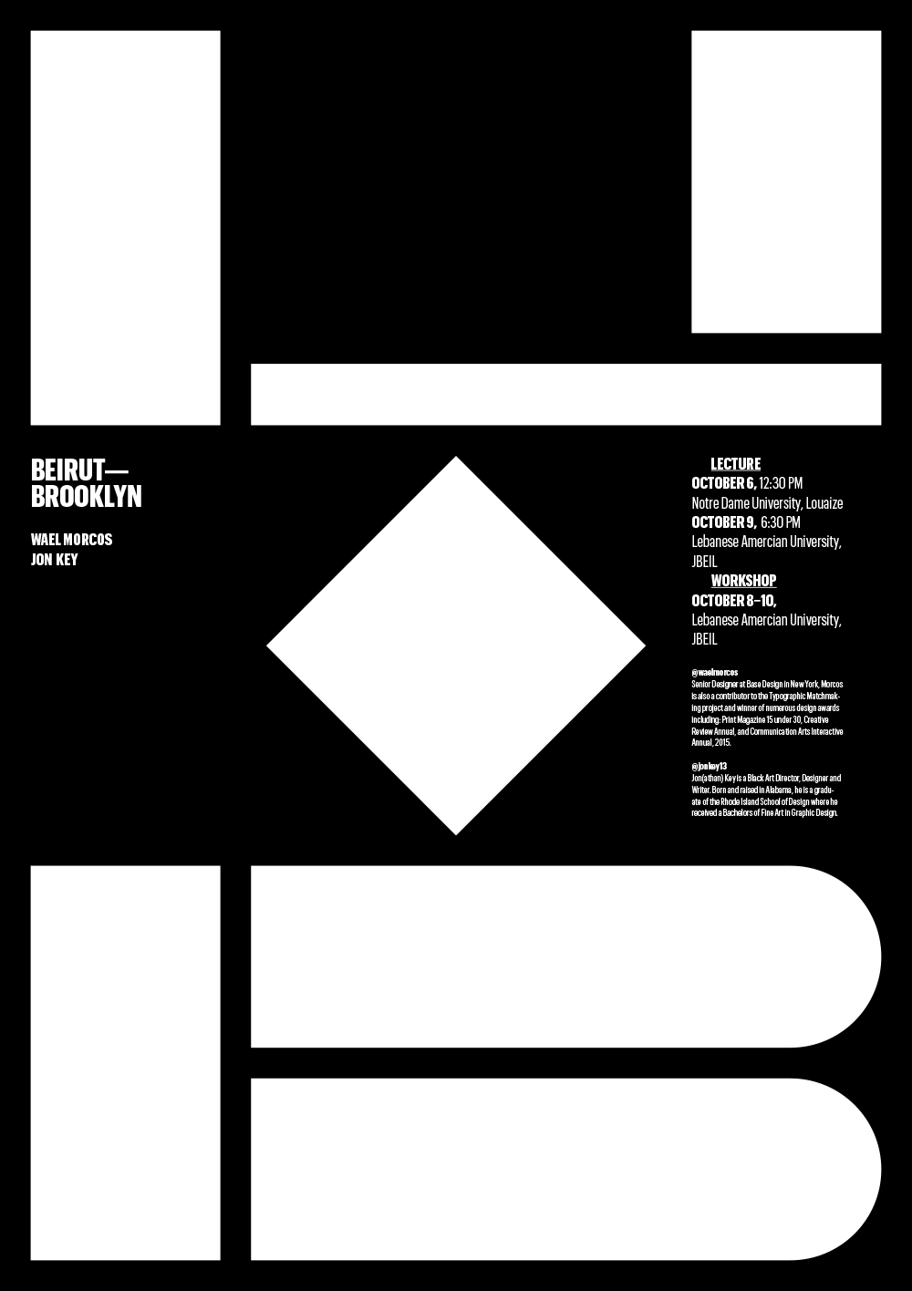
Beirut — Brooklyn Poster Wael designed for two lectures and a workshop.

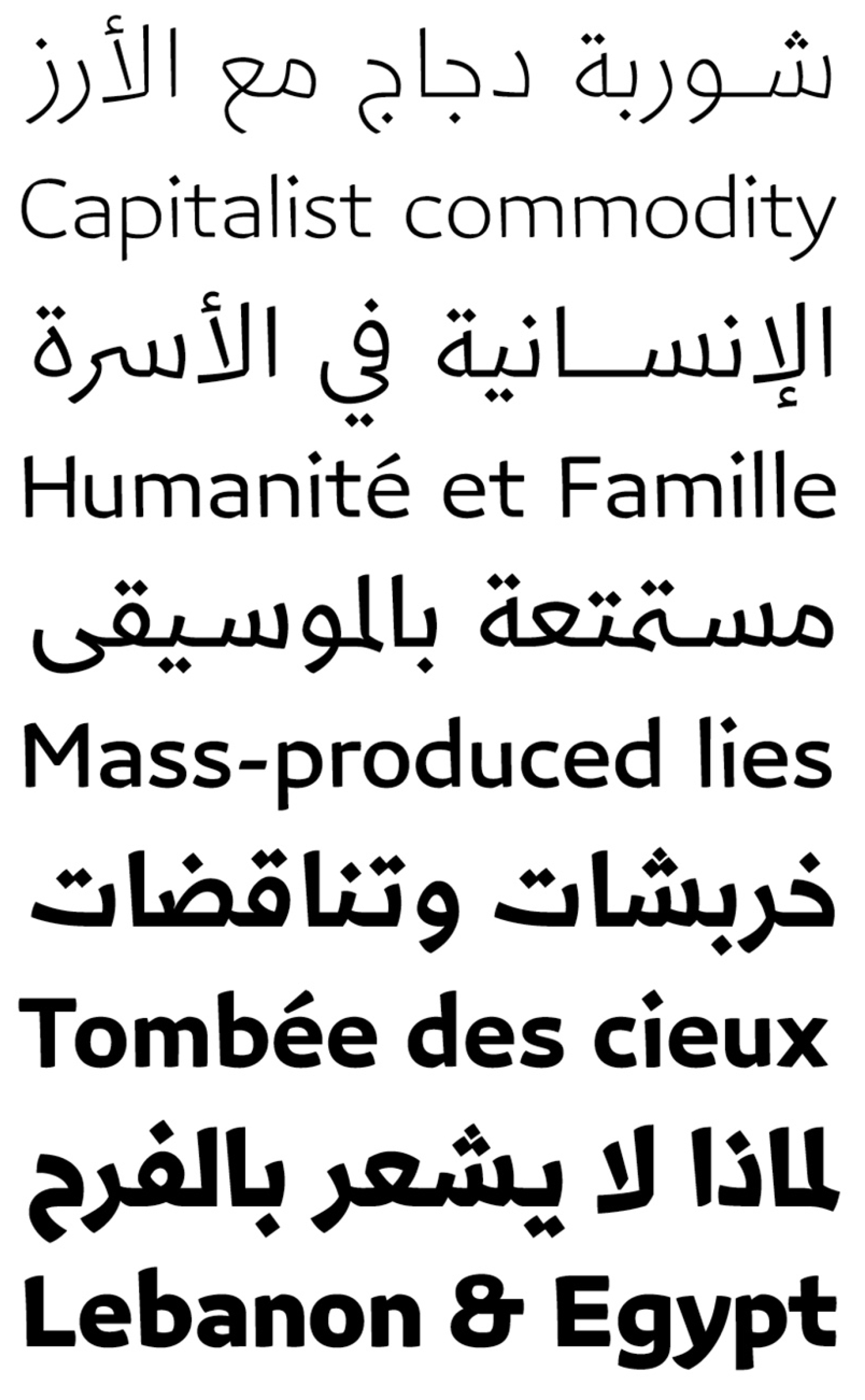
Azer is a multi-script typeface available in five weights. It was designed by Wael, 29ltfonts and Swiss Typefaces.
What is your all time favorite piece of design?
I don’t have all time favorites but illuminated Ottoman manuscripts from the 17th century are impressive feasts of craft work. They are perfect examples of formal excess testifying to the holy value of the text. Today it’s considered medieval decoration but imagine the political power and spiritual influence those texts had and still have!
Where do you see the future in typographic design and typeface design?
For Latin typography the answer is perhaps more automation and elimination of repetitive tasks. Refinement of parametric modeling would allow the designer to input values for style, proportions, and usage and have the whole typeface automatically drawn. Perhaps such functionalities will be embedded in the design software and you’d be able to generate a display version of any typeface on the fly…
For Arabic, the calligraphic script still needs to evolve to a mature typographic form. But that’s why the present is an exciting period for Arabic type design.

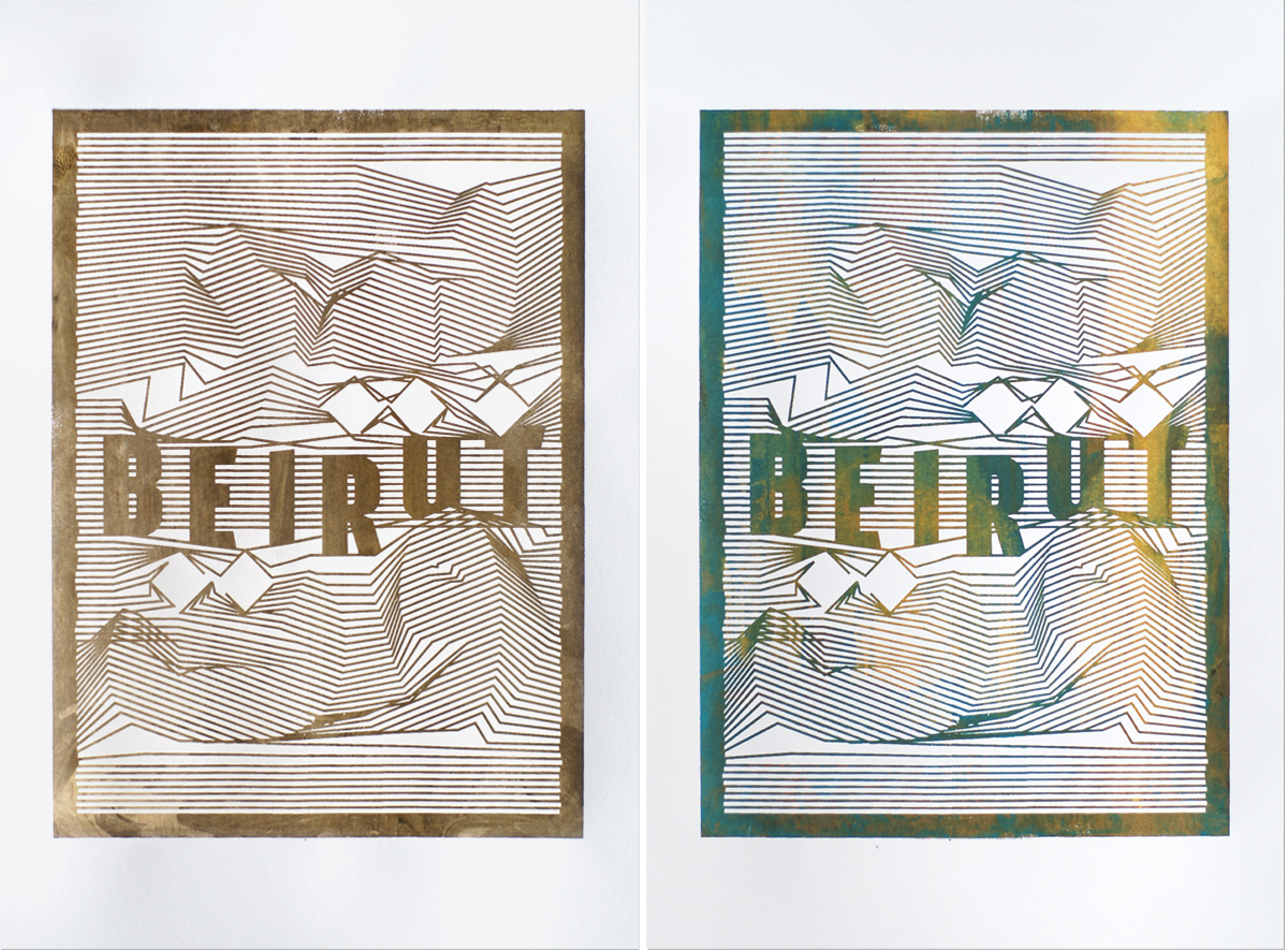
Silkscreen posters, for a city that is never itself and never the same. The topographic lines spell the word Beirut in Arabic.
What is your favorite aspect of being a TDC member? / What drew you to become a member of the TDC?
Finding a community that shares my interest in giving shape to language and receiving the annual of course.

Bozoni is Wael’s generative typeface made of 3 stacking fonts based on Bodoni. Light Design: Jon Key.
Links:
Website: waelmorcos.com
Twitter: @waelmorcos