Tell us a little bit about yourself – what you do and where you work
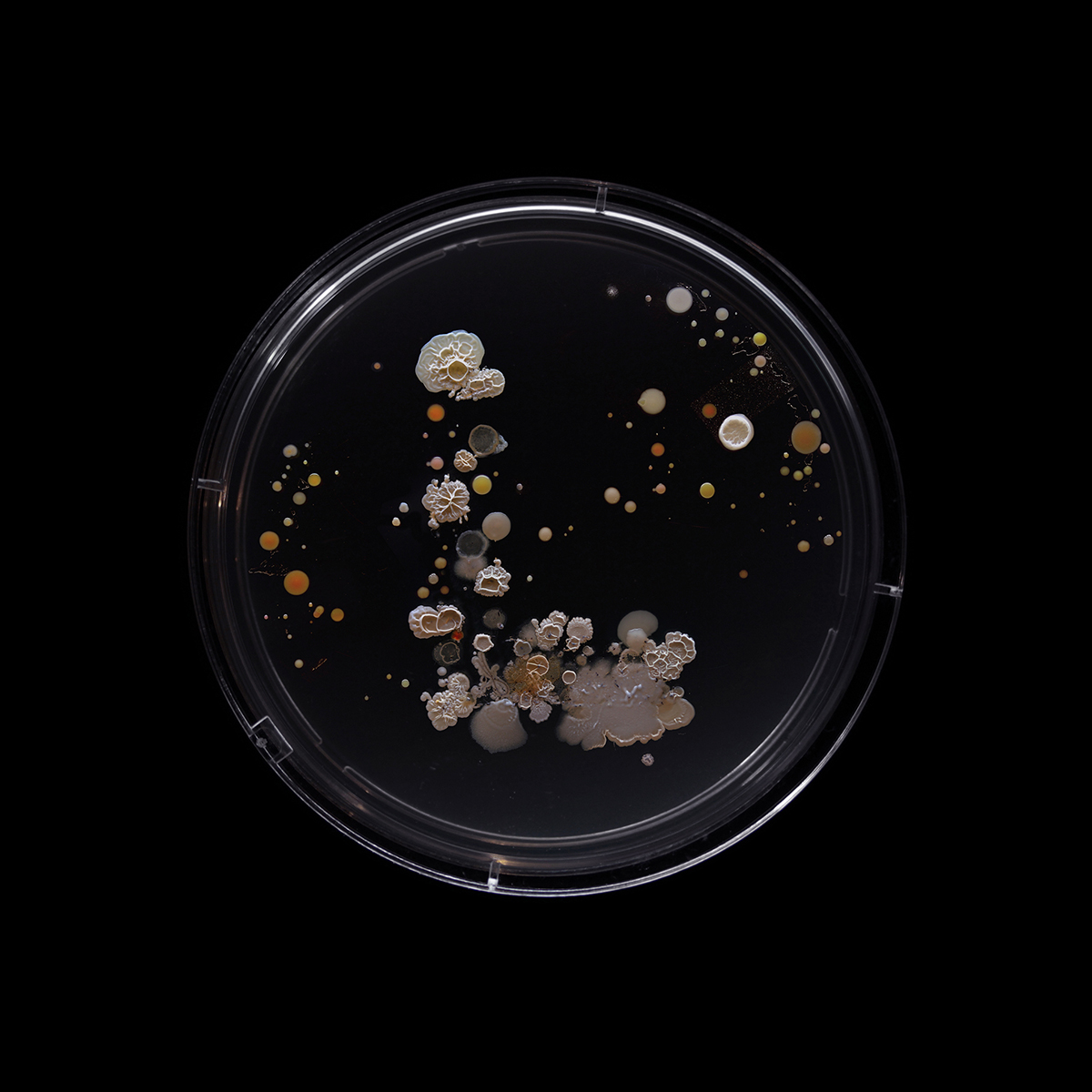
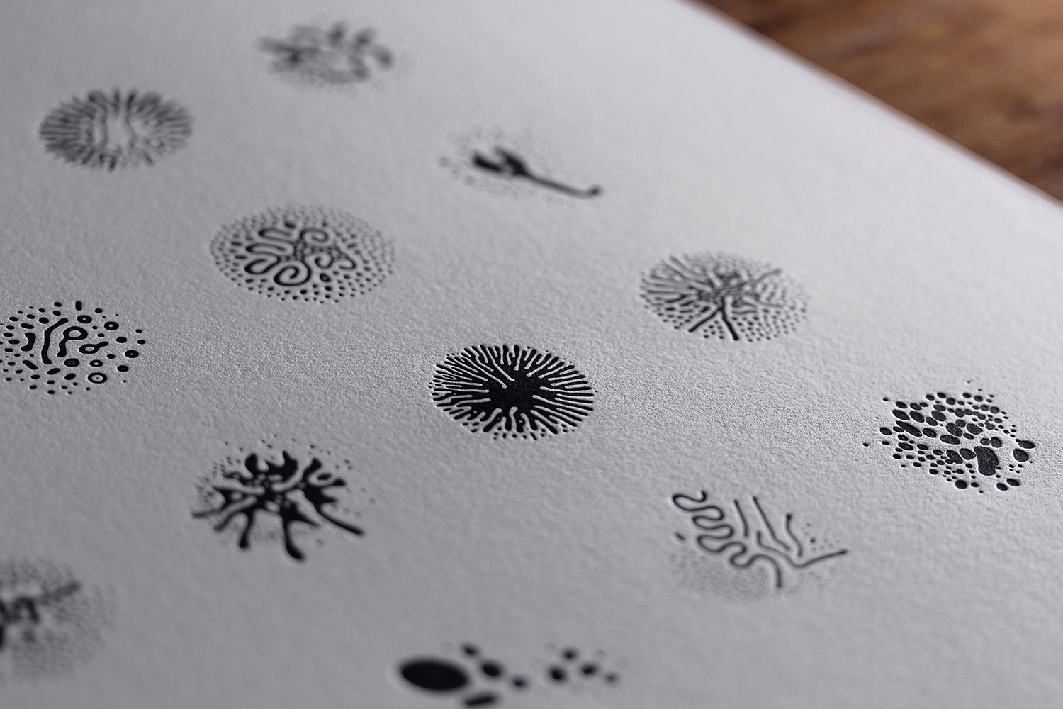
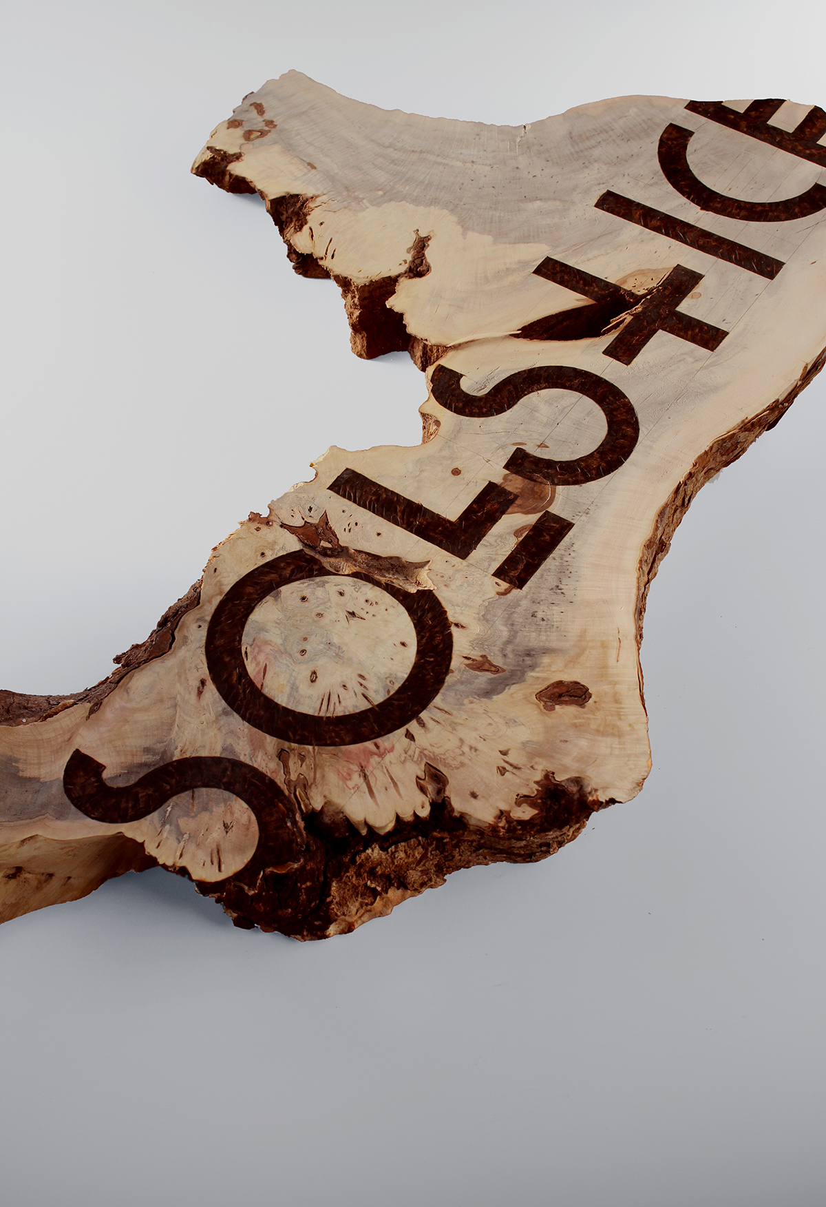
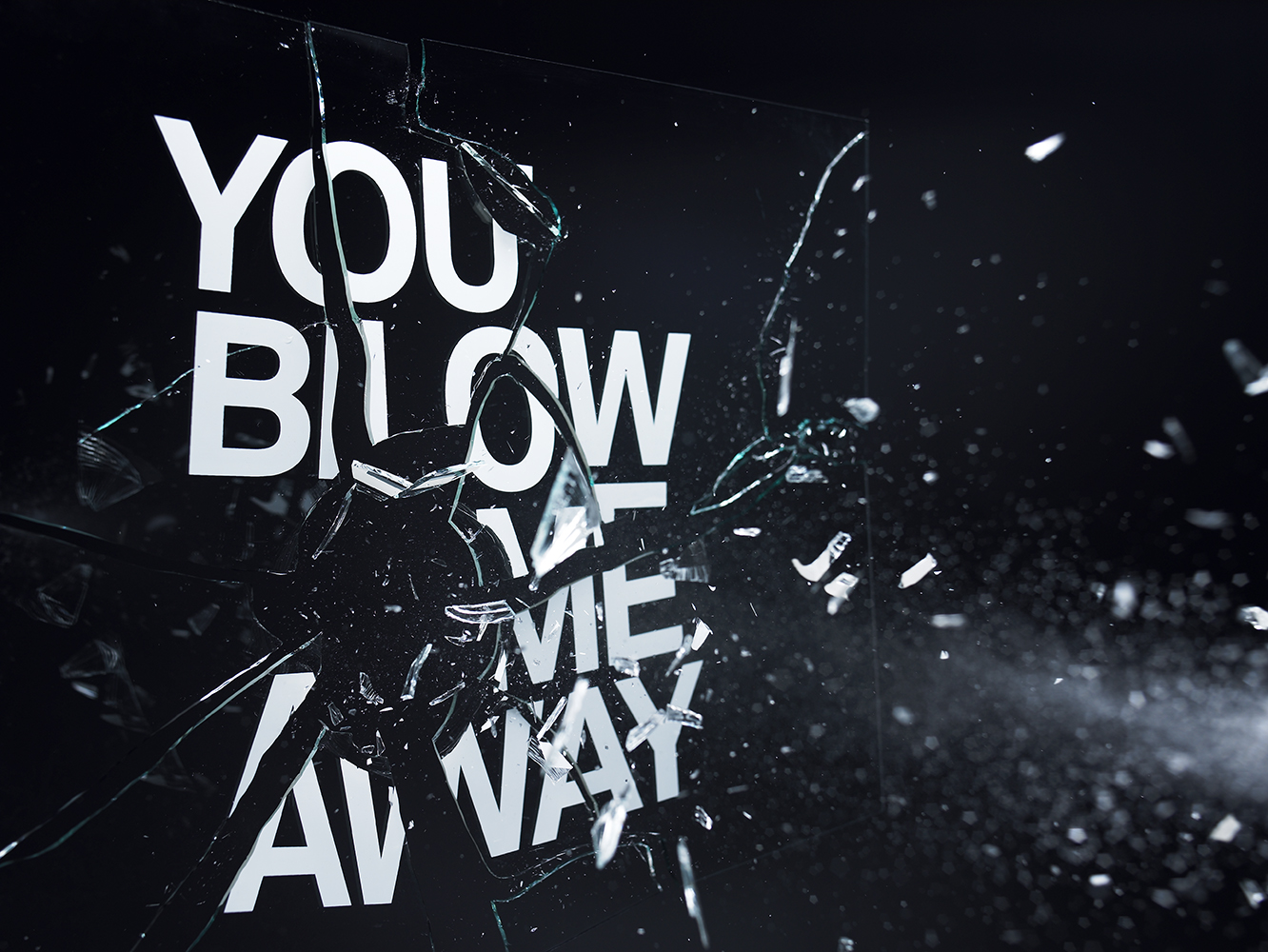
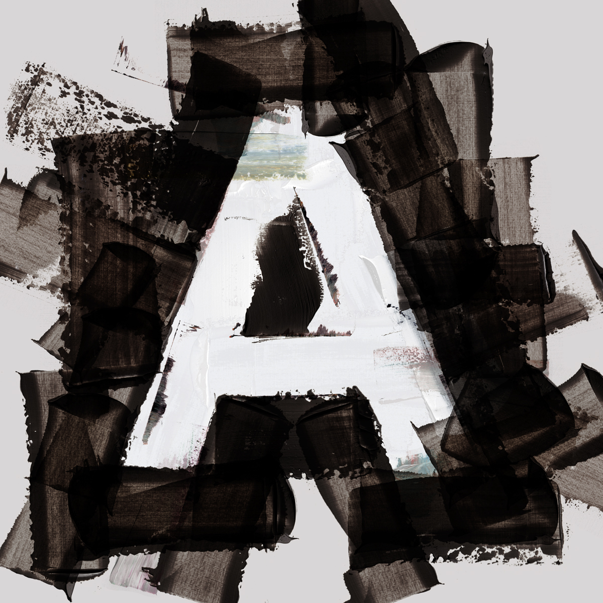
I’m a British designer, typographer and art director currently based in New York, where I’ve run my studio for the last 5 years. A lot of my work revolves around the juxtaposition of clean, classic type with various organic or uncontrolled processes.
What is your favorite typeface? And why?
I don’t really have a favorite, although I always find myself coming back to classics like Futura and Helvetica. They’re a nice blank canvas for my experimental work. I’m really into slightly awkward, European sans-serifs right now… I know they’re very popular and specific but there’s something nice about the way they have this clarity and stiffness. Favorit by Dinamo is a good example.
Where do you take your typographic/design inspiration from?
Pretty much anywhere and everywhere. I try not to look at other people’s work, I’m more interested by processes and accidents – misprinted posters; peeling, faded or broken signs, smudges, environmental wear and tear etc. Those things are all tools I can put in my botox drawer to tell a story at another time. I also look a lot at the fashion and art worlds for material inspiration. The less commercial the better really as they operate without limitations.
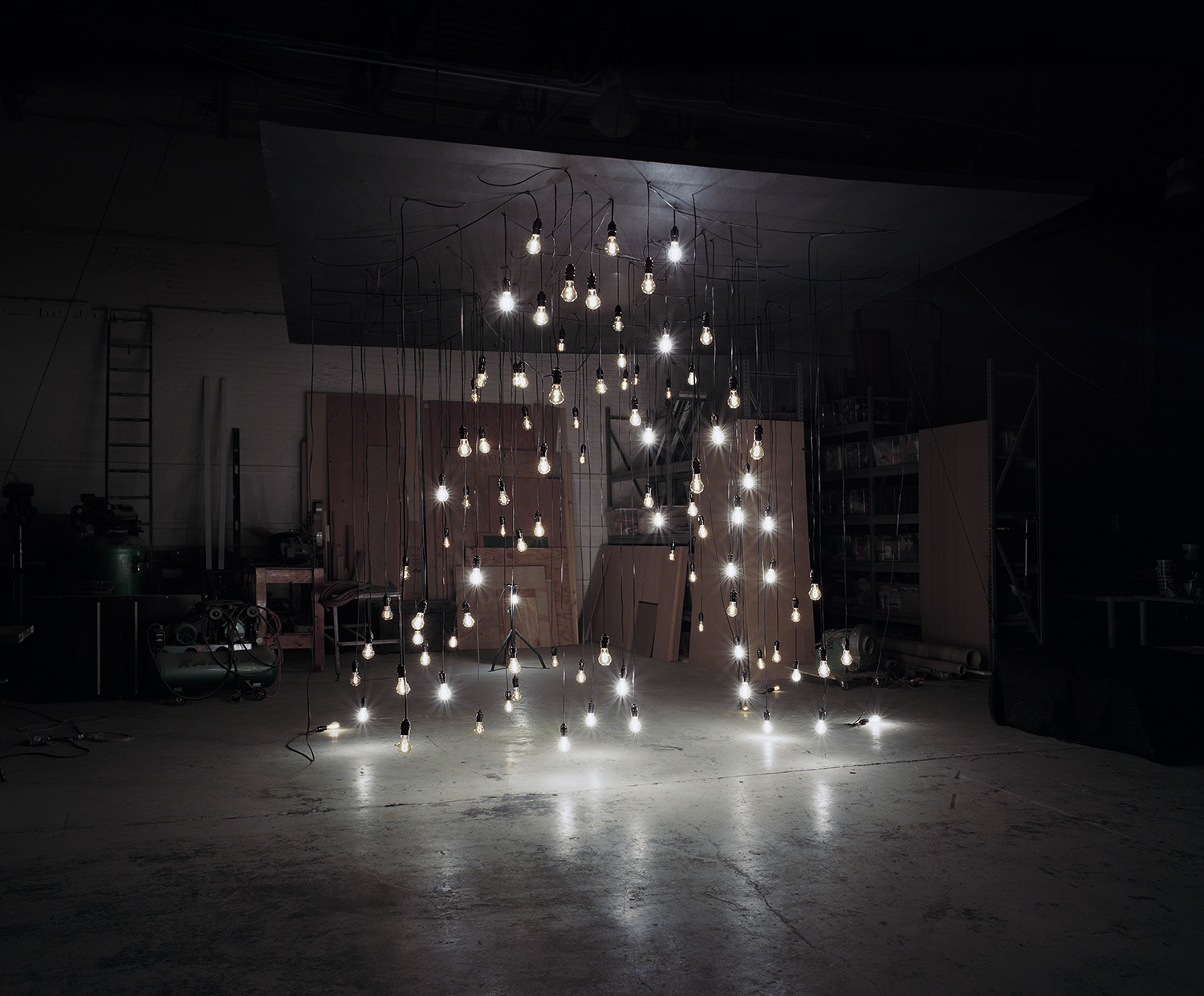
Adobe Remix – A 1700cu/ft installation created for Adobe using dozens of hanging lightbulbs and anamorphic perspective.
What is your all time favorite piece of design?
Big question! My favorite kind of design is always quite simple / minimal. I don’t want to overthink it, so it might be something as simple as Josef Müller Brockman’s Beethoven poster.
Where do you see the future in typographic design and typeface design?
Well, I think like most things in life it’s cyclical. We’ve gone from hand made type into pure CGI and have seen a return to hand lettering as a reaction to this. Hi-fi > lo-fi and back again. In terms of type design, again we went from these very laborite script typefaces a few years ago to these exercises in restraint that you see coming out of Europe. It’s tricky though as all of these things are going on around the world at different times, and also thanks to technological advances things are speeding up.
What is your favorite aspect of being a TDC member? / What drew you to become a member of the TDC?
I like the slightly niche and esoteric nature of the club. I think there are members who are waaayyyy more into pure typography than me, and it’s nice to be in the same group as those people, even if they have this discipline that I can never have. We’re just coming at it from a different place.
Links:
Website: wordsarepictures.com
Instagram: @mrcraigward
Twitter: @mrcraigward
