To celebrate our talented and diverse membership, the TDC features a monthly profile of one of its members. This month, we are putting the spotlight on Alexander Tochilovsky, designer, typographer, instructor, and curator at Cooper Union’s Herb Lubalin Study Center of Design and Typography. TDC asked him several intriguing questions – how he began at Cooper Union, what it’s like to manage a famous archive, and perspectives on lettering in Lubalin’s time versus now.
You’re a graduate of The Cooper Union School of Art, and you teach there now. What kind of student were you, and did that inform your teaching?
I was quite shy during my first two years at Cooper, as I felt that I was not quite on the same level as my peers. Cooper is highly selective, and I felt that I had somehow “snuck in.” By my third year, I opened up more in critiques. Being able to talk about work helped me to grow immensely. Because of that, I put an emphasis on getting my students to open up, and to learn how to talk about work, verbalize their ideas, and offer constructive feedback to their classmates. I was also a procrastinator, so I tried to instill a better time-management ethic in my students.
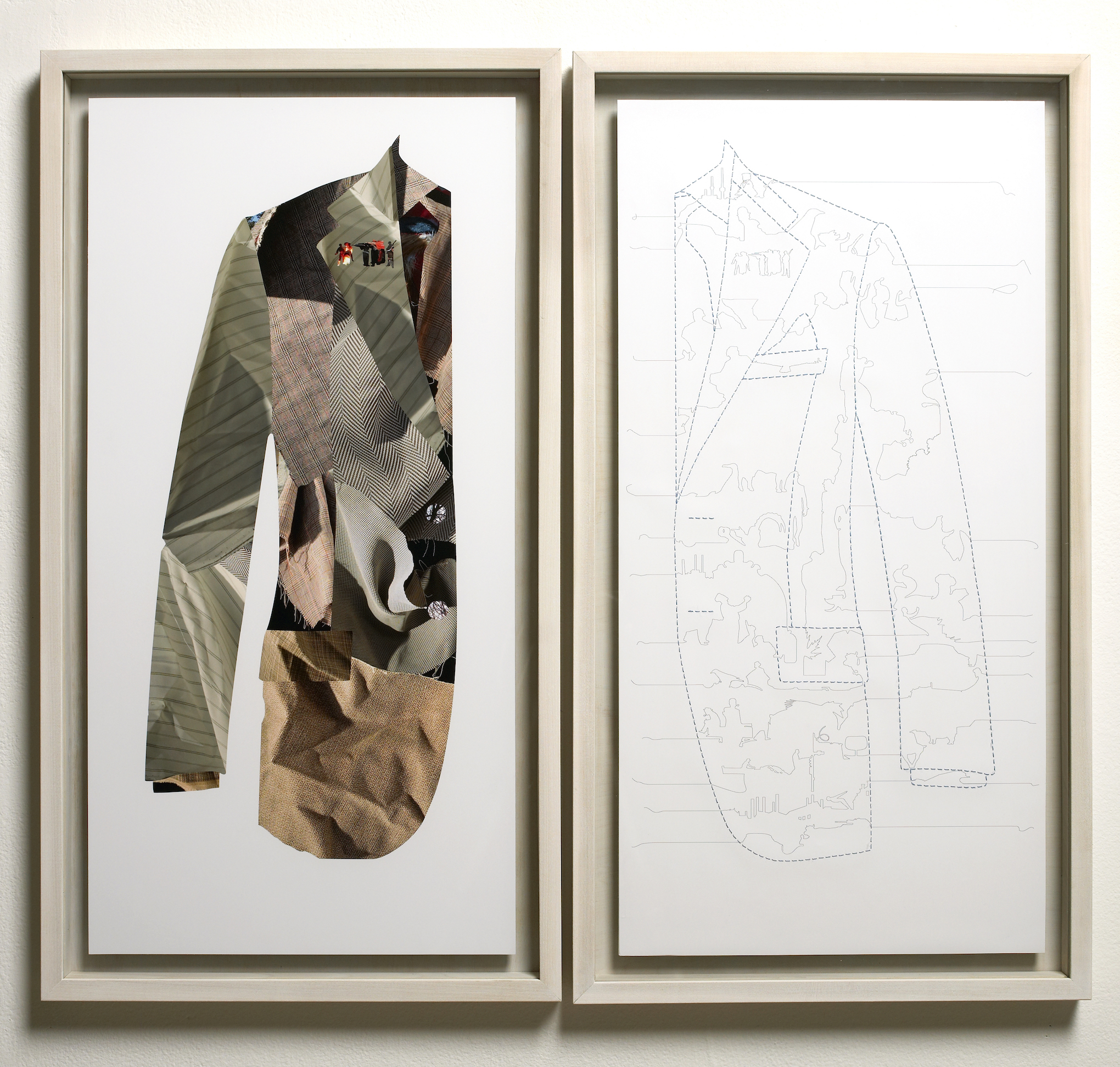
 Suited was my diploma-graduating piece at Cranbrook.
You earned your MFA from Cranbrook, a school known most for its postmodernist approach to typography. How did your experience at Cranbrook differ from how you had previously learned about typography?
I was attracted to Cranbrook because it was not a traditional graduate program, in that it had no classes or grades. I wanted to go somewhere that I could spend time thinking about design and typography from a new perspective. I found that at Cranbrook.
Cranbrook also appealed to me because it seemed similar to Cooper — very open and interdisciplinary. In that sense, the environment and spirit of thinking about typography was quite similar, even if the output was different. The two schools also have a similar outlook in terms of questioning the status quo, and both are quite small allowing, for a more intimate and focused learning.
At Cooper, I was exposed to many of the post-modern ideas by my teachers, especially by Barbara Glauber, who greatly expanded my understanding of the possibilities of typography. My work grew at Cranbrook from a critical perspective and started going into a more research-driven direction. I started to think about design’s connection to history, as well as its own history.
Both environments shaped how I teach design to my students. A lot of what I do in terms of critiques at Cooper is influenced by how Elliott Earls ran the critiques at Cranbrook.
 A piece I designed for the Cranbrook Academy of Art commencement.
The Lubalin Center is a very unique archive in that it is centered around a distinct typographic style. What are the parameters for adding to the archive when the acquired works differ from Lubalin’s work?
Personally, I don’t have any strict parameters for adding to the collection other than the object must be interesting and well designed. Probably, the main restriction is trying not to stray too far outside the bounds of design. The collection itself and even Lubalin’s own work are quite eclectic, so it’s easy to continue to add to the collection without feeling too restricted.
We have design work from all over the world from the last 100-plus years. I deliberately try to include design examples that often get overlooked by design history books to provide a more honest perspective on what design really looks like if you start looking at it decade-by-decade. Since most people who haven’t visited the center think we only have Lubalin’s work, it’s usually a nice surprise when they discover that we have so much more and how varied it is.
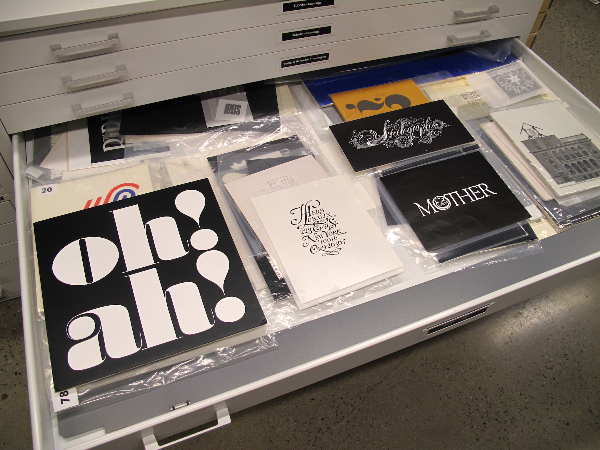
 Looking into the Herb Lubalin Study Center of Design and Typography logo collection.
What are the most noticeable style or craft differences between lettering in Lubalin’s time and now?
There is so much more variety of styles and references today than in Lubalin’s time. Designers and letterers now have a much wider range of forms to reference. The control and precision enabled by computers is also pushing the envelope of what is possible. In Lubalin’s time, lettering artists were constrained by the limits of reproduction technology. What was possible in his day has been far surpassed in the last few decades.
I would like to see is more recontextualization and new lettering range. Tom Carnase, John Pistilli, and Tony DiSpigna all took inspiration from the nineteenth century but turned it into something more contemporary, which came to define the look of the late Sixties and Seventies. I’d love to see more lettering that feels new, rather than mere revivals of the Spencerian and Carnase. I see some that feels new, but would love to see more.
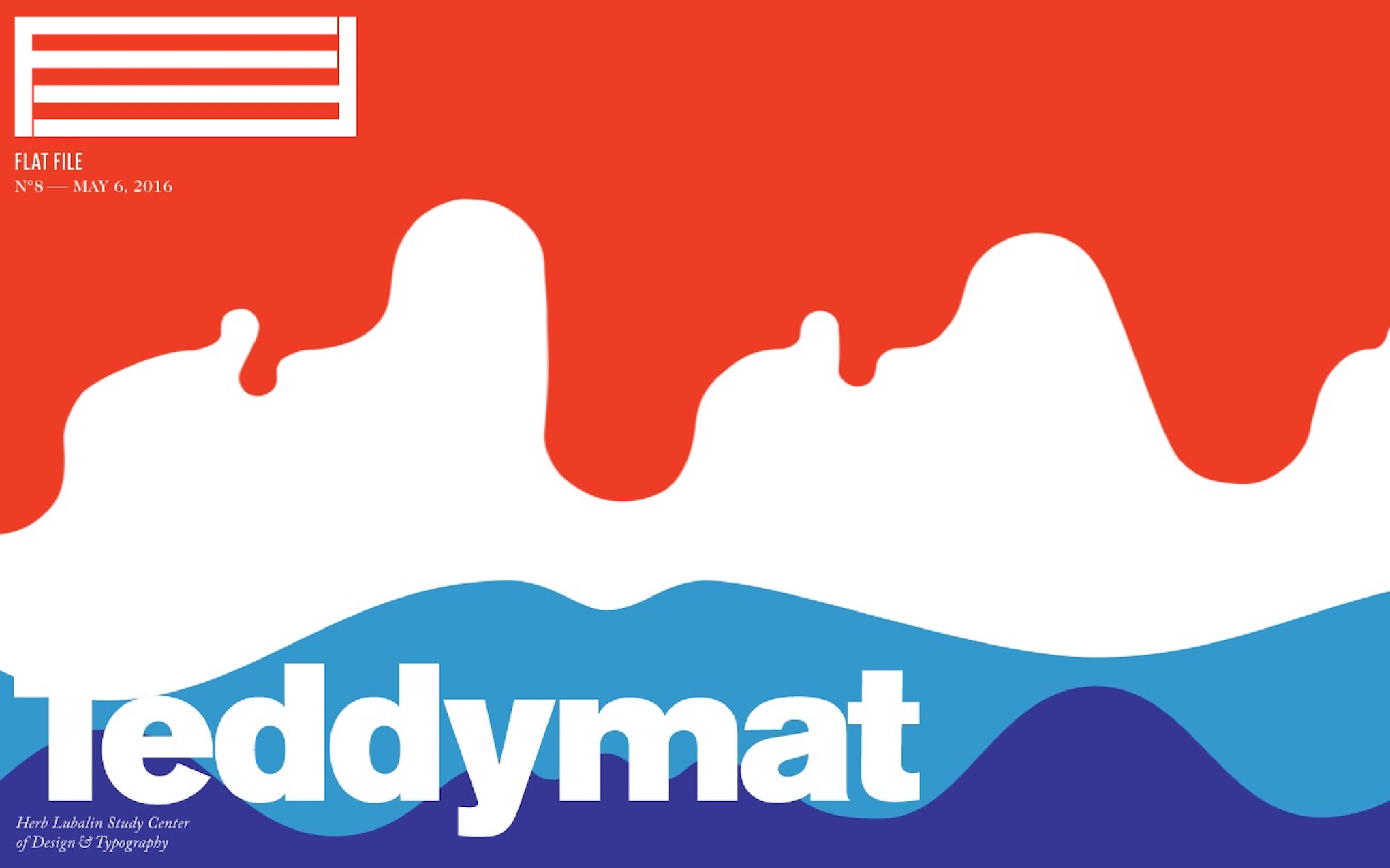
 FlatFile is an online digital magazine project Anton Herasymenko and I started earlier this year. We handle the design and content and feature items from the Lublin Center’s collection.
Between teaching and curating, how much do you get to design?
I don’t get to design as much as I used to, but I maintain a couple of clients. I do some work for Cranbrook and am looking for some non-profit clients. I plan to continue working, because I think it’s essential if you teach graphic design. It keeps you connected to the ever-changing tools and discussions.
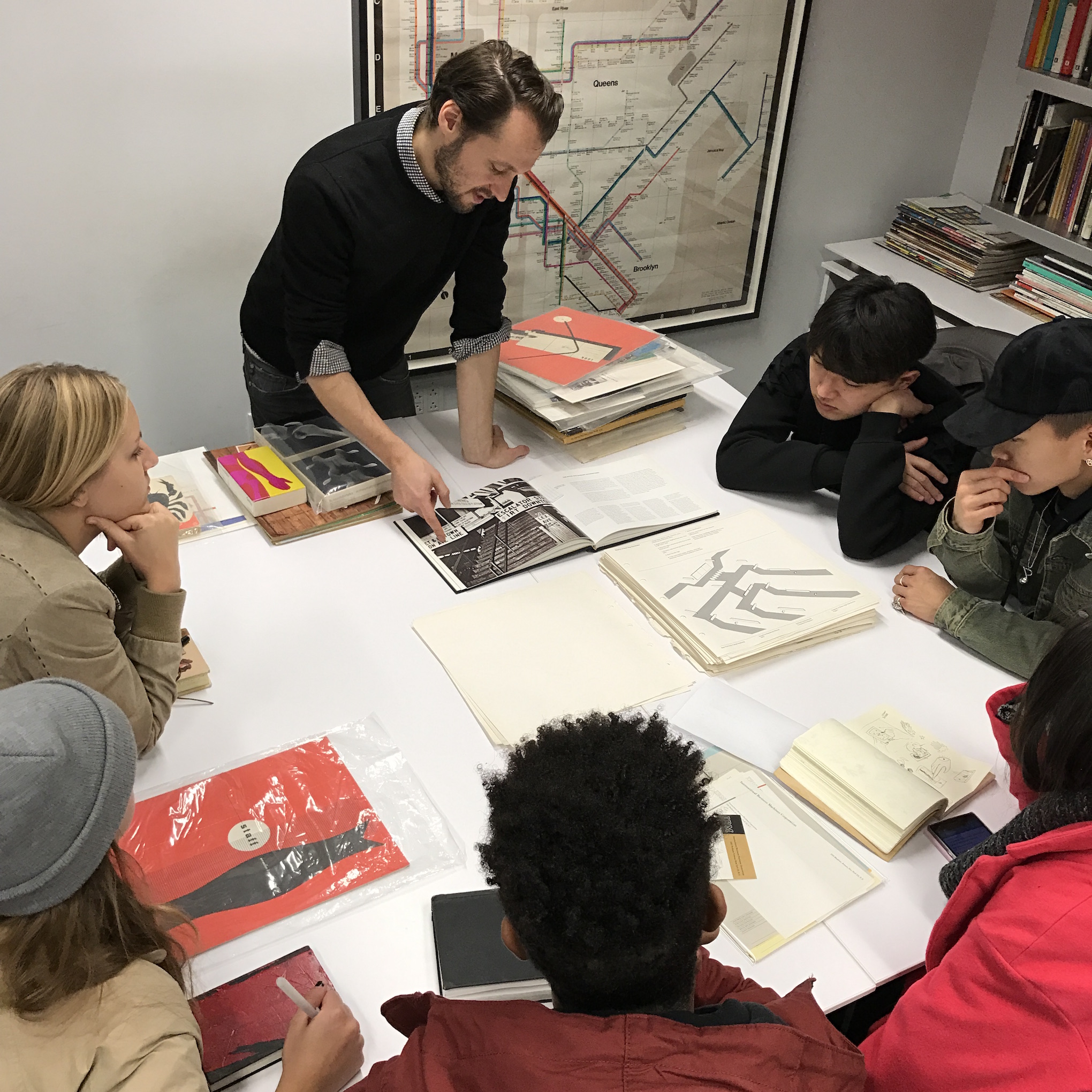
 We run a number of hands-on presentations for students in the archive, exposing them to the wonders of the collection. Photo: Scott Santoro.
Links:
Web: http://lubalincenter.cooper.edu/
Web: http://flatfile.lubalincenter.com/
Twitter: @lubalincenter
Instagram: @lubalincenter
Medium: https://medium.com/@lubalincenter