Naomi Abel is a graphic designer and typographer working on Michael Bierut’s team at Pentagram in New York City. A graduate of the Type@Cooper program, she also has solid art direction skills in fashion, beauty, and retail. For this month’s Member of the Month feature, Elizabeth Carey Smith asks her about what’s good now.
The TDC is a sponsor partner of Type@Cooper, the post-graduate typeface design program at The Cooper Union. Tell us about your experience with Type@Cooper. What did you make? Who were your teachers?
I’ve said this to multiple people, and some may consider it an overstatement, but in some ways I consider Type@Cooper to be just as, or even more, valuable then my college education. Sorry, Mom and Dad. Stephane Elbaz taught my first semester, and Berton Hasebe and Christian Schwartz of Commercial Type taught my second and third semesters. I really lucked out there.
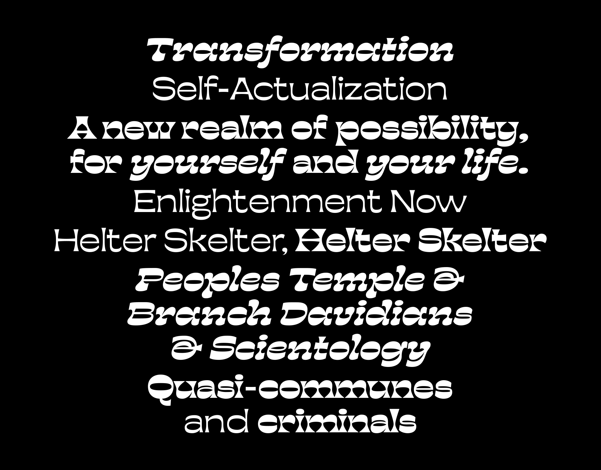
Our first semester largely consisted of drawing letterforms by hand over and over and over and over and then eventually creating a typeface based on these drawings. For our second and third semesters, Christian and Berton tasked us with creating any typeface (although sans serifs were generally frowned upon) in three weights. One developed in the second semester and two in the third.
My proposal was to create a typeface inspired by cults. Where this idea came from, I have no idea. Like many people, I find cults fascinating and was legitimately curious about what a typeface would look like if it was visually derived from these groups. In a weekend workshop, I began sketching reverse contrast letterforms and realized that it was the perfect approach to my project. Aesthetically, it communicated the underlying, sinister nature of cults while also referencing their “unconventional” nature through the reversal of “normal” contrast. At the end of the program, I had developed a regular, bold, and bold italic weight.
Has studying type on this deeper level informed your work as a graphic designer?
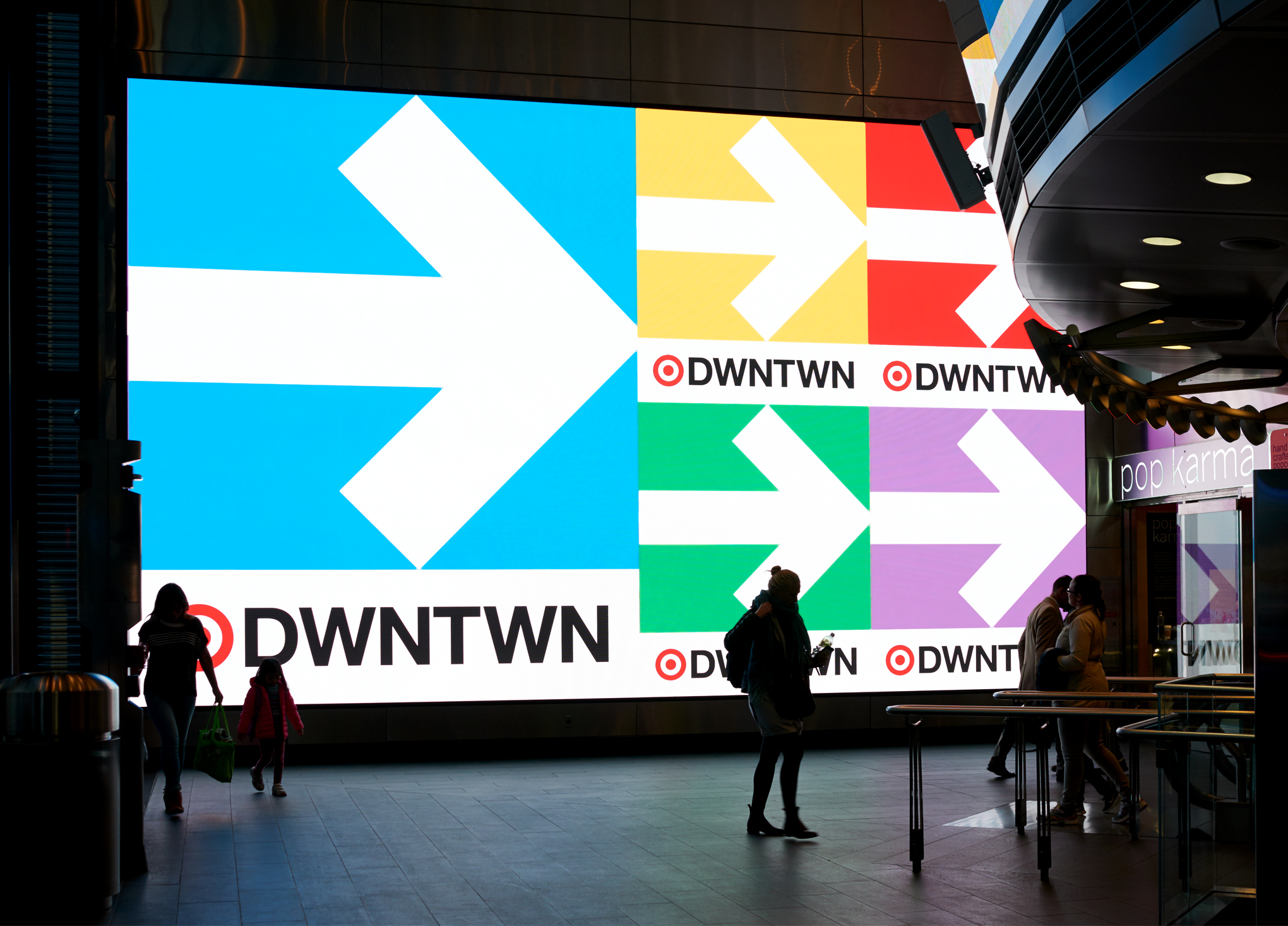
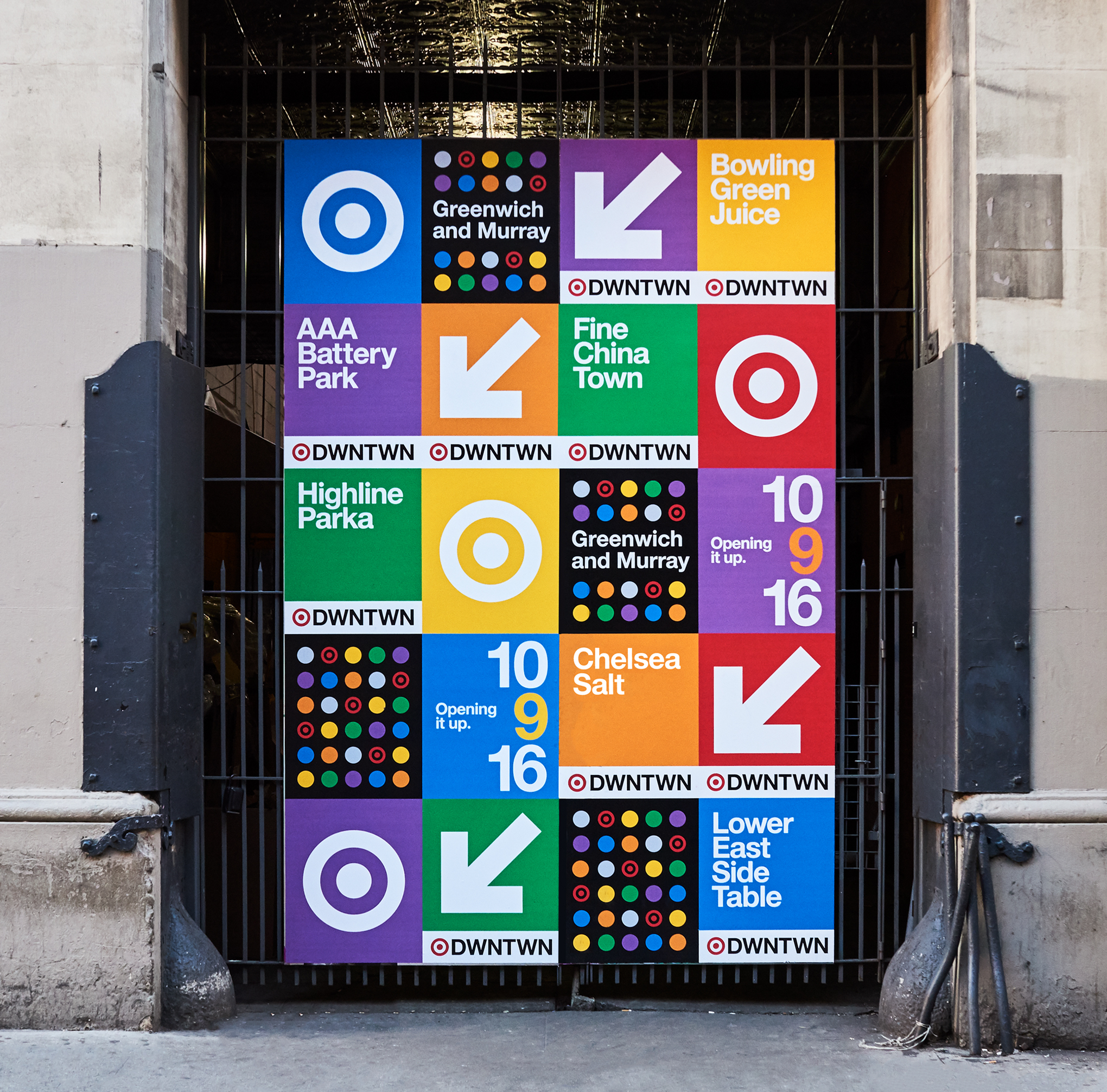
Completing this program and studying typography on a deeper level has completely changed how I work as a graphic designer; it changed the way I see. I now actively look up when walking around and am more cognizant of the amazing typography that exists within this city alone (thank you Sasha). In terms of my work, I am much more detail-oriented then I used to be and feel much more confident and in control when using typography. I pay attention to spacing (and see a lot of bad kerning out there), notice subtleties in letterforms and actively try to participate in the type community by going to lectures and keeping up to date on foundries and the typography currently being produced.
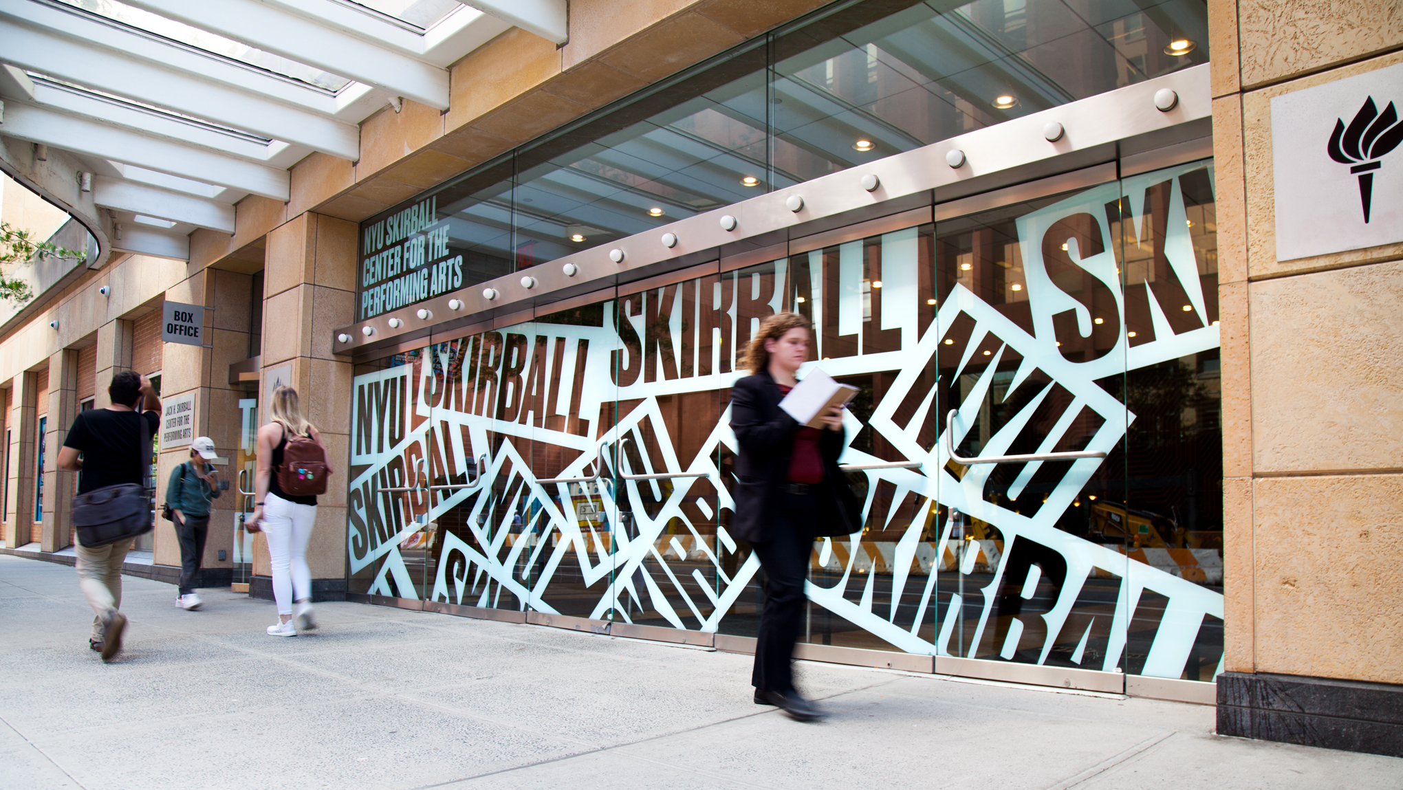
 Project for NYU Skirball Center for the Performing Arts in New York’s Greenwich Village.
As a TDC member you’ve been to several of our events… any memorable ones stick out for you?
I have two TDC events that were particularly memorable to me. One was the lecture with Mitch Paone of DIA studio. Music is very important to me and I loved how he found parallels between musical thinking and the design process. I was particularly fond of his analogy between grid systems and rhythm. Second was “The Return of the Type Director” with Elizabeth Carey Smith (and I’m not just saying that because you’re my friend and conducting this interview). I love badass women in the type community who motivate me to work harder and exercise more authority and confidence in my use of typography.
Great answer. Hahaha. Which type designers or studios’ work are you into at the moment?
Currently, I’m incredibly inspired by the typography of James Edmondson at Oh No Type Co. I love a solid text face just like the next person, but I think it’s amazing that he is able to successfully create typography that is expressive, fun and impeccably crafted. Blazeface, recently used by New York Magazine, is sooooooo sick. I can’t wait to try it out.
I’ve also been looking a lot at the work of Italo Lupi, an Italian graphic designer who was the art director at Domus magazine and currently works in Milan. He’s created some of my favorite logos of all time, such as the Fiorucci angels (classic Nineties graphic tee), Miu Miu, and Pompei. I also need to give a shout-out to my girl Jacqueline Casey. Her poster designs blow me away every time.
Do you have a favorite typographic sign or landmark in NYC?
I’m a big fan of all the typography on the auto body shop signs down Atlantic Avenue. They’re so wacky and full of character. Everything is technically wrong yet it all looks so right.
Links:
Website: http://naomiabel.com/


