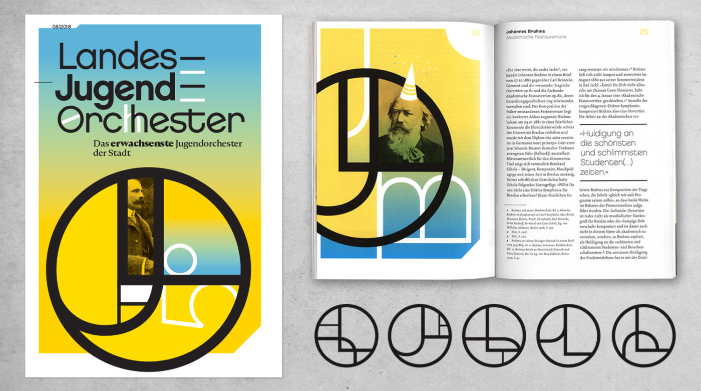
Torsten Jahnke is a graphic designer born, raised, and working in Hamburg, Germany. Here at the Type Directors Club, we are big fans of design for live music — we recently had Swiss designer Dafi Kühne come to speak about his work and an exhibition of Mike Joyce’s Swissted poster series. This month we spoke to Torsten about designing for music, DIY, and connecting with fans through the power of design.
Tell us about what your design “day job” entails. How did you end up working there?
Music was my first love… I always wanted to start an interview with this quote. It’s a tad bit schmaltzy, but true in my case. And it led me to what I am doing today.
Music was an essential part of my upbringing. My father has been a concert promoter for 60 years, so not only did we have music around all the time, but early on I was also exposed to works from the heyday of German concert poster art — designers like Holger Matthies, Kieser+Michel, and Klaus Hoppe.
This made a lasting impression on me, as I showed no interest in following my father’s footsteps but instead studied communication design in Hamburg. During my studies, I started to work as an in-house designer at his company with an emphasis on concert posters.
By the time I started my own studio (first Haus der Lüge, then Mitchum D. A.), I had found my niche. Being hooked on all things cultural, I had to admit to myself that I was somehow lost for the insurance or banking industry, much to the disappointment of my accountant.
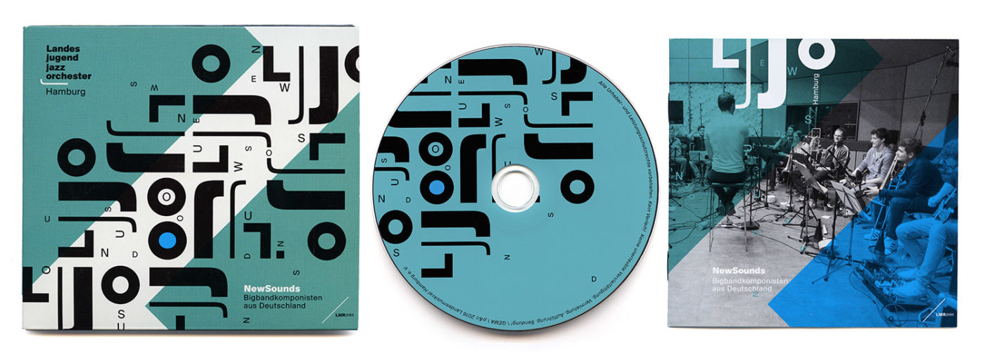
Instead, I have developed comprehensive branding systems for music festivals, EDM-clubs, youth orchestras or cultural institutions; websites for national team football players (that’s “soccer” for our American readers), work for Documenta artists; and album covers for boy groups and obscure noise bands. Recently, I’ve done a lot of editorial design work, art catalogues, theory publications, and newspapers.
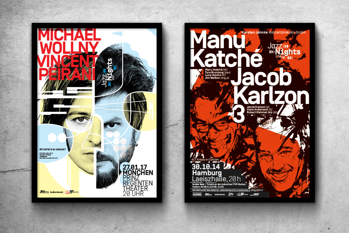
I still enjoy working for my father. We have had an ongoing project for nearly 20 years that I am really proud of — a concert series called JazzNights, which brings the top jazz artists of our times into the finest German venues. Artists like Sonny Rollins, Branford Marsalis, Diana Krall, Herbie Hancock, you name it. Every season I come up with a new design, using bits and pieces of the rich heritage of jazz design as a reference.
What do you enjoy about designing gig posters?
I grew up at a time when concert posters were considered an art form. Poster art tries to capture the essence of a musician/band and thus connect with the fans. By being part of the vibrant gig poster scene, it feels as if I have come full circle, because that description above also perfectly captures the concept of gig posters.
In times of digitization, the devaluation of recorded music and the disappearance of the album cover, music fans long for a physical signifier of their fandom. As the blokes from the UK Poster Association so perfectly put it, “A gig poster serves as a memento of a fan’s experience at a live gig in a way that cannot be downloaded or shared digitally.”
Rooted in the 1980s Punk/Hardcore scene, with its DIY antics and thriving new established live music scene with a constant need for promotional posters, gig posters have emancipated themselves from being a mere means of show promotion by turning into a mixture of merchandise and fine art, screen printed with spot colors on thick stock, over the course of 20 years.
Responsible for this transformation was to a certain point the website GIGPOSTERS.COM, which started in 2000 as a hobby of Clay Haynes, a Canadian gig poster fan. It became the internet’s definitive poster archive and screen printing knowledge base. Basically, people could upload poster images and talk about them. By the time the site was pulled down by the provider due to the risky old code it was running on, there were around 130,000 posters in the archives by 10,000 artists. I miss it every day.
Through the site, poster artists (and collectors) from all over the world connected, encouraged, and pushed themselves forward. In 2002, some regulars of that site got together in the real world and started what was about to become the longest ongoing series of gig poster shows: FLATSTOCK was born with annual shows in Austin, Texas; Chicago, Illinois; Barcelona, Spain; and Hamburg, Germany.
I joined gigposters.com in 2004, but my quintessential kid-in-the-candy-store-moment came in 2006, when I stepped into the big tent that was hosting Flatstock Europe 1 (Flatstock 11) in Hamburg. Even spending all the time at gigposters.com couldn’t really prepare me for the onslaught on my senses. The motives, the colors, the talent, the black humor… I was in love. It was just the perfect antidote for my frustration about the decrease of the regular concert poster culture, where lowest common dominator posters with the musician’s name in 500-pt. Futura Extrabold became more and more the rule.
In 2007, I made my first gig poster. In 2008, I had my first booth at Flatstock Hamburg and since 2014, I’ve organized Flatstock Hamburg. We are now up to Flatstock 68.
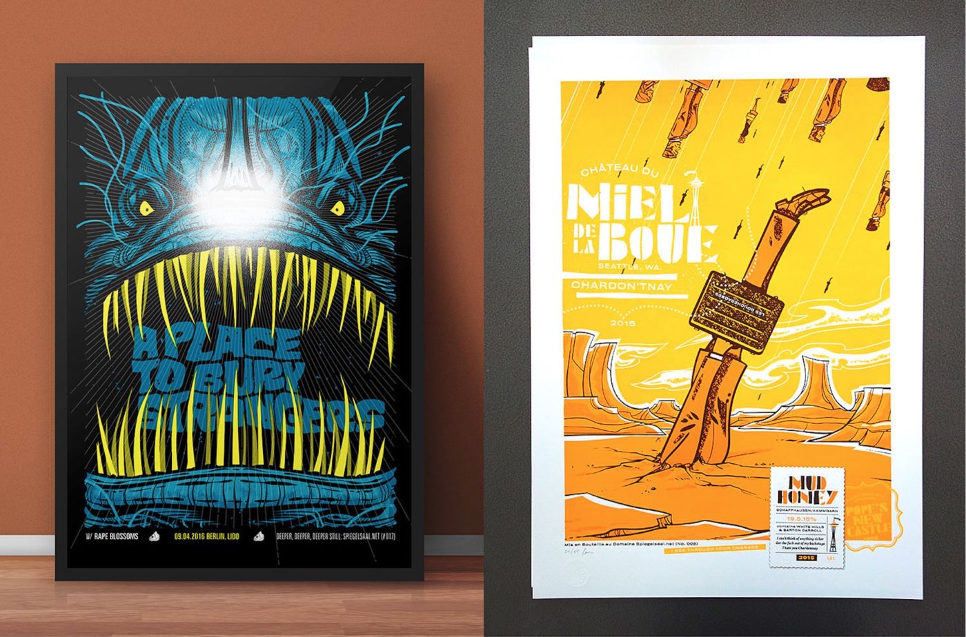
In 2015, illustrator extraordinaire Jochen Mönig (based in Dusseldorf) and I founded Spiegelsaal gig poster and art prints. We indulge in epic email ping-pong battles until the concept is bulletproof. Jochen does the illustration; I do the overall design and type and eventually print the poster. We have worked for bands like the Flaming Lips, Mogwai, Sleafords Mods, Warpaint, Mudhoney, and many more.
The most recent project that I am involved in is POSTER-O-RAMA, Poster To The People! — a gig poster show out of a box, which four of us European poster artists founded in 2017. You live in mainland Europe and would like to have a proper gig poster show featuring the artworks of more than 30 of the best European poster artists in your town? Get in contact!
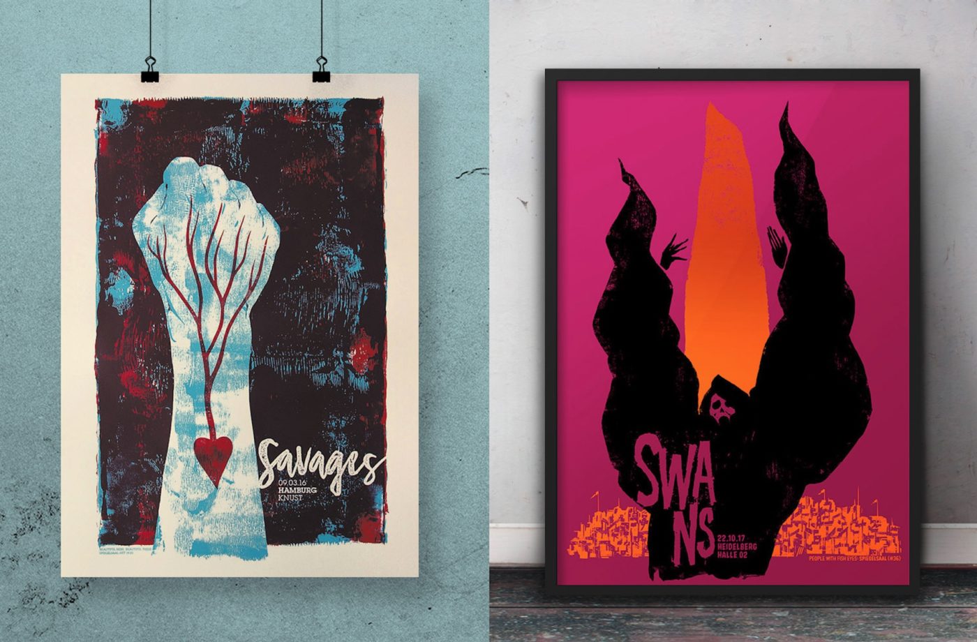
What is the type and design scene like in Hamburg? Is there a design school there?
Pretty impressive, I’d say. Hamburg has the University of Applied Sciences with huge design and illustration programs, the University of Fine Arts, and a few private design schools. The Museum of Kunst and Gewerbe has the second-largest poster collection in the world after the MoMA.
The Museum für Arbeit has facilities where you can set metal type and print on old Heidelberger. There’s also a lively gallery scene, covering everything from low-brow to high-brow art and design.
Hamburg used to have the largest advertising agency and publishing house scene in Germany. That was at a time when they actually employed real Type Directors! Those days are over, but there is still a flock of excellent advertising agencies and design bureaus with emphasis on typography.
