Brian LaRossa has been a member of the Type Directors Club since 2011. He works at many intersections right in the heart of typography, as a prolific and curious designer, teacher, writer, typographer and type designer. He even runs a foundry! Are we leaving anything out? Read this month’s interview with this thoughtful and creative New Yorker.
You have a career I’d describe as “multi-hyphenate”. How would you describe your professional day-to-day?
The majority of my day is spent leading a team of in-house and freelance designers for Scholastic’s education division. We build a wide range of print and digital products and services authored by thought leaders in literacy instruction. I often describe our work as a “strange loop,” because we lovingly craft reading experiences for teachers about how best to lead children to fall in love with the experience of reading.
I also help lead a group called the Scholastic Design Forum. The late great Russ D’Anna founded the group in 2006 to connect Scholastic’s designers across divisions and to elevate the role of design within the business.
Over the years, we’ve hosted luminary speakers such as Ed Benguiat, Gail Anderson, and Ellen Lupton, to name a few. The Design Forum work I’m most proud of is a collection of seminal books about design theory and practice that we curated shortly after Russ passed away earlier this year. The Russ D’Anna Memorial Collection is housed in Scholastic’s corporate library and it makes these texts available to all of the designers in the company. My hope is that it encourages a literate design culture. I’m of the belief that graphic design can only reach its full potential when it sits atop a foundational culture of voracious readers and writers.
The rest of my multi-hyphenate professional endeavors are squeezed into the tiny pockets of spare time that don’t belong to my wife, Allie Rex, and our six-year-old twin sons. In the past, those endeavors have included an art practice, curatorial projects, and experimental poetry. Currently, my free time is divided between my type foundry and my writing practice.
You’re a prolific writer of design criticism for some great outlets. When did your interest in criticism start, and how does it play into your design process?
If you have time for the long answer, I recently spent an hour discussing this question with Jarrett Fuller on Scratching the Surface, his podcast about the intersection of design criticism and practice.
The shorter answer is I started a daily writing practice in 2015, and began by publishing my essays with Medium. Toward the end of 2016, Jessica Helfand, Betsy Vardell, and Maya P. Lim kindly invited me to join Design Observer’s roster of contributing writers. During 2017, I strove to publish one essay a month with Design Observer. In 2018, I’ve been working on longer, more in-depth pieces, in addition to shopping a book proposal for a collection of my essays.
My writing practice does influence my approach to design. I don’t write to broadcast already established opinions — for me writing is an act of discovery. I write to discover how I feel about ideas. The writing process brings my emotions into focus — changing my perception, which inevitably alters my behavior.
I find reading to be similarly transformative. Together, reading and writing form a potent accelerator for personal growth. For example, reading and writing about customer empathy a couple of years ago led me to begin volunteering in an elementary school one day a month.
At this point, I can’t imagine being a designer without spending time in my customer’s environment — I view it as a baseline job requirement. If I worked as a design director for Starbucks, I would insist on working as a barista one day a month.
As a brief aside, I believe engaging in this brand of self-reflective, transformative, long-form reading is a necessity. We all need to submerge in text and question its meaning — and its validity. Skipping across the shallow surface of social media is precisely how a critical mass of Americans were persuaded by disinformation to elect an irresponsible candidate.
What was the impetus to start your own independent type foundry, Type Brut?
Looking back, I’d say the impetus was the convergence of at least four influences which were a little tangled, so please bear with me.
Earlier I mentioned hosting a talk by Ed Benguiat for the Scholastic Design Forum. Researching Ed’s career in preparation for writing his introduction led me to begin thinking about drawing type. Around the same time, I was curating an exhibition of art by designers, so I was also thinking about the intersection of art and design.
Shortly before that, Paul Soulellis, who was also one of the artists in the exhibition I curated, created a revival display face called Stetson that was inspired by a partial sample of hand-drawn letterforms from the 19th century. I was obsessed with Stetson and used it heavily in my experimental poetry, so this idea of extrapolating an alphabet from a few found letters was rolling around in the back of my mind.
Lastly, Nina Stössinger also created a revival from a partial historical sample for Paul’s Library of the Printed Web called Sélavy (now represented by Type Brut). Sélavy was inspired by the punched-out caps on Marcel Duchamp’s 1934 Green Box. All of these influences combined and compelled me to draw my first display face, Dada-Tank, in response to the title lettering on Dragan Aleksic’s 1922 dadaist journal of the same name.
I finished the alphabet just before hosting Ed at Scholastic. I greeted Ed when he arrived at Scholastic and while we were doing sound and video checks, I shared a specimen of Dada-Tank with him. He delivered the most wonderful critique right there on stage while the AV folks whirled around us. We stayed in touch and he graciously continued to help me refine the letterforms.
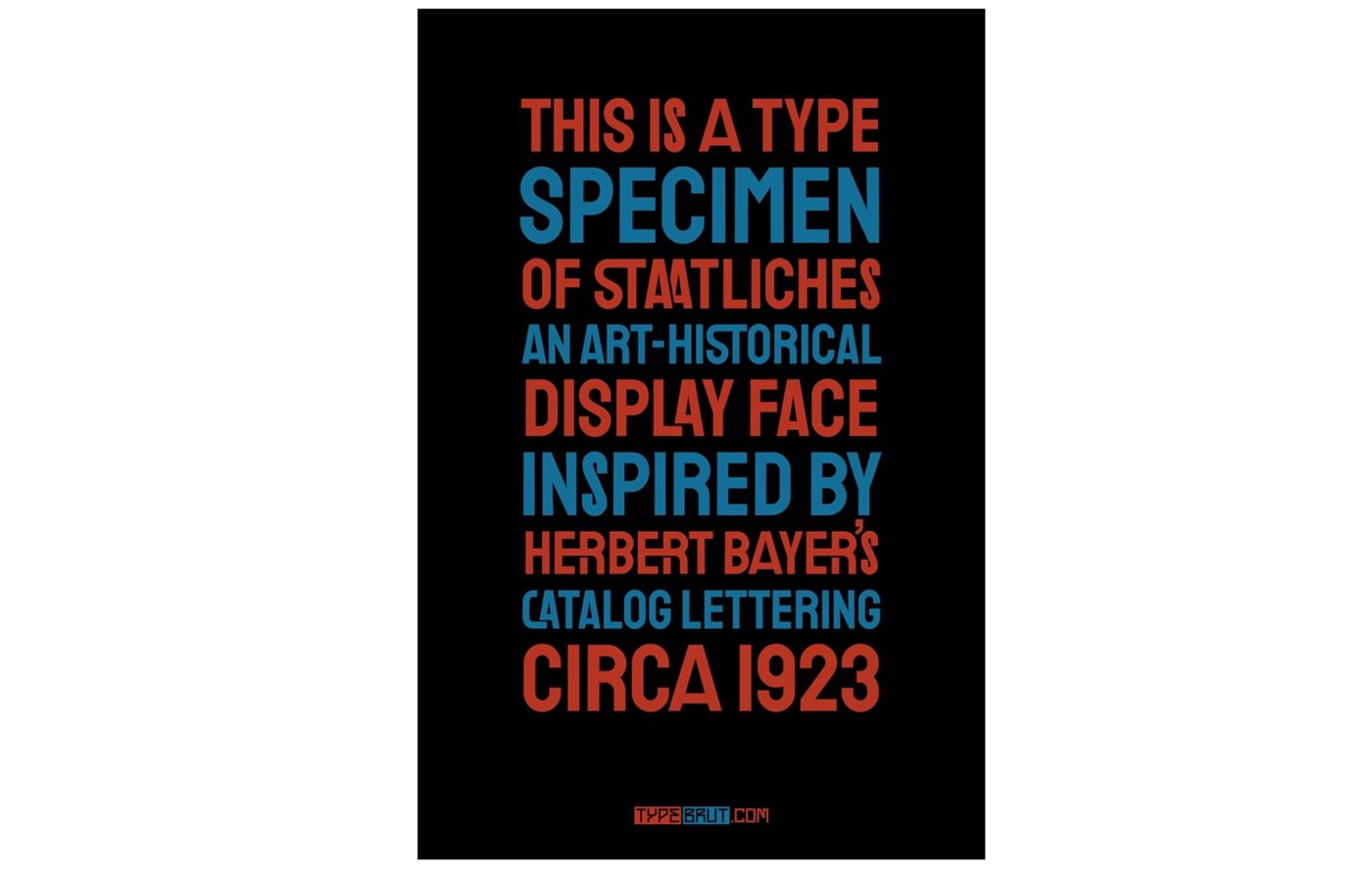
Upon finishing Dada-Tank, I felt it needed a proper home. So I created a display-type foundry to house Dada–Tank, Sélavy (thanks, Nina!), three other art-historical display faces that I subsequently drew, and — as of this month — a brand new display face that I designed with the type designer Erica Carras, named Staatliches. Staatliches is inspired by Herbert Bayer’s title lettering on the cover of the first Bauhaus exhibition catalogue, which was published in 1923. Thanks to generous support from Dave Crossland, Staatliches will also be available from Google Fonts.