2012 Winner
Typeface Design
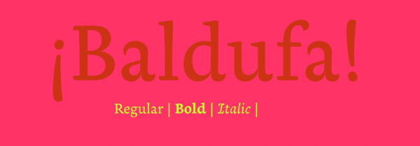
Baldufa
Baldufa
Category—Typeface Design
2012 Winner
Typeface Design
Baldufa
Designer(s)
Ferran Milan Oliveras, Barcelona
Additional Credits
FOUNDRY: Letterjuice
LANGUAGE: Arabic and Latin
CONCEPT:
Baldufa is a typeface for books, catalogs, and small publications with cultural content (art, design, etc.). It is designed to be used in bilingual publications – Latin and Arabic – however, both scripts can work well individually. The typeface's natural environment is editorial material where users are looking for added value rather than just a compilation of information – an interesting object to be kept. The font family provides a wide range of weights to cover all the needs for book design: Roman, italic, bold, small caps, ligatures, and an Arabic companion.
The design of the typeface explores the structure of the letter, breaking with some conventional ways of distributing contrast, stems, or serifs. the anatomy of the letters abandons the coherent movement of the nib pen to introduce more expressive and personal shapes. The final design provides movement, repetition, and expressiveness in text, encouraging the reader to read.
MEMBERS OF TYPEFACE FAMILY/SYSTEM: Regular, Italic, Bold, and Arabic