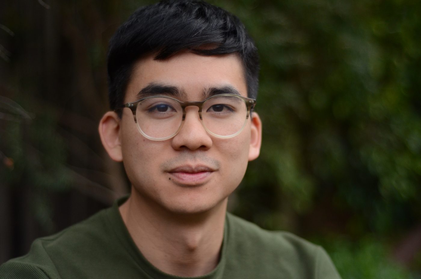
Each of our 2019 Ascenders spoke with us about their design inspirations and aspirations. Here is our interview with typeface designer Vincent Chan of Matter of Sorts, who resides in Melbourne, Australia.
What schools did you attend?
I completed a Bachelor of Visual Communication (Honours) at Monash University in Melbourne, where I am currently a PhD candidate in the Design department.
Did you have a teacher, past employer, client, or colleague who was instrumental in your career?
I was introduced to typography and type design by Dan Milne in my undergraduate degree. Dan is a natural teacher and really demystified typography for me. Before I took his Typography 1 class, I hadn’t even heard of the term and it’s not an exaggeration to say that without his influence and generosity, my career would not have taken the path that it has.
After I graduated, I was fortunate enough to work at Commercial Type for a couple of years. There, I really learned my craft under the influence of Christian Schwartz, Paul Barnes, and Berton Hasebe. Like Dan, they went out of their way to assist me and entertain my incessant questions. Any notion of resolution I owe to them; all folly is my own.
Today, I work closely with graphic designers who continue to inspire me. They include Dominic Hofstede, Stuart Geddes, Žiga Testen, Paul Mylecharane, and Matt Lenz.
Did they have any specific advice/words of wisdom that you remember?
It’s difficult to remember specific advice, as their influence was almost daily (and I have a terrible memory), but I recall Paul Barnes giving me the advice to look closely at really small cuts of metal type as “interesting” things happened under such difficult conditions.
On a related note, I remember Dan Milne suggesting that I not spend too much time on the finish of a text typeface until the overall colour and proportions were worked out.

Which of your design projects are your favorites? Why?
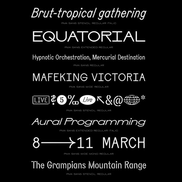
PMA Sans was a typeface drawn under the guidance of Peter Deering for the inaugural Pitch Music and Arts Festival. I was lucky to come on board quite early on in the project, which meant that the identity came to life in tandem with the development of the typeface. Each year, the typeface grows up in public as we add widths, stencilled cuts, monos, and so on. I like the idea of typefaces as incomplete entities, so this way of working resonated with me.
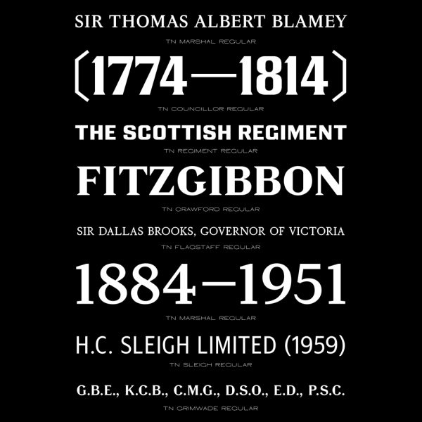
Recollection is another typeface that was the result of a close collaboration, on this occasion with designer, educator, and writer Dominic Hofstede. It is a typeface that responds to a specific archive of Australian graphic design from 1960–1990 and will always be a favourite project of mine simply for the richness of the source material, as well as the close working relationship I established with Dom.
What’s your worst design experience and project? Why?
The worst (but perhaps also the best) experience has been drawing type for myself. This is mostly due to the discipline it takes to finish things and not give into the distractions of new projects, everyday life, or pets. Collaborations keep you accountable. I’m not so good at keeping myself on track.
Where do you work now? In a studio, independent, other? What’s a typical workday like?
I am developing my own practice under the moniker Matter of Sorts, which includes collaborating with designers, studios, and agencies as well as initiating my own projects, often involving typefaces. I am also a PhD candidate, so currently that looks like a whole lot of reading and writing and thinking about what I’m doing while doing it, and then thinking about how what I set out to do didn’t work so well. I also teach at two universities and occasionally run type design workshops.

What are your hobbies besides typography or design?
I honestly don’t fit much else in besides looking after/training my pets (a dog and a cat). Travel? day trips?
Do you know any of the other Ascenders personally? If yes, whom ?
I know of a few awardees from last year, but none that well. I have caught up with Mark de Winne a couple of times.
Do you have any favorite designers and/or artists? Who are they?
The most persistent influence on my thinking has been that of David Reinfurt and Stuart Bailey, collectively known as Dexter Sinister. Their journal Dot Dot Dot really opened things up for me when it came to how graphic design could relate to the world.

Do you think you have a design philosophy or methodology? If yes or no what is it?
I’m not sure that I have a design philosophy per se. I am interested in how typographic design can act discursively, which is to say, propose alternative futures or ways of thinking. How it might be productively difficult, so to speak. Design that does this is perhaps what excites me the most.
Now that you have had some time to think about it, what does the award mean to you?
This is the first form of international recognition I have received since starting out on my own, so I am really quite humbled. It is certainly an encouragement to continue making work and trusting my instincts.
Website: www.matterofsorts.com
Instagram: @matterofsorts
Twitter: @matterofsorts
To see the list of all the 2019 Ascenders, click here.