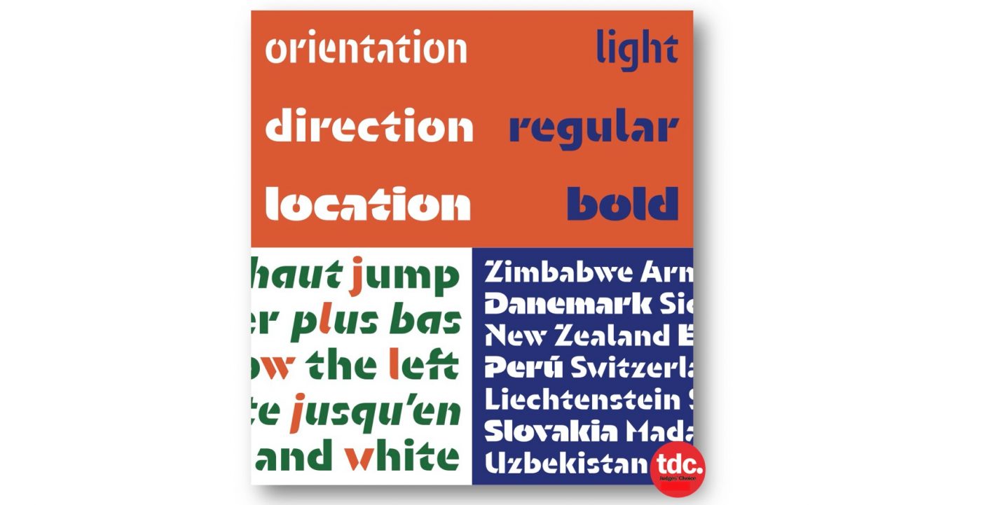
When asked to select his favorite from among all the entries, typeface design judge Kristyan Sarkis chose Orientation, created by Sandrine Nugue to help students find their way around a new student housing complex in in Roubaix, France.
Orientation is currently on view in The World’s Best Typography exhibition (TDC65) at Sheridan College in Oakville, Ontario through November 1.
About Orientation
- Typeface Design: Sandrine Nugue, Paris
- Clients: Thanh Phong Lê and Bethilde Millet Architects
- Foundry: Commercial Type
Orientation was designed in 2015. It was commissioned by the graphic designer Thanh Phong Lê as a way-finding project for new student housing. Because the type would be painted onto a building, one of the constraints was to make a stencil. This fact defined the identity of the typeface and justified the opened slanted cut.
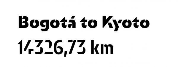
Another request was to design a geometric typeface that would fit with brutalism architecture. I enjoyed playing with legibility of signs: On their own some letters could look abstract, but when they composed a word, the result became readable. Orientation was developed with other weights (Bold, Regular, and Light) and styles (Roman and Italic) and is released by Commercial Type.

Comments by Typeface Design Judge Kristyan Sarkis
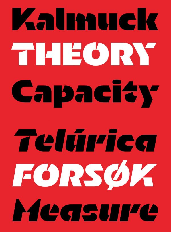
“Orientation represents everything I am interested in and excited about when it comes to type design: a clear understanding of the writing system at hand, experimenting with novel ideas, and having fun in the process. To begin with, its striking forms are not made out of loose aesthetic tricks; this level of abstraction is the result of a deep understanding of the core elements of the letterforms and a decidedly novel approach to stenciling. The smart—and in many instances, unusual—choices Sandrine made in how to abstract the forms and where to cut the letters make Orientation read very smoothly while boasting a dramatic 3D-like texture of light and shadows .
These characteristics are delicately and seamlessly brought to all the weights and their respective italics, giving them just enough different personalities to create a more dynamic range within one consistent type family.
And last, it is quite clear that Sandrine had fun drawing these playful forms (especially M, W, K, and several others), and that adds even more charm to Orientation. Fun did not, however, get in the way of drawing clear and direct forms that do their job very well, especially in wayfinding contexts.
Orientation is the kind of typeface that makes me want to design an Arabic counterpart for it.

About Kristyan Sarkis
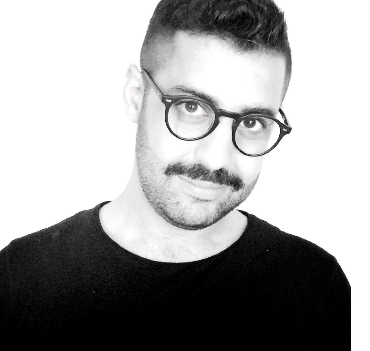
Born in Beirut and based in Amsterdam, Kristyan Sarkis is a type and graphic designer. After receiving his master in Type & Media from the Royal Academy of Art (The Hague) in 2010, he started his own design studio in the Netherlands. In 2015, he co-founded TPTQ Arabic, a type foundry specialized in high-quality Arabic fonts. In 2016, he co-founded Arabic Type Design—Beirut, the first educational program dedicated to the subject. He has taught at the Type & Media master program since 2015 and the design master program at ESAV Marrakech since 2016. His work has received several awards including the Type Directors Club Certificate of Typographic Excellence in 2011, 2012, 2016 and 2017.
