Here’s a recap of the insights and advice that our Members of the Month shared with fellow designers this past year in our monthly interviews with ECS.
“My trajectory makes a lot of sense looking back, because I had always been in love with both words and visuals, but I never would have discovered that if I hadn’t let go of the idea of what I was supposed to be doing.”
“To me, really great typography manages to have some unique, interesting design idea that soaks through its normal facade to give the reader some vague, can’t-quite-put-my-finger-on-it feeling. It’s that balance of functionality and atmosphere that I really love.”
“Have you noticed the trends in our culture and in the business world? Design skills across the board are in incredible demand. They are creating value and building fortunes for corporations and investors everywhere you look. So, creative people are in a stronger position to advocate for themselves than perhaps any other time in history. So, I’m choosing to be on that side.”
“I am a firm believer that if you’re not asking the right questions, you’ll never know what kind of story you’re trying to tell.”
“Space comes alive when there is human involvement. The specifics of scale, orientation, interaction, sequencing, and perception become design tools that are fluid and changeable. When these aspects are further manipulated with skill and care, the designs become more moving and successful.”
“Like all humans I have a complicated mix of emotions governing my behaviour and relationship with my work. For a very long time I had a toxic mix of high self-esteem but low self-worth. Coupled with a decent talent for drawing letterforms and a high work rate resulted in making lots of good fonts, but never really being satisfied with them. Even as I made more fonts, got awards, recognition, money, etc., I was still not satisfied. All those things were a small dopamine hit, quickly extinguished by a drive to keep working. It’s taken a lot of personal work to untangle all that shit, and now I have a healthier relationship to work.”
“Lygia (my Type@Cooper graduation project) is a mix of various elements: gestural and elegant cues that are definitely an influence from my past in fashion and references from 16th-century masterpieces by Robert Granjon to the geometric approach of W.A.Dwiggins. But it also brings a Brazilian flavor, an homage to neo-concrete artist Lygia Clark, that shares both visual and conceptual references to her work and questions the idea of frontiers, the inside and the outside of what we are versus what we want to show.”
“At Parsons, I was lucky enough to study under Herb Lubalin, Henry Wolf, and Milton Glaser, some of the greatest talents in the field. They taught me the power of typography, and that one word, designed well, can tell a whole story.”
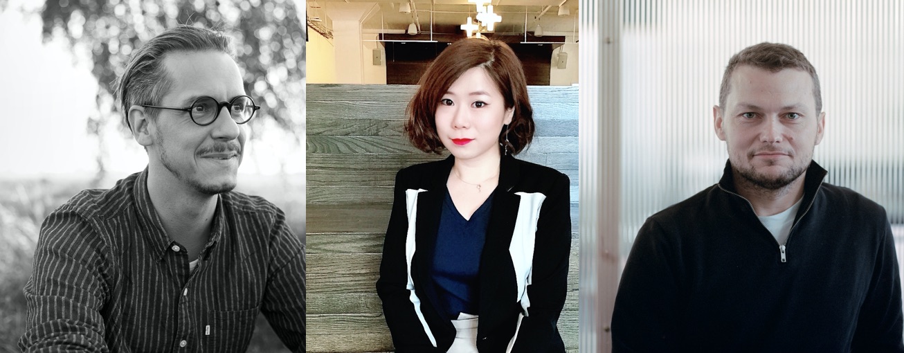
“There are things I know I can do well, and I like to carry them out myself. If I find something exciting, but know that I’m not the best for the implementation, then I get the right person on board and we work it out together! This leads to the best result and is also fun. Having fun at work always ensures the best result, and that’s why it’s so important.”
“I like drawing under the restraint of simplicity, like my Architype series. I find using black and white, as well as the simplicity of the repetitive action is calming, almost like meditation.”
— Qian Sun
“I love to devise shapes that I have not yet seen. It’s not pressure, it’s a paradigm, that’s all. Not constraints, just an environment. I would do the same job as a florist, just the output differs.”