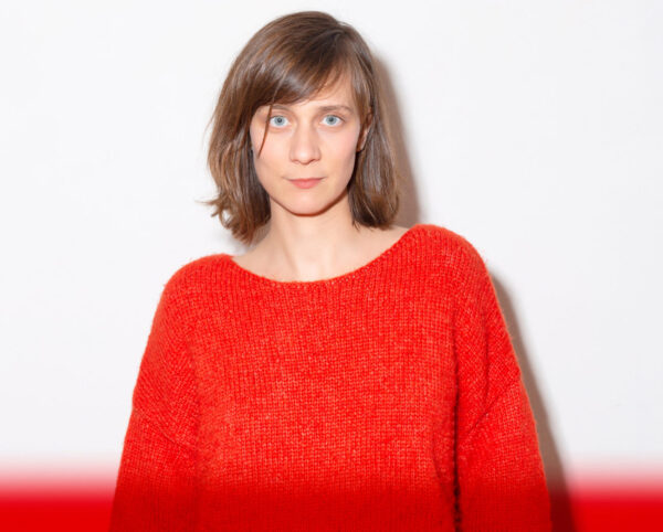
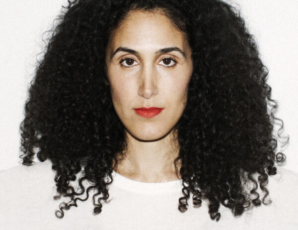
Marta Cerdà Alimbau and Parasto Backman are the two women designers behind the Ascenders 2024 look.
Marta is an experienced typographer and graphic designer based in Barcelona who also happens to be a Young Guns 6 Winner. Parasto is a true visual storyteller based in Stockholm who founded her own design firm, Studio Parasto Backman, in 2010. These women put their expertise together to create a unique design for the Ascenders 2024 competition.
The Ascenders 2024 branding is vibrant, colorful, and full of movement. What inspired you to create the competition’s design identity in this way?
Marta: We were inspired by the idea of climbing the ladder as a symbol of progression and believing in one’s own ability to achieve one’s designer utopia. Climbing the ladder is also a symbol of the ongoing, never-ending creative process.

Parasto: We wanted to create a visual world full of movement and energy. For us, Ascenders represents a movement forward and a platform to highlight the progressive creators of tomorrow, and that calls for a rich and vibrant color palette. Another aspect was we wanted to create a visual identity that works just as well moving as still and is adaptable in many different formats.
“Ascenders represents a movement forward and a platform to highlight the progressive creators of tomorrow, and that calls for a rich and vibrant color palette.”

On Instagram, you wrote, “The design identity depicts the ‘ascending’ by embracing the idea of climbing the ladder towards progression, creative growth, and the future of type.” How do both of your career stories connect to this statement?
Parasto: I am in constant dialogue with my creative process and my craft, and I’m constantly renegotiating and testing new perspectives and nuances. It’s a work in progress which can be compared to climbing the ladder.
Marta: Indeed, if we stopped evolving and questioning things, we would start moving toward stagnation.
When working together, how do your design styles complement each other, or not?
Marta: This is actually the first time we have worked together! It’s very fun and educational to collaborate with someone you respect. We have inspired and pushed each other, and we have gone between big visions and small details. But of course, it’s also challenging to work together when we are both used to working individually and making our own decisions. When collaborating, we share every decision with each other, and it’s rewarding, but it’s also more time-consuming– especially when it’s a new collaboration and you are just getting to know each other.
Parasto: We both work expressively and illustratively as graphic designers. We like to challenge norms and given frameworks. What separates us would be that Marta is more digital while I am more craft-based.
Why did you decide to go with Pangram Pangram Foundry’s Air for the text?
Marta: Since we have constant movement in our design identity, giving the text a distorted feel, we were looking for a sans serif that could withstand the distortion. But it was important for us to find a sans serif with personality and also a font that was relatively newly drawn to reflect Ascenders. Pangram Pangram describes Air like this, “step into a world where design boundaries are pushed, and artistic influences collide,” which we think fits well with our vision for the design identity and for Ascenders in general. The letters inside the moving stairs are actually tweaked so they fit inside the distortion, so it’s a custom, modified version of Air.
“It was important for us to find a sans serif with personality and also a font that was relatively newly drawn to reflect Ascenders.”
When you are looking to use a font for a project, what are the typographic cirteria you look for?
Parasto: The font carries the message and gives the text a voice, so I put a lot of time into either drawing letters for specific titles/logos or finding the right typeface for the specific context. I am not super keen on using the same fonts, even though it happens sometimes. I also spent a lot of time researching the font, looking for information about who drew it, why, for what context, what was the inspiration, the motivation, and so on. I am always looking to broaden my font library with designers that go beyond the normative font designer, and I prefer foundries that work in parallel with many writing systems, not with a sole focus on Latin.
What typography/graphic design projects are you both working on now?
Marta: Right now, I am working with the LA Times crafting the logo for its weekly magazine, for Fortune preparing a new cover, and for Travel+Leasure for an opener and an animation. Besides those projects, I am also working on a more art-related piece by digging into real-life data with a new collective from LA. I am collaborating with a product design studio on a very special project for next Christmas, involving lighting, that I can’t explain yet. And lastly, I’ve been briefed to write an essay book about design for Anagrama, so I am doing that too. And I have a few upcoming talks in Paris for Type Paris, in Montreal with Offf, and in Oslo with IGM.
Parasto: I’m simultaniously working on a few projects at the moment – among them, artwork for a film and design for three different books. One book is about ornamentation, the second is educational and about racism for high school students in Sweden, and the third book is for The Röhsska Museum in Gothenburg, where I’ll be showing my work in a group exhibition opening in September 2024. Alongside these projects, I continue to work on my ongoing collaboration with the renowned theater Unga Klara (the national stage for children and youth’s theater in Sweden), making design identities for two upcoming plays. Throughout the year, I will continue my self-initiated typeface project called Zaban (voice/language in Farsi) in collaboration with Naïma Ben Ayed. The project started from the Iranian progressive and feminist periodical Zaban-e Zanan (Women’s Voice in Farsi) in the early 20th century. I also teach at Konstfack University of Arts, Crafts, and Design in Stockholm and give various talks.
What advice would you like to give the designers who will be entering Ascenders this year?
Parasto: The path forward is not straight. It’s messy and ongoing. You need to give yourself space to find your own visual voice!
Marta: Exactly! That’s how it usually works for everyone. Sometimes, you think you’re not good enough or that it’s too late to do something, and that’s the worst thing you can do to yourself. For me, a good friend of mine insisted I enter Young Guns back in 2008 (Ascenders didn’t exist back then) at a moment when I was a bit down. He insisted so much that I finally entered. I never, ever thought I would win, but I won. And that gave me the strength to start with my own path and jump into the freelance world.