When asked to select her favorite from among all the entries, communication design judge Karin Fong chose T The Next Point of View, a typographic identity system created by David Galar Design and Pràctica that reacts according to the way a VR user moves – a project undertaken for Gravient, a virtual and augmented-reality company.
T The Next Point of View is currently featured in The World’s Best Typography exhibition (TDC65) at the Polish-Japanese Academy of Information Technology in Warsaw through September 30, and can be viewed here.
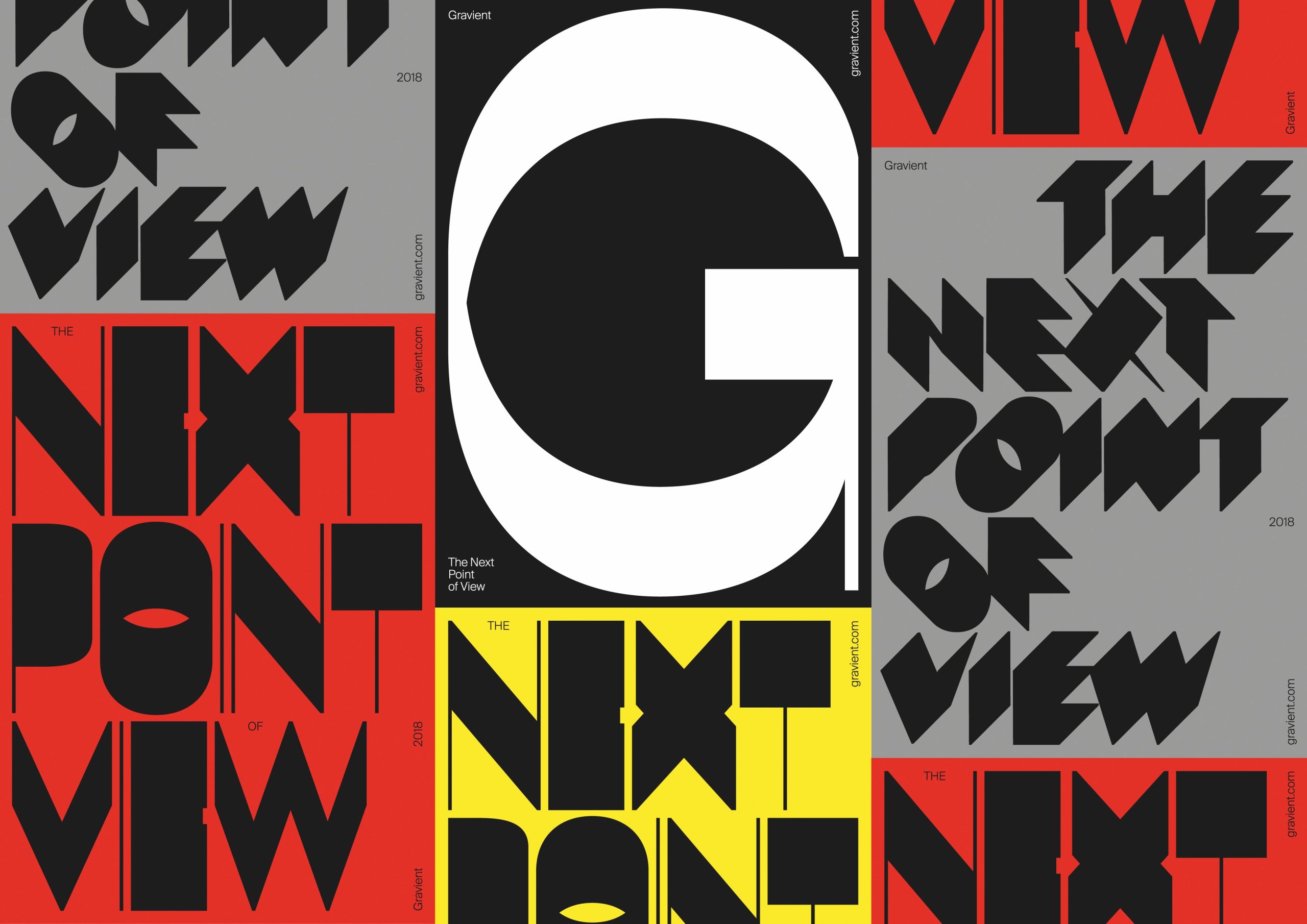
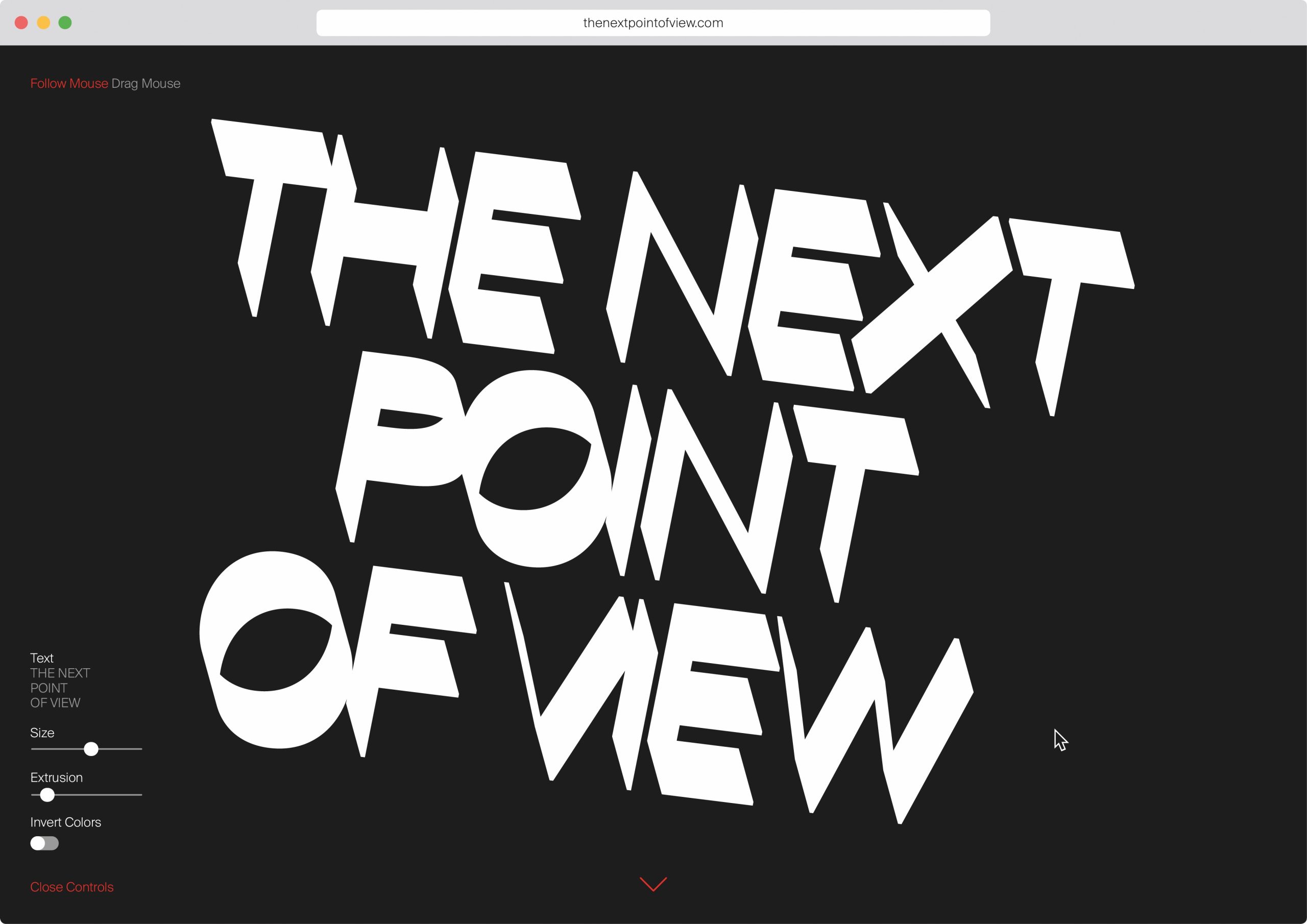
Typographic system that is responsive to the direction in which a viewer’s head moves.
About T The Next Point of View
- Concept, Design, and Art Direction: David Galar Design and Pràctica, Barcelona
- Code: Thomas Hoek
- Typeface Development: Mikel Romero
- Music: Reykjavik606
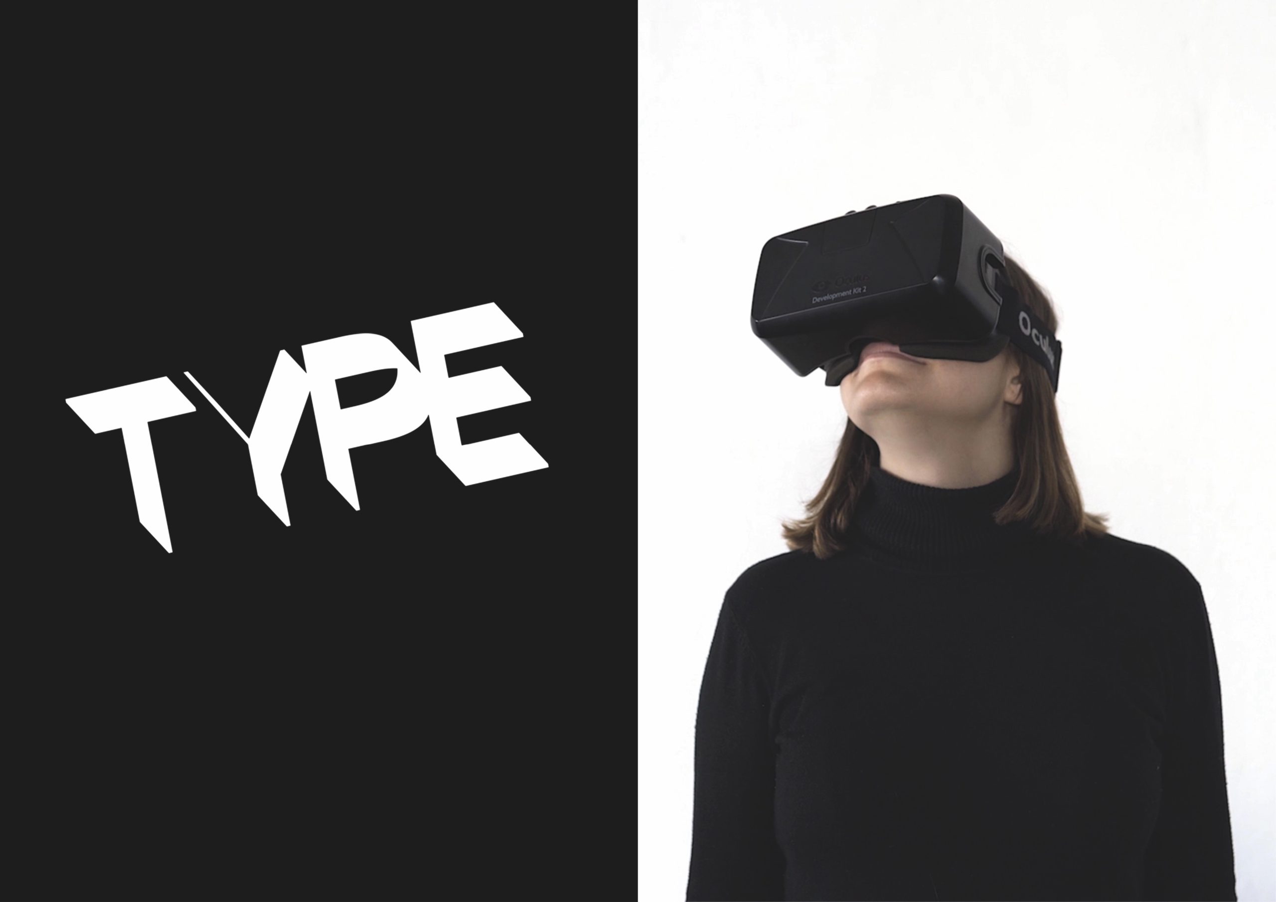
- Photography: Kiwi Bravo
- Video: Liten Studio
- Cast: Mireia Farran
- Design Firm: David Galar Design
- Client: Gravient
- Principal Type: Gravient Diagonal, Gravient Horizontal, Gravient Vertical, and interactive typography and lettering
“Gravient, a virtual and augmented reality company, asked us to develop its brand identity, their main objective is the creative use of technology for commercial purposes.
Built from a standard typeface, we have developed a typographic behavior using interaction and three-dimensionality. Letters are set to change depending on the angle in which they’re looked from, this way, the user’s point of view becomes key in determining the shape of the typography.”
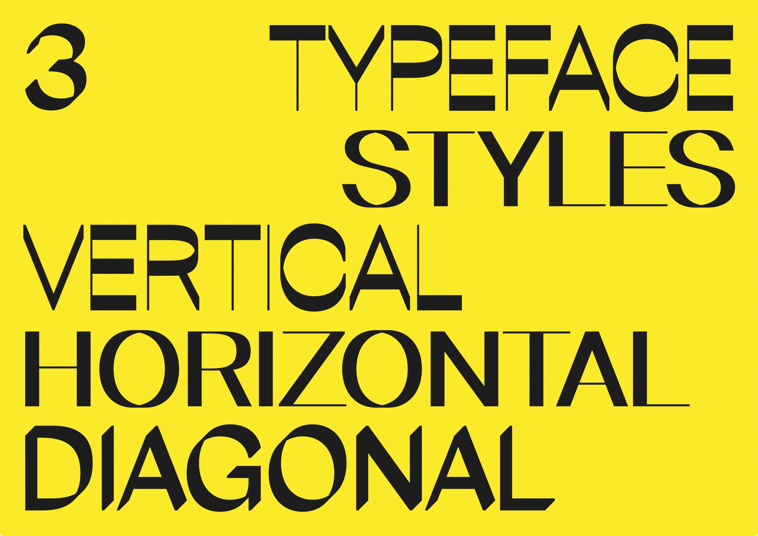
Multiple typeface styles.
Comments by Communication Design Judge Karin Fong
" ZZ [Zipeng Zhu] and I had to arm wrestle about who was going to write about this one! Smart and playful, this typographic system beautifully references the language of virtual reality. I immediately connected with the way the type changed with motion. What impressed me was that it really conveys the ideas of depth and space elegantly, while providing lots of variation in both looks and usage. By making the extrusion and rotation reactive, the Gravient typefaces use z-space to make more “weights”-- if you can call them that (part of my excitement is that perhaps ideas like this usher in even more choices in type systems). The interaction seems intuitive; type appears the way you move when you explore the space with your headset or device.
“As someone who constantly uses typography in motion, I was struck by the idea of a typeface that changes with the user’s-- or camera’s-- point of view. I enjoyed how dynamically the letterforms could animate, changing from something that could be very flat to sculptural over time. It’s a simple idea that is successfully executed-- while high concept, it avoids being cartoony or limited. There are moments when it seems classically modern, others seem almost calligraphic. In short, I could see using it.
“I chose this project because it points to a way in which we can start thinking of type systems that relate to new technology. It’s an exciting time to think about how letterforms will interact with new ways of seeing and creating content. As our lens on the world becomes more dimensional, so can typography. It’s a reality I’m looking forward to!”
About Karin Fong
Karin Fong is an Emmy Award winning director and designer working at the intersection of film, television, and graphic design. A founding member of Imaginary Forces, she is known for designing iconic title sequences. Her projects include the opening credits for the TV series Boardwalk Empire, South Park, and Black Sails, and most recently Lost In Space and Counterpart, as well as numerous feature films. She has helmed spots for major brands, including LEGO, Lexus, Target, Sony PlayStation, Toyota, and Herman Miller. From large-scale video installations to video game trailers, Karin’s diverse projects showcase her unique voice in visual storytelling.
Named by Fast Company as one of its 100 Most Creative People in Business and the recipient of the 2018 AIGA medal, she has won numerous awards in both advertising and entertainment. Her work has been featured at the Cooper-Hewitt National Design Museum, The Walker Art Center, The Wexner Center, SXSW, and in many publications about design and cinema.
Karin Fong: Instagram | Twitter
Imaginary Forces: Website | Instagram | Twitter | Facebook | Vimeo | YouTube