When asked to select her favorite from among all the entries, typeface design judge Nicole Dotin chose Pyk by Erica Carras, who designed this typeface as a student in the Type@Cooper program.
Pyk is featured in The World’s Best Typography exhibition (TDC65) at the Polish-Japanese Academy of Information Technology in Warsaw through September 30, and can be viewed here.

Pyk type specimen
About Pyk
- Typeface Design: Erica Carras, New York
- Instructor: Hannes Famira
- School: type@Cooper 2018
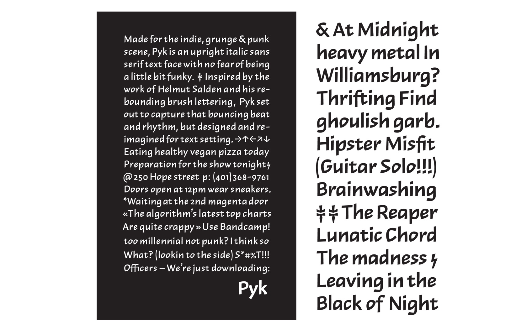
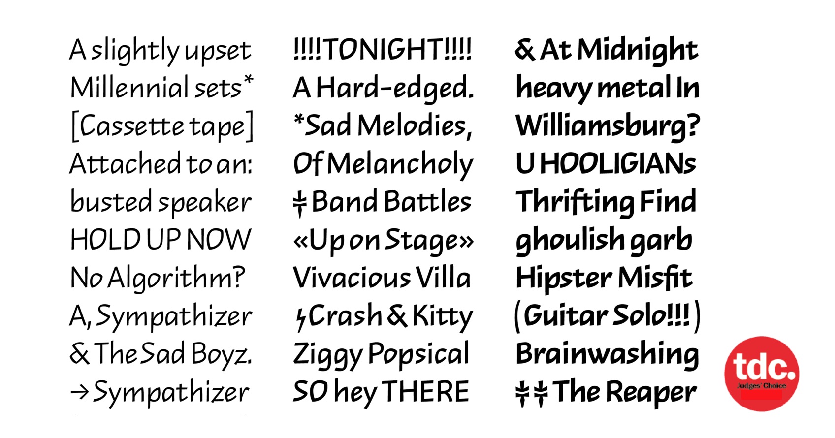
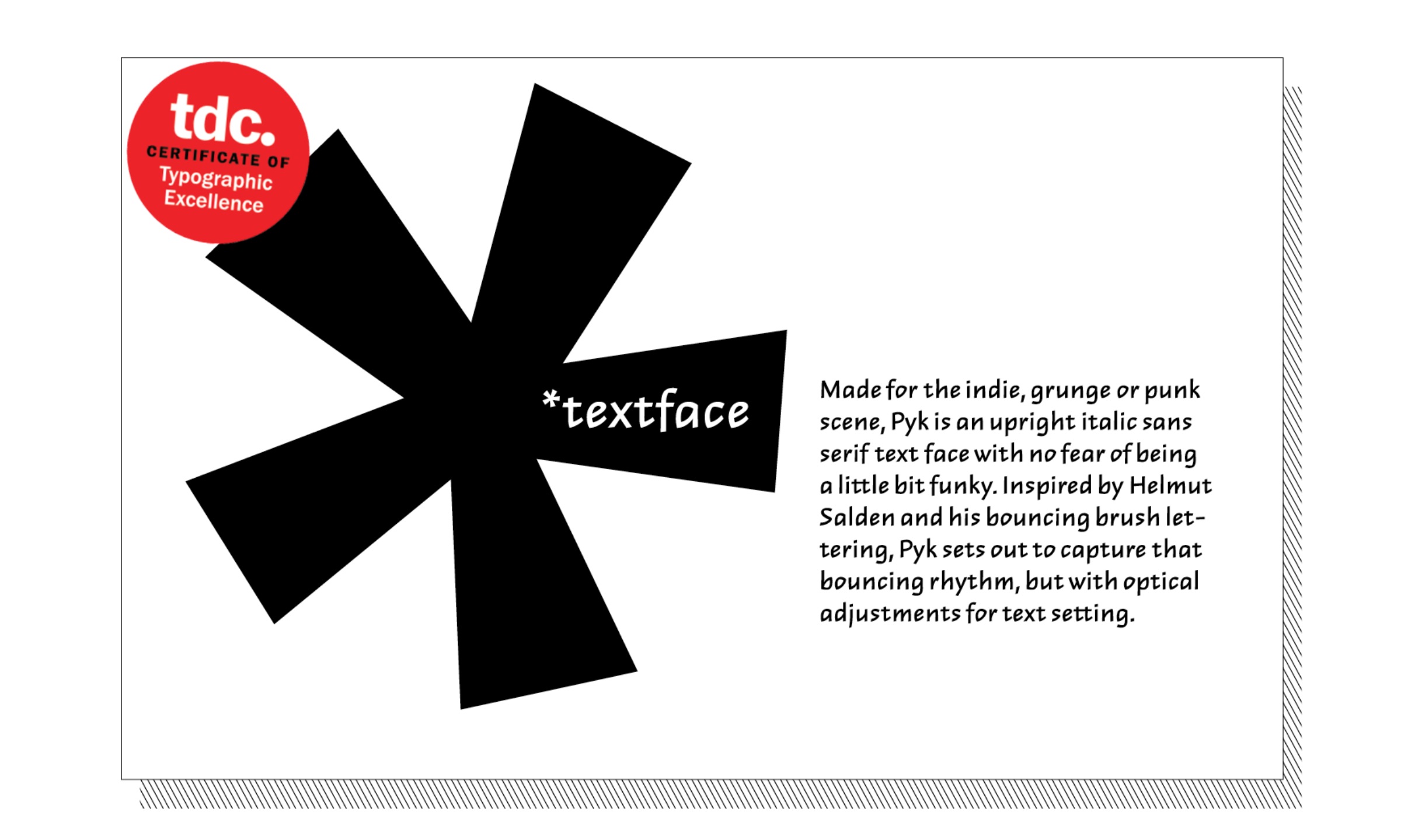
“Inspired by Helmut Salden’s brush lettering, the process of uniting a running hand (italic) system of calligraphy into an upright text face gave Pyk its unconventional letter shapes.
Looking at the o, e, c and s, these traditionally round letters instead follow a triangular model, echoing the n’s counter shape and the bouncing upstrokes that connect the stems. This upward motion directs the eye forward and also creates an even diagonal rhythm across the line of text.
To increase legibility as a text face, Pyk has low contrast, uniform letter widths, and generous spacing. Pyk stands at the crossroads between calligraphy and type design, with a bounce in its step.”

Comments by Typeface Design Judge Nicole Dotin
“When considering student work, you’re looking at what’s directly in front of you but also hoping to get a peek into their future. Pyk is an accomplished piece of design. It manages to be quirky, energetic, and full of character without sacrificing the harmony that must be maintained for a well-functioning typeface. With its unusual angular shapes, this is no small feat. Step back and you’ll see a designer developing their voice, choosing an uncommon path. If Pyk is indicative of Erica’s future, then we'd be lucky to see more.”
About Nicole Dotin
Nicole Dotin is a typeface designer and partner at the Process Type Foundry, an independent type design studio based in Minneapolis, Minnesota. Nicole holds an MFA in visual studies from the Minneapolis College of Art and Design and an MA in typeface design from the University of Reading, UK. After designing Elena, a low-contrast serif typeface for extended reading, she went on to design Pique, a brush script modeled after her own marker techniques. When not designing typefaces, she enjoys giving workshops to help others learn to code and is involved with the Alphabettes, a loose network that aims to support and promote the work of women in lettering, typography, and type design.
Process Type Foundry: Website | Instagram | Twitter | Facebook
