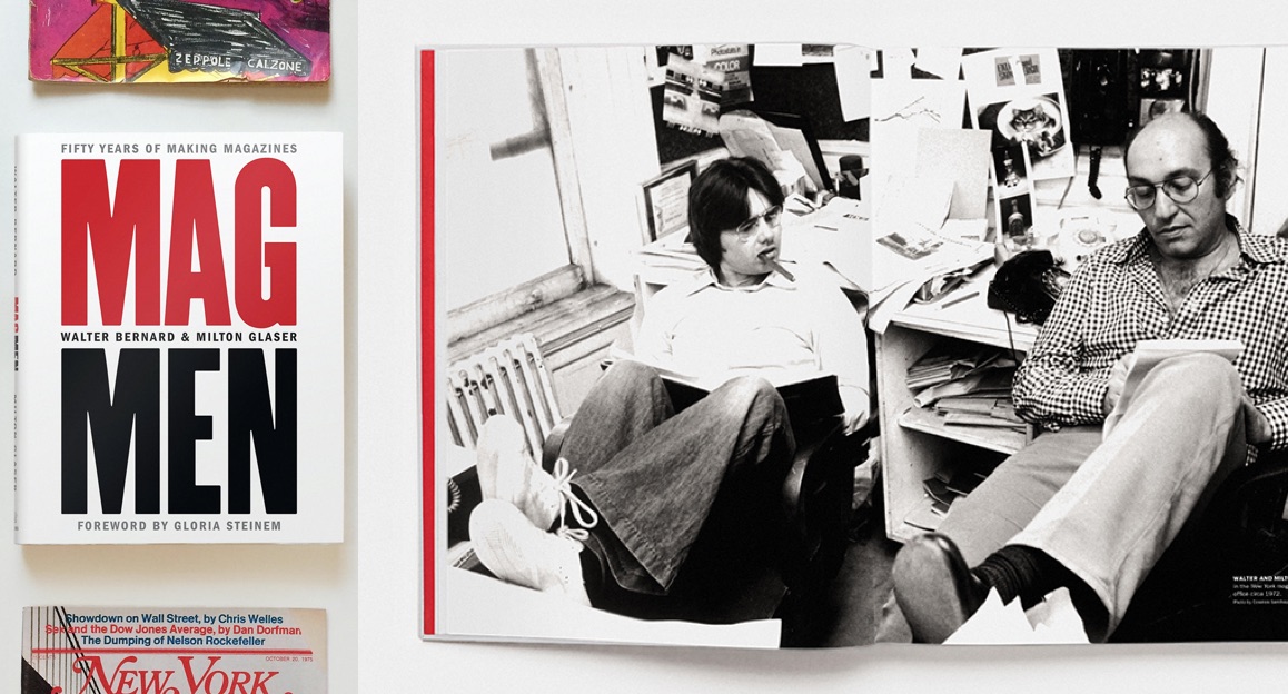
On May 28, Anne Quito and Walter Bernard gave a presentation for TDC Virtual Salons on their book, Mag Men. Milton Glaser was not able to attend but he has responded to some of the attendees' questions. The TDC has compiled their answers to your most salient questions.
Do you think design can impact the trustworthiness of online publications?
MG: Graphic design is usually used to amplify a desired effect. As such, when successful, typography changes perception. This is not easy to quantify, but we know that it happens.
AQ: Design always has an impact. But it’s not one formula, not always about the Swiss grid and sharp graphics. A community gazette, with a particular aesthetic, can be just as trustworthy.
WB: I do think design impacts the trustworthiness of online publications and any other form. But of course it is not alone in the mix to attain trust.
The book describes your collaboration with the editors at New York Magazine in such a beautiful way. Why do you think that was the case? What advice would you give a modern magazine staff on how to create that community of shared ideas?
WB: My advice would be to read and listen. Get to know the editors and writers. They are usually very smart people who also want to put out a great issue. Defend your ideas with well thought out arguments but don’t be afraid to let other ideas influence yours.

You mentioned selecting typography that was practical and accessible. Any suggestions for how you balance that need for type that fits in those categories while also leveraging custom or less ubiquitous type for creating recognizable brand experiences?
WB: In this era of access to all types of letterforms the opportunity to customize is almost unlimited. For magazines, I think a classic or modern readable text face is important. Headline display offers more opportunity to be unexpected and inventive. The trick is to keep the typography consistent with an attitude compatible with the magazine’s intent. Fred Woodward of Rolling Stone Magazine was a master of creating a unique and recognizable brand experience.
We know that the digital generations prefer online publications to printed magazines. As a result many publications are struggling to stay afloat. Some are now entirely digital. How do you feel about this, and do you think we will see a time when print magazines disappear entirely?
WB: I don’t think print will disappear. It is such a pleasurable experience to hold a magazine or book in your hand and turn pages. But the new generation will be so comfortable with digital that we can only hope online publications will be profitable. I do think that the generation to follow will be more willing to pay for online content as my generation is willing to pay for print.
What skills do you think are the most important for an art director to have in order to be successful in editorial design?
MG: Intelligence and humility, and also a skepticism about everything that has been done.
WB: When I was first hired out of school it was because I could do neat paste-ups. That is I knew how to use the tools of an art department. Rulers, t-squares, triangles, proportion wheels, rubber cement, razor blades, etc. My design portfolio was hardly noticed. So, I would say first be well versed in InDesign, Photoshop and Illustrator even if you only direct designers using those tools. Be able to sketch an idea. Then, as I said before, read and listen.
Loved seeing the “mistakes.” Would you talk about a situation that lead to a great learning moment?
MG: I can no longer remember any of the specific events in my life that would explain this process, but I do know that mistakes have always been essential to me, as an unconscious symbol of something I was concerned with.
WB: When New York Magazine started we had collected and pre-engraved many beautiful photographs of the city to be used as covers. We soon learned that this would not work and we had to design a cover each week based on the contents in that issue. At one point I designed a last-minute cover about the difficulty of finding an apartment in the city. The photograph went well but in the rushed process to print the cover came out-of-focus and out-of-register. When I saw it on the newsstand I knew it was a graphic disaster. But it was a best-seller because we printed a story that the readers were interested in and we demonstrated that the magazine was “on their side” in coping with life in the big city. It helped give us direction.

Walter, what’s the piece of design you designed or art directed you are most proud of and why?
WB: Time magazine’s redesign and art direction was the first project I designed without the collaboration of Milton Glaser, my teacher and mentor. It was a pleasure to have my name as art director on 6 million copies a week.
If you had to Art Direct a magazine nowadays which would it be and why?
WB: I am happy art directing Scandinavian Review, a journal published by The American Scandinavian Foundation. It’s a 96-page journal of general interest. I feel that some of my favorites, like New York, Time, The Atlantic, The New Yorker and others are best left to the new generation of art directors. When I started in this field I’m sure I pushed out some of the older, more experienced art directors because it was the time for new ideas and new approaches to design. I like what I am seeing from many of the contemporary group of magazine art directors.
What are your favorite current magazines that most people don’t know about?
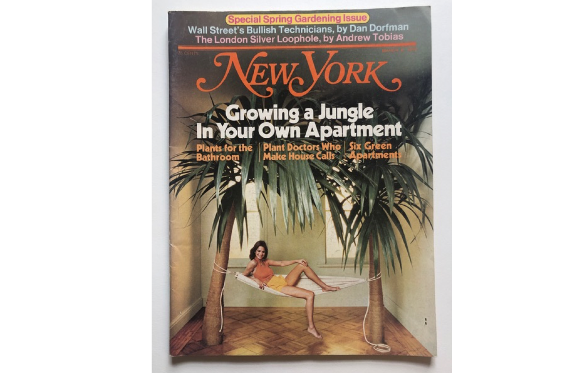
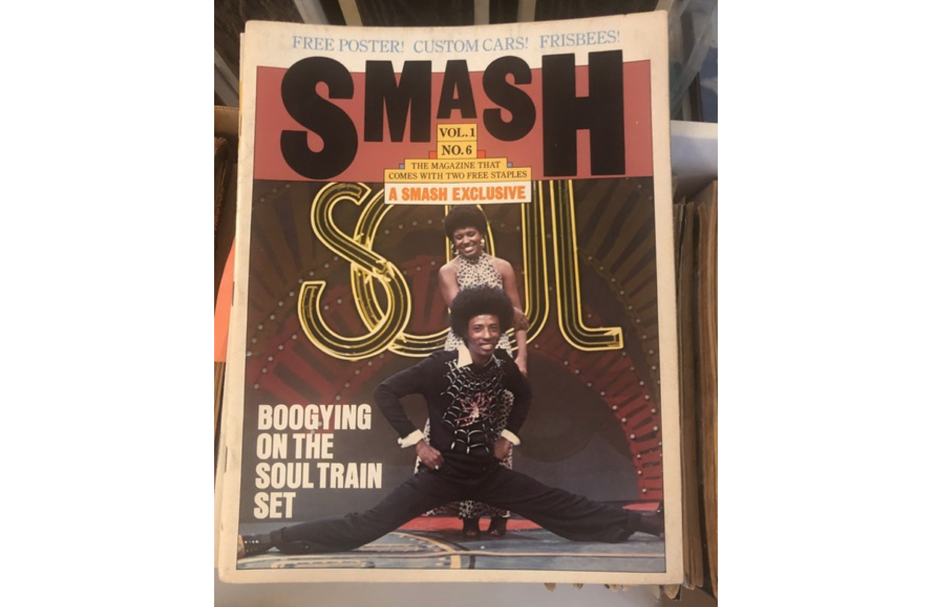
AQ: I love Stack, a subscription service that mails you a different Indie magazine each month. Other than that, I’m into back issues lately. I’m also scouring through issues of Spy, New York (all on Google Books), Audience and a little-known genius kids magazine that Milton Glaser art directed called Smash.
WB: I like magazines like n+1 and 1843, but I assume they are fairly well known.
Any recommendations for students attempting to get jobs/internships during COVID-19 pandemic, most studios no longer have internships, any advice?
AQ: The job market is extra competitive, but there are still open jobs for new graduates. During this impasse, take the time to put together the strongest application—a succinct, error-free resume, a well-edited portfolio tailored to the position you’re vying for and a pithy cover letter that expresses why you’d want to work for the company succinctly. Scout opportunities by joining workshops and Zoom webinars to expand your repertoire—it’s basically cheap or free continuing ed. Write to any speaker or participant who piqued your interest.
