Aleksandra Samuļenkova, TDC72 Type Design Competition, Jury President
When Type Directors Club asked me to share type design projects I admire, I assumed that focusing on my immediate surroundings would make the task less intimidating.
Yet celebrating the local type design scene proves overwhelming when living in the Netherlands, a country densely populated by type designers from all over the world. There is so much thriving in its typographically rich, diverse soil.
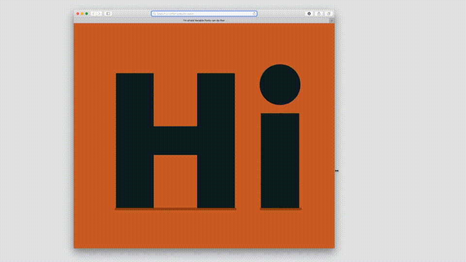
Distinct in approach, the projects I have selected share an ingenious, resourceful use of variable font technology beyond technical prowess alone. Their authors do not employ HOI but use linear interpolation inventively. The result is work that remains consistently engaging while differing in tone—laconic or intricate, witty or poetic. The movement matters to different degrees in each project, but it is crucial to all of them.
Silver Coil, designed by Edgar Walthert and released by Font Spectrum, is a stylistically impeccable exercise in optical illusion. Although the interpolation between two masters captures only a small segment of the rotation, its repeated playback creates the impression of continuous, mesmerizing movement.
Invert by Anna Khorash is a typeface defined by transformation. Its extreme states are compelling, and there is a mind-blowing, Escheresque brilliance in the expertly choreographed process of transition.
Speaking of choreography, Erik van Blokland’s whimsical LTR Very Bauble deserves special mention. Delightful at any point along the interpolation axis, the typeface fully reveals itself in motion, as once restrained letterforms gracefully reach their full bloom.
Sweet Lily by Céline Hurka translates the effortless beauty of a flower into a typographic language. Céline makes extensive use of floral motifs throughout her work, skillfully balancing concrete form and abstraction.
Arthur Reinders Folmer’s Variable Color Font Initials is a so-far unparalleled experiment in type. It is hard to believe that these colorful animations are, in fact, fonts: variable color fonts. Arthur pushes letterforms to the extreme, both technologically and stylistically.
For those eager to understand how variable color fonts work, Arthur offers a tiny guide as well as a dedicated course.
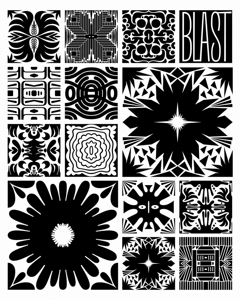
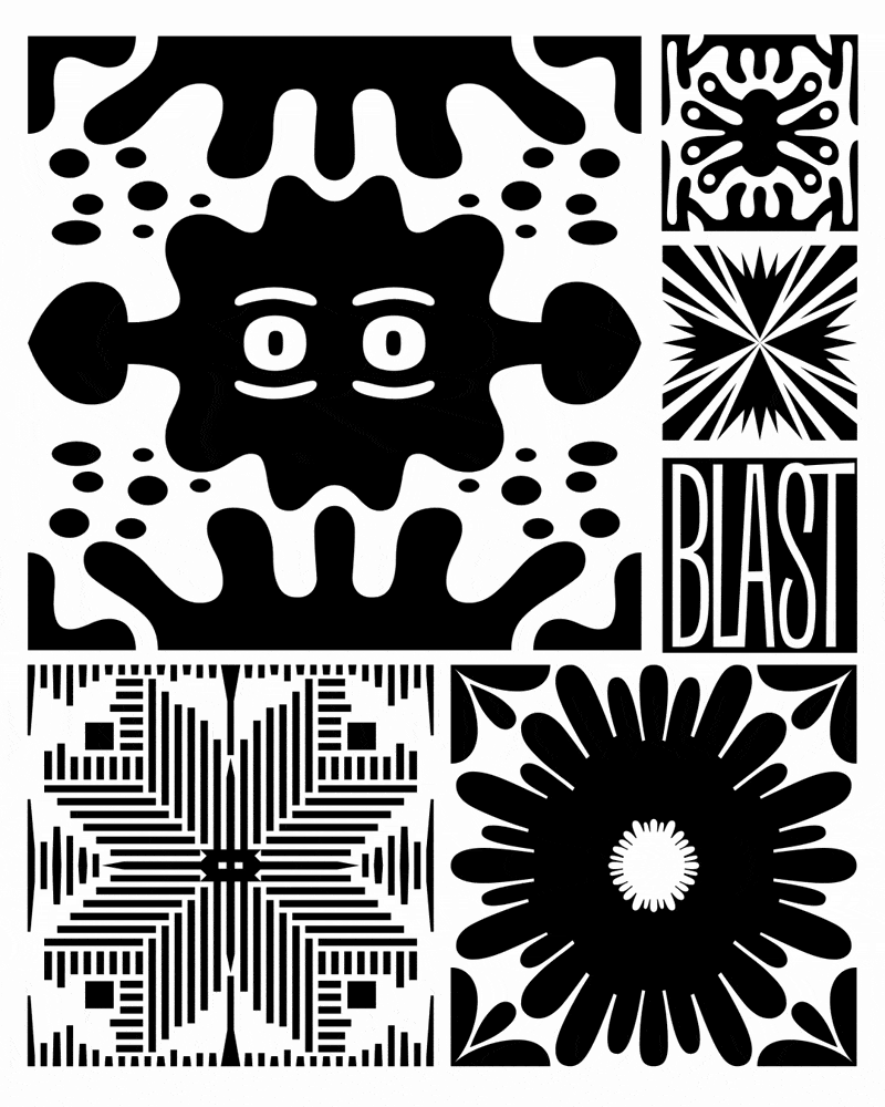
Last but not least, BLAST Pattern Mix 1, designed by Barbara Bigosińska and Diana Ovezea for Blast Foundry, is a witty and refined set of square format variable ornaments. This free-of-charge font is a wonderfully playful tool for graphic designers.
As I was preparing this publication, I found myself contemplating how variable font technology allows movement itself to become a typographic quality. Around that time, I came across Simon Truffer’s Motion Font Manifesto. It defines Motion Fonts as a category of type design in which movement is an integral part of the font’s design, rather than a tool merely enabling greater flexibility in selecting static variations. The manifesto emerged through dialogue with type designers working in this field and offers an explicit definition of a phenomenon many of us, I believe, have been observing.
Simon pushes the boundaries of variable font technology in his own practice, and his contribution to this field is not only conceptual. He created the Motion Fonts Player—a practical, free online tool for testing and animating variable fonts, with dedicated loop features and video export. The latter is especially valuable, as there are still very few easy and accessible ways to export variable font animations to video formats.
For those interested in experimenting with variable font creation without immediately investing in font-editing software, Fontra is a good place to start. It is a free, cross-platform, variable-first font editor offering out-of-the-box tools for working with the movement and choreography in variable letterforms.
As a practicing type designer, I appreciate different aspects of different font editors. Having worked with variable fonts in Fontra, however, I find little motivation to return to other environments for this kind of work. While a built-in slider to move between masters might seem like a basic requirement for contemporary font editors, it only appears to be available in Fontra.
Beyond being a low-friction font editor, I see Fontra as a genuine tool of empowerment, particularly beneficial for minority scripts and languages. Being open source and cross-platform, it lowers the threshold for entering type design.
Aleksandra Samuļenkova is a Latvian-born type designer based in the Netherlands. She designs for Latin, Cyrillic and (occasionally) Greek, and consults on the former two scripts. Aleksandra is known for her typeface Pilot—one of the few contemporary type designs that has been cast in metal, as well as for her award-winning Cyrillic and Greek extensions of notable typefaces such as IBM Plex. Aleksandra also specializes in designing diacritics and special characters for the Latin script, and enjoys lecturing on the topic at various educational institutions, among others—her alma mater—Type and Media Master programme at the Royal Academy of Art in the Hague.
Follow Aleksandra on Instagram:
@aleksandrasamulenkova
ENTER THE TDC72 COMPETITION