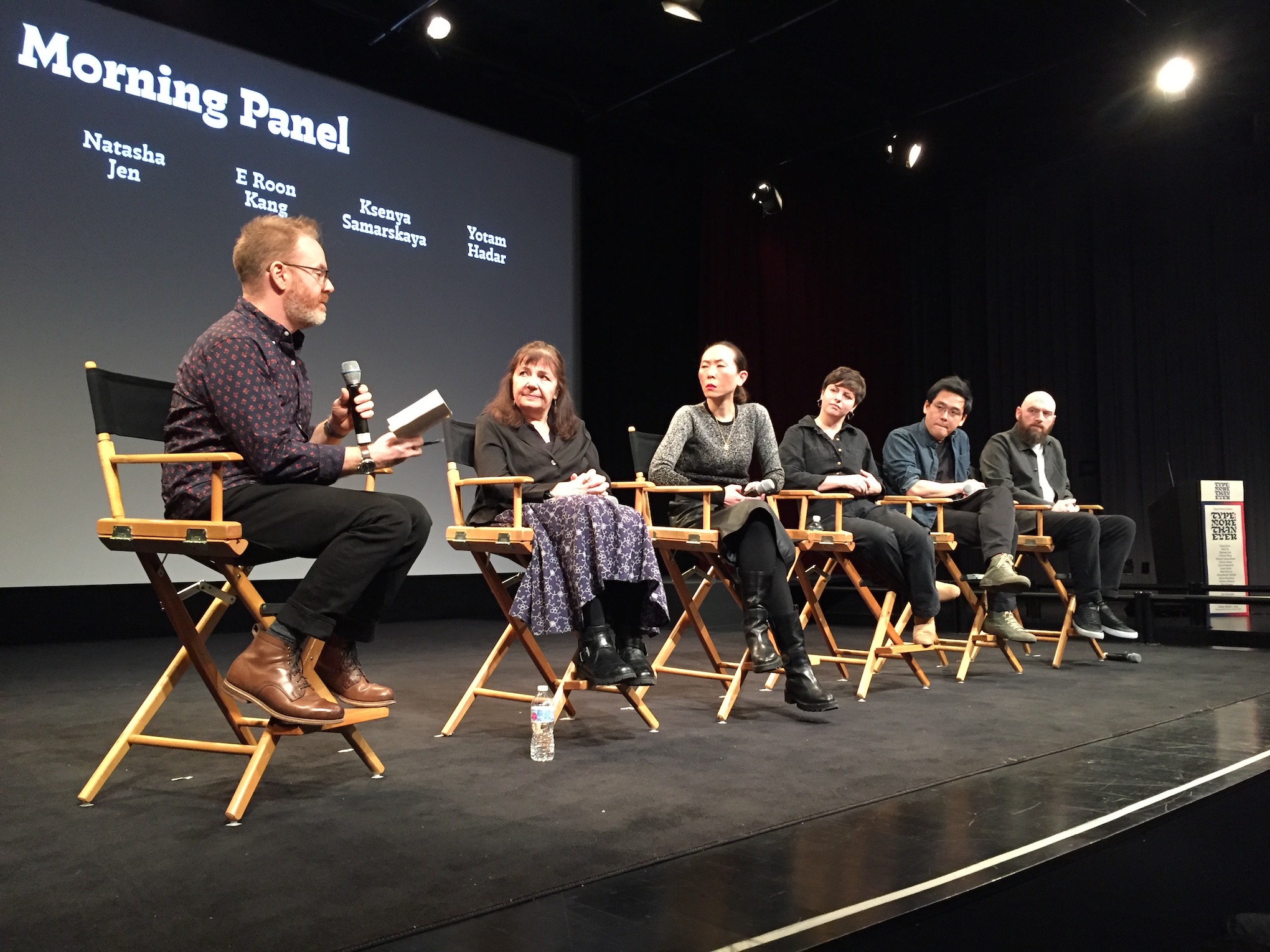
It takes a lot for a group of volunteers to put together a day of talks that attendees will enjoy, learn from, and value! But we think his year's annual Type Directors Club conference did just that. The chairs were filled at the SVA Theatre in New York City on March 1 to hear an eight-hour lineup of speakers and panels fill in the blank on the Type Drives Culture conference theme: Type: More _____ Than Ever.
For a chronological look at the event, take a look through the photo album and captions in our Flickr album. Here, we share some of the reactions from people in the room and on social media.
Diversity
A special effort was made this year to include diverse voices in the roster of speakers, and this was noticed in the room and on social media. TDC board member Liz DeLuna admired conference organizer Juan Villanueva’s morning welcome that clearly articulated “the underlying intentions that drove the creation of this conference agenda, as well as the broader significance and impact of diversity and inclusion in the worlds of type, design and culture.”
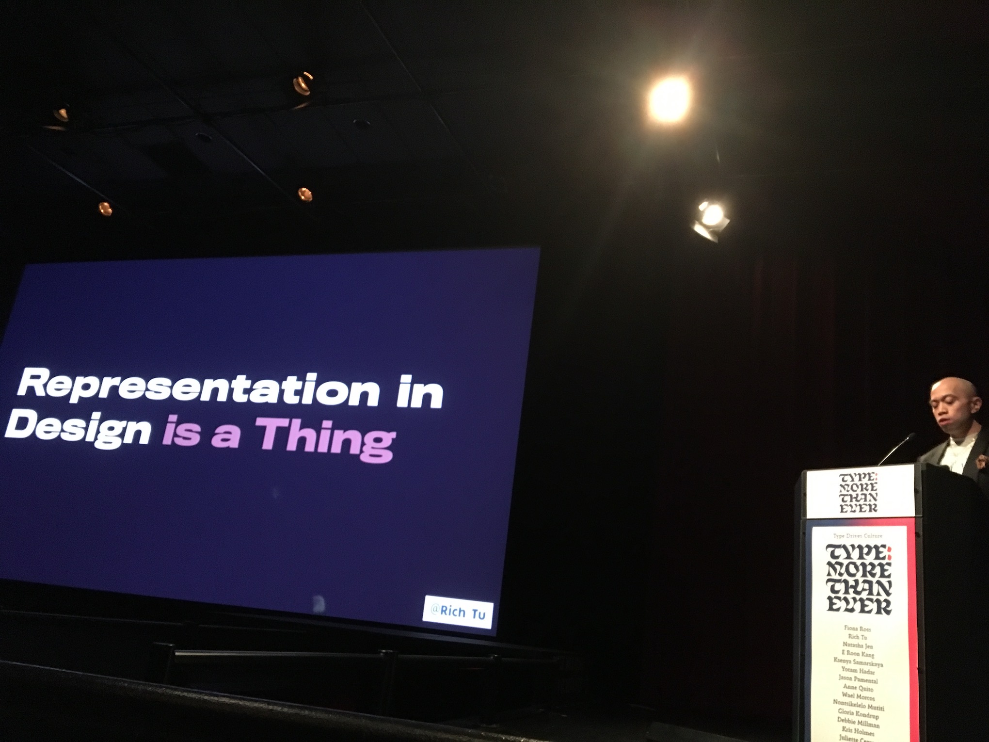
Rich Tu, VP of brand design for MTV and conference emcee, starts the program by illustrating why diversity in media is critical
Rich Tu, MTV’s VP of design and host of the podcast First Generation Burden, amplified Juan’s message with a powerfully personal story about how seeing someone who “looked like him” on screen gave him the hope as a young Filipino that it was possible to make his mark on an international media landscape.
Speaker after speaker provided a tour of language, writing styles, art, and innovation that spanned cultures around the globe – a feat that kept the audience spellbound with a mix of art, history, technical prowess, graphic achievement, and images from a who’s who beyond the world of Latin type.
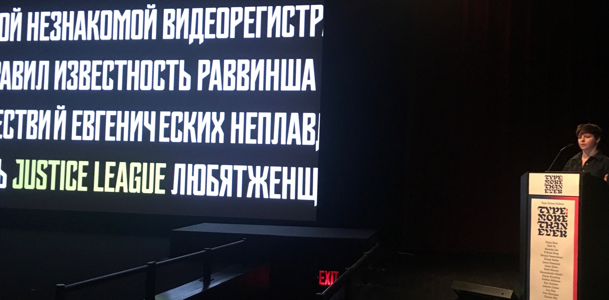
Ksenya Samarskaya shows images combining Latin and Cyrillic scripts during “Type: More Questionable Than Ever”
Juliette Cezzar tweeted that she admired the “thoughtful (multiscript!) lineup.” On Instagram, Philip Readman @philread0417 said that the diverse approach to this year’s conference was “well played.”
Professor Miriam Ahmet, who brought six of her students from Howard University, tweeted, “Awesome to see designers like @waelmorcos and @nontsiMutiti showing their visionary and diverse work.” She also tweeted to Zimbabwean archivist and artist Nonstikelelo Mutiti that her Reading Zimbabwe project is “fascinating and I’d love to bring my @HowardU #graphicdesign students to meet you and learn more about it at @VCU.” Summarizing their day, she said that her design students filled in the blank with “Type: More Inclusive than Ever!” We really appreciated Miriam and her students spending the day with us!
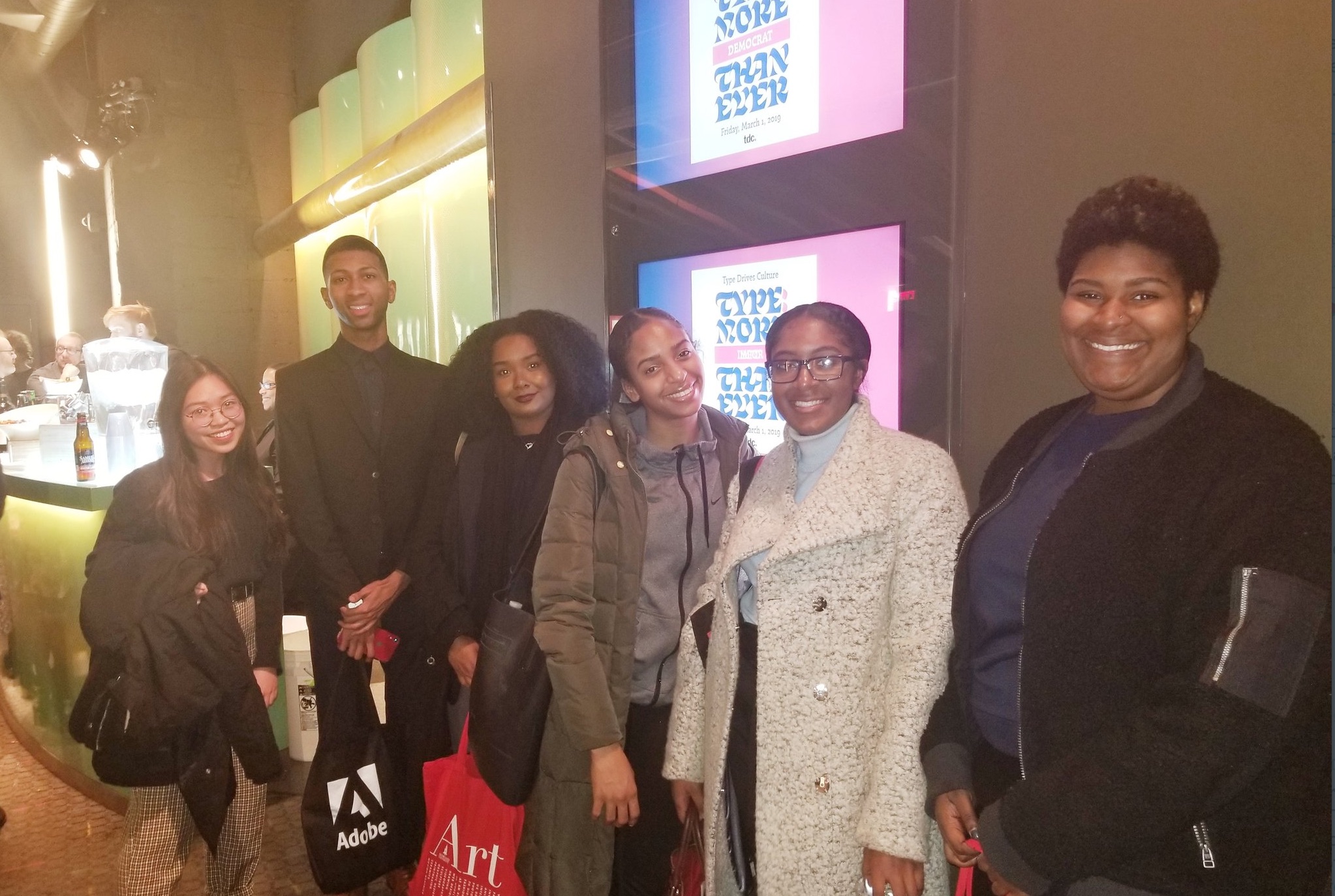
Professor Miriam Ahmet's students from Howard University at the reception
Design Crushes
Most design conferences include good-looking presentations, full of inspiring work by envy-worthy designers. The TDC conference also evoked reverence for work and speakers. For instance, Juan Villanueva loved TDC Medalist Fiona Ross’s wit and candor, both in her keynote on non-Latin writing systems and in her remarks during the morning panel.
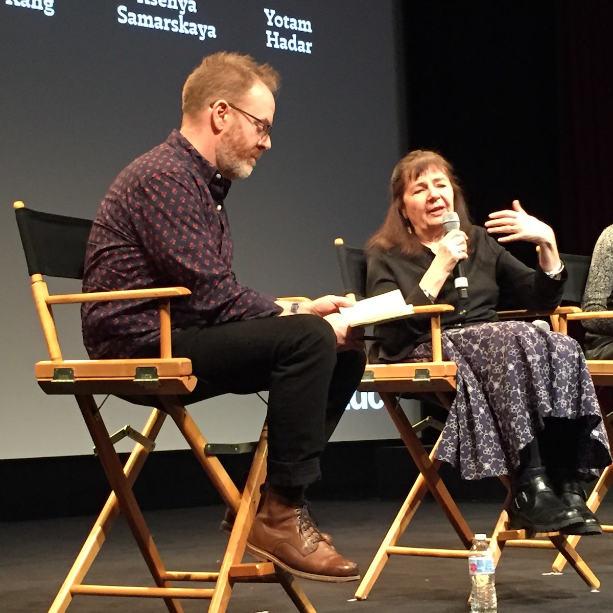
Fiona Ross of the University of Reading responds to a question posed by panel moderator Jason Panmetal
Juan also said that one of his favorites was Debbie Millman’s Design Matters podcast interview with Kris Holmes – someone he had never seen before in person -- because we all discovered in Kris a “new design hero” whose success in typeface design was built upon a mastery of calligraphy.
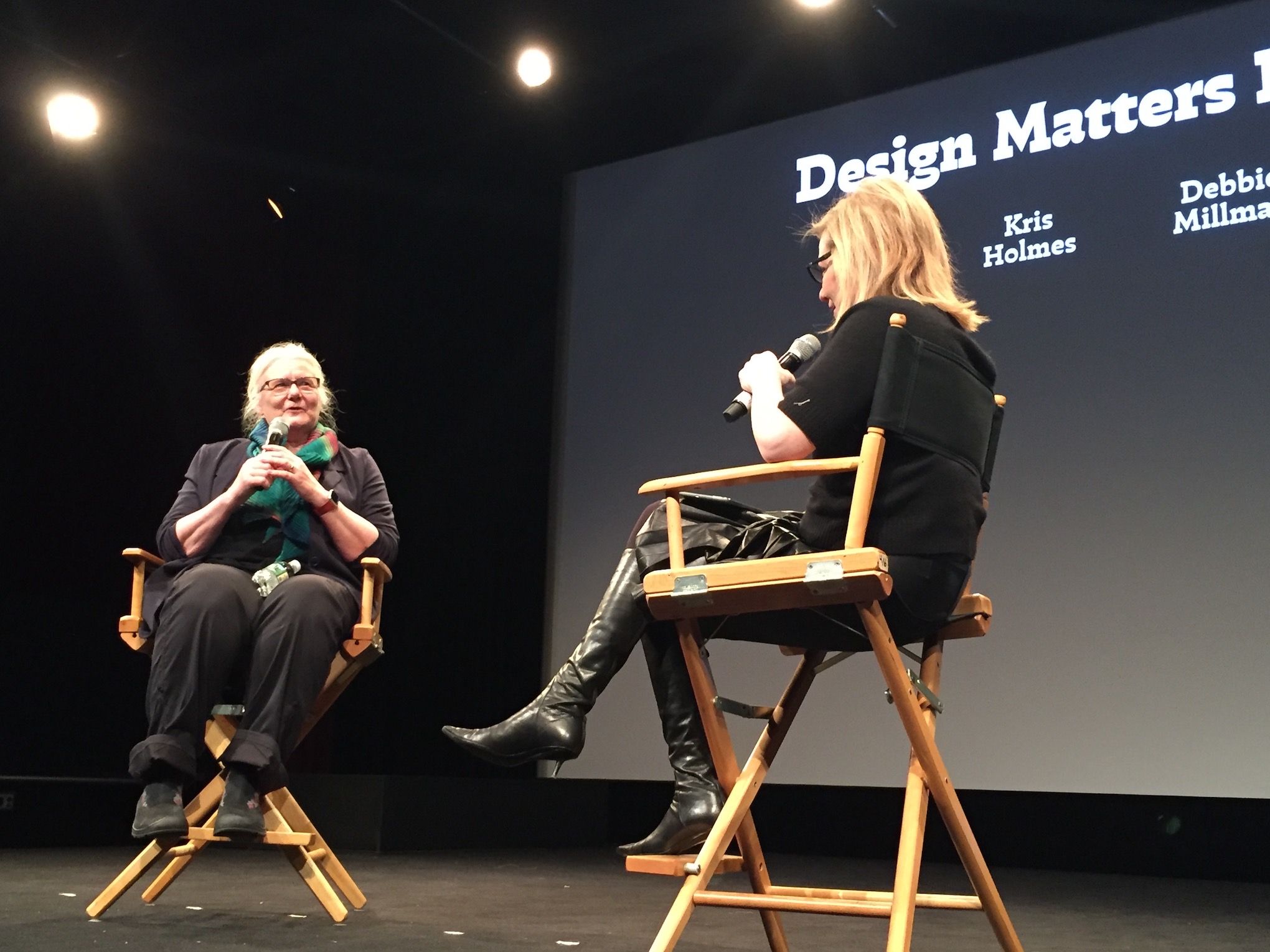
Debbie Millman asks type designer Kris Holmes how she began her career during her podcast “Design Matters”
Natasha Jen of Pentagram bravely showed beautiful work that was never produced. Natasha’s presentation showed how her team used Chinese characters in an extraordinarily wide-ranging branding assignment for a Taipei client. Liz DeLuna felt that Natasha did “an incredible job of verbalizing and visualizing how type, language, culture and poetry can drive the design process and product.” Type Magazine cited her talk in a humorous tweet about Natasha’s reference to one of the most complicated characters in Chinese, which she confided represents the moment when a certain kind of noodle hits the noodle-maker’s table.
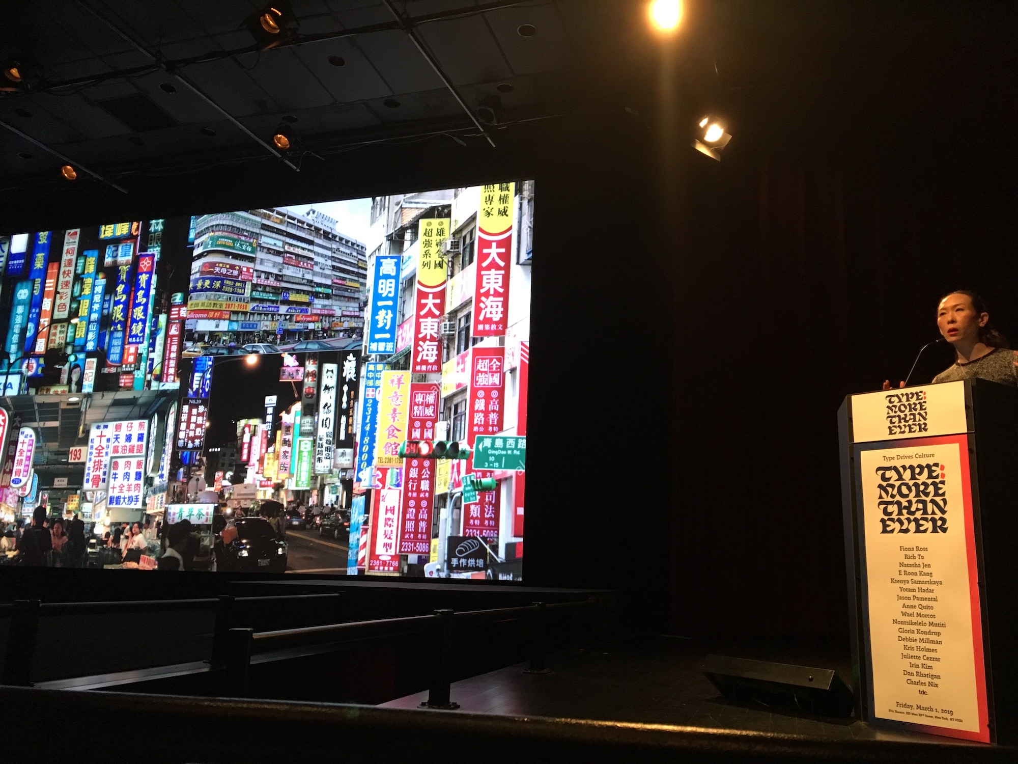
Natasha Jen of Pentagram describing how to draw inspiration from the cityscape of Taipei.
Photo by Liz DeLuna
Anne Quito’s appreciation of type in the news and her sharp sense of humor made her one of the speakers you would most want to share martinis with.
Learning More
Without a doubt, our conference speakers had substance and well as style. YuJune Park and Doug Clouse applauded the presentation by Nontsikelelo about unearthing and archiving Zimbabwean 20th-century publications and authors -- important work that is setting the historical record straight and revealing voices that colonialism suppressed.
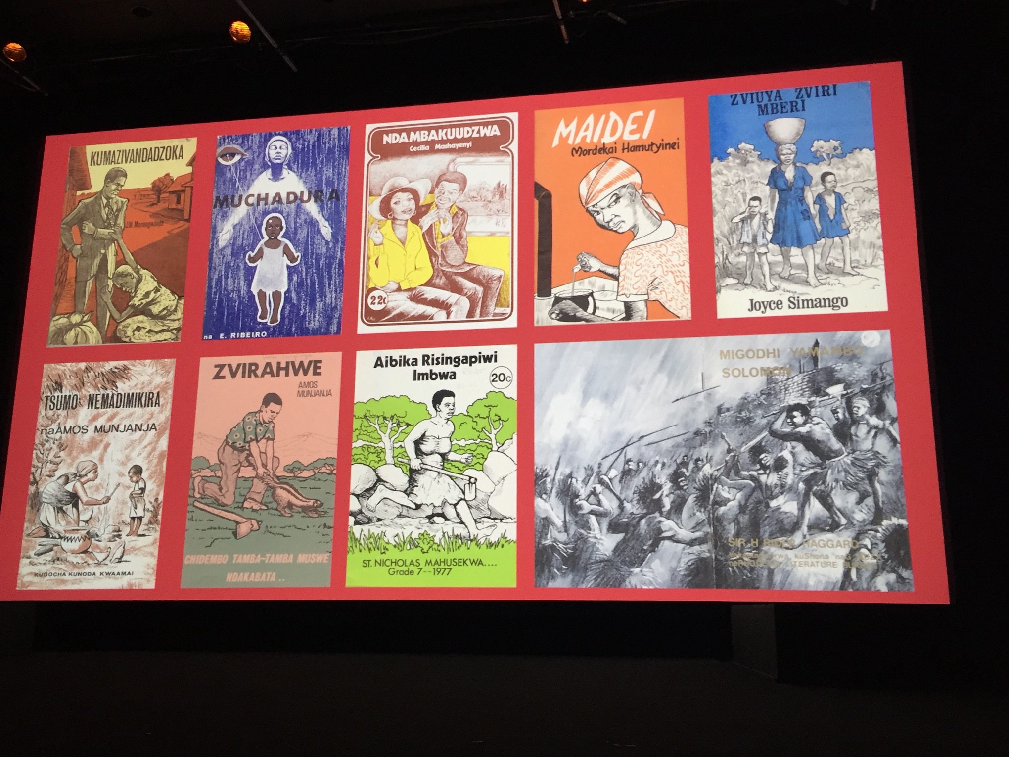
Images of lost publications by writers in Zimbabwe from Nontisekilelo Mutiti’s presentation “Type: More Obscure Than Ever”
Likewise, Doug Clouse was pleased that Fiona Ross showed Korea’s Diamond Sutra, the first printed book ever, and that she drew attention to the fact that moveable type was invented in Korea and China, long before Gutenberg. Academia is well aware of this, but Fiona’s point was that this kind of innovation history deserves broader exposure. YuJune Park loved the way that Fiona Ross’s “expansive presentation rolled together theory, history, print technology, and its relation to form so beautifully.”
Liz DeLuna admitted that the conference was an eye-opener: “After the four-hour morning line-up, I learned more about the Indian, Cyrillic, Chinese, Korean and Hebrew writing systems than I had in the last 40 years! YuJune Park singled out Wael Marcos’s presentation on Arabic for the same reason, and speaker Natasha Jen took photo after photo of Yotam Hadar’s slides of Hebrew and bilingual typesetting.
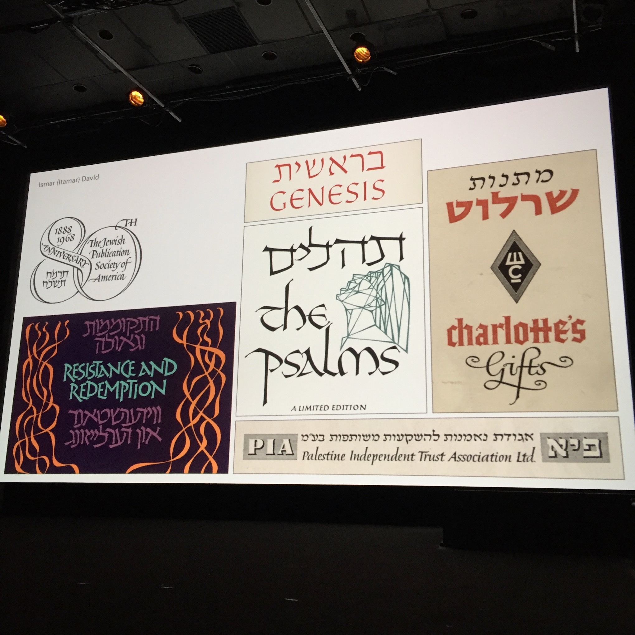
Images of Ismar David’s bilingual work in Yotam Hadar’s walk through modern Hebrew typeface design (“Type: More Bi- Than Ever”)
Immediate Impact
All of us organizers were energized by proof of the conference’s immediate impact in the theater and on social.
During the afternoon panel, our new design heroine Kris Holmes said that she had come to the conference and believing that type design, particularly in our digital age, needed "more handwriting" than ever. But after hearing the speakers, Kris said that it was a revelation to hear and see how many young, technically savvy typeface designers were used drawing and lettering to inform their conceptualization process. She felt a new sense of kinship with the current generation of innovators over a process that she felt injected spirit and quality to everything she’s made throughout her long career.
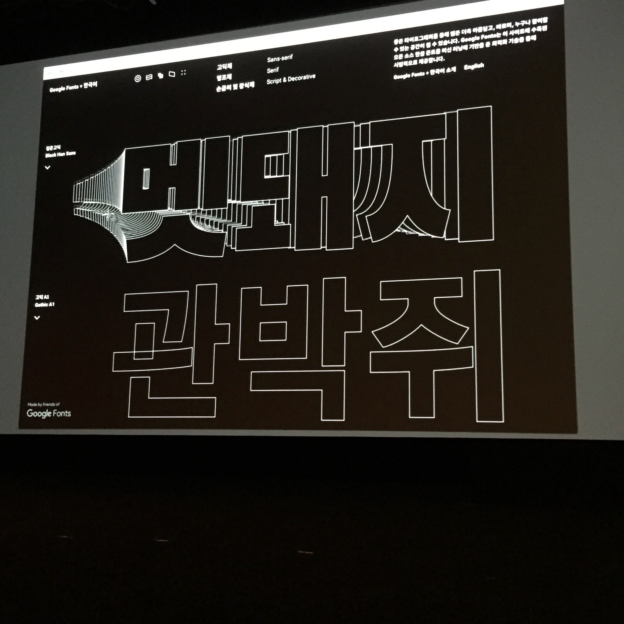
Open source Korean Google Fonts by E Roon Kang from his presentation “Type: More Systematic Than Ever”
Joe Newton told us that a complex question that arose during the day’s morning panel will definitely affect the way he teaches design: “As global capitalism pushes culture towards a convenient homogeneity, how do we champion unique voices?”
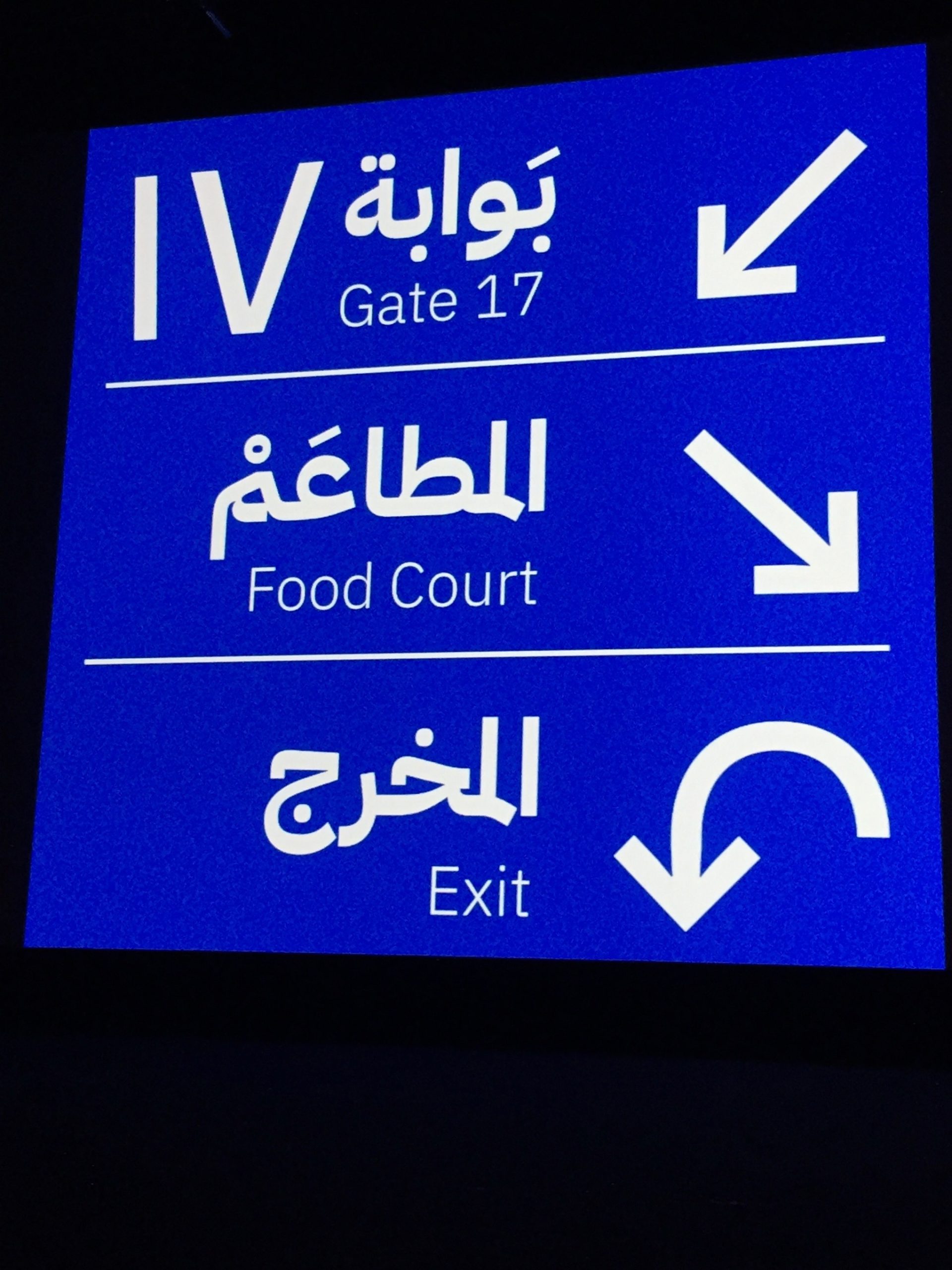
Examples of modern Latin and Arabic typography from presentation by Wael Morcos, “Type: More Arab Than Ever”
Doug Clouse will always remember the dramatic moment that followed a story from journalist Anne Quito about the US Department of Transportation and use of the Clearview typeface on highway signs. Audience member and type designer James Montalbano jumped into the conversation, revealed that he was the designer that created Clearview, and clarified details behind the story! The encounter showed the value of bringing analysts and designers together, and how doing so helps refine our understanding and histories of type and design.
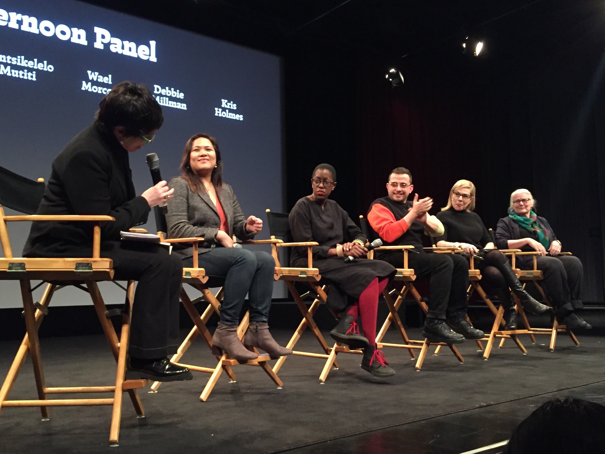
Gloria Kondrup asks Anne Quito, Nontisekilelo Mutiti, Wael Morcos, Debbie Millman, and Kris Holmes why type is so “vital”.
On Twitter, @NickSherman commented “Listening to Kris Holmes (from @LucidaFonts) talk to @debbiemillman about the Ikarus type development system is alone worth the cost of admission to the Type Drives Culture event.” Responses in the Twitter-sphere were immediate -- @Bruno_Maag tweeted, “I digitized using the Ikarus system. I’m still in therapy.” After @espiekermann tweeted, “I loved MacIkarus,” the conversation in social went on from there, as it did in the post-conference reception for so many of the New York conference attendees.
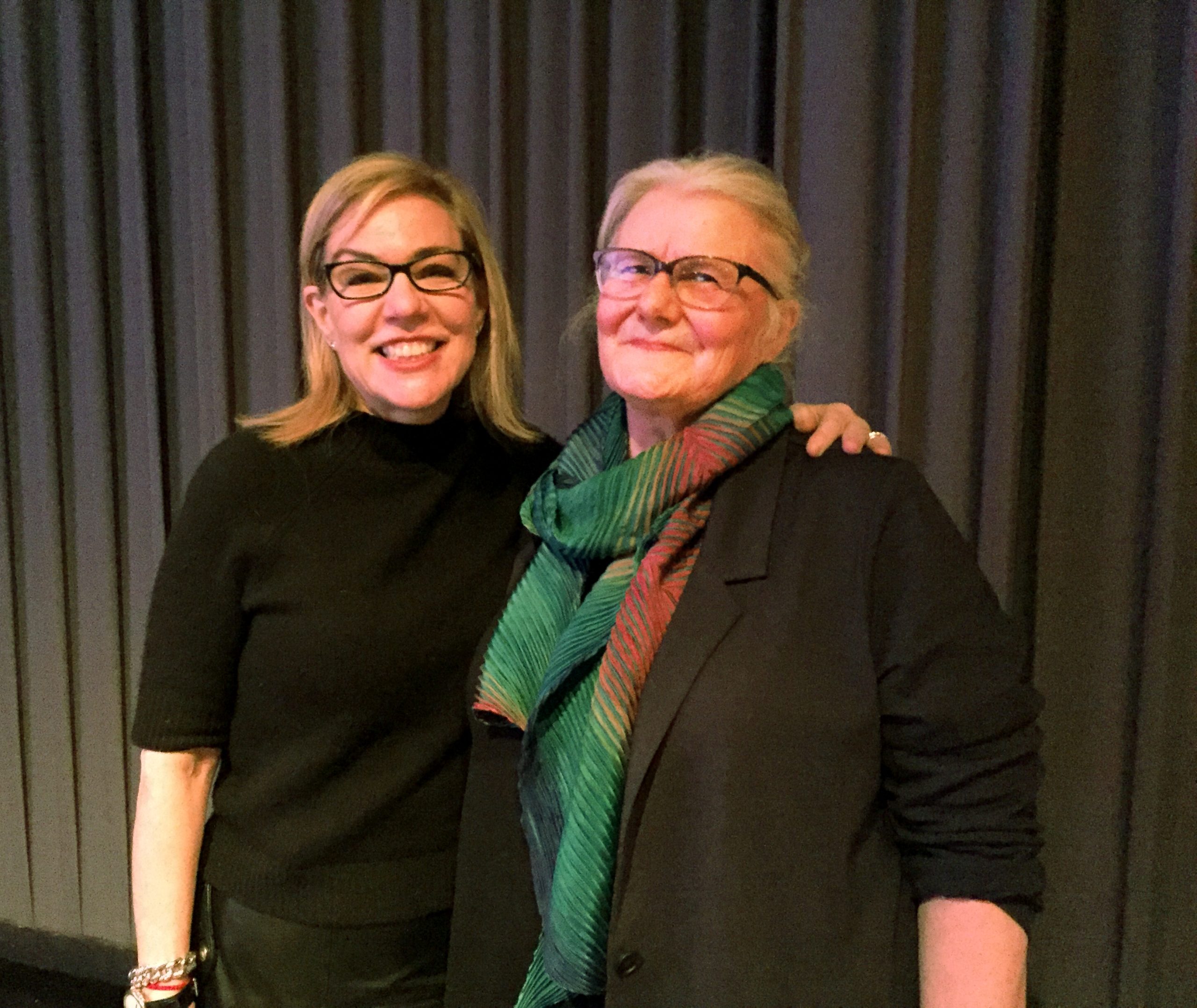
Debbie Millman and Kris Holmes following the “Design Matters” live podcast.
