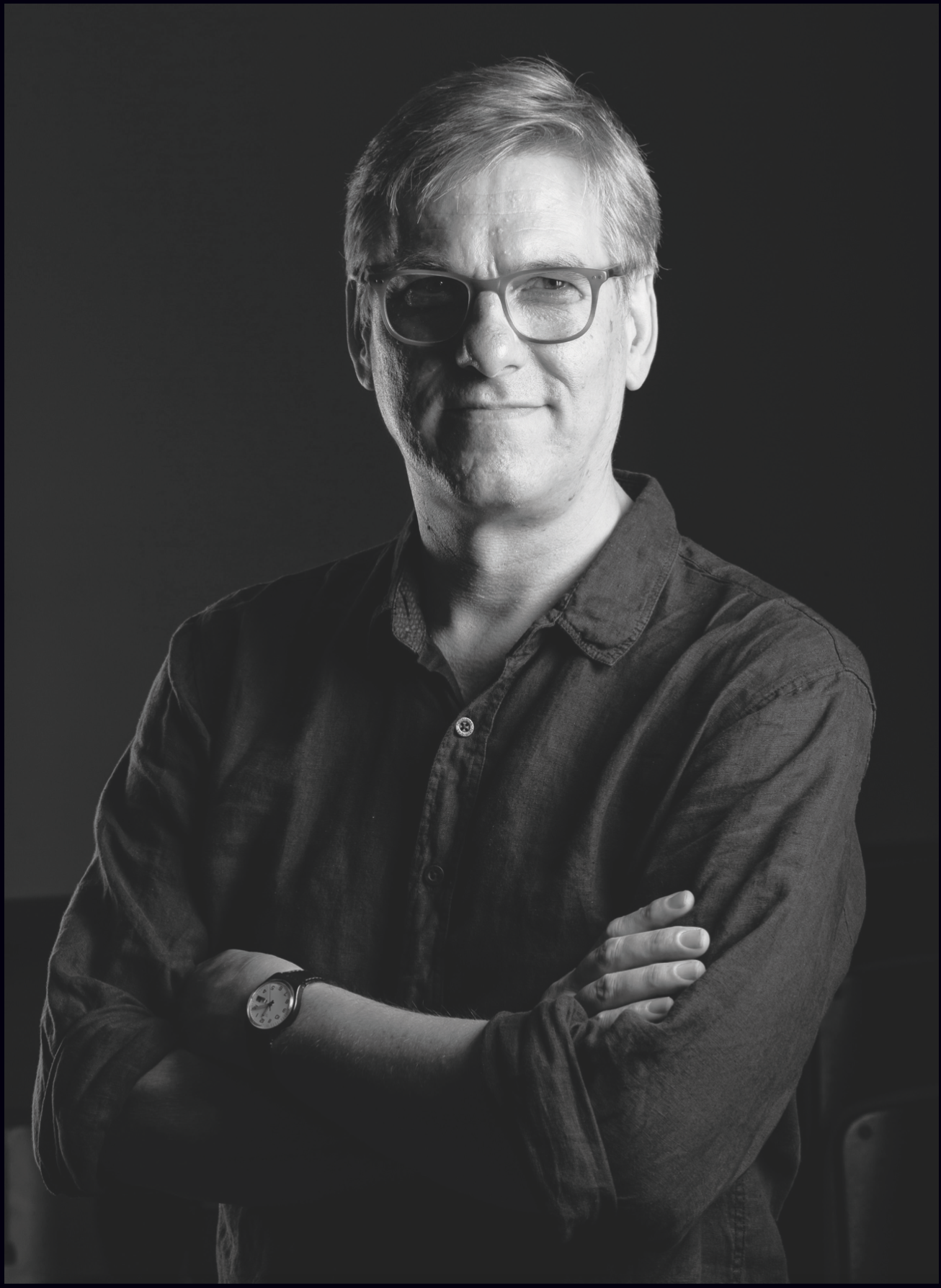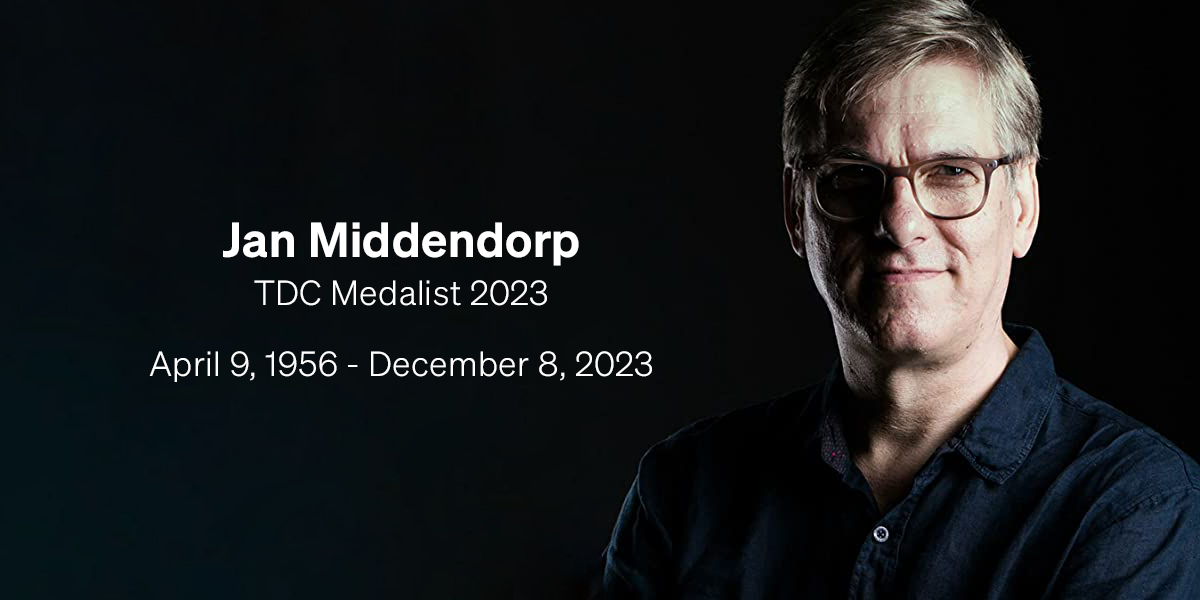
Dutch-born, Berlin-based designer, author, researcher, and TDC Medalist Jan Middendorp sadly passed away last month at the age of 67. In Middendorp’s honor, we are proud to republish eye magazine editor John L. Walters’ reflections on Jan’s life and career from the 44th edition of the TDC Annual.
TDC Medal Jan Middendorp
Eye editor John L. Walters profiles TDC Medalist Jan Middendorp.
Jan didn’t go to Berlin to make his fortune – he found a home there, a friendly, creative milieu in which he could practice all the things at which he excelled.
It’s worth remembering that Jan was once a designer, which meant he was in the engine room when the worlds of graphic design and type design were in aesthetic and technological turmoil.
Though he covers a multitude of specialised topics that demand time and study, his writing never fails to conjure a world in which everybody’s welcome.
Jan Middendorp has been my friend and go-to type expert for nearly two decades. We first spoke on the phone when he called Eye’s office to tell me about his research for the book that became Dutch Type, a monumental achievement that was widely acclaimed when it finally appeared in 2005. After many emails and phone calls, we met in person when he visited London and we realised we had many intersecting interests outside graphic design and typography: music, dance, art – culture in general. Jan’s tastes and critical sensibilities were alert to everything he encountered; he was well read and spoke six languages, but wore his skills and learning lightly.
When I was invited to attend the Italian design conference ‘Imagine.it’ in 2007, I was delighted to hear that Jan would be the keynote speaker alongside an extraordinary gathering of designers, illustrators, writers and design historians. The participants there included James Clough, George Hardie, Anette Lenz, Liza Enebeis, James Mosley, Rathna Ramanathan, Leonardo Sonnoli and many more; most of the people I met there have remained friends, advisors and colleagues ever since. We enjoyed walking through the porticos of that ‘red’ city’s streets, hanging out in Bologna’s splendid bars, restaurants and jazz clubs to discuss what we’d seen and heard that day. Jan surprised us by explaining that he knew Bologna well from studying studied semiotics and theatre there as a young man, learning Italian and attending many of the lectures without officially enrolling on any course at the university (DAMS).

I am the Abcist
Letterpress-printed card.
Idea and design by Jan Middendorp
ca. 2020.
18 cm × 14 cm
To me, Jan was the ultimate ‘European Man’: accomplished, modest, witty and comfortable with any person he encountered in any place. In 2005 he moved to Berlin, which remains his home to this day. When I visited the city for the first time, Jan was the perfect person to show me around, and when we published Eye’s Berlin special issue (Eye 74, 2009) he wrote this fluent introduction to that city’s creative qualities:
‘Berlin attracts ‘creatives’ in all disciplines from across the world. Part of its attraction goes back to the cold war decades, when West Berlin (an island in the socialist GDR) became a refuge for young leftists, as men living here could not be drafted. It is also Europe’s most affordable big city, and its club life is the stuff of legend. Those are just a few of the reasons the city is home to tens of thousands of artists, architects, cooks, musicians, illustrators, dancers, ceramicists and fashion designers as well as product, graphic, Web, interface and type designers.
‘Like the physical cityscape (still under feverish development twenty years after reunification), the creative networks are in constant flux. Each organises its own events, using anything from state-owned museums and theatres to derelict office buildings or abandoned riverside plots, and catering to its own little niche. For those who haven’t decided which niche they want to be in, there is a choice of about half a dozen professionally organised festivals and conventions to go to each week. … It was Berlin’s mayor himself, the openly gay Klaus Wowereit, who coined the brilliant anti-slogan that sums it all up: “Berlin is poor but sexy” (“Arm, aber sexy”).’
Jan exemplifies the mindset explored in this article. He didn’t go to Berlin to make his fortune – he found a home there, a friendly, creative milieu in which he could practice all the things at which he excelled. Six years ago Jan assembled a website to summarise and present those achievements, which included a colourful, overlapping infographic CV made to show his multifaceted career.
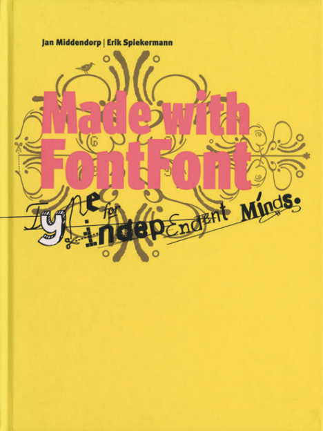
Three vertical channels – work for clients, writing and ‘various’ – are further trisected with coloured lozenges that represent projects and platforms over time, from studies in the early eighties (at the foot) right up to the then present of 2017. Toneel Teatraal overlaps with De Volkskrant; his work for the Dutch Graphic Design Museum overlaps with Plantin Institute Antwerp. The books Made With FontFont, Creative Characters, and Type Navigator run alongside his articles for Eye and the times he was working for FontShop, LucasFonts and MyFonts. Small ‘DJ’ lozenges remind us of his enthusiasm for music. And it’s worth remembering that Jan was once a designer (he was both editor and director of Druk 1999-2002), the FontShop magazine – which meant he was in the engine room when the worlds of graphic design and type design were in aesthetic and technological turmoil. More recently, he has designed and typeset a heroic run of books for adventurous publishing house Repeater Books. Then there’s Shaping Text (2012), his practical guide to typography, a slim volume compared to Dutch Type, but an elegant, finely crafted classic all the same.
However heated the creative climate, Jan’s writing has always been cool and considered, blending a deep understanding of type’s role in design and society with empathy for the professionals who have to deal with clients and consumers while keeping their self-esteem. He translated Adrian Shaughnessy’s How to be a Graphic Designer Without Losing Your Soul, which deals with some of these knotty issues, into Dutch. The contributions he has made to books with (and about) LettError, René Knip, Brody Neuenschwander, Erik Spiekermann, Mark van Wageningen and Alessio Leonardi have benefitted from his deep understanding of the way designers think and design. Though Jan is entirely serious about design and type, his sense of humour adds a light touch to the most complex subject matter.
All of which helps explain why he has been one of Eye’s most valued contributors over the decades, whether writing critiques of new books or exhibitions or in-depth profiles of esteemed practitioners. He profiled Andrea Tinnes (a ‘cutting-edge graphic designer who is also an accomplished type designer’) in Eye 49 and Cyrus Highsmith (‘one of the truly original new voices in American type design’) in Eye 59. He wrote an elegant appraisal of prolific but under-appreciated Cuban poster designer Eladio Rivadulla in Eye 68. His blog post ‘Outlook variable’, about the 2018 TYPO Labs gathering in Berlin, showed his ability to bring the latest technology to vivid life for Eye’s professional readers: ‘There are roughly two kinds of audience in these conferences: the trailblazers and the still-learners (though most trailblazers will volunteer that they, too, are learning on a daily basis.’ Jan explained that the ‘hot theme’ of the conference was a new format – Variable Fonts – and goes on to explain the crucial role of independent designers: ‘Variable Fonts were rushed out as a technology in 2016 at the Warsaw ATypI conference, but there was not much that was concrete. It wasn’t the big companies that came up with dedicated type design software, striking experiments, or visualisation tools – these were developed, literally overnight sometimes, by micro-companies such as Georg Seifert’s Glyphs or individuals such as Laurence Penney.’
When Jan profiled Anette Lenz (Eye 101), a piece long-planned and delayed by the pandemic, his subject was similarly impressed by his dedication to the article. ‘What stands out to me about Jan is his unwavering devotion and passion for type, writing, and capturing stories accurately,’ says Anette. ‘He has a keen sense of detail and ethics.’ His concern for the ecosystem of design and typography, the need for opportunities for students and more marginalised groups shines through States of Independence (Eye 98), about small type foundries. When he wrote ‘Generation Font Rent’ (Eye 97) about Peter Biľak’s Fontstand, which makes it possible for students to work with professional quality typefaces, he didn’t just speak to Peter, he discussed the issue at length with Indra Kupferschmidt, professor at HBKSaar (University of the Arts
in Saarbrücken)
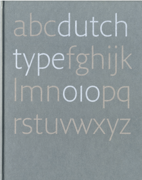
Dutch Type
Edited by Jan Middendorp.
Design by Bart de Haas and Peter Verheul.
Rotterdam: 010 Publishers, 2004.
22.5 cm × 28 cm
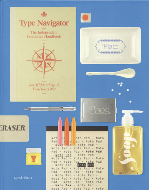
Type Navigator.
The Independent Foundries Handbook
Edited by Jan Middendorp and TwoPoints.Net.
Design by TwoPoints.Net. Berlin: Gestalten, 2011.
24.5 cm × 30.5 cm
Jan always had an eye for less widely celebrated practitioners, as in his warm-hearted tribute to Tom ‘Kiet’ Hautekiet (‘a standard-bearer for Flemish design’) soon after the designer’s unexpected death. In an Eye blog post, Jan described him as ‘one of the friendliest, smartest and most energetic designers of his generation – a very talented communicator working for musicians, festivals, theatre companies, museums and television.’
Even a simple book review can be a vehicle for Jan’s particular worldview of type: ‘Open up a spread of this lovingly produced Futura book and you almost find yourself in a vintage type specimen or magazine issue. I am not sure if there has ever been a fuller, more joyful book about a single typeface.’ Jan was critical of this book’s English translation, yet his enthusiasm for the subject matter remained infectious and stimulating.
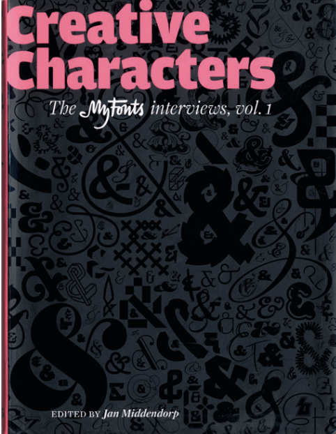
Creative Characters.
The MyFonts interviews, vol. 1
Edited by Jan Middendorp
Cover design by Nick Sherman
Amsterdam: BIS Publishers, 2010.
22 cm × 28.5 cm
Type Navigator.
The Independent Foundries Handbook
Edited by Jan Middendorp and TwoPoints.Net.
Design by TwoPoints.Net
Berlin: Gestalten, 2011
24.5 cm × 30.5 cm
Writing about the experimental type journal FUSE in 2012 (‘Postmodern jam session’, Eye 83), he vividly explained its appeal for those who missed it the first time, or were too young to have lived through the early days of digital type: ‘Contributors included people who, even then, were big names in type and / or graphic design: Spiekermann, Malcolm Garrett, Gerard Unger, Margaret Calvert, Jeffrey Keedy, Pierre di Sciullo, Peter Saville, Rick Vermeulen. It was like an open stage on a Tuesday night, where weathered players join newcomers in trying out new ideas, different instruments and unfamiliar rhythms.’
The Eye 102 feature Jan wrote about Laura Meseguer looked at her ways of working and her formative years with an understanding that comes from knowing the scenes, the people, the context from personal experience. Laura recalls first meeting Jan when he came to Barcelona to profile design studio Cosmic and Type-Ø-Tones foundry for Druk in 2000. She continued: ‘Jan’s writing is marked by objectivity, which stems from his research-oriented approach. I appreciate how he provides the text with details that create a context and help the reader understand the content. Most importantly, his writing engages the audience and makes them want to know more about the subject or person he is writing about.’
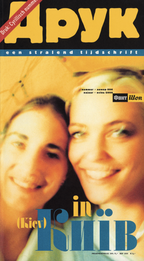
Druk magazine, no. 006
“In Kiev”
Conceived and edited by Jan Middendorp
Ghent: FontShop Benelux, fall 2000
17 cm × 31 cm
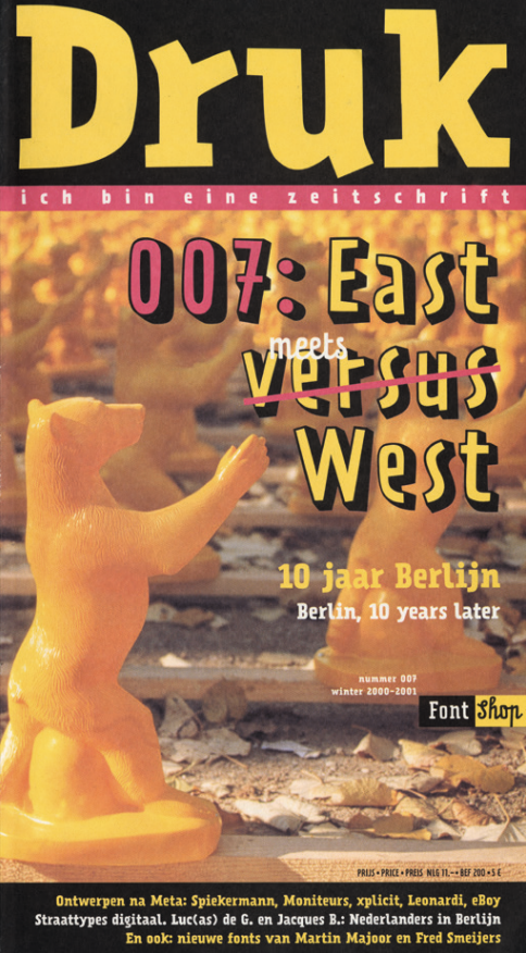
Druk magazine, no. 007
“East meets West”
Conceived and edited by Jan Middendorp
Ghent: FontShop Benelux, winter 2000-1
17 cm × 31 cm
And Jan’s recent appraisal of Jérôme Knebusch’s GoticoAntiqua, Proto-Roman, Hybrid, 15th century types between gothic and roman (Eye 102) was informed by Jan’s knowledge of the original project and his experience of publishing. As Jan wrote, the book ‘convincingly places the historic research in today’s type world.’ The review ends with a cheering flourish typical of Jan’s egalitarian positivity: Gotico-Antiqua, Proto-Roman, Hybrid is a book for an elite of type lovers and specialists, but then again, as we have seen from the dedication of so many students, practically anyone interested can join the club.’ And in a way that sentence summarises one of Jan’s great gifts as a writer. Though he covers a multitude of specialised topics that demand time and study, his writing never fails to conjure a world in which everybody’s welcome.
— John L. Walters, Editor and co-owner of Eye magazine