How do typography, architecture, and storytelling blend into your studio practice?
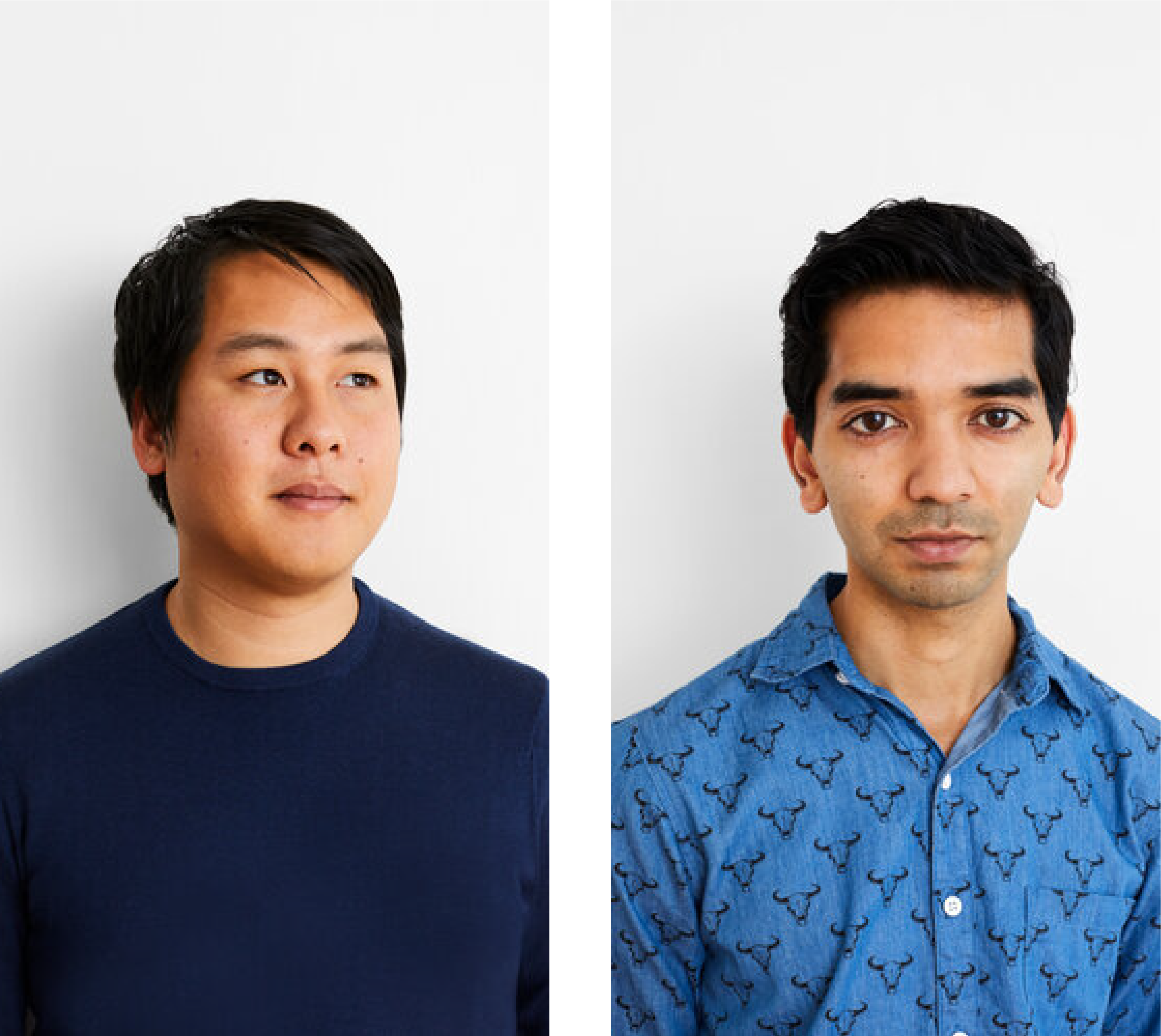
The studio’s practice evolved naturally from our backgrounds and interests– Andy’s training in the ethnography of inequality and in graphic design, and Waqas’ study and practice of architecture. The many talented team members we have had the privilege of working with over the years have also brought their particular strengths to the table– type design, digital, photography, animation, illustration, etc.
We were initially conflicted on presenting ourselves as a design studio that focused on “social issues,” or even a “multidisciplinary” studio that integrated architecture and graphic design. These descriptions were demoted by elite academic circles as unserious and lacking disciplinary relevance. However, we have embraced that we start many projects with photography, interviews, and research that delve deep into personal narratives, particularly those of marginalized people who need representation in visual culture.
Our team has embraced ethnography, graphic design, and architecture as one continuum of design practice towards a modernist ideal: “Gesamtkunstwerk”; “综合艺术品” — or the total work of art. In some ways, this parallels an evolution in society in thinking more about the emotional, intellectual, and visceral impact design has on its audience rather than imposing strict boundaries around the medium of delivery. And, it liberates designers to think openly about the interstitial spaces among typography, architecture, and storytelling.
Andy, why was it important for you to start your own studio? And how has being your own boss shifted over the past 8+ years?
The reason to start a studio was two-fold. First, I have an intense personality and a specific vision for design as a fulcrum towards a more just society. It would have been hard to work for someone else. Second, I was born into a multi-generational family of salespeople. I have always resisted following in their footsteps, but deep down, business is in my blood, and I think design overall benefits from having shrewd advocates.
Honestly, it was terrifying at first, and there was a lot of doubt and anxiety. Fresh out of graduate school, I approached a trusted mentor Paula Scher, with what she would do if she were in my position. Paula said that if we had three clients, we could start a studio and fall back on the job market if that didn’t work out. Even if one of them dropped out, there would still be two others to work with. And that’s exactly what happened. We had three clients, and the South Asian tea packaging dropped out. The founder Zahir Dossa came back a few years later with a customized hair care project that became Function of Beauty, which is now a global, $1 billion-dollar company.
Over the last eight years, I’ve developed a greater sense of humor and understanding for my teammates, clients, and myself. I try to approach people with kindness and patience, even when I’m under a lot of stress. I try to focus on areas where I can make a positive impact rather than decisions that are out of our control. I share power more readily and make space to affirm my collaborators. I’m still hard on myself about small details, like designs we work through over months, and then notice that the kerning might be uneven in a final print. Or, I’ll worry about a client not loving some portion of a presentation. But I’m starting to embrace that flaws—typographic or otherwise—can be beautiful too. It’s the evidence that something was made by human beings and encodes our subjectivity, vulnerability, and humanity.

Waqas, you joined the studio after stepping away from a large architecture firm– how was this adjustment? Are graphic design language and studio culture vastly different from an architecture firm?
My dream was to become an architect and after interning at some prominent international studios like OMA and SANAA, I began my first full-time job at Skidmore, Owings & Merrill in a tall tower on Wall Street. At the time, the work culture was quite brutal and the end product—super-tall towers in China for investors—was not the most thrilling to me. So, Andy and I joked about working together and within a week I was in a startup space in Dumbo.
Like most architects, I thought I already knew graphic design and was quickly disabused of this mistaken notion. Working with Andy was like getting another graduate education. Over time, I learned about the history of the discipline, absorbed a ton of cultural references, and became profoundly aware of how typography and images define our visual culture.
As we work on a lot of exhibitions, we try to integrate the best aspects of architecture practice and graphic design culture while trying to unlearn the toxic elements of each. For example, we always do deep benchmarking research for our projects and are very open with our clients about our inspirations. This practice comes from architecture, which is a discipline built on precedent and collaboration. On the other hand, we care deeply about the visual aesthetics of all elements of our architectural work, and our attention to its graphic presence and power lends it a unique quality that is quite distinctive.
You bring power to exhibition and physical spaces: Cooper Hewitt’s Contemporary Muslim Fashion exhibition, Rising Together exhibition at Google, and the Princeton Field Center, etc. How do you consider your audience in telling urgent stories that deal with race, sexuality, and systemic issues?
We think about social justice issues as design issues. Even among well-meaning people, majority audiences often carry stereotypes that circumscribe their understanding of people who are marginalized. Just as design can redefine people’s assumptions about products and brands, it can open their understanding to the lives of others– people of color, queer people, people who face systemic and sometimes violent oppression.
The graphic designer’s responsibility is to create moments of instantaneous and often visceral recognition for the dignity and humanity of people who are suppressed and suffering. Unlike filmmakers or playwrights, graphic designers face the added challenge of appealing to audiences who are experiencing content in a state of distraction and often without the guarantee of continuous, durational storytelling.
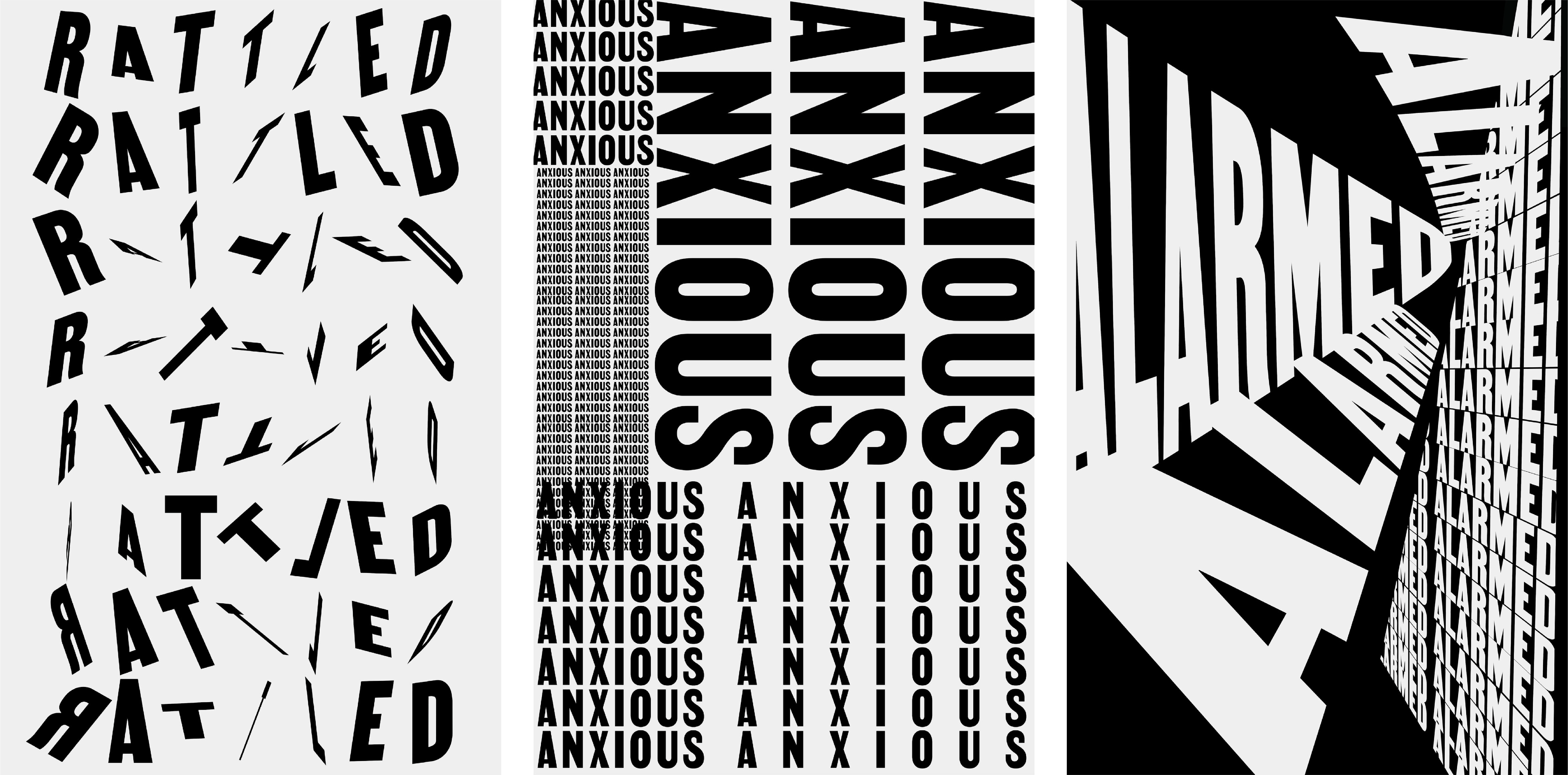
In that way, basic typographic techniques such as scale, hierarchy, and composition are primary to our ability to persuade audiences to engage. Typography has tremendous linguistic and emotional power to provide a vocabulary for people who often don’t get a say. It manifests a visual voice that recognizes their personhood. In social justice work, we are sensitive to our role as mediators for this content and try as often as possible to foreground people’s beliefs, hopes, and aspirations with first-person, direct quotations and dignified portraiture.
We take on projects only if we feel like the client also believes in centering the experiences of the people who are living out the stories we are telling. When we are treading into uncomfortable territory where people’s stories are being exploited or undermined, we try to be kind yet honest, setting clear expectations for the baseline of dignity we expect. The vast majority of clients embrace this, and we ourselves need to be open to critique and change, regularly evaluating whose stories we should be retelling and under what circumstances.

Describe a day-in-the-life at Isometric Studio.
Every day at Isometric Studio begins with an all-staff meeting for a check-in and review of current projects. The pandemic has normalized remote work, and this meeting has become a vital part of our day for both practical reasons and a sense of community, connection, and collaboration. The pandemic has allowed us to collaborate with team members internationally, and our team meetings across time zones and borders with staff from New York, London, Italy, Brazil, and more. The remainder of the day is variable. From design work to client meetings and site visits, the constant is that our small team is in regular contact on Slack. At the end of the day, our team shares what they’ve worked on with a brief message and a packaged Dropbox link.
How do you tackle new clients?
In terms of new clients, we review most inquiries and RFP’s with the team so everybody can weigh in as to whether the project is in line with our mission and bandwidth. Lately, as a studio, we have been reflecting on what kinds of collaborations spark joy for both us and our clients, and we are focusing on these.
With new clients, our first step is a kickoff meeting and benchmarking process so that everyone is on the same page. We want to ensure we start off on the right foot, and this applies both to the project as a whole, as well as individual meetings and interactions. We believe it is crucial that both sides agree on the scope of the project and are aligned on key parameters. This includes practical considerations such as timeline and budget, as well as intangible values such as mission and goals.
From an interpersonal perspective, we encourage realness, humor, anecdotes, and sincere communication. Client relationships are like any others, and nurturing a good-natured and mutually supportive working dynamic is vital. Early in the process, we think it’s key to decide who from both the client team and our team need to be in what meetings and what their roles are. We then create a timeline and a plan on who will tackle which parts of the project.
The Type Drives Culture conference is a global conference. How does Isometric Studio consider international identities and issues in your work?
Our team, though small, is made up of global identities that cross four continents, so an international engagement with design is endemic to our practice. That said, many clients and their audiences are based in the United States, which means that we often have to go the extra mile in getting clients excited about multilingual identity and type systems. We love exploring new type systems and are indebted to our colleagues who have produced incredible recent innovations in non-Latin type design.
A few projects, like Liberty Asia, which has to do with human trafficking in East and Southeast Asia, required first-hand ethnographic and photographic engagement in Hong Kong, Thailand, and Cambodia, with type design that originated in letterforms we saw in the field. Other projects, like our design for the AIANY Design Awards, use multilingual typography set in the top 10 languages of New York. An upcoming exhibition at Poster House on Soviet avant-garde film posters modifies supergraphic Latin letterforms to give them a Cyrillic character, providing the Cyrillic type at a smaller scale for added effect.
Our particular perspective as immigrants—often at the periphery of the dominant narrative—allows us to assess problems with more criticality, as well as openness and creativity. We try to be good advocates for our own communities, as well as to bear witness to the historical and systemic injustices experienced by minorities in this country. We understand that the United States is a country of immigrants, so all our projects are somehow about cultivating a sense of belonging.

Any new faces of design we should be aware of right now?
There is a whole new wave of Gen Z design that is appearing in full force in the portfolios we have received over the past year. This is really exciting, especially among younger designers who are seeking a personal vocabulary beyond trendy Insta-ready mannerisms. It’s like seeing the Billie Eilish or the Lil Nas X of graphic design.
Contemporary type designers we admire include Beatriz Lozano, Tré Seals, and Corinne Ang, who are all exploring vibrant typographic expressions of their personal heritage. It’s also inspiring to see organizations like The Creative Collective NYC and The National Organization of Minority Architect Students generate networks of support on social media. We are also inspired by the recent Radical Return and As, Not For: Dethroning Our Absolutes exhibits that have focused on the work of designers of color. We hope to see more presentations of work by a new generation of minority designers who are currently working.
Where do you imagine type in the next 75 years?
We hope that the shared trauma of the pandemic and Trump years has and will continue to foster a greater awareness of designers’ role in challenging unjust systems of oppression. This occurs both in terms of what kinds of clients and content we choose to support with our work, as well as the culture of our own workplaces, which will hopefully evolve beyond the cut-throat agency stereotype where people throw temper tantrums, everything is “urgent,” and designers are stuck in toxic settings where their work is undervalued.
In the next 75 years, we hope that typographers and type designers will continue to challenge the canon in more explicit ways. 20th century typography is often remembered for insular, disciplinary debates about “crystal goblet” vs. “experimental” type, modernism vs. post-modernism, etc. But if you look closely, the Bauhaus was trying to create a utopic (albeit misguided), universal vocabulary to relieve the horrors of war.
Designers like Rebeca Méndez, Lucille Tenazas, and Emory Douglas were trying to expand the boundaries of typographic and graphic expression to challenge white-dominated capitalist structures. However, if you look at the folks recognized by our industry and taught in history books, they still tend to be predominantly white or white-adjacent, designing in English, Dutch, French, or German. The problem is that design history and scholarship are tendentious and exclusive; authored primarily by a few white luminaries who are friends with limited circles of other white people, and that dictates what is recorded and valued. Reforms are enacted via aggressive, institutional cancellation, and often without a true rethinking of how this time will be different.
This is tedious and needs to change. Arabic, Asian, Cyrillic, Indic, and other non-Roman alphabets need to be part of the core curriculum, as does a history that privileges and celebrates minority type designers and typographers. Design students should be required to set type in at least one other script and language, and schools should pay international experts to teach those writing systems. Publishers should publish ten books by minority design authors for every book they publish by a white writer.
We should abolish awards and competitions, replacing them with more supportive formats that allow people to share their work in non-hierarchical yet considered ways—without a paywall to entry. At Isometric, we too are part of the system that needs to change, and we are excited to explore ways in which we can work with others to think of the design community more as a coalition than a membership, a union of practitioners rather than a club of competitors.

Any new projects you are excited to share at Type Drives Culture during your keynote talk?
We are designing two exhibitions that will open on February 28 at Poster House on 23rd Street in New York City, both curated by the formidable Angelina Lippert. The Utopian Avant-Garde: Soviet Film Posters of the 1920s features legendary work by young revolutionaries like Rodchenko and the Stenberg Brothers, produced in a brief, utopian interval between Lenin’s futurist embrace of cinema and Stalin’s totalitarian suppression of artistic expression.
Ethel Reed: I Am My Own Property explores the brief, illustrious career of the prolific Art Nouveau artist whose career was beset by a male-dominated art world that undervalued her lyrical and popular work. Aside from the sheer excitement of adapting historical type styles to contemporary effect, we love working with Poster House, which has quickly become one of very few graphic design museums in the United States.
We will also show a preview of visual identity and signage for the National Black Theatre, a venerated Harlem institution founded in 1968 by Dr. Barbara Ann Teer to cultivate and elevate Black artists and to center theater as a liberatory social practice. The project is currently under construction and will open in a few years, and we’re so excited to offer a peek into the typographic and signage systems we are developing for their new home.
How does your studio measure success?
The pandemic has been devastating and humbling, yet also liberating. It has put into perspective what really matters and put our attention on the shared impact our team can make on issues that matter to us. We tend to take things a week at a time now and measure success in more modest ways. It’s nice to be recognized for our work on an institutional level or to get the opportunity to work on interesting projects that align with our values.
And there is always the practical matter of keeping the studio financially healthy. But honestly, we feel a lot of joy from meaningful conversations and interactions within our team and with our clients. We are excited to shape digital and physical spaces that promulgate an ethos of belonging. We aim to define success through the lens of kindness and grace, forgiving our own mistakes and those of others. We work to take a stand for what we believe in, bear witness to injustice, and raise our voices against it. We hope to keep striving towards a culture and body of work that amplifies inclusion, equity, and justice.


