You both had established careers in type design before coming together as XYZ. What prompted the partnership?
Ben Kiel: Jesse and I kept on hiring each other, and it started to become clear that we worked well together. We were at similar stages of career when we decided to form our partnership, having worked for foundries and both doing a mishmash of client work as independents, I think we both wanted something of what we had when we worked at foundries, but also to keep that spirit of independence.
Jesse Ragan: Our first project together was when Ben was at House Industries, back in 2008!
BK: Showcard Stunt back then.
Were you splitting the same tasks or dividing up the workflow in a specific way?
BK: The splitting really depended on the project back when we hired each other.
I have an ongoing ticker in my mind for every time a type designer says “it depends on the project.”
BK: It is my only answer.
JR: We work together on running a foundry and also on designing typefaces, and the way we approach each of those is different. I make Ben do all of the money stuff, because I hate it. Also, Ben gets really excited about print specimens, so he takes the lead on promotional graphic design… and then I nitpick it to death. (We also have collaborated with some great graphic designers on branding, print, and web.)
BK: Jesse does a lot (most?) of our copywriting, as he’s got a finely tuned sense for that. We both do typeface design, client management, proposal writing, business planning, overall marketing strategy. The client management through marketing strategy things are always done in collaboration. The type design happens with one of us as a lead designer, the other one offering feedback and suggestions.
JR: I drove Ben crazy at first with my reluctance to let go of control for some things, which ended up doubling a lot of our work. A big learning curve for me in forming a partnership has been to delegate different tasks for us to do independently, and I think I’ve gotten better about that.
BK: Jesse’s being kind—I did the same. We’ve both gotten a lot better at it; I think partly we worked independently for the amount of time we did because we liked to do it all, but now we can pick what we really want to focus on.
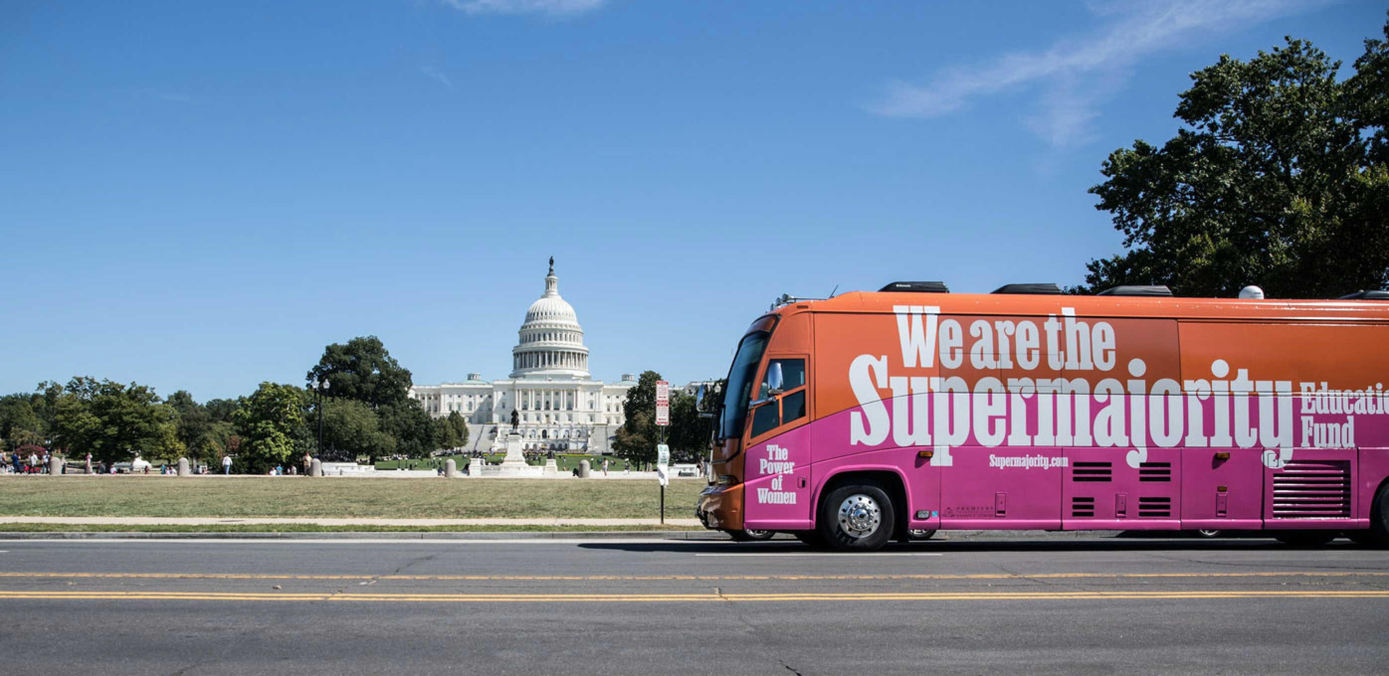
Lettering for Supermajority based on Ballast.
Can we talk about control and systems?? As type designers, you’re constantly inventing a system, right, so the system has to make sense in your head, which means you have to control its parameters?
JR: You have to be a bit controlling to be a good typeface designer, don’t you? Strongly opinionated and willing to see things through to final polish.
BK: We don’t lack for that!
Right! I think type designers have to be control freaks to a certain extent. And so partnerships, collaborations, etc. —how those are set up are really interesting.
JR: If I’m being honest, in an ideal world I would prefer to spend most of my time designing type, not all the things that go into running a business. So it’s really nice to have someone to share that workload with, especially when some things that are burdensome to me are fun for Ben. And like Ben said, it’s worth it in the end, having full control over our foundry rather than working for someone else.
BK: I think the thing that actually has come fairly naturally to us is the communication needed for both of us to keep the system in head. We’re forced to; being in two different cities.
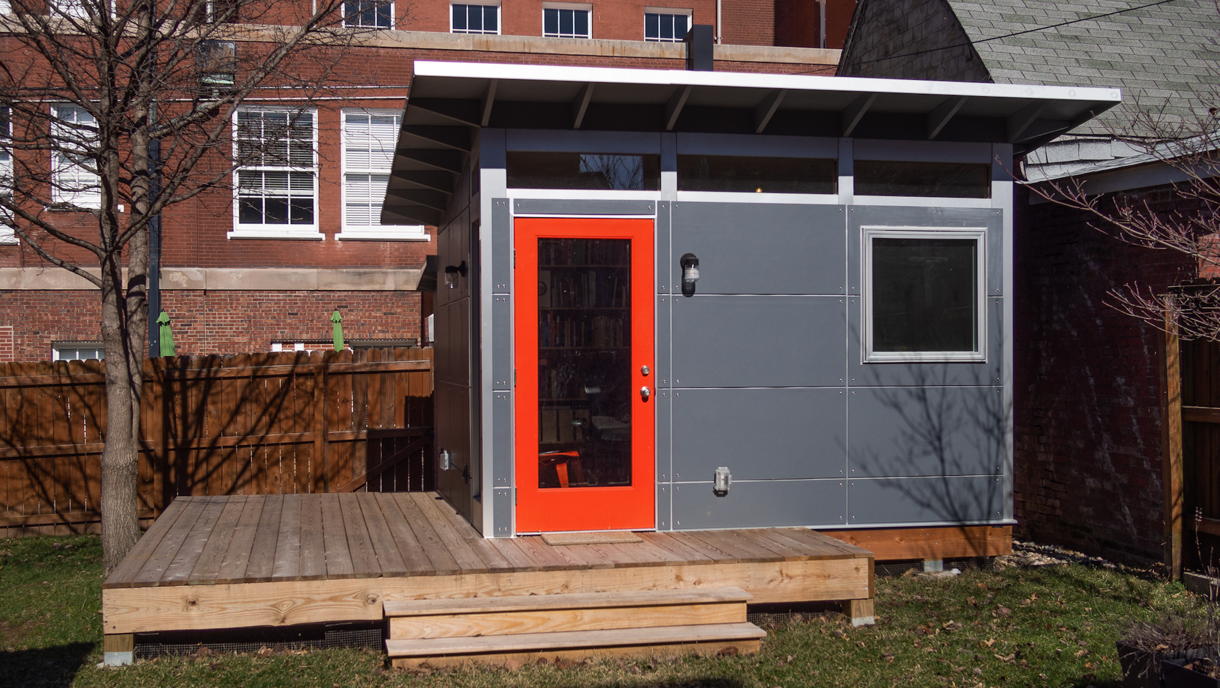
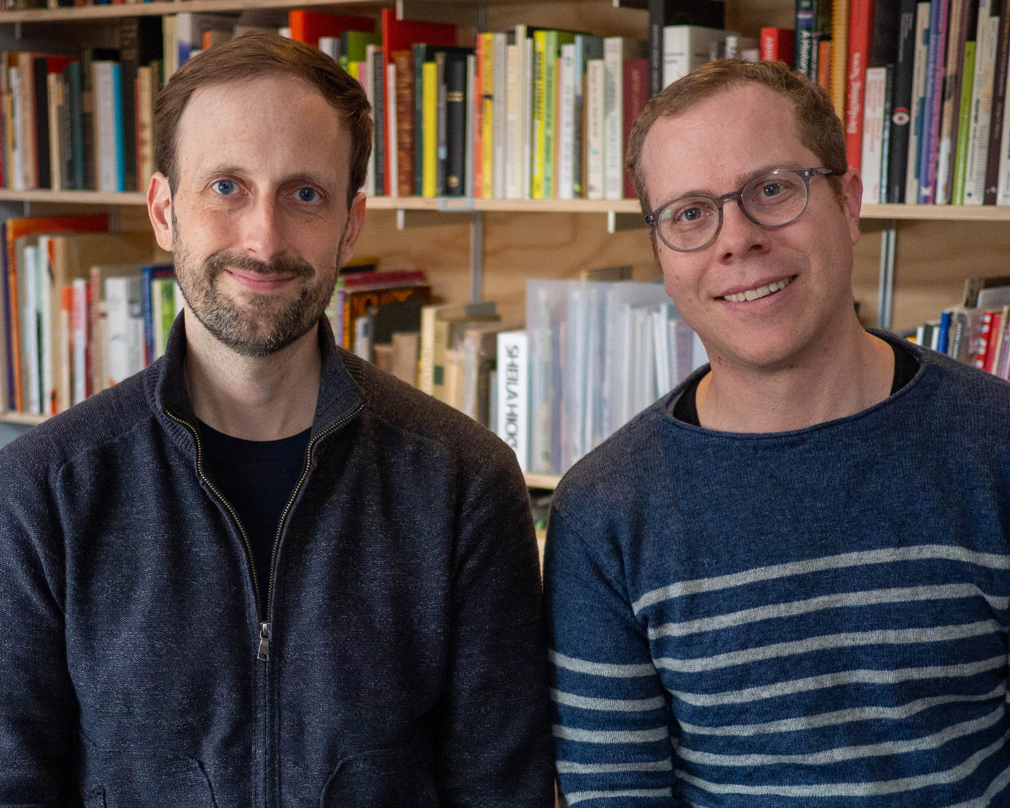
XYZ St. Louis office, where Ben Kiel works.
As more and more people work remotely, what would you tell others about how to communicate?
BK: We video chat a lot, having that interaction has been key. You hit a point where typing is just longer, and you hit the video button. We also meet in person at least once, if not twice a year, that’s been key. And we’ve had to learn to be upfront and honest about anything that bothers us.
JR: Early on, most of our discussions were by phone and email, until we realized that a lot of nuance gets lost when you don’t have visual cues. When we switched to video chat, communication became so much smoother. (Yes, I know we are not the first people to learn this.) We have a rule that for any conversation longer than a minute typed out on Slack, we should just be on a video call.
BK: We’ve defiantly yelled at each other.
Defiantly or definitely?
BK: Both!
JR: Sometimes I need to be clearer about what kind of feedback will be helpful when I show something in progress (an early version of a typeface, a sketch of a specimen). This is something I should know by now, since whenever I critique student work, the first question I ask is, “how can I be most helpful to you right now?”
BK: Sometimes we fail to communicate how important a thing is to each other, and find ourselves in awkward conversations because we haven’t let the other person know that something is really important to us (or not at all important / why do we keep talking about this…) Jesse picked up a rule somewhere that you had to say if you gave a shit or not about something upfront, and we try to do that.
JR: It was Cap Watkins’s “Sliding Scale of Not Giving a Fuck”!
I think forgetting to include that information when asking for feedback has caused problems for both of us, where the feedback was either too fundamental (“Burn it all down!”) or too specific (“This stem is one unit lighter than the others”).
How much do you think about the potential uses of the type you make? And to that end, does that inform your marketing?
BK: We do, at times. Some things we just want to make, and we don’t worry too much about the use. But when it comes time to market, then we try to cast things in an accessible form that doesn’t color the design too much. It’s hard sometimes with the name, it can throw things into a category, but then we try to play against that casting when we can … Doesn’t stop coffee shops from using Cortado though.
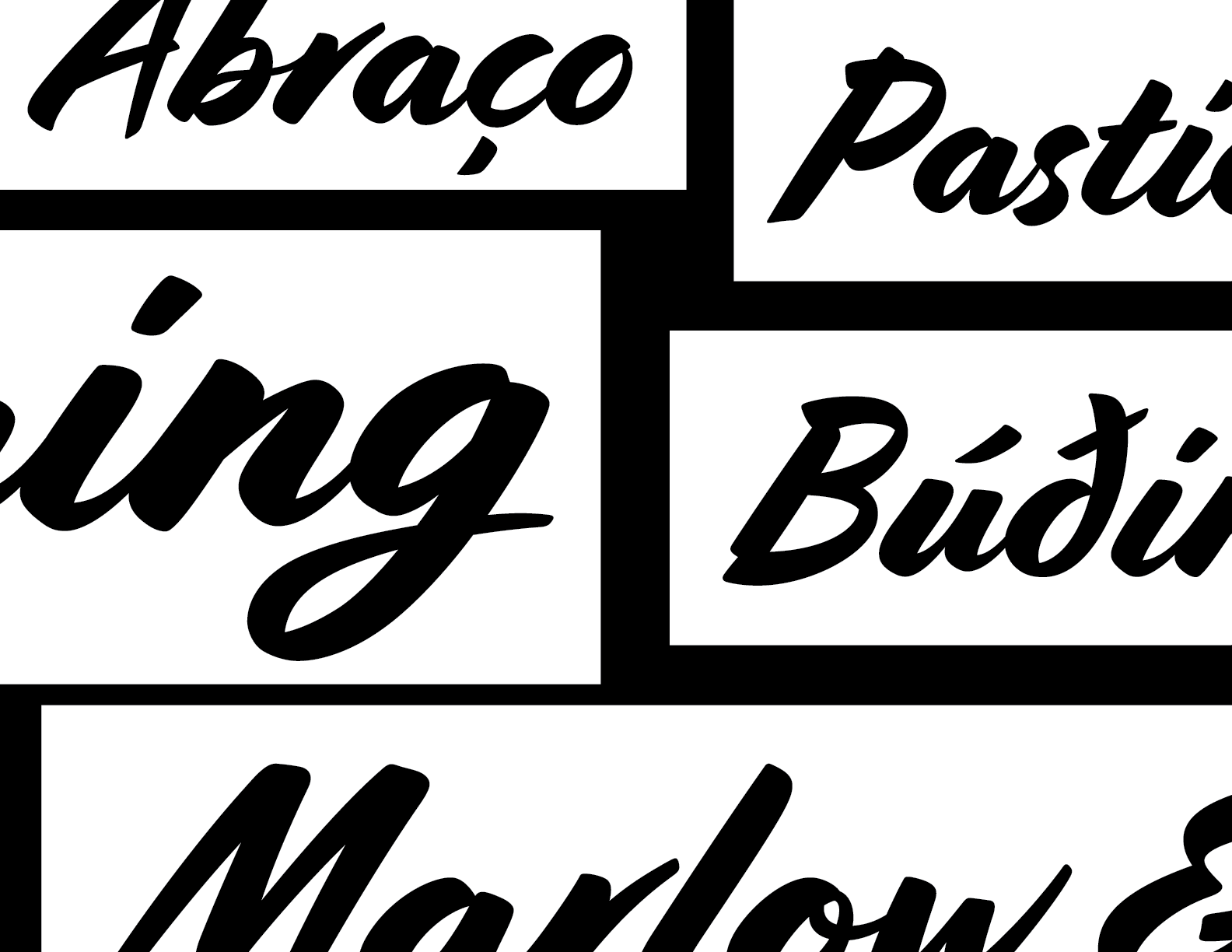
Some of our favorite coffee shops typeset in Cortado.
That’s kind of amazing. Maybe you should name one “Currency”. So with 35 years of experience between you, what’s your current creative state looking like? Be honest. Are you still stoked about making fonts? Do you ever think, I’ve made a grave mistake in focusing so much on type?
JR: It’s tough to be excited about designing type in the current state of the world. Is this really helping anyone? Aren’t there better ways I could be contributing to humanity? I’m going to make a really controversial statement here: The world does not need new typefaces.
I am here for it.
BK: Extensional crisis. F@#$% hell, autocorrect. And, here I remind Jesse that we do need clients. And they do need new typefaces.
JR: The WORLD doesn’t need new typefaces, but YOU do. Making fonts does still bring me joy after all these years, and that’s why I keep doing it. And people keep asking for them, so that’s great. And I also really enjoy logotype lettering projects. Usually a branding agency will come to us with an idea that’s pretty far along for cleanup or exploration. It can happen MUCH more quickly than a typeface, and it’s so satisfying to see our work fold perfectly into a well-crafted identity system.
BK: My relationship with the work has changed over the years. I’m less prone to identify every font on a menu, instead I enjoy the challenge of figuring out how to pull off interesting solutions to old problems. And teaching is a good way of feeling refreshed — sometimes.
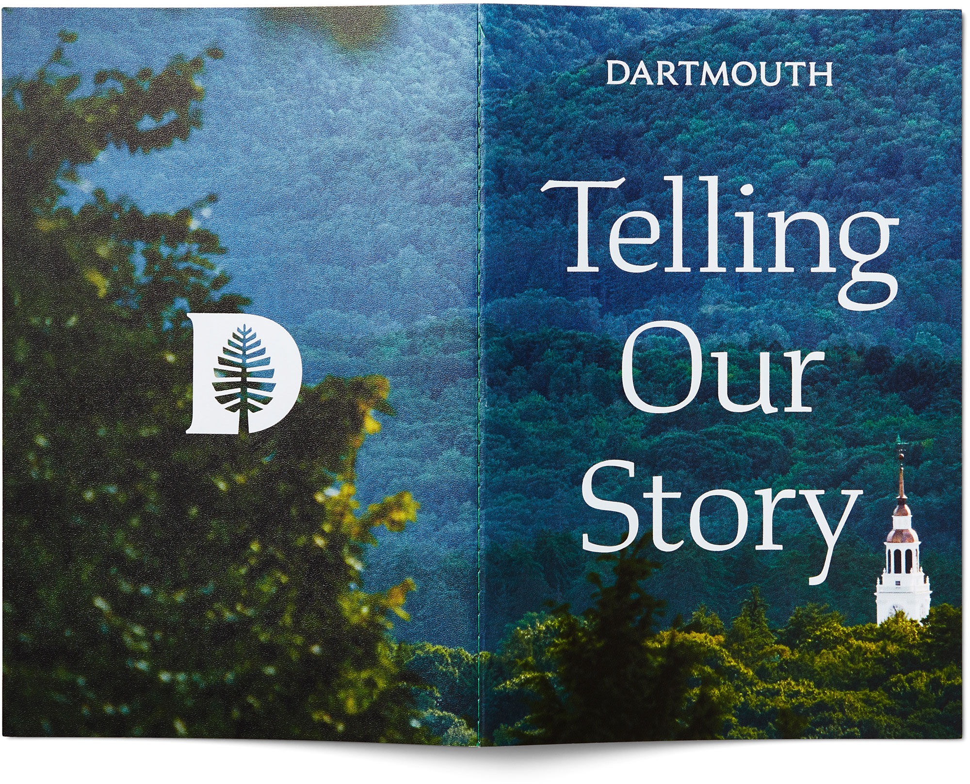
Dartmouth Ruzicka.
Yes, I agree about teaching. It also reminds you of how much you’ve invested into this knowledge and that’s a very special and important thing you’ve done for your brain and life.
JR: Teaching is great! I got pretty burned out from it, though. You have to really enjoy talking in front of big groups of people.
BK: It’s fun to see students take what you can convey to them and run with it. We try to hire newly graduated students to do work for the promotion of the foundry because they have a fresh view of things, or folks not from our immediate design circles.
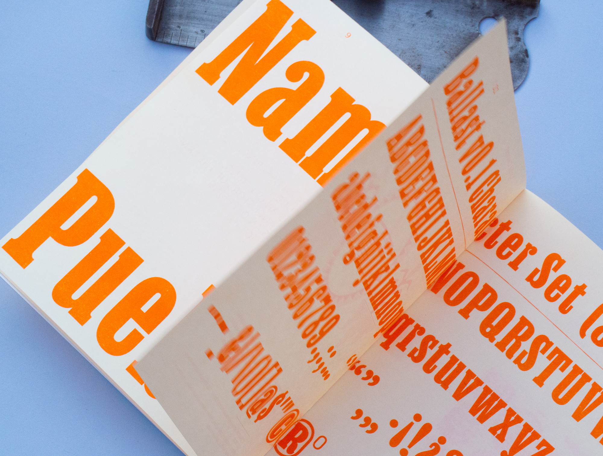
Somewhat intentionally we try to expand who is making things for type foundries. I think that the specimen that Chantal Jahchan and Noah Baker designed for us that was fake band posters did a good job of showing a range for the designs. Also, the one from last Typographics, where it really just focused on a range of scales and less on a stylistic motif did it.
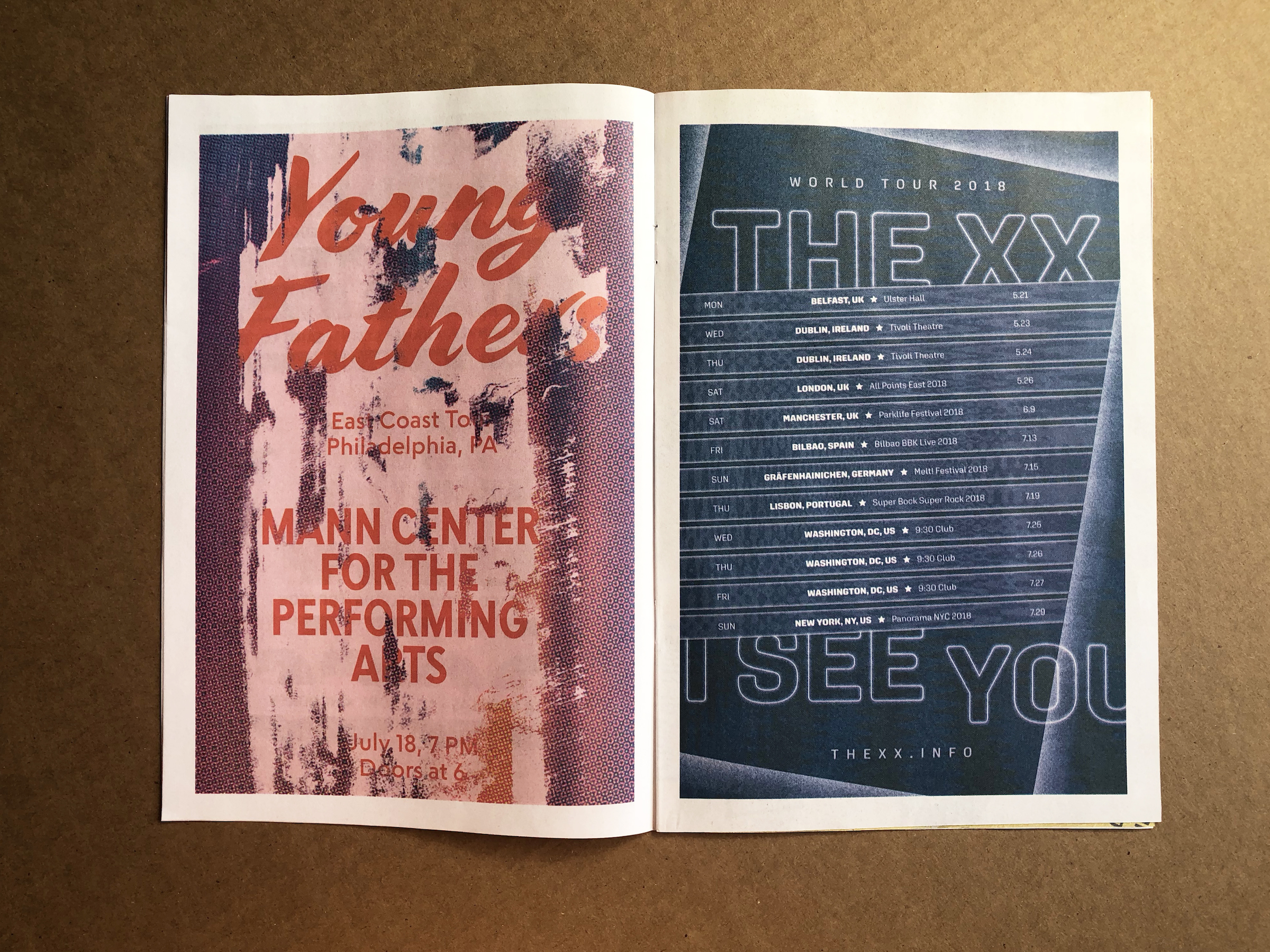
Specimen of fictional gig posters for artists starting with X, Y, or Z. Designed by Chantal Jahchan and Noah Baker.
Do you have any kind of dream scenario you’d love to happen with your work and/or foundry? If a client with money came to you and said ________?
BK: I’m a cycling nerd, so my default is Colnago. They have an incredibly rich history to mine. Honestly, working with designers who use type well and can articulate what they are trying to do with what you design, that’s a thrill. OCD does this really well. I was really excited to do that for them for Supermajority because it also aligned with a cause that I believe in.
JR: That actually happened a few years ago with OCD. They came to me asking for help choosing typefaces for Dartmouth, something that had a tie to the history of the institution. And I had exactly that typeface on my hard drive, waiting to be finished.
What I always hope for is that a client will come along and provide motivation and funding for me to finish one of the many typefaces I started long ago but put on ice.
(There are a lot of them.)
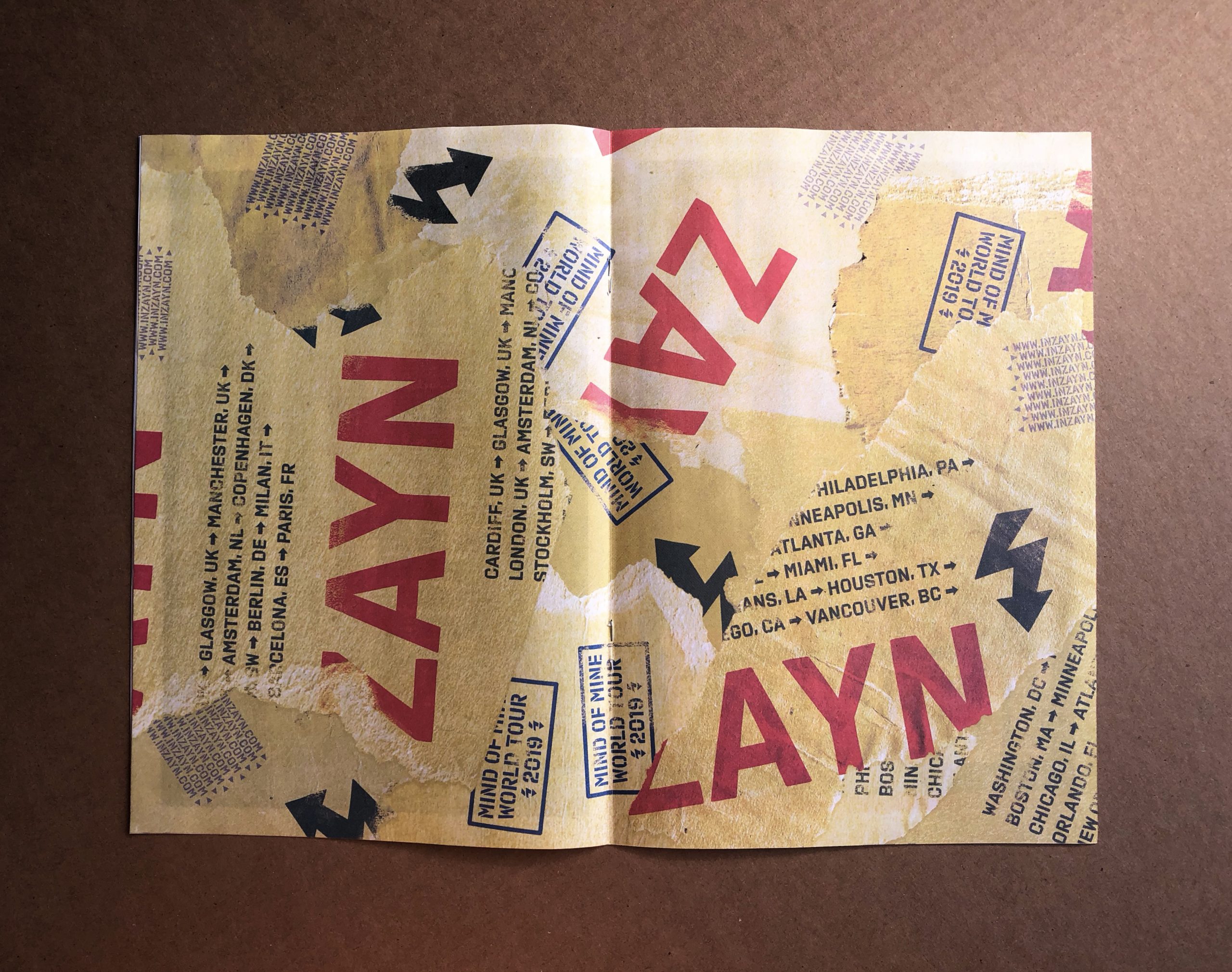
Specimen of fictional gig posters for artists starting with X, Y, or Z. Designed by Chantal Jahchan and Noah Baker.