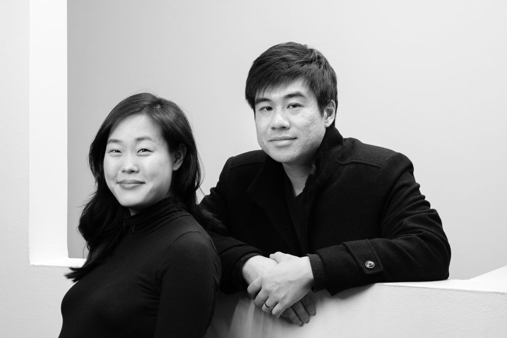
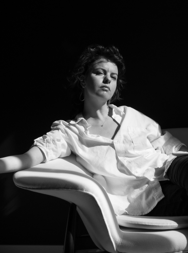
After having discovered that we’d gone to the same undergrad -- College for Creative Studies in Detroit -- a few years apart, we often saw one other at the Type Directors Club, back when you still lived in NYC. You've been an active member of the TDC and an integral part of the larger community for the better part of a decade. I’ve been thinking about my day-to-day activities lately, how different they are compared to the start of my career. The amount of learning the basics of craft and training my eye that were involved in the earlier years of it. I don’t think I ever gained confidence about my work as a whole until I felt confidence about the craftsmanship. I’ve always thought of you as a very good draftsman of type, amongst other strengths. At what point did you feel confident about how you’d trained your eye to head straight-on into type design?
“Fake it until you make it”? I don’t know. I’ve never been very confident about my work. I’m actually becoming more and more unsure of it as time goes on. Experience just seems to mean that I find more things that need to be done better. Getting over the doubt and fear and general insecurities about is a constant struggle.
There’s a lot to be said for naivety.
But specific to your question about drawing quality, I think that might be the easiest part of type design. Managing point placement, managing the weight distribution around a curve, figuring out where to make optical corrections, balancing letterform proportions, and so on. It's just a matter of learning to see those tiny details and relationships. I spent a lot of time studying existing typefaces. I read just about everything I could find about how to draw letters. Especially eye-opening were the Mortimer Leach and Doyald Young books where they explicitly showed good and bad examples of letterform details. Oh, and I was obsessed with drawing things with beziers.
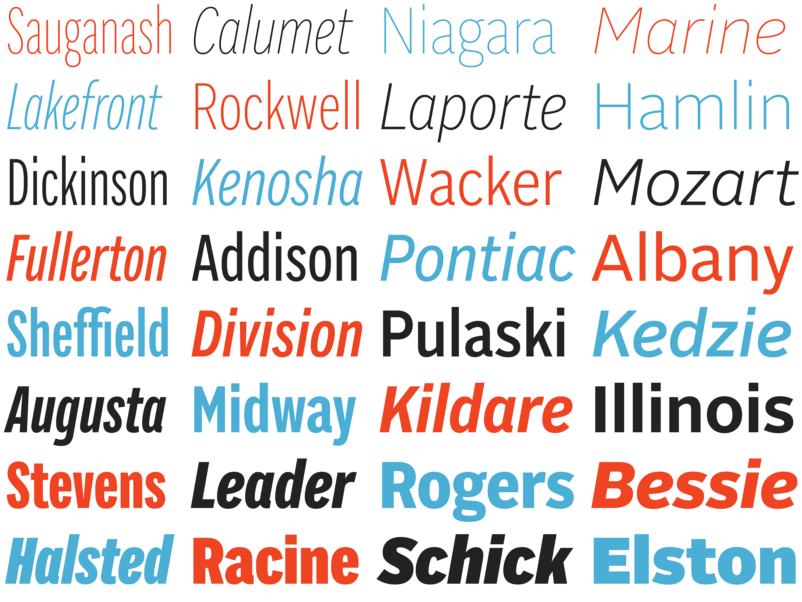
When you and I first met you had only just released Alright Sans, and it occurred to me that that was ten years ago this year! Does that feel like any sort of marker for you, having been your first retail release?
Holy cow, it doesn't feel like it has been ten years.
It's a little surreal to look back on. I'm incredibly grateful I've been able to do something that I love, pretty much on my own terms, for over a decade. On the other hand, it's hard not to be reminded that I'm getting old and want to spend less time kerning.
I am pretty amazed that I've been able to make a living off only a couple of typefaces. A massive thank you to anyone who has ever bought one of my fonts. It means a lot.
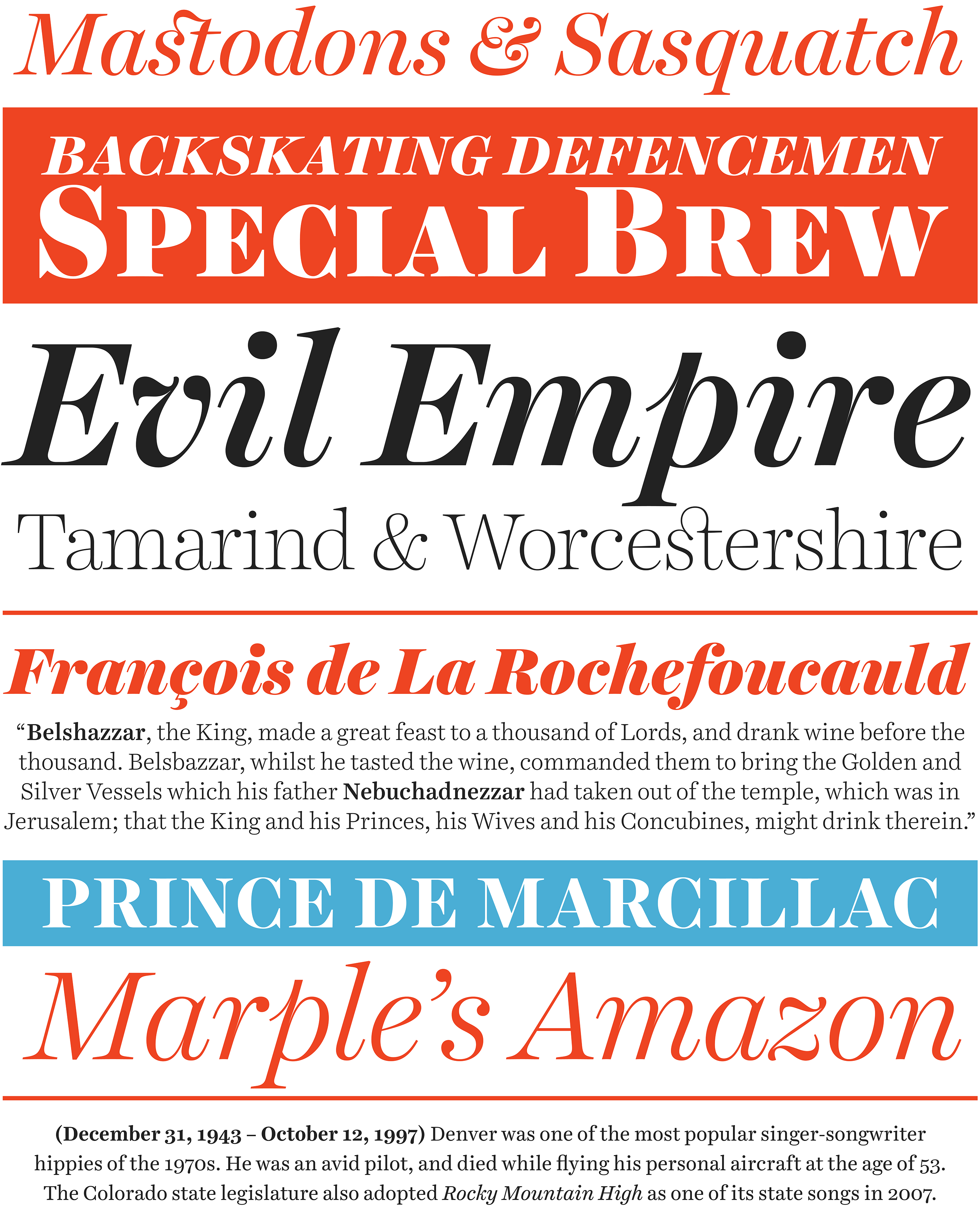
Back when we used to see each other at the TDC, I remember you taking a sort of anti-stance to the notion of ‘release early and often’. You’ve been more slow and deliberate with your releases; what’s your philosophy behind that?
There is a lot of pressure on young type designers. It's an incredibly difficult job to break into and it's just hard to make a living from. Part of it is the right combination of great ideas and design skill. But a huge part of it is dumb f@#$%g luck. Having the right design at the right time. Getting a font used in a high visibility project. Catching the attention of an influential design voice, etc.
Anyone who says "do things this way" is full of shit. What worked for them or me isn't going to work for someone else (wouldn't things be boring they did?). No one really knows what they're doing. With that said, the strategy of constantly releasing things makes a lot of business sense. Smaller and shorter projects have a lower time investment, having a larger catalog means you might have a larger variety of sales, and it increases the chance one of the designs might take off. I get it.
But for a type designer who is just starting out, you need to be damn sure what you're releasing is worth it. Especially now, where the market is completely saturated with unbelievably talented young type designers. When I was starting out, I decided it was better to present a small, concentrated portfolio of my best work. But I didn't a huge portfolio of amazing work. I still don't think I do. I don't want to show work I don't believe in 100%, much less try to sell it.
We should probably have warned the readers that I'm a bit of a crazy grump.
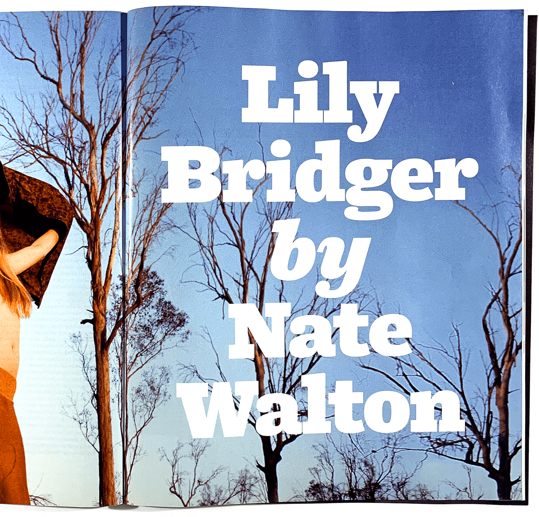
You were a quite successful graphic designer first — where did you work prior to launching Okay Type? Do you do much graphic design anymore?
I haven't done any graphic design for money since releasing my first typeface. Nothing.
I went to school for graphic design and then worked at a big "strategic brand consultancy" for three years (which feels like nothing looking back on it). It was a design factory, insane hours but big clients and lots of interesting projects. It great experience, I got to work on a lot of great projects and with a lot insanely talented designers. And then I burnt out.
Back then, I really only wanted to work with type. But I was a very green designer with mediocre type skills and, most importantly, zero taste. Sure, I read things like Design is Kinky and could emulate the cool design trends, but that was nothing like the world of corporate reporting and brand identity where anything interesting or fun seems to get smoothed away over a dozen rounds of feedback.
The few years I had to work directly with art directors and clients who more worried about the CEO and shareholders than they were with the design gave me a strong point-of-view that shaped the way I approach type design. My typefaces are pretty conservative. They have interesting ideas but they're more conceptual things that shape the whole project. I avoid things that might catch the ire of an art director who's having a bad day and feels the need to prove their worth. Most of those ideas end up being superficial anyway.
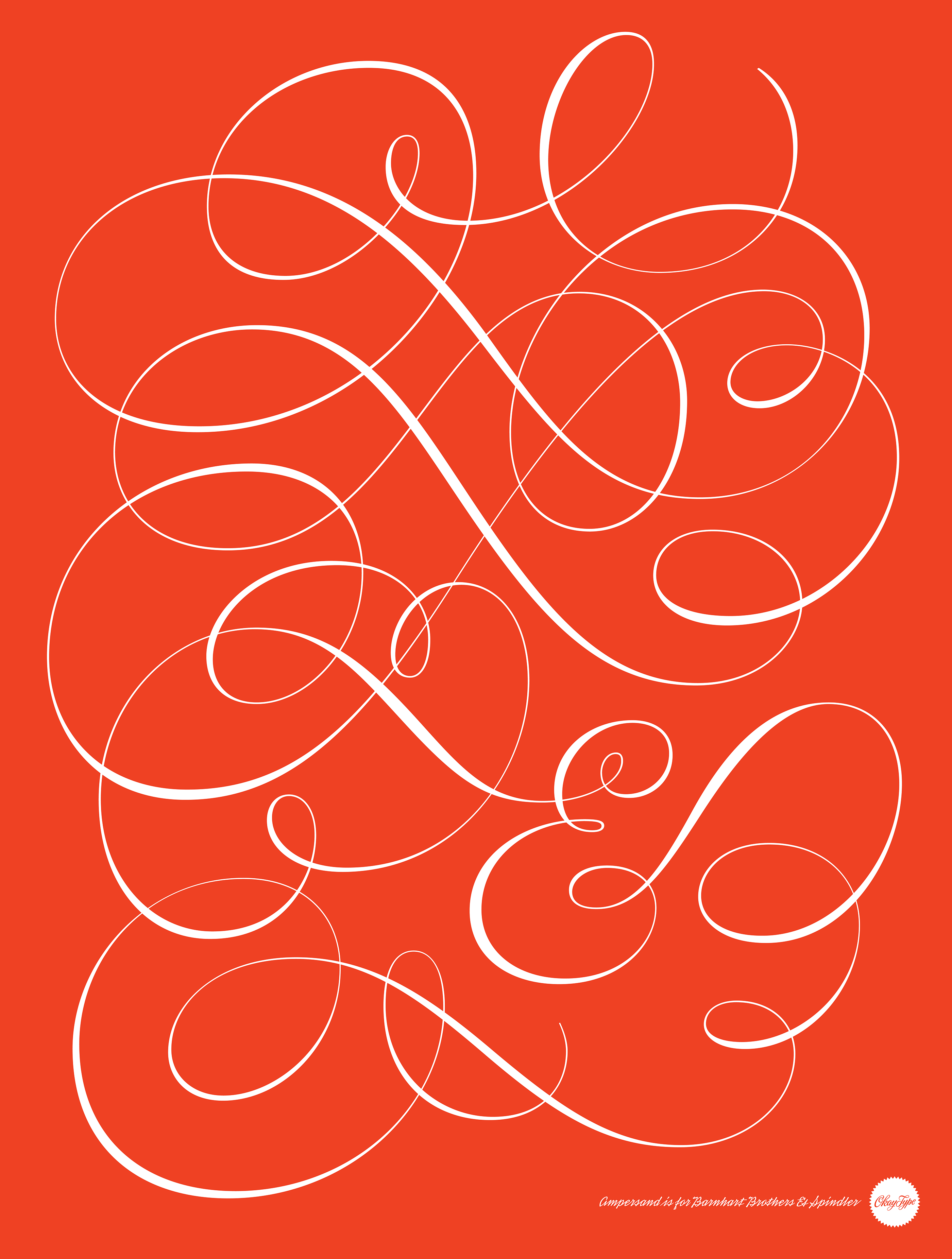
How would you describe that strong point of view? Given your thoroughness, what kinds of questions do you ask in an idea to ensure that the outcome feels properly vetted?
I have a strong idea about how good typography should look. I should have said, “sensibility” instead, that’s a better word for it. It comes from dealing with clients and art directors in the corporate/branding world, where creative and experimental ideas are, umm, generally unappreciated. To me, really great typography manages to have some unique, interesting design idea that soaks through its normal facade to give the reader some vague, can’t-quite-put-my-finger-on-it feeling. It’s that balance of functionality and atmosphere that I really love.
Most of what I do are self-initiated projects that take a really long time. The majority of the “design” part of Type Design happens early in the process. It’s important to figure out if an idea works before investing a huge amount of time doing the production work. Sometimes there are clear objectives or reference materials that can guide those decisions. Problems to solve, client-directed details, source material, etc. But there are a lot of other decisions that are purely subjective or too small and numerous to explore. Personal preferences for one form over another. Having a well-form design sensibility makes that part of the process much easier.
