Elizabeth Carey Smith: I want to talk to you about food, but I think it’s going to be more ridiculous than that. Is anything off the record?
Roberto de Vicq: You can call us “fat”, Elizabeth, but “clowns” -- I’m not so sure.
ECS: What’s your favorite thing to eat without utensils?
Douglas Riccardi: Tacos, of course.
RdV: I dunno.
DR: Spaghetti?
RD: Waffles with maple syrup. No, sourdough bread. I highly recommend that.
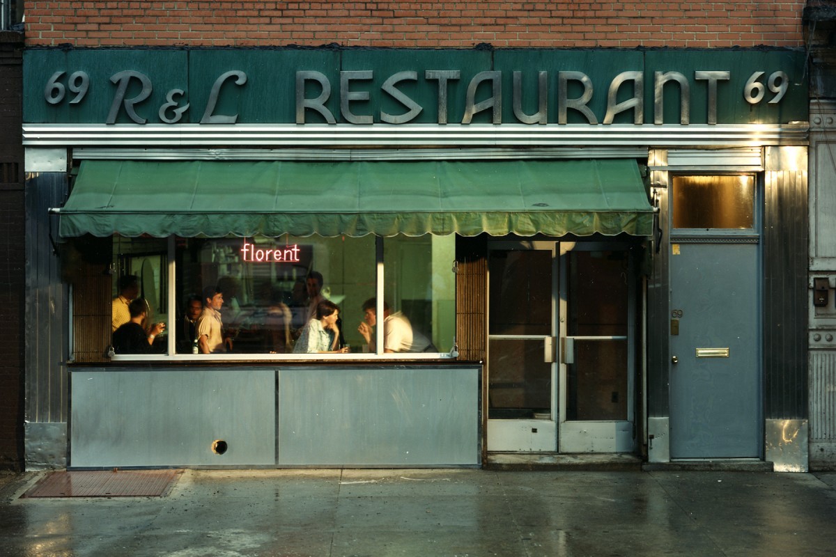 Florent, world-famous 24-hour French/American bistro that worked with Douglas Riccardi on many branding and design projects over the years.
ECS: What happens when Douglas Riccardi, Roberto de Vicq, and Louise Fili are in the same room?
RdV: First of all, we always wanted to be Louise Fili when we grew up. That was the goal. She is God. There’s Neville Brody, there is Louise Fili… there are those people who are so important to you that you really make a mess of yourself when you finally meet them. They’re the reason you start in this business -- because you love the work Louise does. It’s sheer awe.
DR: It’s like, why the fuck do we bother? What I love about going to Louise Fili’s office, is that I don’t do work that even tries to do that. I do like that although we all work in hospitality branding, there are many ways to skin a cat. It’s inspirational, yet it makes us realize that we all do different things.
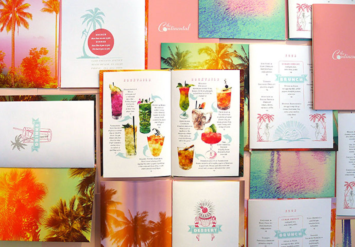 Menu design by Roberto de Vicq for Steven Starr’s Continental Miami.
RdV: She’s extremely talented, but she also has this...she also is a person who will mine history and art history for references. She takes us back through the history that she loves. When I met LF she was art director at Pantheon. Then she left, and I was filling in for the person who had taken her place. I would be sitting there and think, “This is the desk Louise Fili sat at… This is the book she looked through.” It was so overwhelming and amazing. She created a sense of interest for graphic design history. I come from a third-world country, we have no graphic design history documented.
DR: When you go to Louise’s office, and you look at her work … until then, a designer doesn’t realize the degree of creative liberty they have, how far you can push something. It opens their minds about their total freedom and potential.
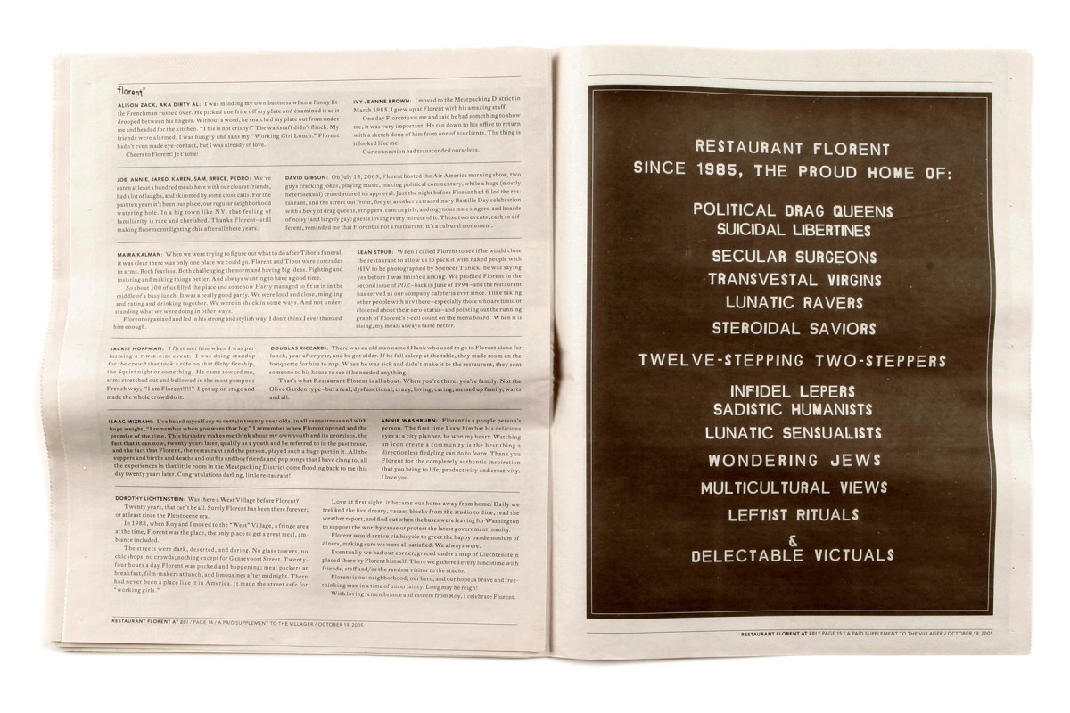 Restaurant Florent ad appearing in September 2005 issue of The Village Voice.
ECS: When you’re analyzing the competition for a restaurant, do you go covert like Adam Platt, the food critic from New York Magazine?
DR: No one knows us. They’re not like, “Oh look, Roberto is here.”
RdV: I can’t imagine wearing a toupée and a mustache, like Ruth Reichl from The New York Times, with all these wigs. The best thing is to go with the client, because they can relax and can tell you what works and what doesn’t. They have an idea how their restaurant will be different from their competitors, so our knowledge is based on their experience. A lot of this is learning with the restaurateur. And then you get drunk a lot.
DR: Exactly.
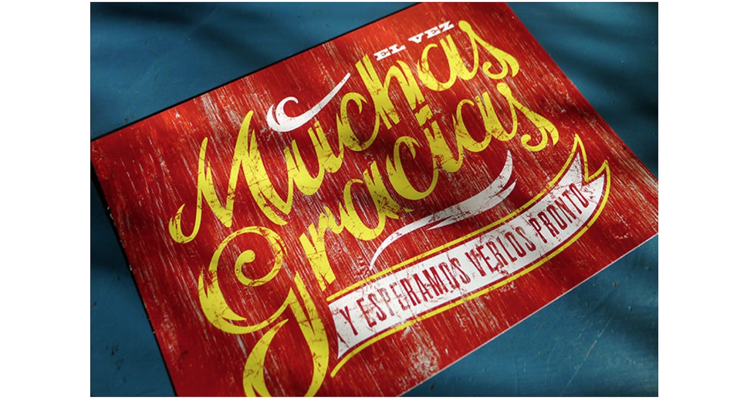
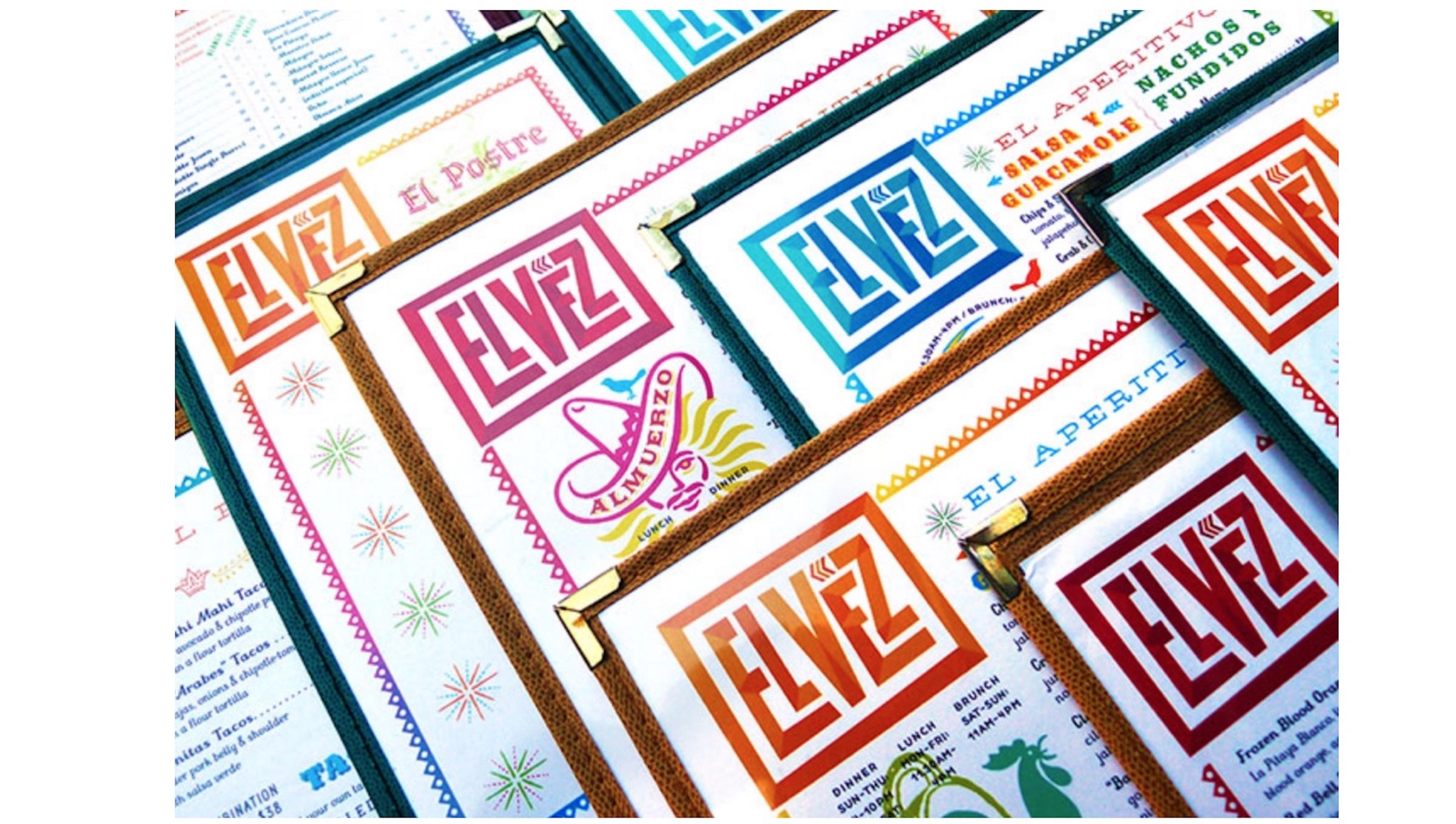 Menu designed by Roberto de Vicq for Steven Starr’s downtown Manhattan restaurant El Vez.
RdV: There was this Mexican restaurant we were doing and I remember, at 3 in the morning we were drinking flights of tequila, and there is this orange slice that had this crunchy thing around the orange. I asked the waiter what was crunching and he said, “It’s meal worm.” I don’t know if it was because I was drunk or it was three in the morning, but I highly recommend crusted oranges with meal worms.
DR: If we have to talk about the grossest thing I’ve ever eaten, it was definitely ant larvae in Mexico City.
RdV: How did it taste?
DR: It tasted like little beans, but then you realized it was ant larvae.
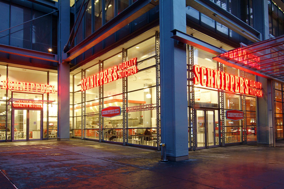
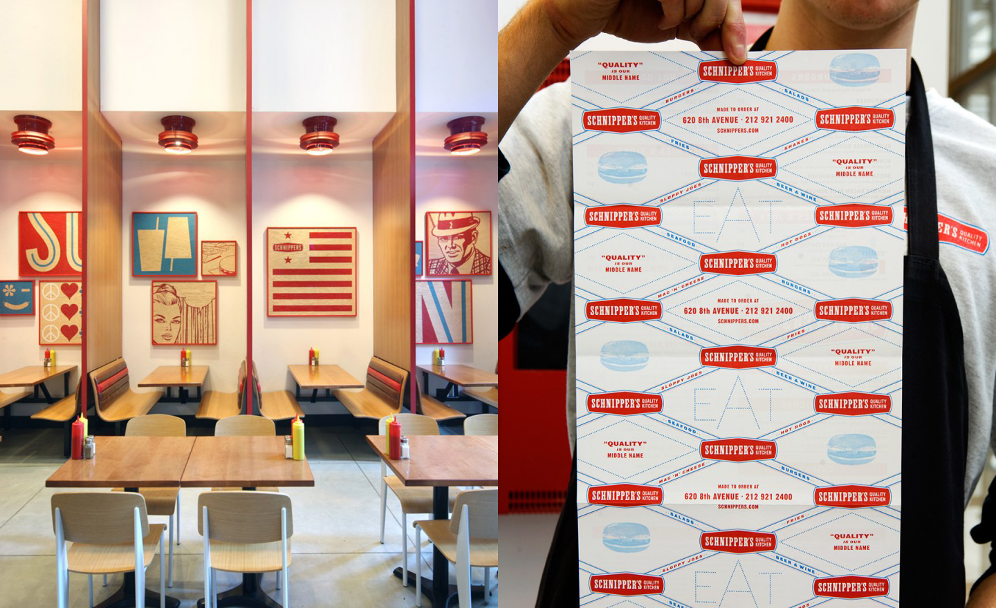 MEMO’s branding and design for Schnippers, a fast-casual New York restaurant with a Fifties feel.
ECS: I used to have this favorite restaurant in the East Village on 6th Street. I loved it because not a lot of people knew about it, and I could typically get a table at 7:30 on a Saturday night. I purposely never told people about it so I could keep it for myself, and then they went out of business. Are either of you personally responsible for a restaurant going under? Was it because of your typography?
RdV: Oh yeah, restaurants have a specific lifetime. Sometimes you do this great work you love and then the restaurant opens and it doesn’t take off. So, they rebrand and make something dumb and generic.
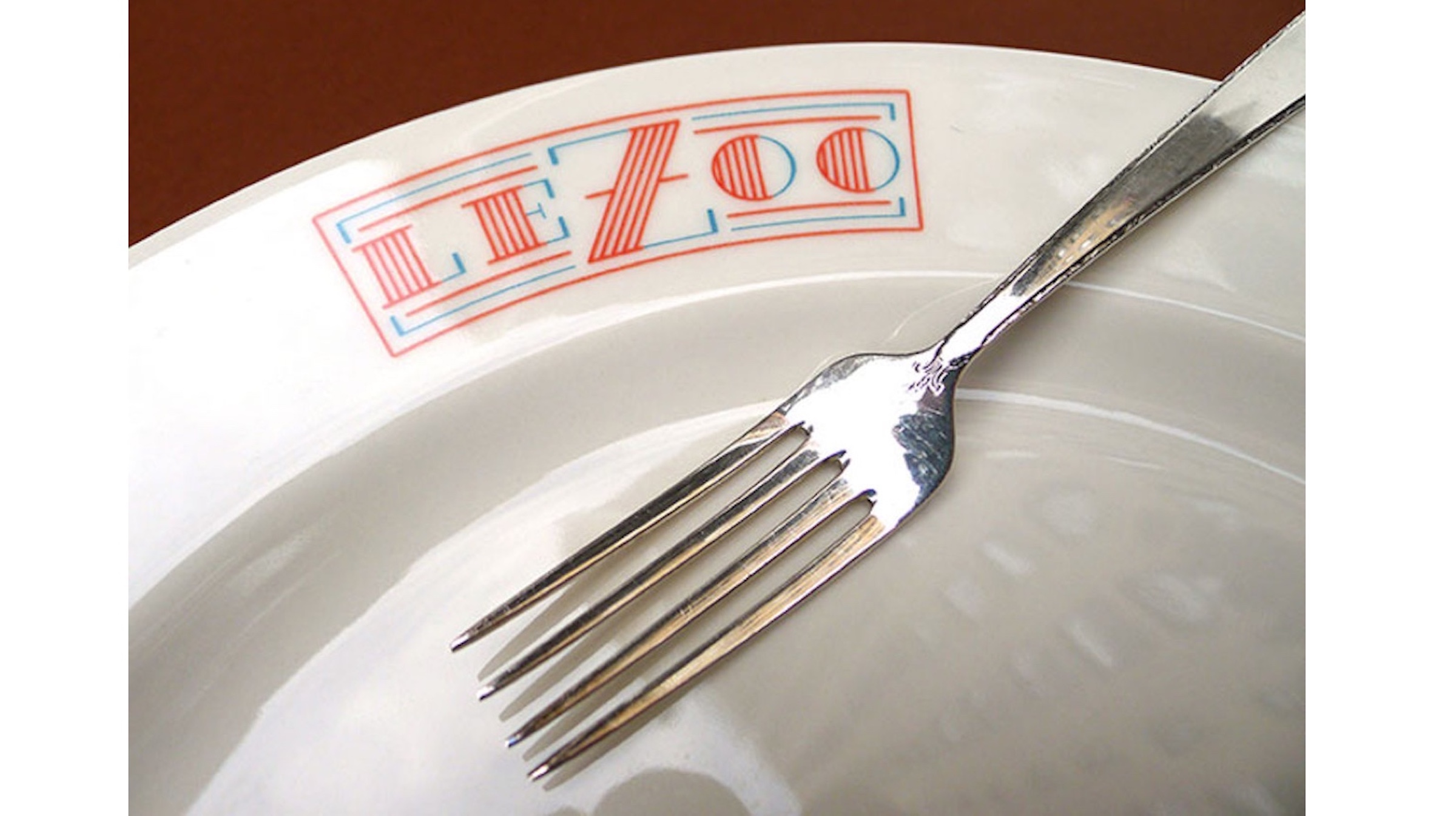 Branding by Roberto de Vicq for Miami’s Le Zoo.
DR: The success rate is low. About 80% of restaurants fail in the first three years.
RdV: One of the first things I teach, that I got from Louise, is the first thing you do is get paid before the restaurant opens. Budget until the day they open.
DR: They all say their food is going to be awesome, but a lot of time you aren’t able to try the food until it opens, and then you’re like, fuck, you’re just an ordinary dumb pasta restaurant.
ECS: Who makes a better sauce, the French or the Italians?
RdV: There is a difference here. Douglas’ family is Italian. My surname is French. I’m all for the butter. You’re more for the tomato, or no?
DR: If you travel to France first, and then go to Italy, then you’re like, “Oh good! I can get a fucking vegetable without fucking Hollandaise all over it.”
RdV: I don’t know, I love the bechamels. It’s horrible, but I love croque monsieurs. It’s delicious.
DR: Pastry. That’s true. Butter is kind of awesome, yeah.
