Tell us a little bit about yourself - what you do and where you work
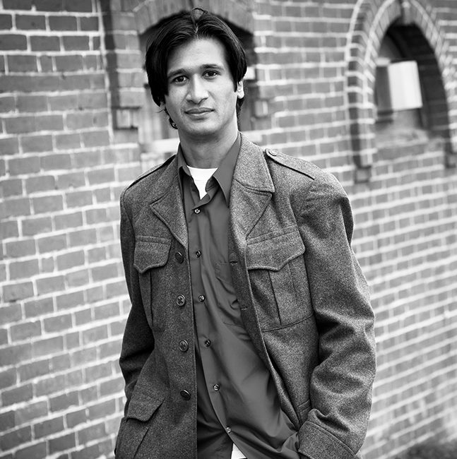
Based out of Portland, Maine, I am the owner of the retail type foundry, Greyletter, and I am the Patel half of JamraPatel, which is a partnership I started with Mark Jamra to focus on non-Latin type design and commercial work.
What is your favorite typeface? And why?
That’s a really tough question to answer, not only because there are a lot of great typefaces out there, but I’m pretty sure the term ‘favorite,’ isn’t one I really use in regards to anything. For the purposes of moving forward, let’s say we were to define ‘favorite’ as something that really resonates with your inner aesthetic sensibilities. If so, then I’d have to go with Frutiger’s Apollo. It’s a very sober and elegant typeface, but upon closer look it has some great subtle details — the swelling of the strokes and the asymmetrical serifs on the lowercase that make those letters look like they are physically anchored down. Apollo is not particularly flashy or expressive, but there is something about the understated crisp forms that really speaks to me.

Grafton Titling is a high contrast through-line display face Neil released as Greyletter.

A sample of the Vai Syllabary typeface currently in development by JamraPatel.
Where do you take your typographic/design inspiration from?
I feed the visual part of the equation in the usual way: by trolling through design inspiration sites and observing the world around me. Beyond that, my studio is across the hall from a letterpress print shop. Aside from the collection of hot metal and wood type, there is a steady stream of etchings, wood cuts and polymer plates being printed. It is great to see how the these techniques interact with the substrate to influence the final result. How systems come together to produce a result is something of particular interest to me. This might be a carry-over from my years as a semiconductor process engineer.
What is your all time favorite piece of design?
I guess I really have trouble with ‘favorites,’ and certainly finding one that transcends time is even trickier.
There is something I do find to be particularly brilliant that is worth mentioning. It is a 1950’s Voigtl änder rangefinder camera that I bought many years ago, called the Vitessa T. Not only is the camera built like a tank with 50’s industrial charm, it has a clever system for setting the exposure. The lens is equipped with a ring that you set to the reading from the light meter. This then automatically locks all the shutter speed options to the appropriate aperture settings. Once it is set, you can adjust the shutter speed to change the depth-of-field — which is communicated via sliding indicators on the lens barrel — and the aperture is automatically adjusted. The whole system is implemented mechanically and it elegantly eliminates the need for multiple manual adjustments.
Where do you see the future in typographic design and typeface design?
Typeface and typographic design are going down some interesting paths. On the Latin front, we have achieved a kind of maturity. Not only in terms of the available typefaces, styles and delivery mechanisms but also in our tolerance for abstraction. The sheer volume of content and marketing media produced in Latin-based languages has driven a lot of variation in letterforms to keep things interesting. I think going forward, we’ll see lot more experimental, generative and interactive typographic design. Alternatively, on the non-Latin front — knowing that this term is really an oversimplified clumping of a lot of unique scenarios — there are only a handful of typefaces, or fewer, available in both physical and digital formats. For some of the writing systems Mark and I have been working on, what is available as digital fonts is not properly supported by current technology. The lack of options coupled with societal/economic pressures really limits the amount of abstraction that can be tolerated. The people in these language communities are not used to reading overly stylized forms. The focus is on having functional typefaces that will simply support effective communication with form that does not deviate too far from the familiar. There is a lot of work to do in this arena and it will be ongoing for some time.
What is your favorite aspect of being a TDC member? / What drew you to become a member of the TDC?
The best part of being a TDC member is being tied into the community. Although I can’t always get down to NYC to attend the various events, I can easily keep up on what is happening in the industry. Just the annual alone is a great way to digest the trends and notable moments of the year. Also, Carol is really awesome!
Links:
Websites: greyletter.com & jamra-patel.com
Behance: behance.net/neilspatel
Dribble: dribbble.com/greyletter
Instagram: @neil.s.patel
Twitter: @neilspatel


