How did this crazy whirlwind begin? Were you a graphic designer first? Was type always your goal and/or interest?
If my interest in type had been clear from the start, it might have sped things up a bit! Initially, I didn’t intend to become a designer at all. I thought I would be some kind of researcher or general smart person. Exactly what kind was not clear. I was interested in so many disparate subjects that for a while, I wasn't sure what to focus on.
In the early days, I taught myself how to put together web pages, and that led to studying in a then-new multimedia design program. I was fortunate to get a solid design education, which included an introduction to type and typography. Instantly it was my favorite class there. It almost felt like type picked me, rather than the other way around. Not knowing how to pursue a career in type, immediately after graduating I turned mostly to graphic design. My graphic design work became increasingly more typographic, and once I discovered type design itself, I realized that it was really close to the language my creative mind likes to speak.
I’m very grateful that I have had the opportunity to walk this long path and hunt down this thing I love, and to hold out long enough to get a beautiful, rare opportunity to practice this craft and learn so much more. I could also have had a fine life if I had gotten stuck somewhere along the way, but keeping up the search turned out to be very rewarding.
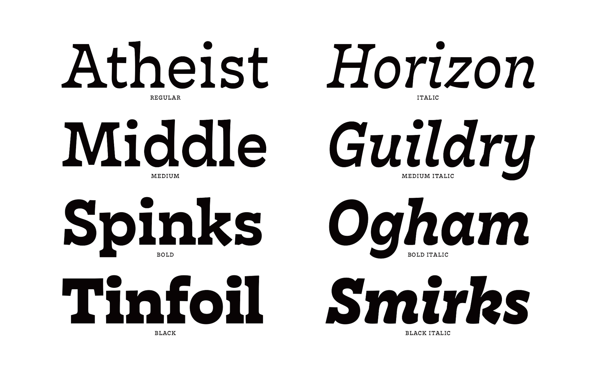 Nordvest, My most recent typeface, a serif text face with subtly stressed horizontals that started as my TypeMedia graduation project (September 2016)
Was there a particular text or book design that prompted this realization?
I don’t think I could point to a single one. Text and language were somehow always there for me. My mother is a writer, editor, and literature critic and my father is a stage actor. Our apartment and my childhood were always full of books, and I read, wrote, and typed from an early age. Letters, too, were always close by. It just took me the better part of a lifetime to realize gradually that making them -- and caring deeply not just about what they say but also how they look and work -- could be the content and center point of a professional life.
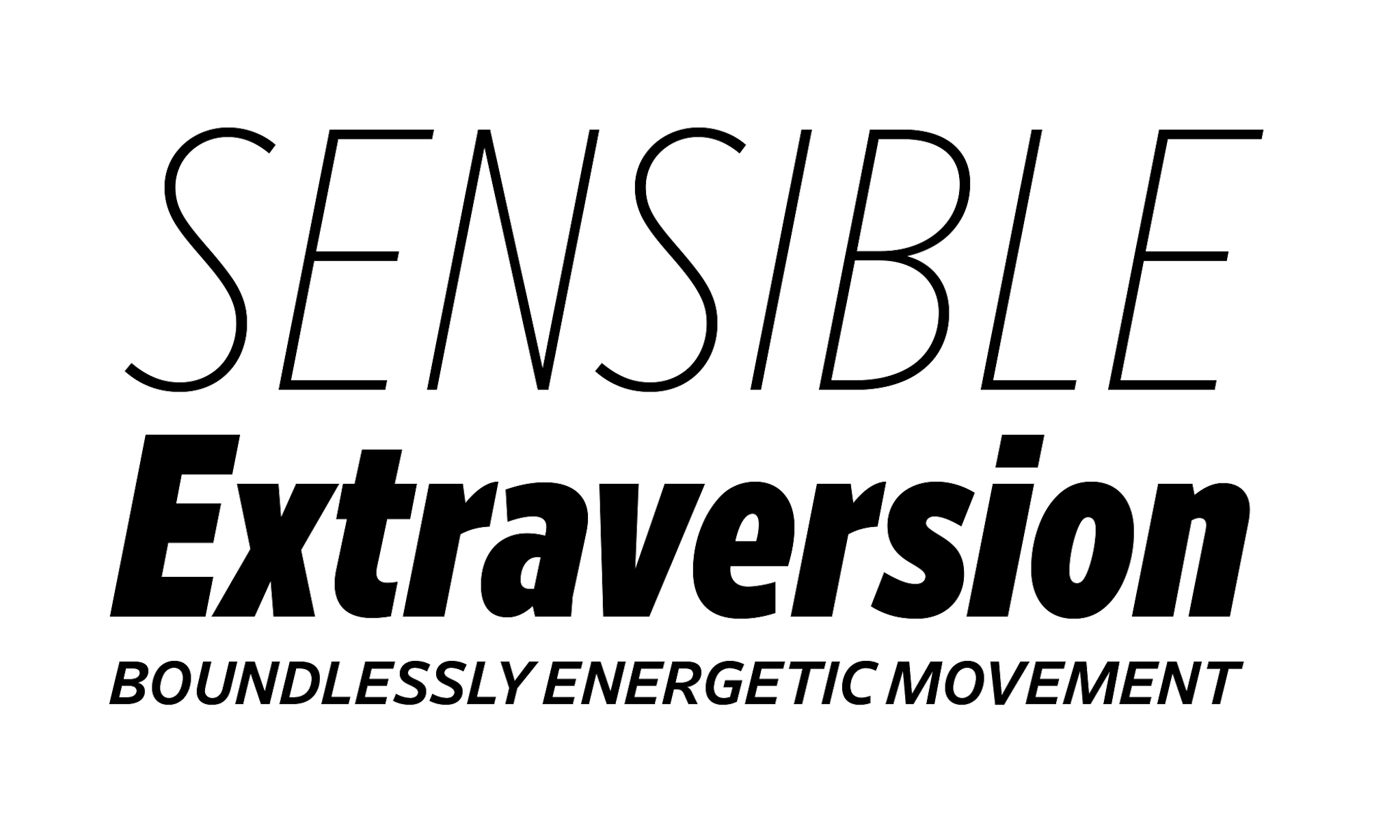 I was honored to contribute some work to Tobias Frere-Jones' Retina (especially the Standard italics), the new release from Frere-Jones Type (October 2016)
You’ve recently moved to New York to be Senior Designer at Frere-Jones, so congratulations and welcome! Is there anything new that you’ve learned about New York City from living here that you hadn’t noticed on previous visits? Have you become jaded yet?
Yes, I had never seen waterbugs! Non-airborne cockroaches were really freaky enough, thank you. I’ve also been practicing getting used to missing lots of events that I would like to see. Seriously though, I do like it here.
One beautiful thing about New York is that even when visiting before, I almost never felt foreign and I feel even more welcome and at home there now. You just kind of blend into the texture of the city, because it matters less where you’re from and more where you’re going. I like that.
It’s been interesting to get to know New York more from the inside. For one thing, it’s less of a mystery to me now how the city gets its incredible energy. Compared to Europe, there’s a certain generosity of imagination, thought, and gesture. Except for maybe Tokyo, I don’t think I’ve ever been in a place with such a dedicated work ethic. I have tremendous respect for that. Inspiration and creativity are certainly important, but these qualities are empty unless followed through with actual work. It seems like a city that collectively allows itself to dream big, but then more importantly goes and gets those dreams done.
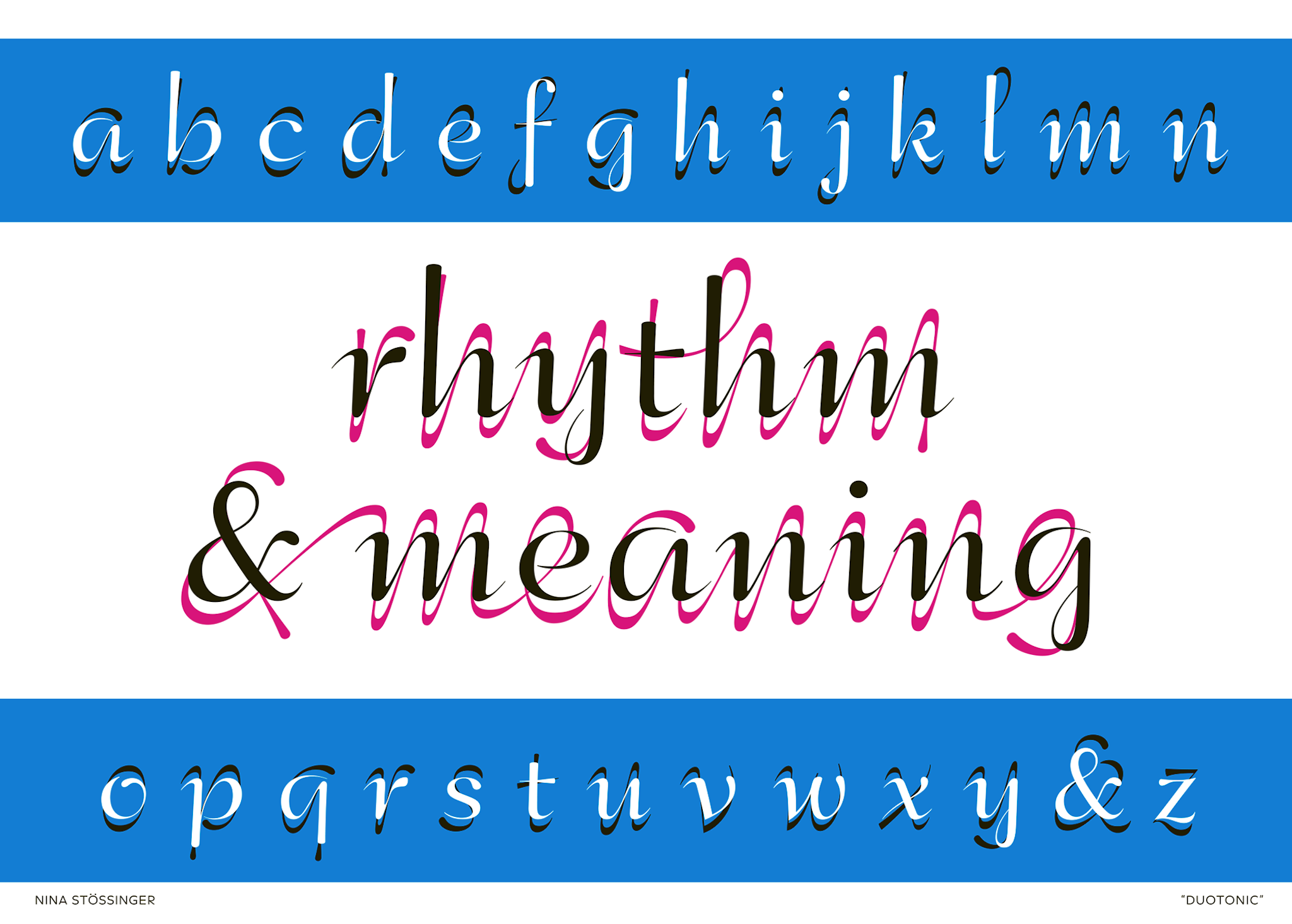 Duotonic, a dual-layer lettering piece created for the Dutch Alphabets publication curated by Mathieu Lommen and Peter Verheul (2015)
Recently, you were quoted in a Tweet as calling a letter “pepperminty”. Do you care to elaborate?
This was something about the angularity of the curves. I was trying something with Retina’s Condensed Thin Italic S. Making the spine a tiny bit more rigid and less curvaceous did seem to make it get up from the sofa and give it a fresh whiff of pepperminty breath. I realized afterwards that more angular/open sans serifs generally smell (taste?) like peppermint to me.
I like metaphors, and often there is no better way to describe how a letterform feels or behaves than with a comparison from another realm. I also have odd bits of synesthesia going on, which is often interesting but can also be fairly distracting and entirely subjective, so maybe this comment was a bit of both. Anyway, I like to think that it made some sense in context.
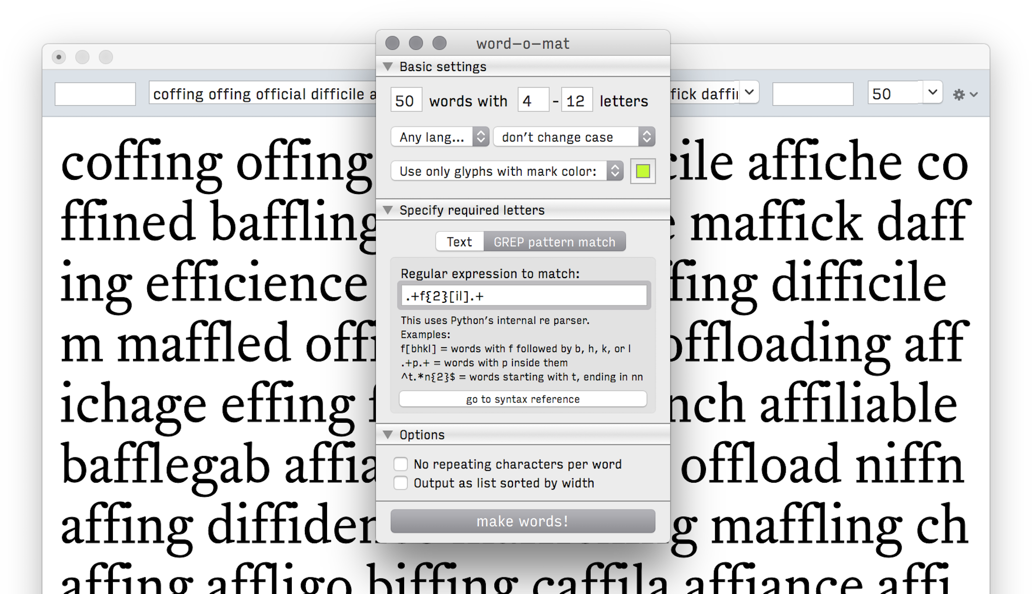 word-o-mat, a widely used extension for the RoboFont editor that generates tailored test words in a multitude of languages (developed since 2014)
What advice would you give to young designers?
I would tell them to remain curious, learn voraciously, and to always be open for things that feel as though they want to inhabit your mind and your world. Cultivate your individual cocktail of things that you know how to do -- things you care about, things you are passionate about. Don’t worry that something you learn might be useless. I’ve been surprised to find that many things -- even the supposedly unrelated ones -- will come back to be helpful in some unexpected way.
It’s also true that you can work on something for many years and feel as though you’re stuck, and then one day, an amazing opportunity falls in front of your feet. And that is just fantastic. So, my advice would be that as long as it feels right, always keep going.
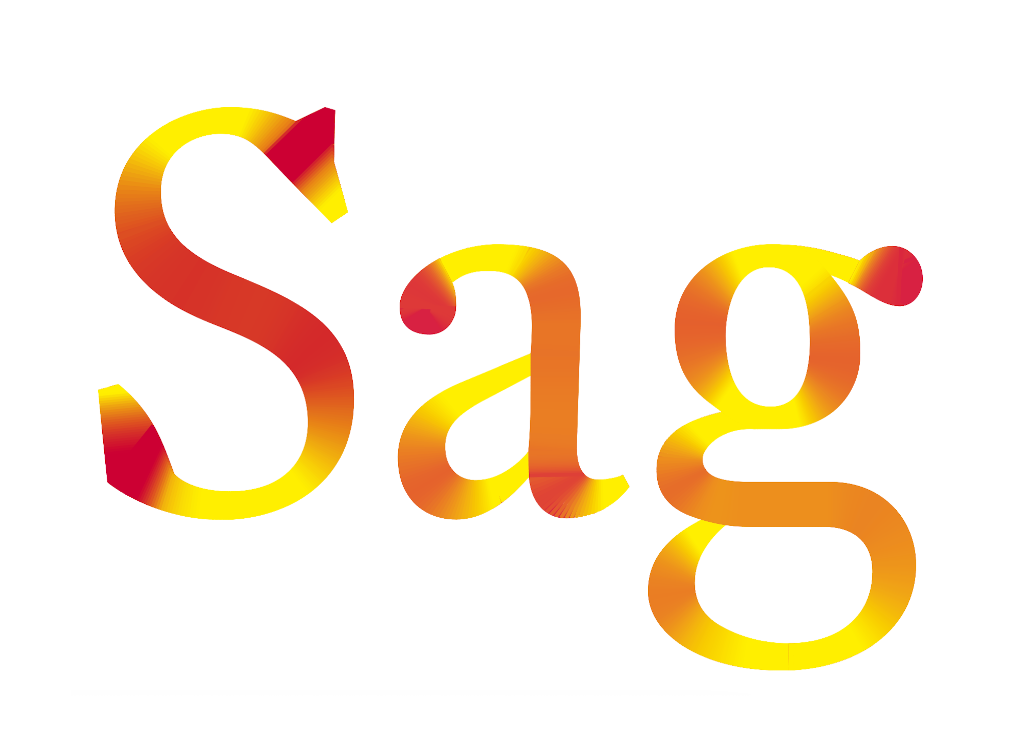 Stroke weight visualization in Python, for Frere-Jones Type (2015); the typeface is a student project from TypeMedia
Links:
Web: http://ninastoessinger.com / http://frerejones.com
Twitter: @ninastoessinger
Instagram: @ninastoessinger
