Tell us a little bit about yourself - what you do and where you work
I am a Pentagram Partner and design identities, environmental graphics, books, promotion and packaging for a wide range of clients.
What is your favorite typeface? And why?
I don’t have a favorite. I like different fonts for different occasions.
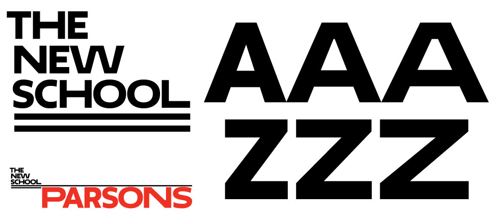
Paula's visual identity for The New School which debuted yesterday
Where do you take your typographic/design inspiration from?
Everything. Books, movies, TV, things on the street, design history, junk shops, pharmacies, everywhere.
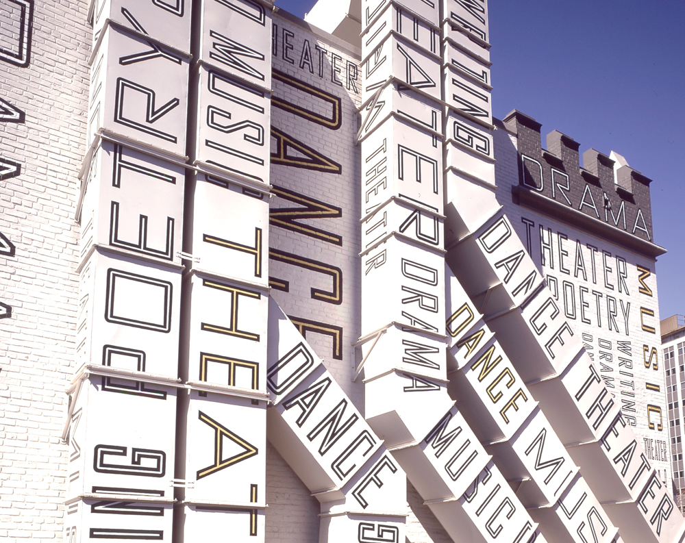 Supergraphic exterior design for the New Jersey Performing Arts Center
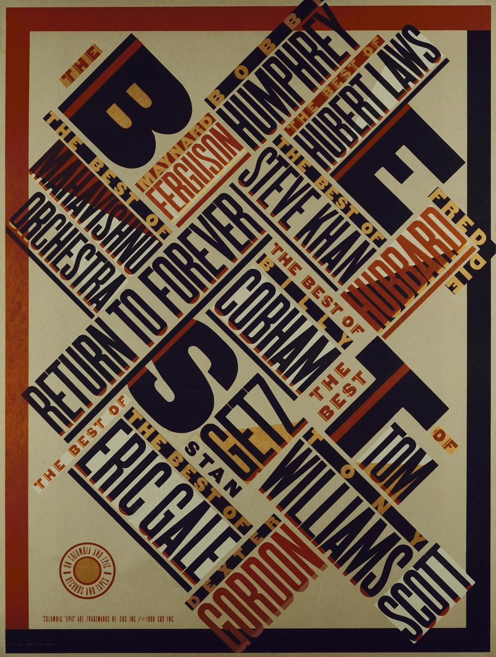 'Best in Jazz' poster designed in 1979 for CBS Records
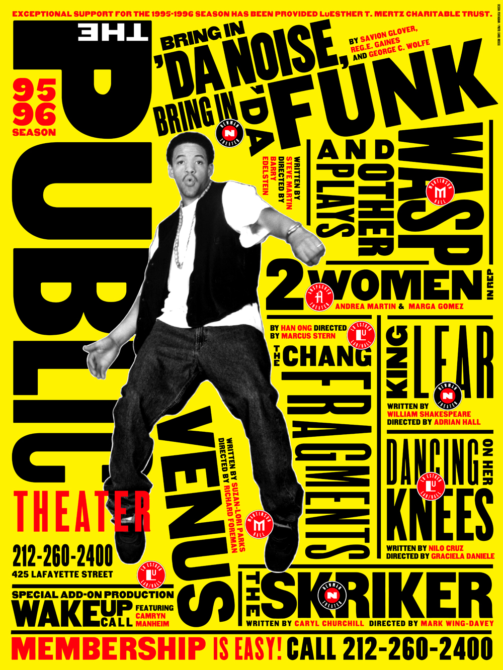 Poster for Bring in 'Da Noise, Bring in 'Da Funk from 1995
What is your all time favorite piece of design?
Probably something by El Lissitsky or Ladislav Sutnar. Brodavitch’s Portfolio.
Where do you see the future in typographic design and typeface design?
I see a future where every business, organization, institution, retail establishment, in fact EVERYTHING has its own bespoke font that operate in spectacular idiosyncratic ways based on the spirit of the organization.
What is your favorite aspect of being a TDC member? / What drew you to become a member of the TDC?
TDC has the best show and makes the best annual.
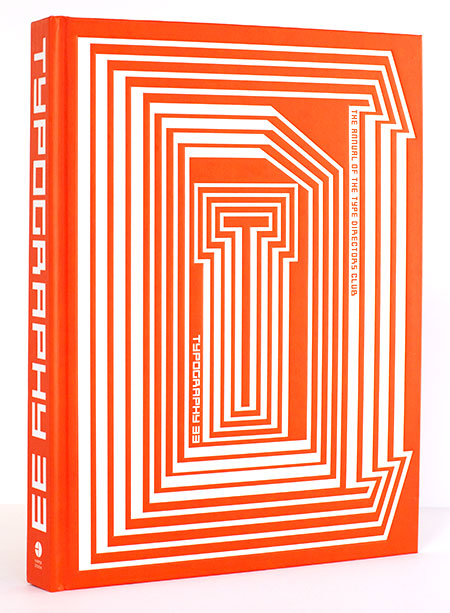 Paula's design identity for Typography 33
Links:
Website: Pentagram.com and paulaschermaps.com
Twitter: @paula_scher

