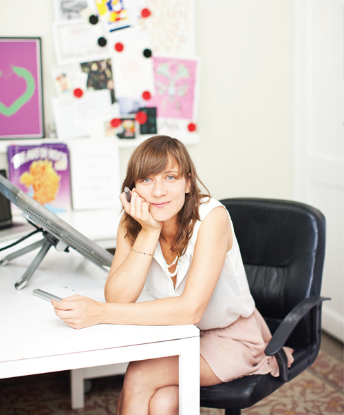
Good morning Petra! How is Prague handling COVID-19? Are you quarantined?
Hi Elizabeth. Yes I’m in home quarantine. The city is empty, but everyone behaves reasonably, luckily. I’m ready to start, I’ve just been jogging.
You are in the final stretch of your PhD. Tell us about your area of concentration.
Yes, I am working on it right now actually, the quarantine is pretty useful for that to be honest. My PhD should be finished in September. The outcome is half theoretical and half practical. For the theoretical part I’m attempting to find a true Czech skeleton of cursive manuscript, that is relevant from palaeographical, methodological and historical point of view, and for the practical part I’m trying to design it both by hand and with digital tools, based on Czech bastardised script from 14th century.
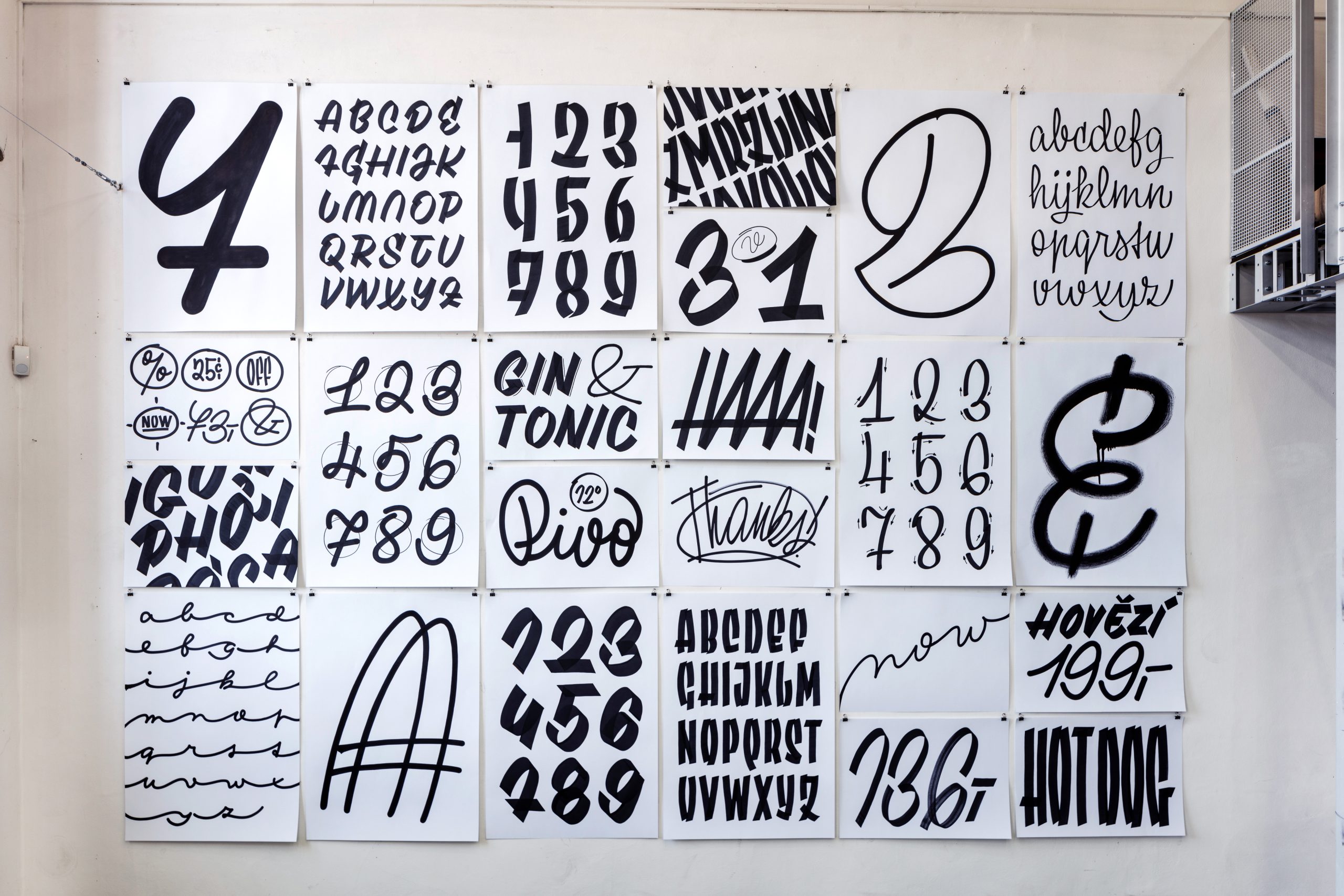
Lettering exploration.
You’ve done a lot of work, yourself and with your foundry, (Briefcase Type) to bring to light the specific nature of Czech type design. What are some of the clear differences between the Czech approach and other Latin-based scripts?
Oh that’s a really good question! From today’s perspective, what I see in the archives abroad, in France, Germany, Portugal etc. the type designers of the 20th century were pretty active and original everywhere in Europe, United States, UK... and their typefaces are stunning! All of these designers had unique conditions, they had special tools and technology that was only available in their environment, and that shaped their style. But they got lucky — those countries were never locked down and closed by Communists for decades; they never lost contact with the field at all. Their work was never lost.
I have to say that Czech type design is not that extraordinary, it’s just an open garden that is new to the world now, because for the first time we have the chance to properly examine what happened with type in our country during the 20th Century. We play the role of investigators, and try to find the true stories of these typefaces, their making, their competition and their distribution. And we can freely share that now. Maybe that’s the funniest part of it. Not the designs themselves — they belong to the past — but the ideas and approaches that we find useful for today.
But what typically Czech features are, is rather a question for someone who is not Czech. Maybe “Czechness” is an extraordinary manuscript, that refers to Slavic and national influence, and is represented by all our famous typefaces like Figural, Preissig’s Antiqua or Týfa’s Antiqua.
I was first introduced to Czech typefaces by a fellow Cooper Type student, who was reviving a specimen he found by the Czech type designer Jaroslav Benda. Years later I met you, and it turned out you have focused deeply on his work for years, culminating in a new monograph of his life and work. Tell us about the process of making the Benda book.
Thanks for this question too. I am so surprised that people share my enthusiasm for his work, because yes – he’s a dinosaur for the young generation! So…
Such lively letterforms, though!
Yes, exactly. What I find fascinating about his work is that even though he never had one unique manuscript like Ladislav Sutnar, Oldřich Menhart or Vojtěch Preissig, he always found a way to take control of the ongoing visual style and put his features into it. He mastered the Rondocubism Serif Antiqua. He ruled the Art Nouveau block typefaces. His calligraphic works — strongly influenced by Edvard Johnston — are such a pleasure to the eyes, but what’s even nicer, is that he used them for ordinary works such as product packaging. His type design always lacks a finesse, or elegant features — they are raw and masculine. They contain mistakes – and that’s the key feature. Mistakes evoke a human hand. They produce a feeling in you to make it better, redesign it better ... you get inspired. You look at them and say, “Oh what a weird B! That A is so strange, I’d never do that that way! Hold on, maybe if I move this stem and that diagonal... wow that would look cool!“ ... First it started with my bachelor degree work in 2013, so I’ve spent seven years with Benda now.
The process was very complicated, because Benda was “buried“ for so long that no theorists wanted to join in the quest. We knew only about his books and typefaces. But the radius of his work is crazy — he worked with architects, he did tapestries, wooden toys, lithographic posters, medals, coins and flags, he worked for president T. G. Masaryk … and all this was hidden and forgotten for so long. We decided not to focus solely on book covers, but broaden the publication into a catalogue of all his works that contain typefaces. We divided the book into type categories and tracked down the artworks, piece by piece.
The hardest part was writing the text. I had just started my PhD, so this was a parallel job. Luckily my professor Jan Solpera guided me, Radek Sidon designed the layout (for the third time at that time) and we sprinted to the finish line. Sadly, there were bureaucratic issues that stopped the release for about a year, so the book got even bigger than before. Now we’ve started a Kickstarter campaign to get the book to English speaking readers.
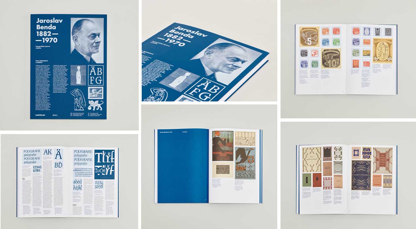
Cover and spreads from Jaroslav Benda, 1882-1970.
Your research is also heavily influenced by your work as a letterer. Do you see lettering and type as a balance in your practice?
Definitely. Without real practice I wouldn’t have the necessary experience that shows me where the limits and boundaries are of a hand. With theory and a digital environment I can go even further than my hand allows and evolve all my ideas into typefaces or other outcomes. I do lettering only because I love the speed of a hand, the rotation of the wrist, and the ability to play with the meaning. In typeface design, it’s more about rules and ways of solving a specific problem.
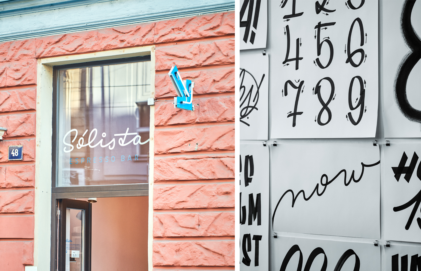
Solista Espresso Bar and detail of lettering explorations.
It seems like you maintain that relationship of making physical things. What kinds of projects do you apply strictly lettering to?
I do. I know we live in the 21st century and we don’t have to write everything by hand every day. We design new scripts to generate texts, robot pens to write our letters, emojis and memories to communicate ... we don’t need to use handwriting anymore. But this transformation of society goes slow (even though scientists say it’s already fast enough) and nobody knows how this lack of handwriting will impact on us. Kids in schools are now learning how to draw a letter A from Arial instead of writing A in cursive. Everyday words on the streets look like they were written by pigs. The visual culture of the street is already a mess. With a gap in writing down information, will we have memory issues? Will we lose the ability to read written messages, because we will only know the shapes of a typeface for print? I am simplifying it a lot. But today, I have the chance to cultivate the written word, so I do it. Tomorrow maybe I won’t need it, but at least I can build something new. Huh, I don’t like that I sound like a philosopher 🙂
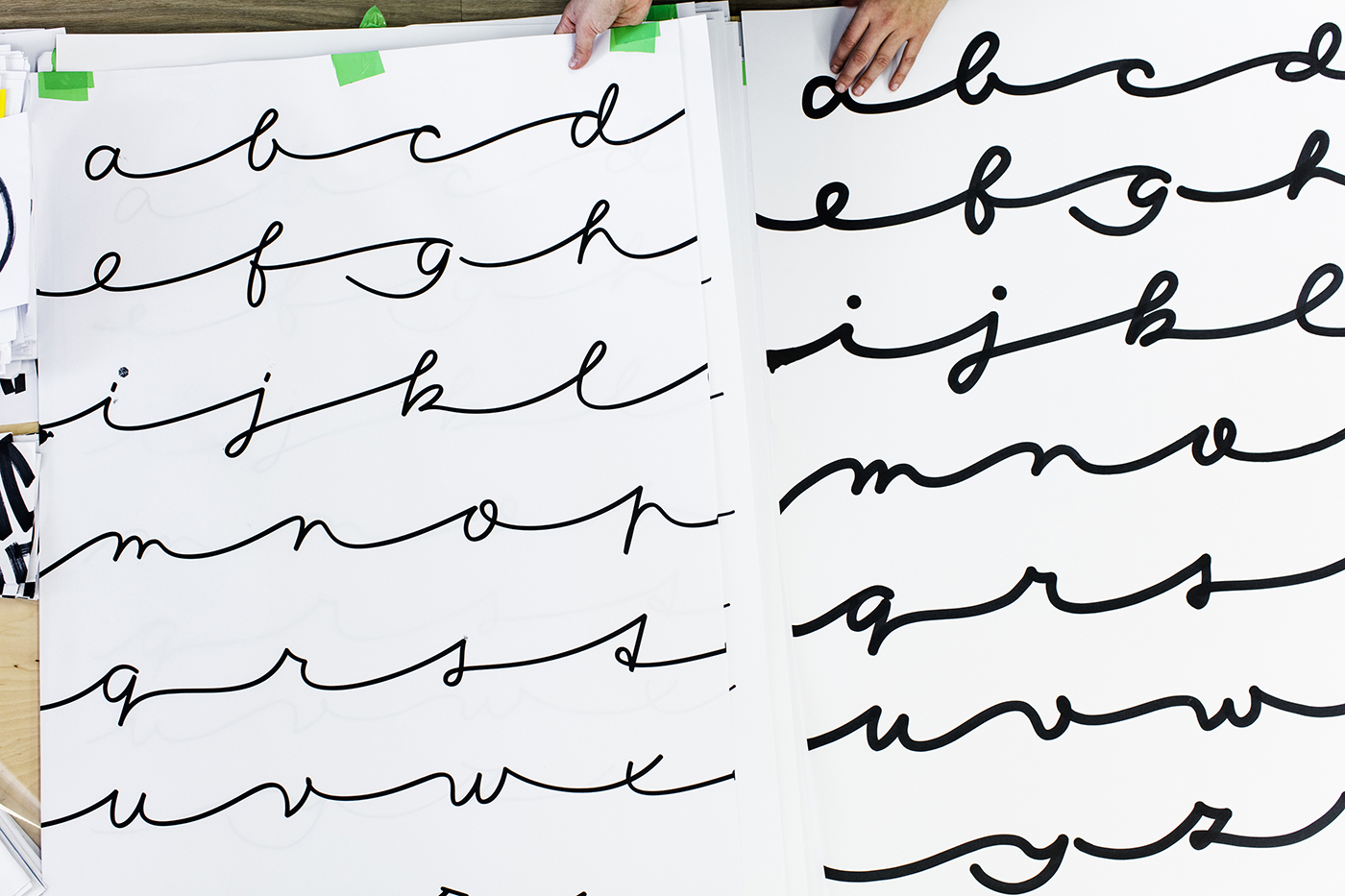
Connected script in two weights.
I use lettering when I begin to sketch any new project and I immediately can see: this doesn’t need a script font! It needs a slab serif or mono space etc. I do a lot of lettering for apps, that have to be visible as icons and on large billboards at the same time; I do a lot of lettering for restaurants, cafés, bars, shops and bistros where I combine it with sign writing to stay consistent, and I use lettering for comic books when designing my own comics fonts. Plus product packaging and merchandise. The task for a good letterer is to design something that suits its meaning, conditions, space and atmosphere. Applying one style to all various projects is a mess.
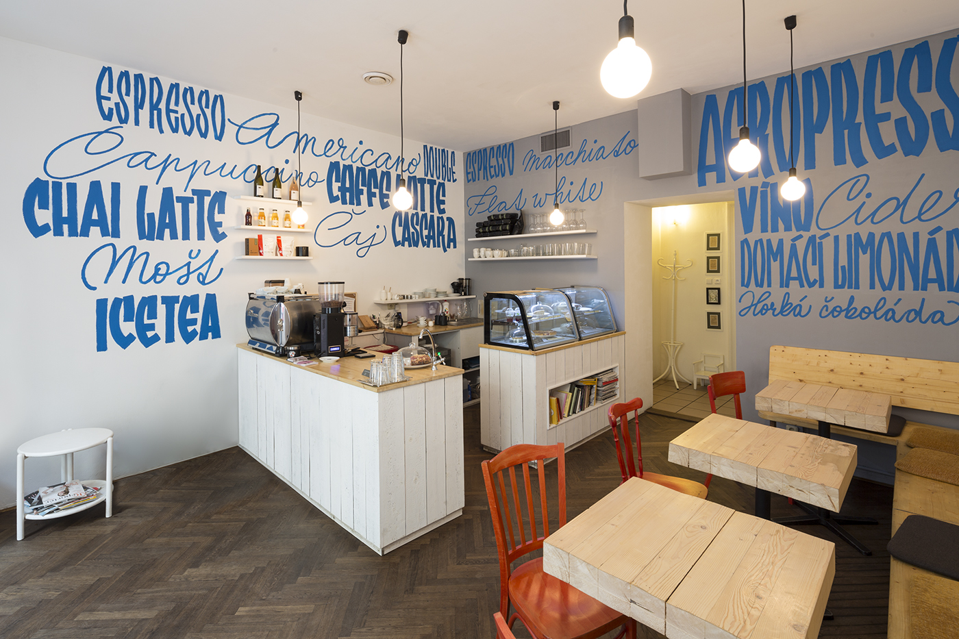
Café interior.
As a society I think we dismiss activities if they’re not “needed”, and devalue making things for the sake of making things and enjoying that activity. So while lettering or even handwriting may seem obsolete, they’re still somehow a natural activity for us. Is that how this all started for you? Enjoying handwriting and drawing letters?
For me, lettering started with a strong passion, an immediate love. For me, lettering started with a strong passion, an immediate love. I hated drawing uncials in art school, but now I understand that the typeface is not only a relationship of outlines, it’s the stroke that rules them all. As Noordzij says, the stroke is the fundamental artefact. A key for every typeface. For all type design.
As human beings we tend to look at things produced by people for people. I would always rather look at my notes written by hand than printed, because otherwise I’ll immediately forget what I’ve written. What I say in my thesis is, that every country has some historical models that they like — they’re used to them. This taste is present in music, in the way we speak, behave and even write. And I think there is a necessity to add local features to globalised language, and the globalised typeface market. You can buy Brandon and use it everywhere in the world. But in children’s cursive, there should be differences between German school kids and American ones, shouldn’t there be? But type designers do the opposite, ignore the cultural heritage, the development on behalf of designing only a nice, sellable font. In my work I’d like to offer a completely different approach, with more respect and less artistic ambitions. It’s a completely new behaviour for me.
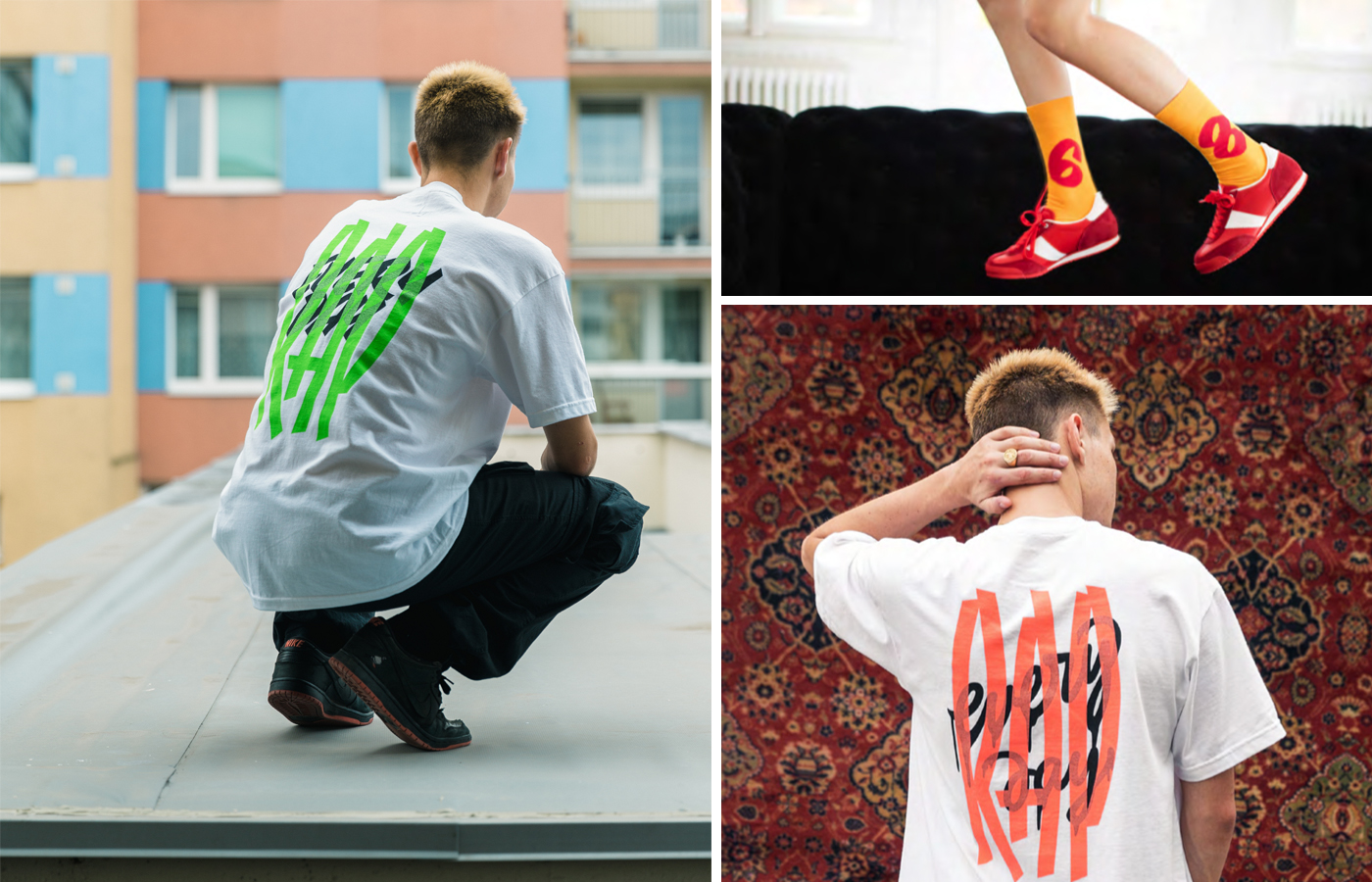
Lettering for Czech streetwear brand, RapRap.