
While traveling through Nicaragua last week, I was captivated by the handmade lettering on a boat—beautifully imperfect, yet honest and full of character. It was crafted with love, care, and precision. I’ve always found more value in imperfections, in spontaneous gestures, in design that feels real and personal rather than constrained by typographic conventions. Its raw, effortless charm really resonated with me.
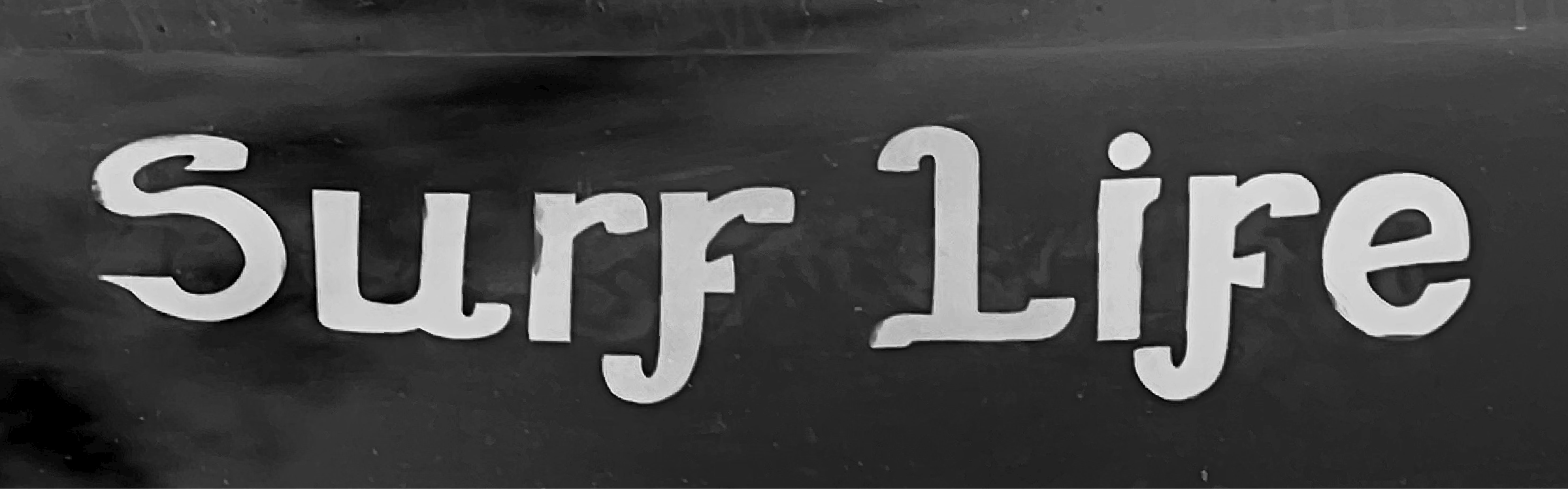
Given a quick turnaround by TDC, I embraced the challenge of rapid experimentation. The deep navy blue of the hand-painted letters, illuminated by sunlight reflecting off the water, sparked an idea. I didn’t want to simply replicate the boat’s lettering—I wanted to distill its essence. The quirky lowercase f stood out, inspiring my own reinterpretation.
The swooping capital S and L echo the movement of waves, capturing the ocean’s fluidity. This experiment reaffirmed that what I love about design is how it often emerges from instinct, context, and the excitement of exploration.