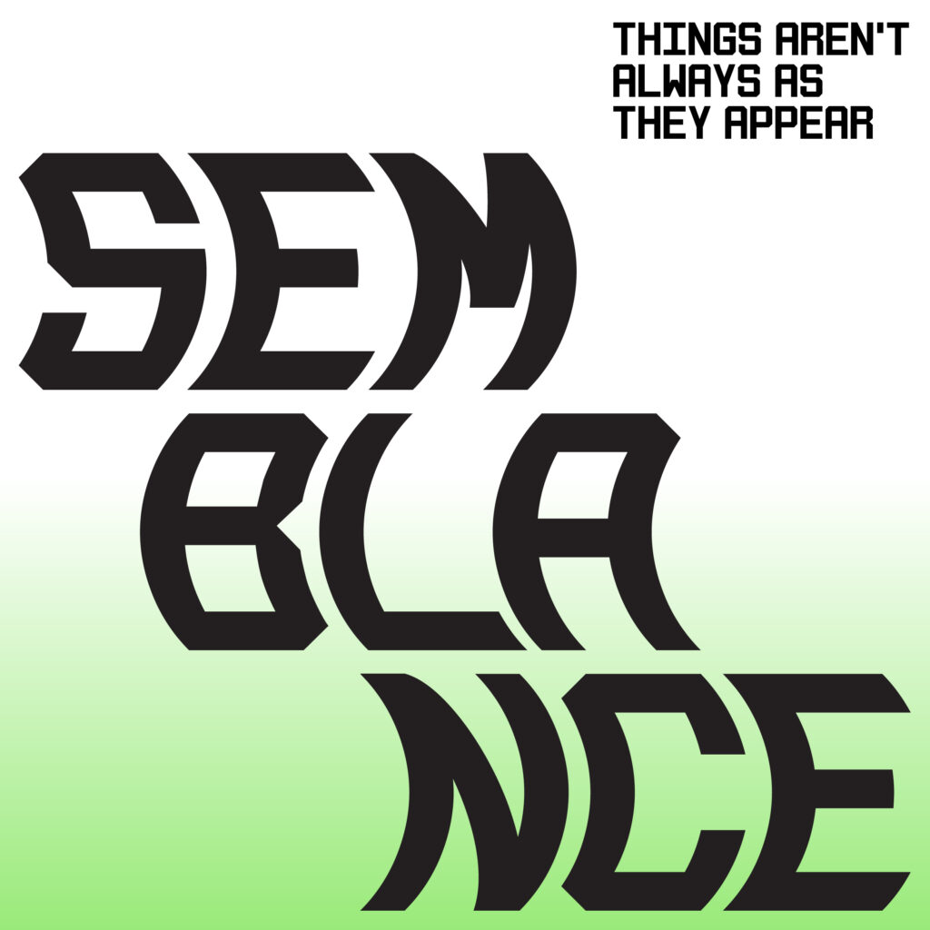
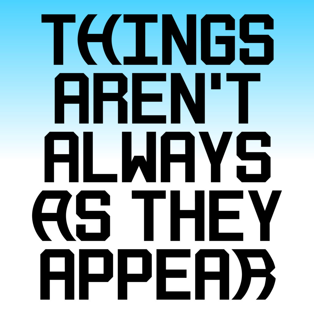
Semblance is an experimental typeface I’ve been revisiting over the past year—a reminder that things aren’t always as they appear. While its static form is a rigid monospace industrial font, it transforms as a variable font, curving horizontally in both directions. There’s still refinement ahead, particularly in character color balance, but I’m already imagining how it might evolve into 3D spaces, curving dynamically along the z-axis to challenge our sense of typographic form.
Semblance is a typeface inspired by my formative years in metro Detroit—a city shaped by manufacturing, resilience, and reinvention. Its design draws from the region’s bold industrial visual language: historic metal signage, ghost lettering on brick walls, and the enduring presence of machinery and production. It also nods to Milton Glaser’s 1977 Hologram typeface, which challenged perceptions of dimensionality and form.
Semblance reflects the duality of metal—sturdy and solid in its final form, but fluid and malleable when heated. This contrast is embedded in the letterforms themselves. In its static state, Semblance reads as a rigid, monospaced industrial font. But as a variable font, it transforms—curving horizontally in both directions, hinting at motion and flexibility.
In uncertain social and political times, this typeface serves as a quiet reminder that things aren’t always what they seem. Embracing complexity and the potential for change is part of what makes design powerful.