Corn-Free Doesn’t Mean Joy-Free; The Making of Cob
Description
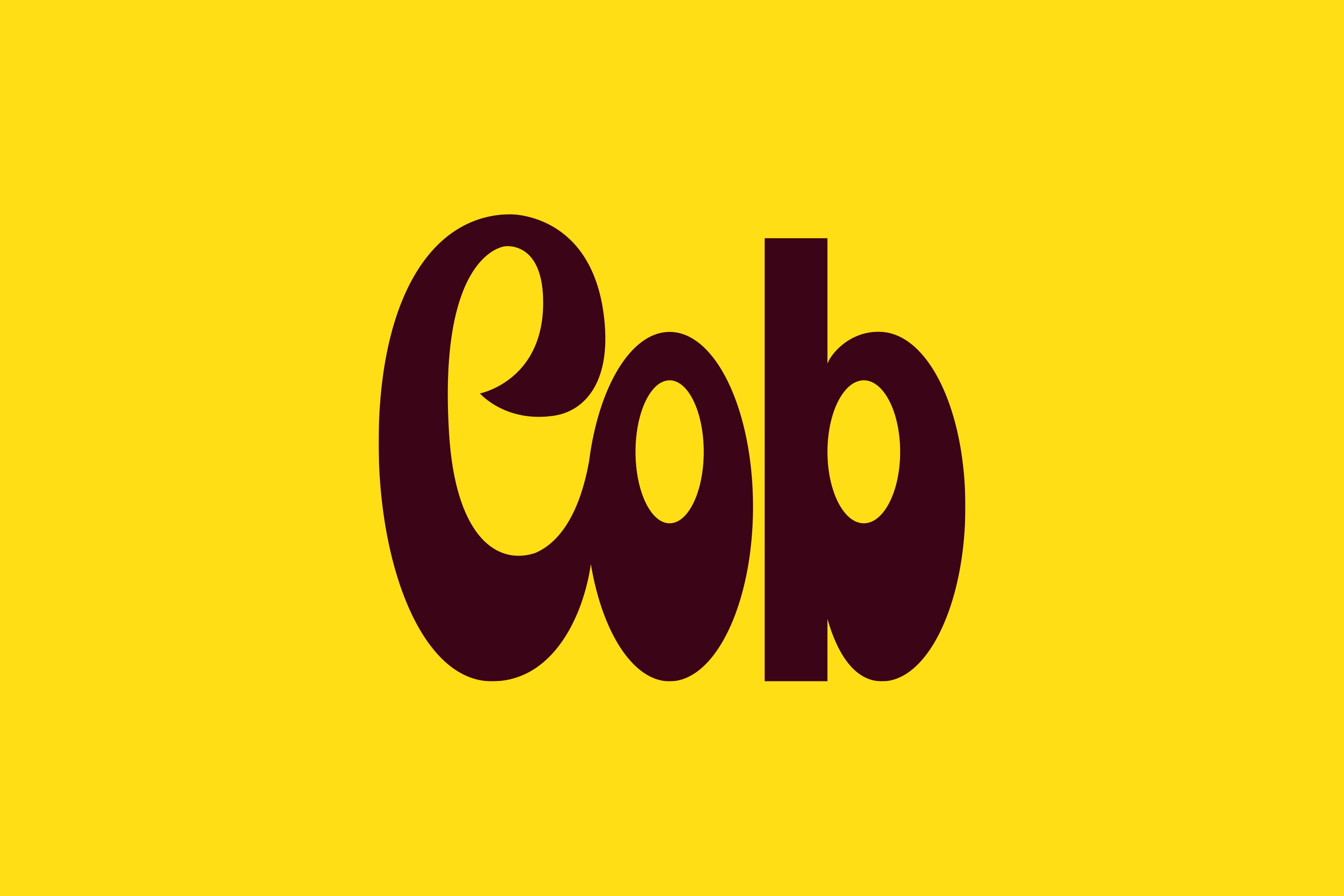
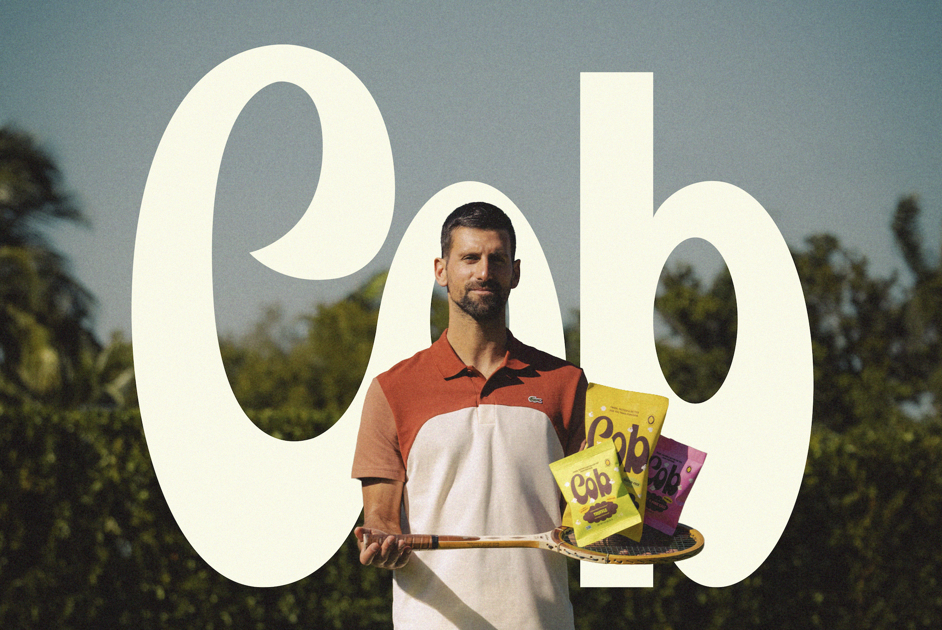
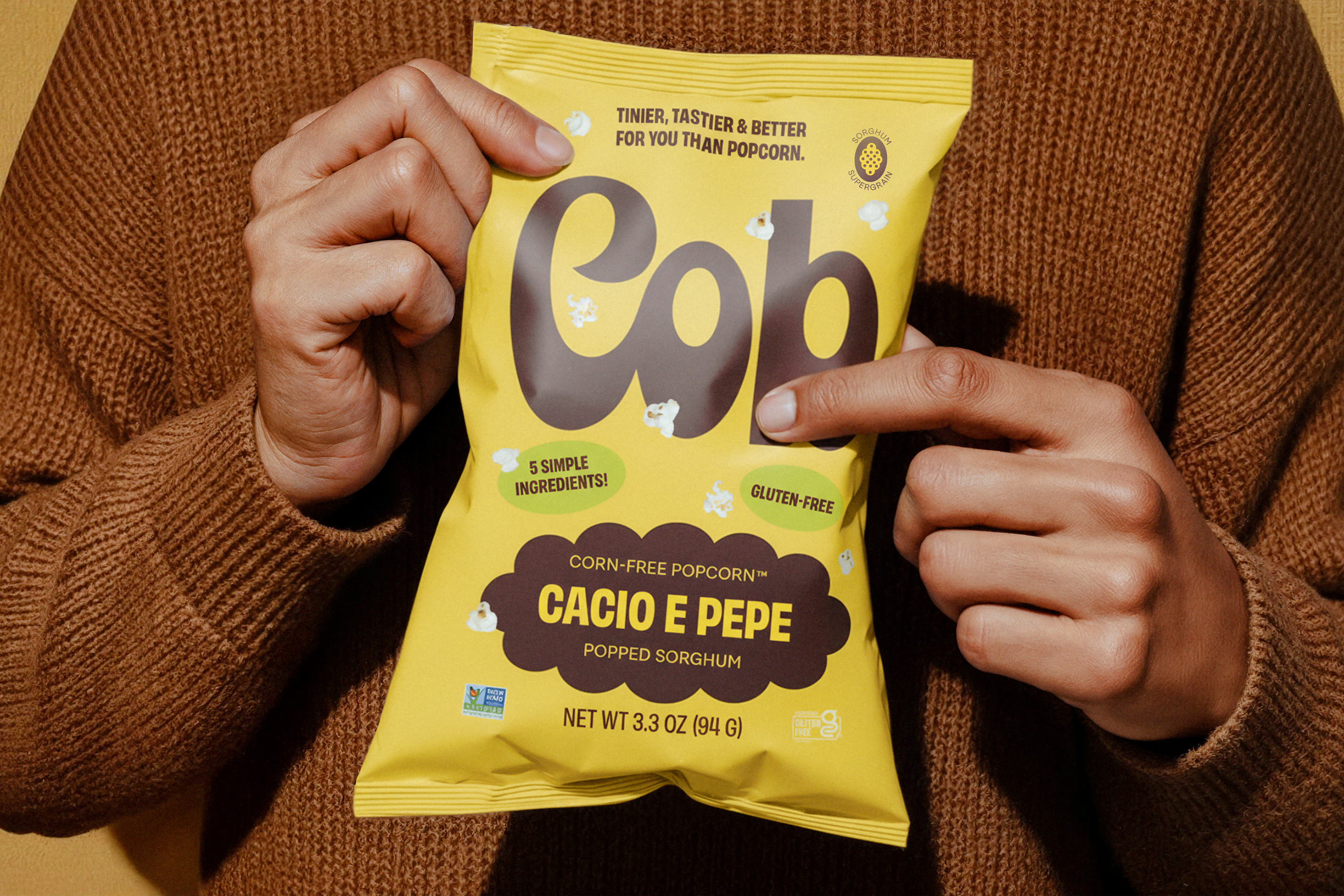
Cob is a corn-free sorghum snack built to reclaim the joy of classic snacking without compromise. Saint-Urbain developed a fully custom wordmark as the foundation of the identity, intentionally avoiding pre-existing retro fonts in favor of something drawn from scratch.
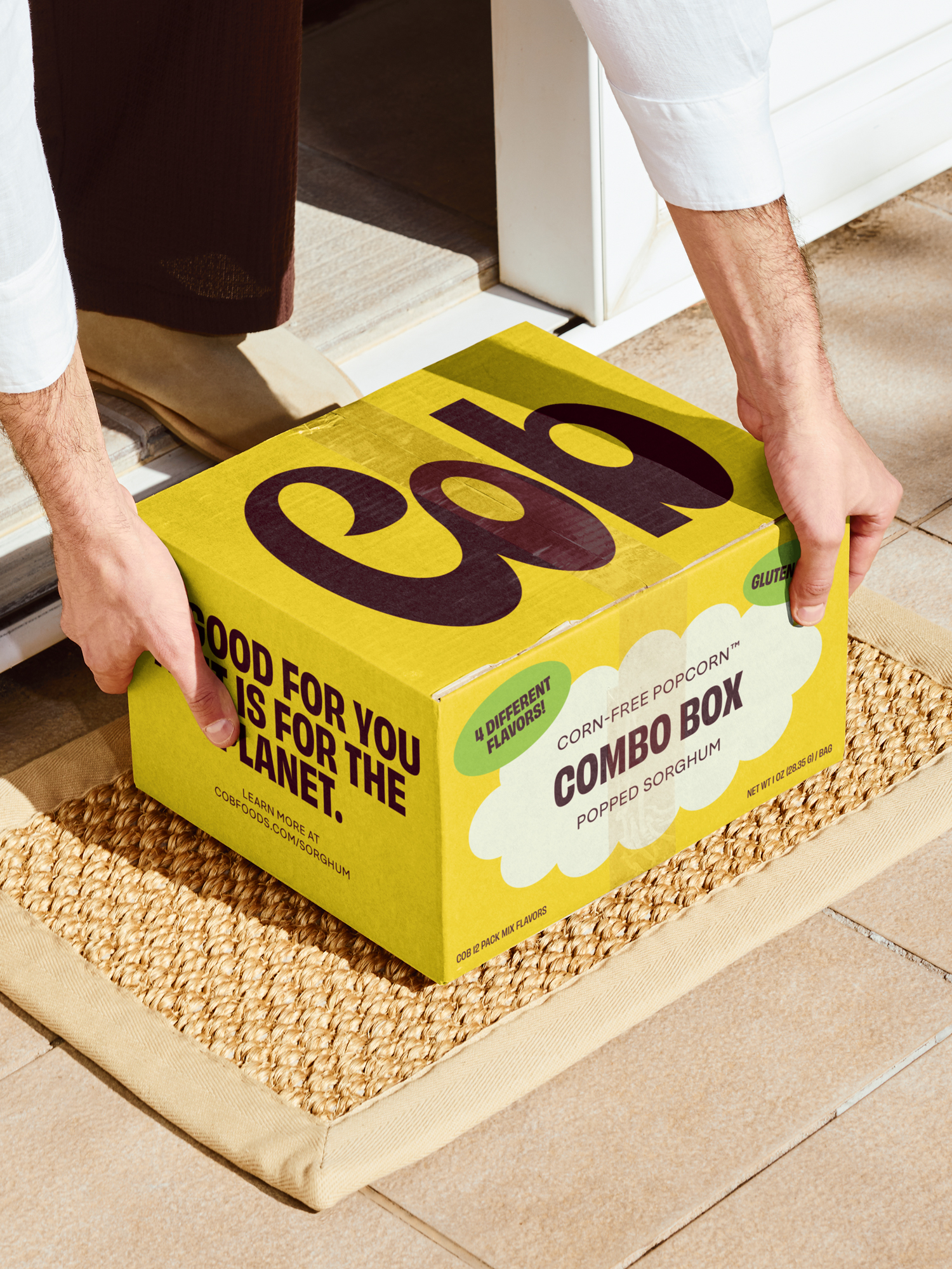
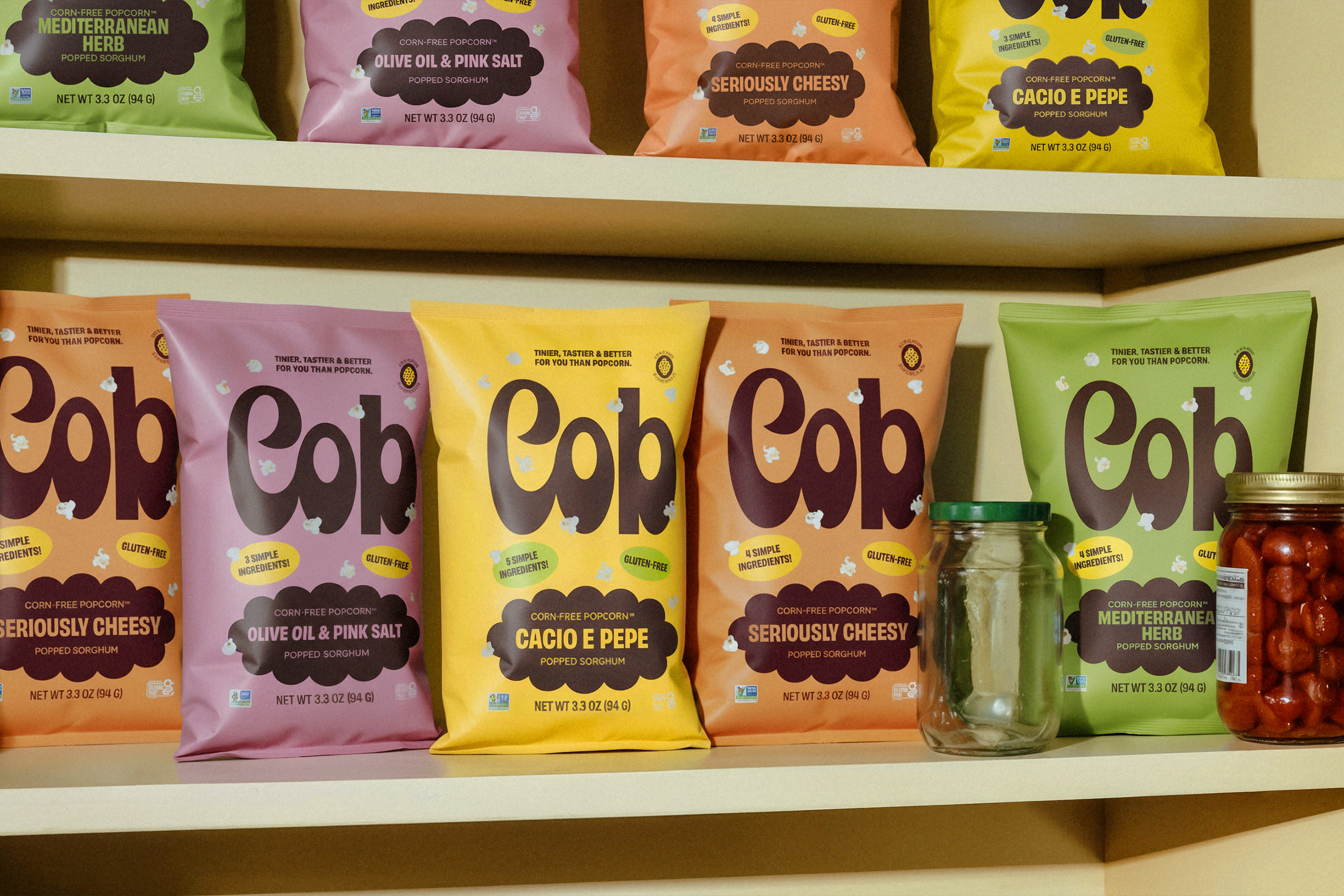
Vintage snack packaging and cereal boxes from the 1960s and ’70s inspired the approach: short names set big, bold, and unapologetic, with letterforms designed to carry weight on shelf. Because “Cob” is only three letters, the mark was built to scale—thick strokes, wide counters, and softly rounded terminals give it presence and warmth, while subtle ligatures and rhythm between letters create cohesion and charm. The slightly condensed proportions reference vintage packaging without imitation.
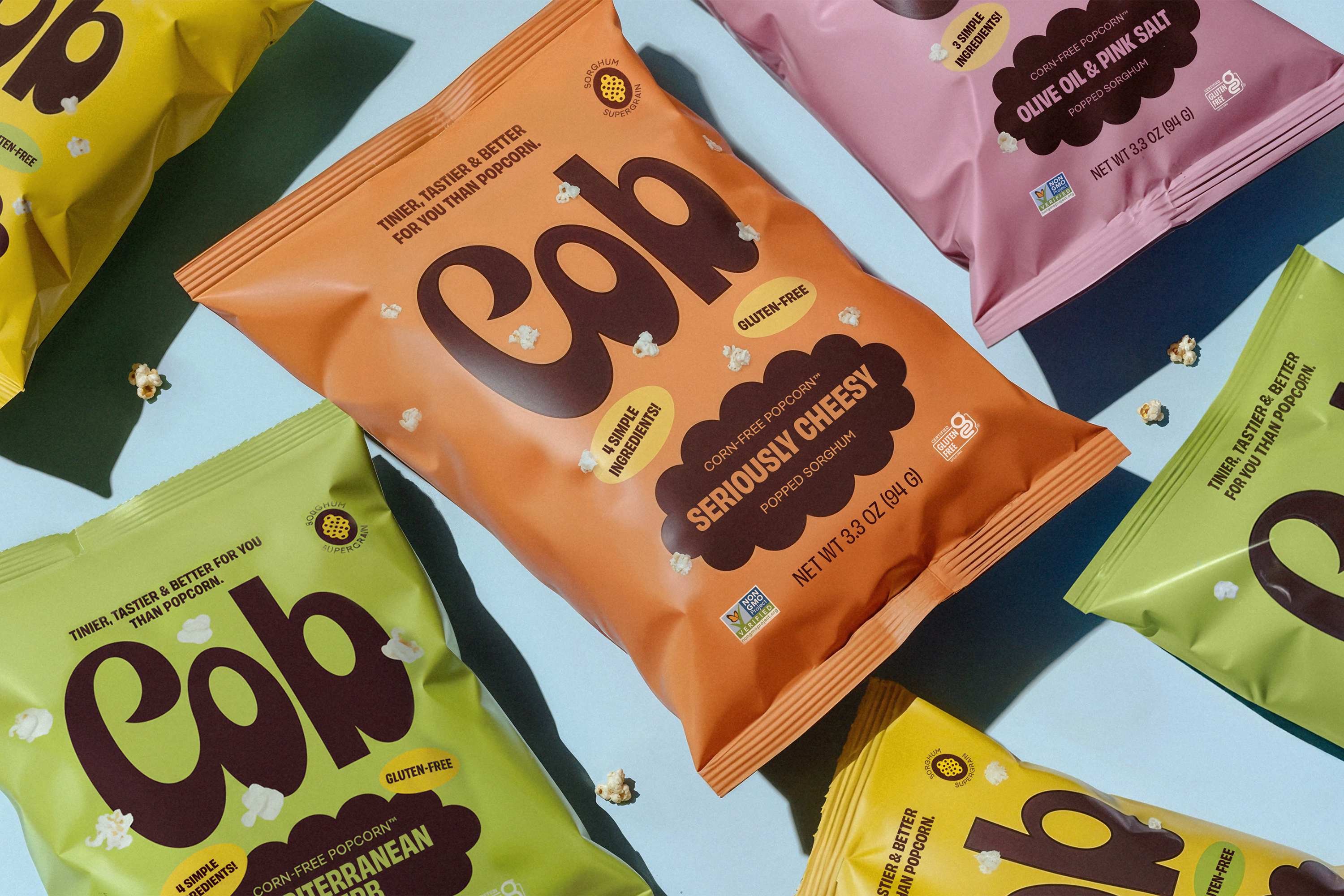
The wordmark anchors a packaging system where true-to-scale sorghum kernels float across vibrant color fields, allowing typography to lead. The result is a joyful, confident identity that feels instantly familiar—and unmistakably new.