Maurizio
Description
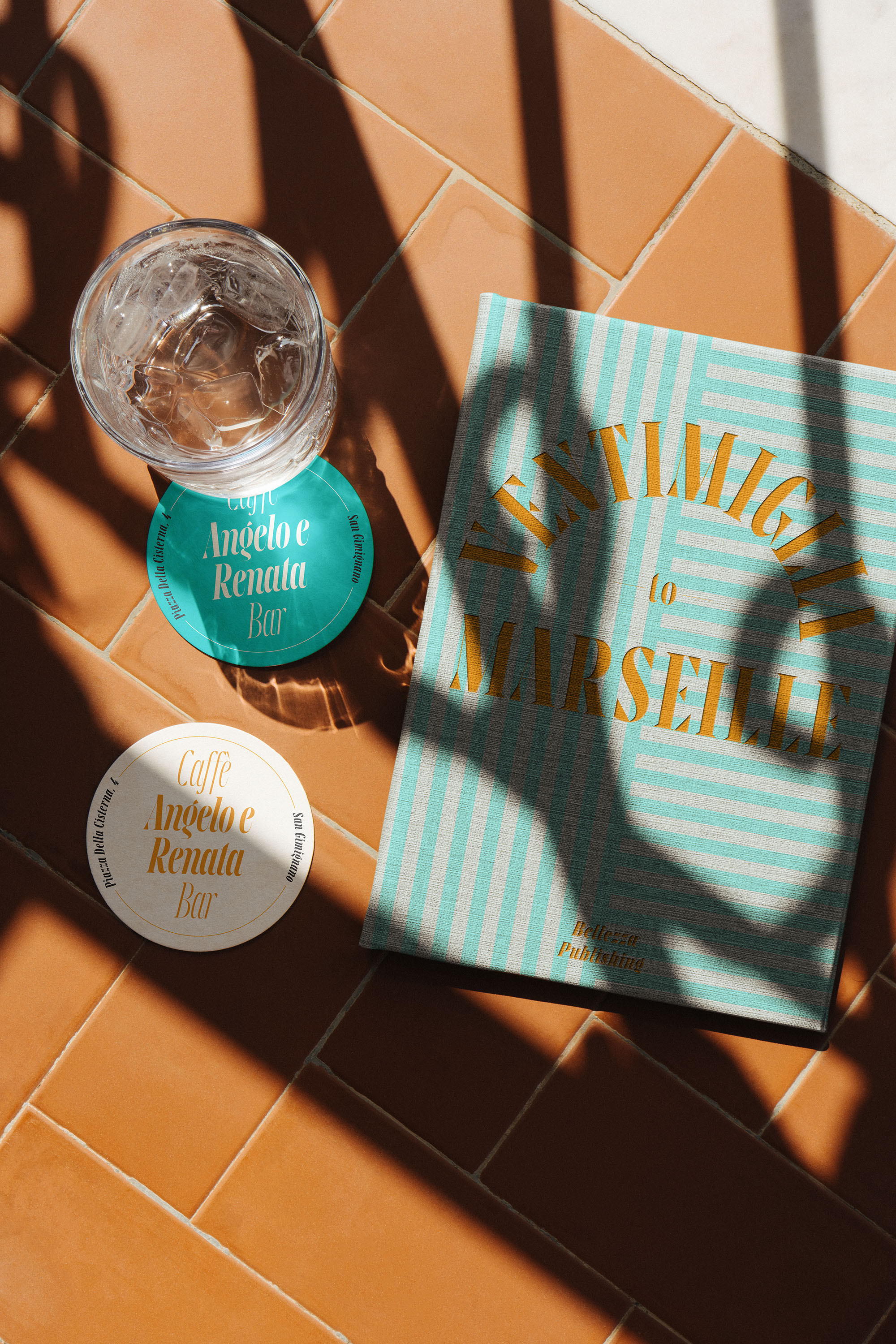
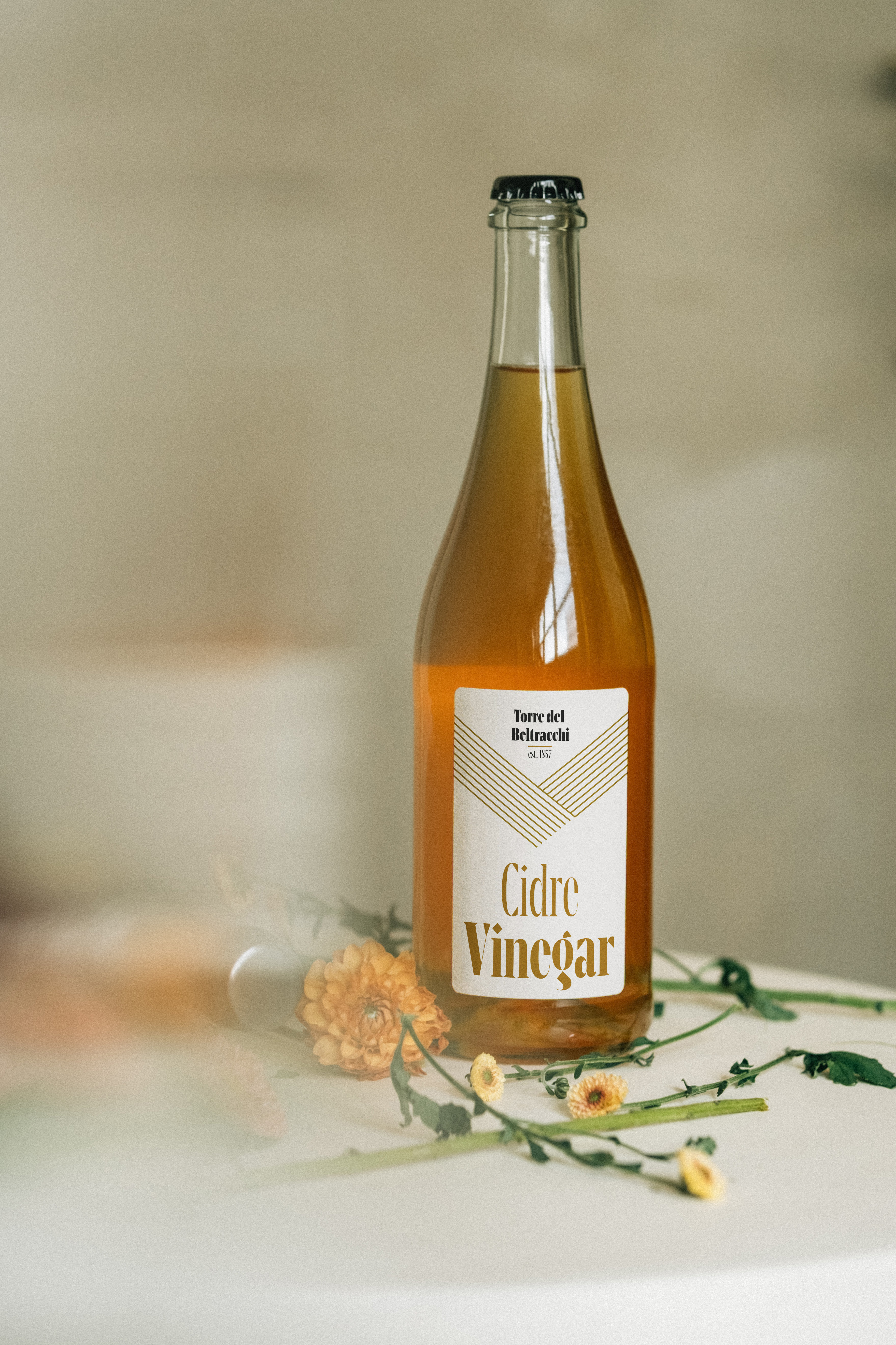
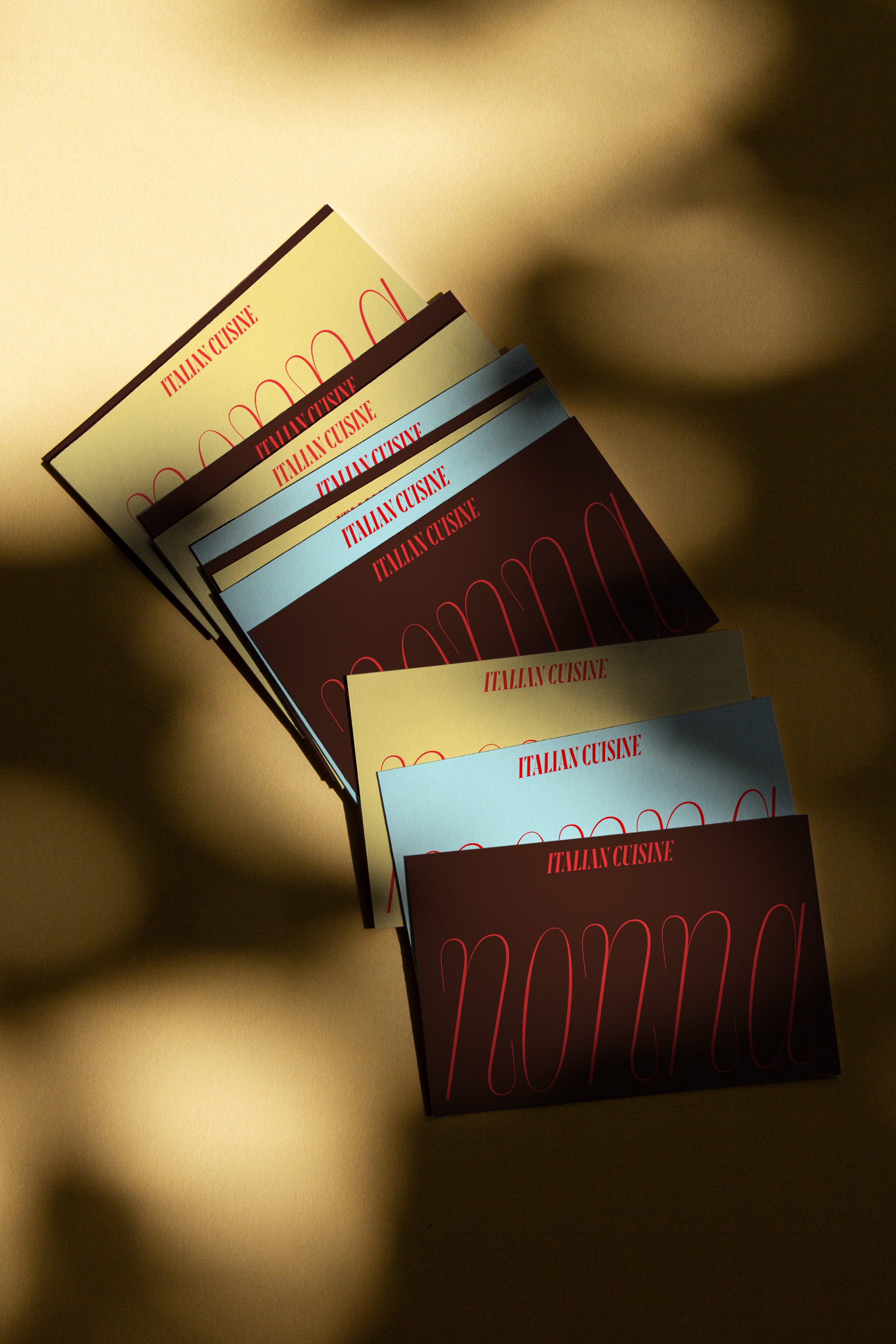
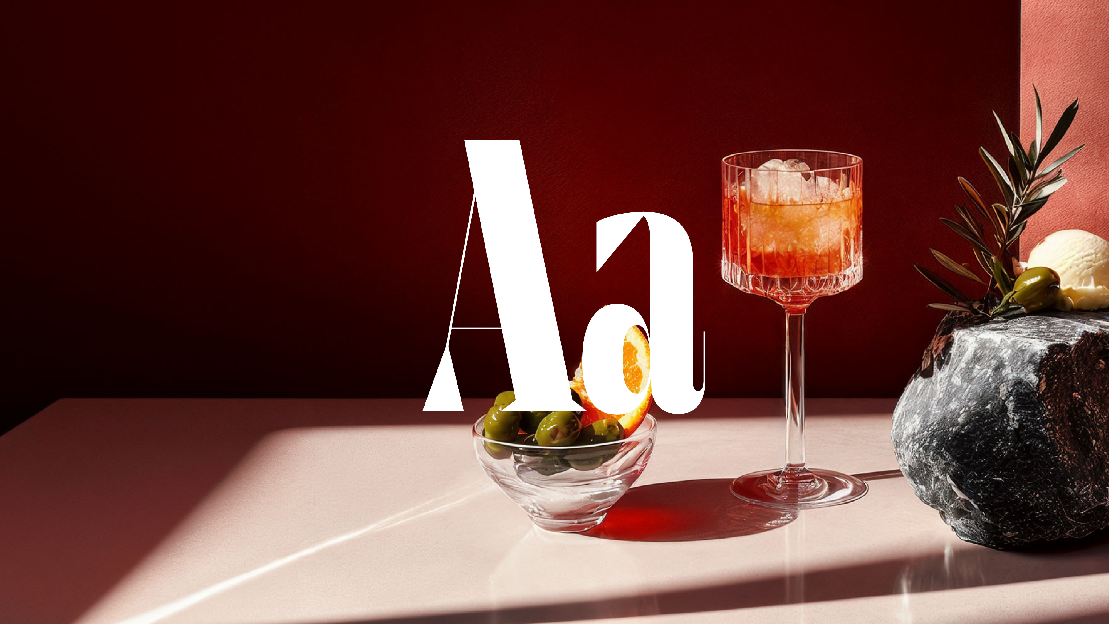
Maurizio is a display typeface suitable for big screens and big stages—the bigger, the better. Why? Because only at large sizes do Maurizio’s design features fully reveal themselves: razor-sharp serifs, open lobes like in “g”, twisted dots on “i”, “j”, etc. The Italic, designed by Nina Botthof, adds some tenderness to the condensed and rigid design. The exaggerated end strokes in the lowercase letters create a very distinctive rhythm in the Italic styles while staying true to the original design.
Maurizio is an exploration into how far the concept of interpolation can be stretched in a superhigh-contrast display typeface. The goal to make the whole typeface interpolable from one extreme to the other heavily influenced the design. Only the two extremes have been drawn by hand: Hairline and Black, in both the Roman and the Italic. (Almost) everything in between has been interpolated.