2019 Winner
Typeface Design
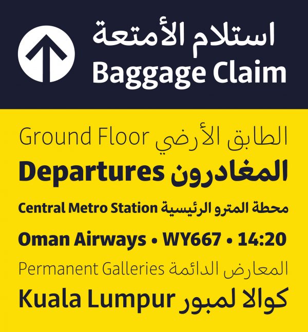
Jali
Jali
Category—Typeface Design
2019 Winner
Typeface Design
Jali
Designer(s)
Mohamad Dakak, Cambridge, United Kingdom
Additional Credits
REVIEWER: Gerry Leonidas
PROFESSORS: Gerry Leonidas, Fiona Ross, and Gerard Unger
WEIGHTS AND STYLES OF THE TYPEFACE FAMILY: Extra Light, Light, Regular, Medium, DemiBold, Bold, Extra Bold, and Display
TWITTER: @mohamaddakak
CONCEPT:
Jali is a way-finding signage typeface designed to achieve optimum legibility by combining two widely used scripts: Latin and Arabic. The concept started as a graduation project motivated by the lack of Arabic typefaces that successfully serve signages. The project was positioned for the market and redesigned with the URW foundry offering extensive help to make the type family reach its maximum potential in both the scripts. Jali literally translates to “clear.” It is a low-contrast sans serif with large counters, distinguishable dots and marks, and compact ascenders and descenders to enhance legibility, especially when viewed from a distance. With its distinct humanistic voice, Jali aims to warmly welcome its readers and efficiently direct them to their destinations. Jali has an Arabic Display companion that is highly characterized to add a memorable identity. Aimed to be an attractive yet easily readable style, it borrows features from both the decorative Diwani and the conventional Naskh calligraphic styles.