2019 Winner
Typeface Design
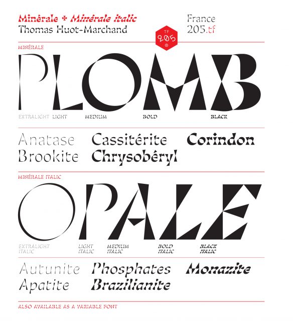
Minérale
Minérale
Category—Typeface Design
2019 Winner
Typeface Design
Minérale
Designer(s)
Thomas Huot-Marchand, France
Additional Credits
TYPE FOUNDRY: 205TF
TWITTER: @205Corp
CONCEPT:
Minérale was imagined as a geometrical exaggeration of the structure of serifs, where the central part of the vertical stems is thinned. This phenomenon is pushed to the extreme: Rather than a flared rectangle, the stem becomes two triangles joined at the tips, creating a clear, almost luminous zone at the center. Sober in its thinnest versions, Minérale becomes more exuberant in its thicker versions: The axis is tilted, resulting in a silhouette close to the “italians,” with reversed contrast. All permutations are possible because all of the weights occupy the same space. Minérale also exists as a variable font.