

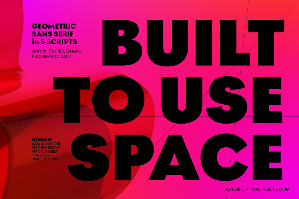
Combining the constructed and human feel while brushing away the dust from a century of geometric derivatives.
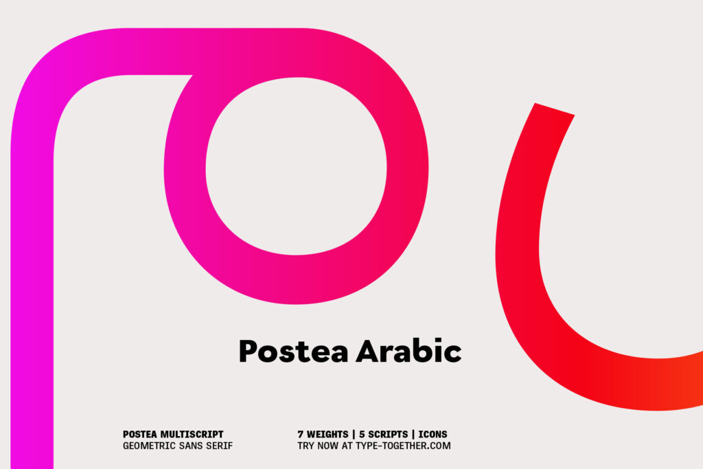
The Postea font family is Veronika Burian and José Scaglione’s take on German geometric typefaces, reshaped with the right attributes for setting paragraphs and headings, and perfect for branding and text use. Some typefaces are a rough tool, like a pumice rock: abrasive to the senses, unforgiving, and unhelpful for most reading situations.
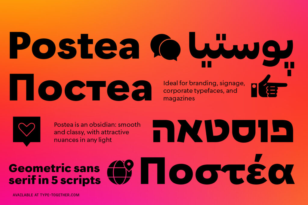
Postea is an obsidian: smooth and classy, with attractive nuances in any light. The classic curves and purposeful details keep its individuality intact while allowing it to fit an incredible range of geometric font needs. Because of these qualities, Postea makes normal reading in paragraphs a cinch and your branding memorable.
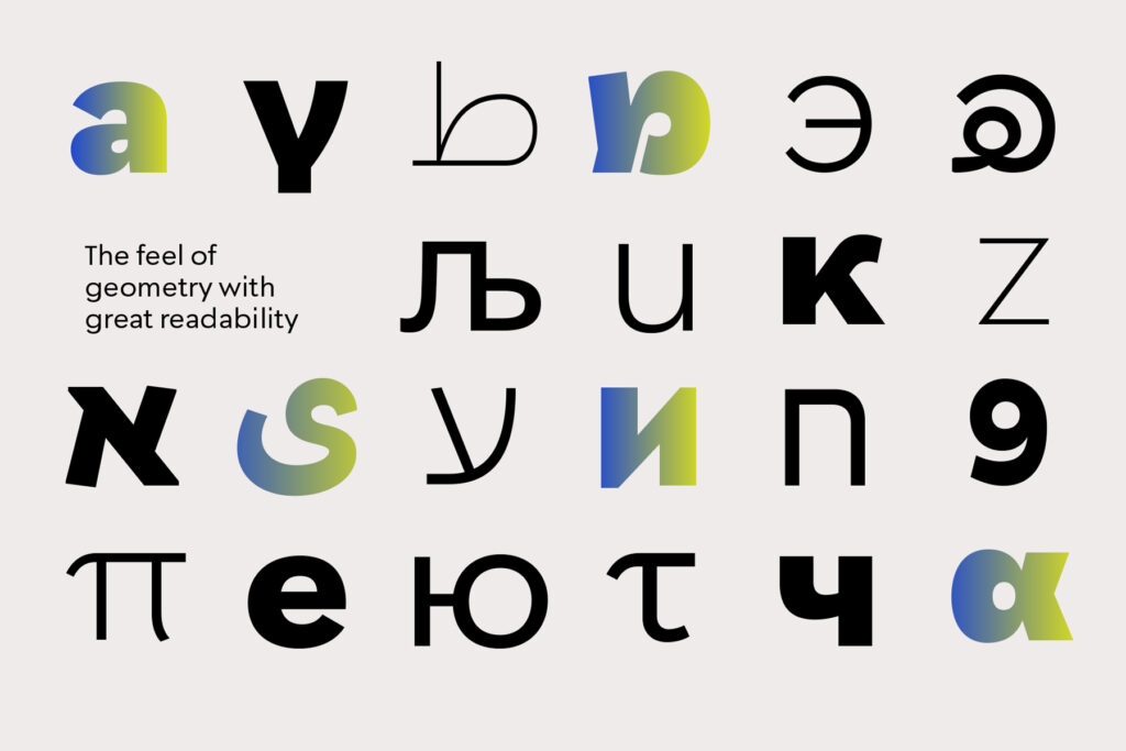
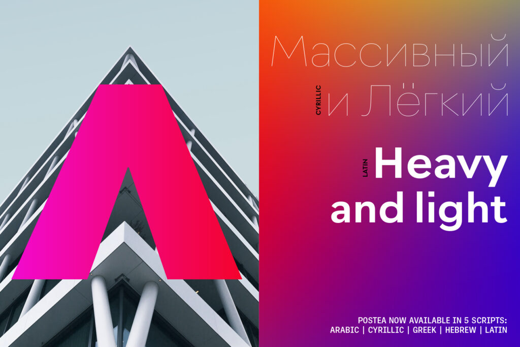
Compared to Bauhaus attributes of restraint and a sparse appearance, Postea’s deliberate play between character widths injects life and distinctiveness into its personality. The default ‘t, f’ have lyrical doses akin to a robust evening drink and are rounded out with a serpentine ‘s’ and rotund ‘o, g, b’.
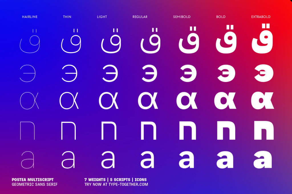
Postea is opinionated and has modern stylistic sets with softer, specially-designed alternate characters. Wallpaper-worthy geometric symbols, arrows, and ornaments are packed into SS01 and SS09. For the ultimate in customisation and glamour, the second and third stylistic sets are where geometric and typographic alternates are found.