Kohl is a modern serif font where sturdy, classic forms meet razor‑sharp, expressive details. It started not with a grand plan, but while we were flipping through an old Miller & Richard specimen book from 1873—as one does—and found a typeface called Antique No. 8. And it was really cool. Kind of condensed, sturdy, and with sharp serifs that gave it a real personality. It felt like it meant business, but in a charming way.
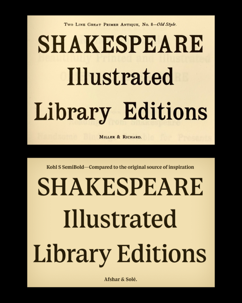
We were sold on the capitals. The lowercase letters, though? Not so much. It felt like someone had wandered into the wrong party. So we kept the uppercase as the mysterious, found‑object muse and designed an entirely new lowercase to meet it. This meant fully committing to the sharpness, letting the triangular serifs guide an exploration of extreme angles and precision.
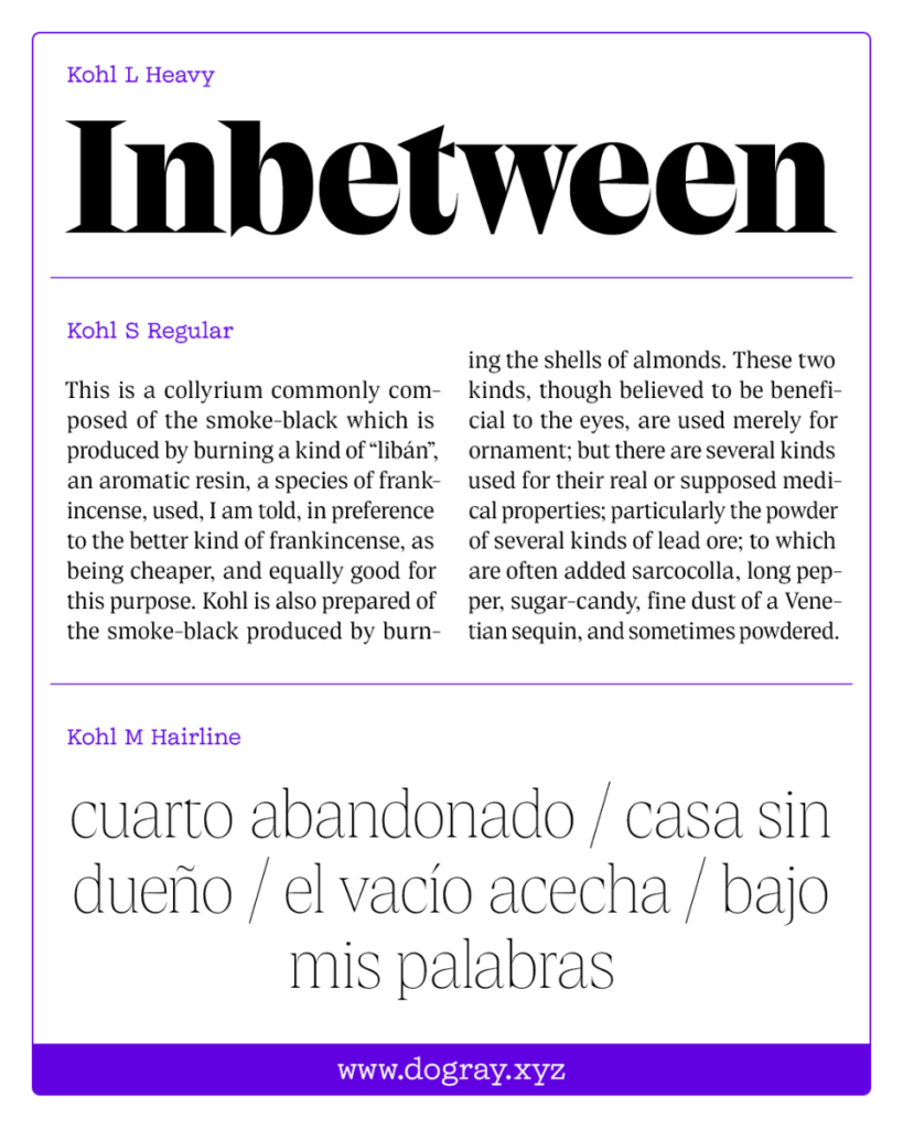
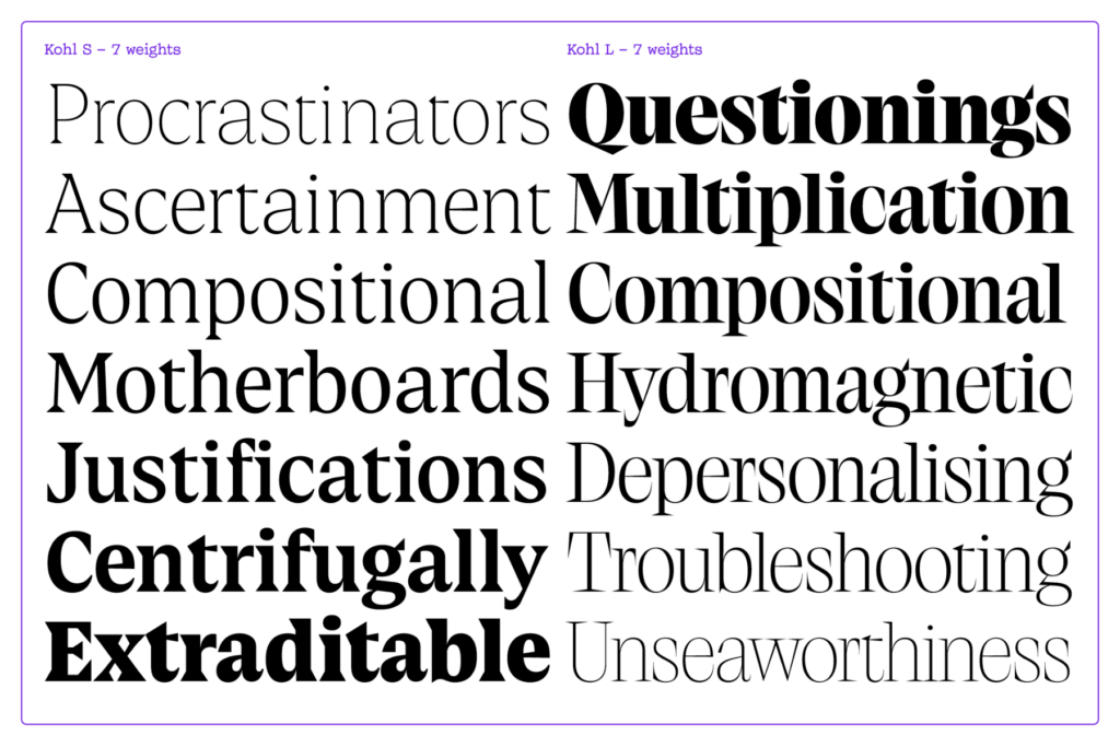
The real magic, however, happened in the optical sizes. When we extrapolated the Heavy weight of size S, cool things happened so we wanted to see how far we could push it. And we did, right to the edge. That's size L; basically size S after three coffees. Sharper serifs, extreme angles, and horizontal serifs that absolutely clash on purpose 😉
Kohl is not here to whisper, it’s here to make a statement that’s a little bit daring, a little bit occult and mysterious and, frankly, extra and unforgettable.