

As you may know, Mexico is rich in diversity and contrasts, shaped by diverse cultures and deeply rooted traditions. Mezcal is no exception. It is made by distilling the heart of the agave tree, which is previously cooked, ground, and fermented using traditional techniques. Thanks to stills imported from Europe, the production process was perfected to its current form, achieving a perfect fusion of both continents.
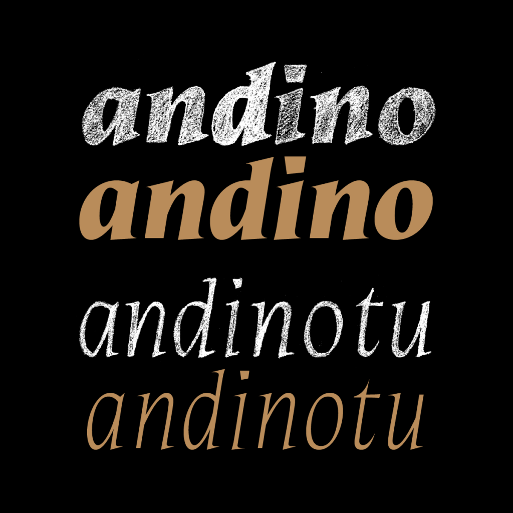
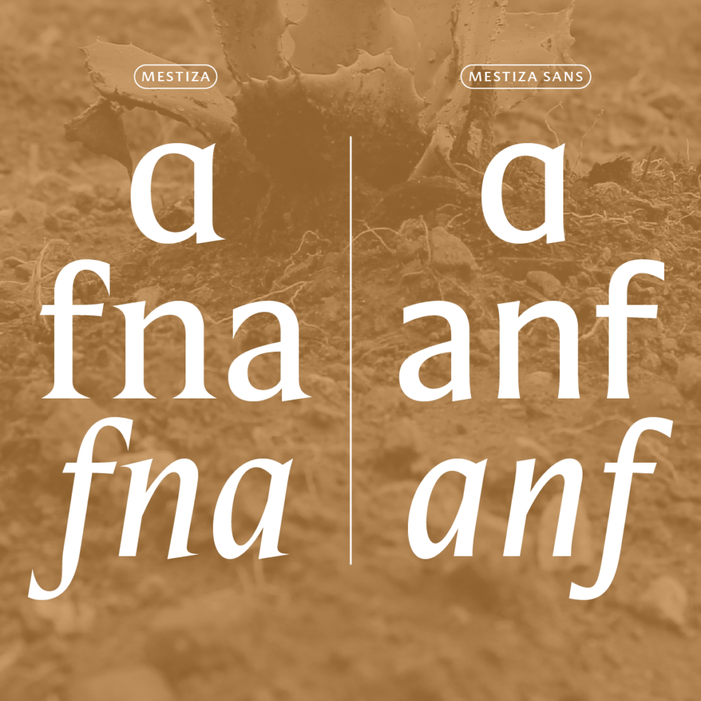
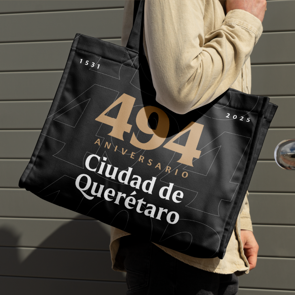
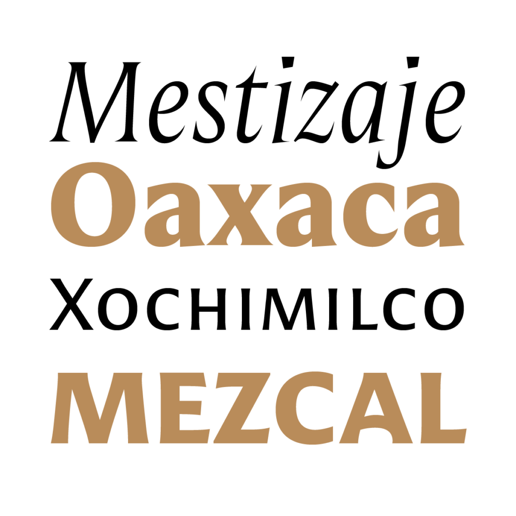

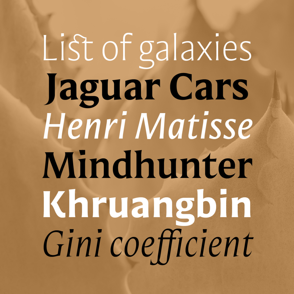
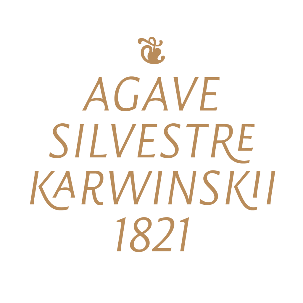
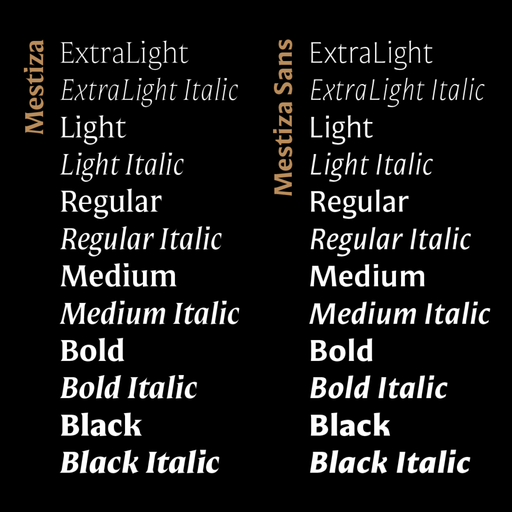
A few years ago, I designed a logo for a mezcal brand that was never implemented, but the typographic shapes proved valuable to me. I set out to create a typeface that captured that spirit, preserving the essence of European typography while integrating the crisp, organic forms of the agave. After considering several names, Mestiza stood out for its stability and symbolism. It reflects who we are: a rich blend of history and culture. The project soon expanded to include a sans-serif version, broadening its range of uses. Mestiza is one of our most rewarding typeface families, as it developed naturally and has been well-received by users for a wide range of products, brands, and institutions. We will soon be launching a text version to expand its versatility further.